Red Dot Tours
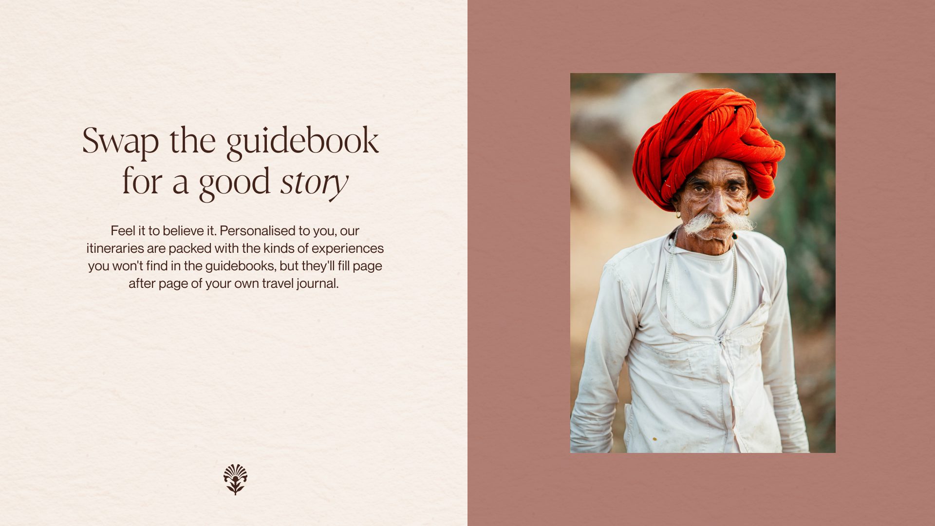
Swap the guidebook for a good story
Challenge
For an industry built on the thrill of discovery, tailor-made travel has become ironically predictable. When everyone’s offering “luxury escapes” and “award-winning” service, no one’s standing out.
Approach
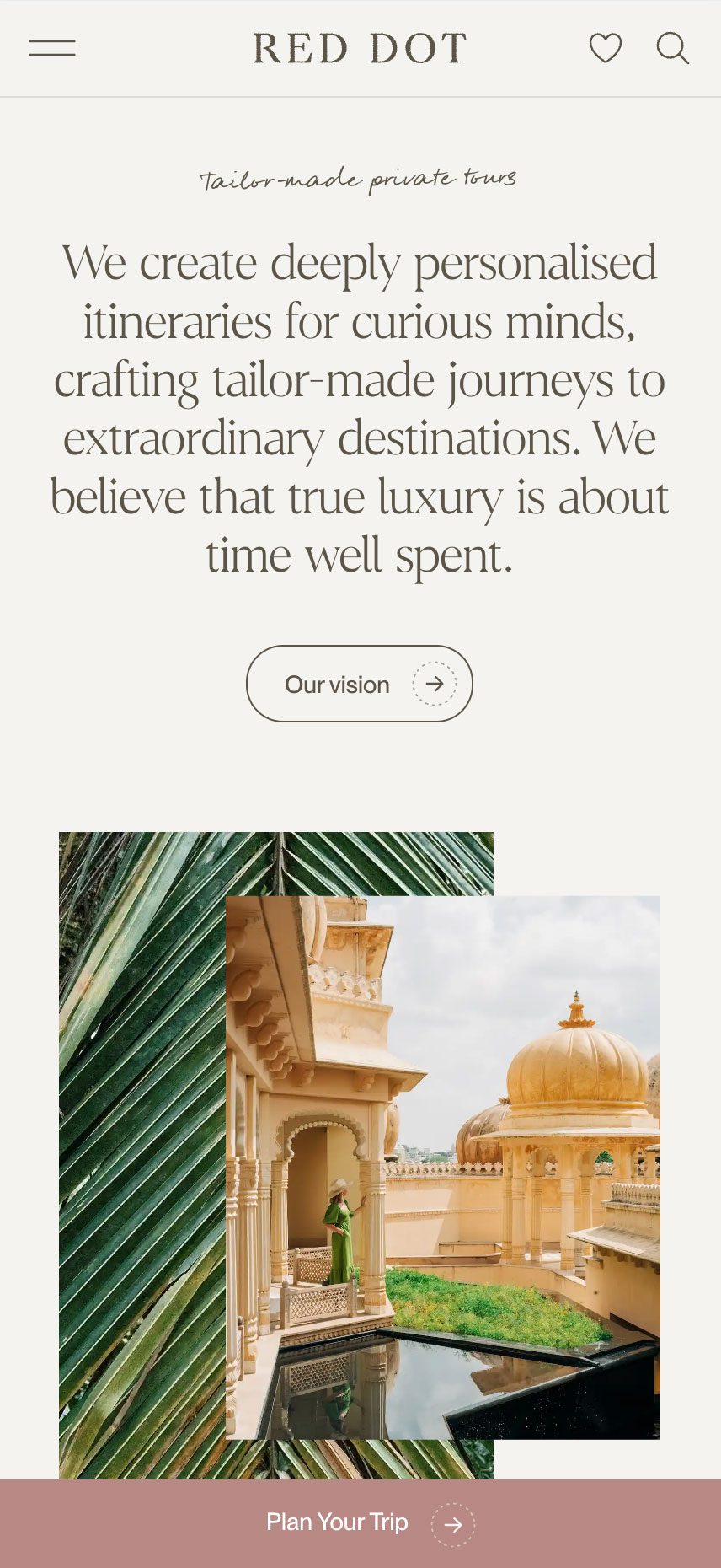
Red Dot is the outlier. With one foot in Colombo and the other in the UK, Red Dot takes travellers to the heart of Sri Lanka, India, Bhutan, and the Maldives, offering a richness of experience, far from the well-trodden path.
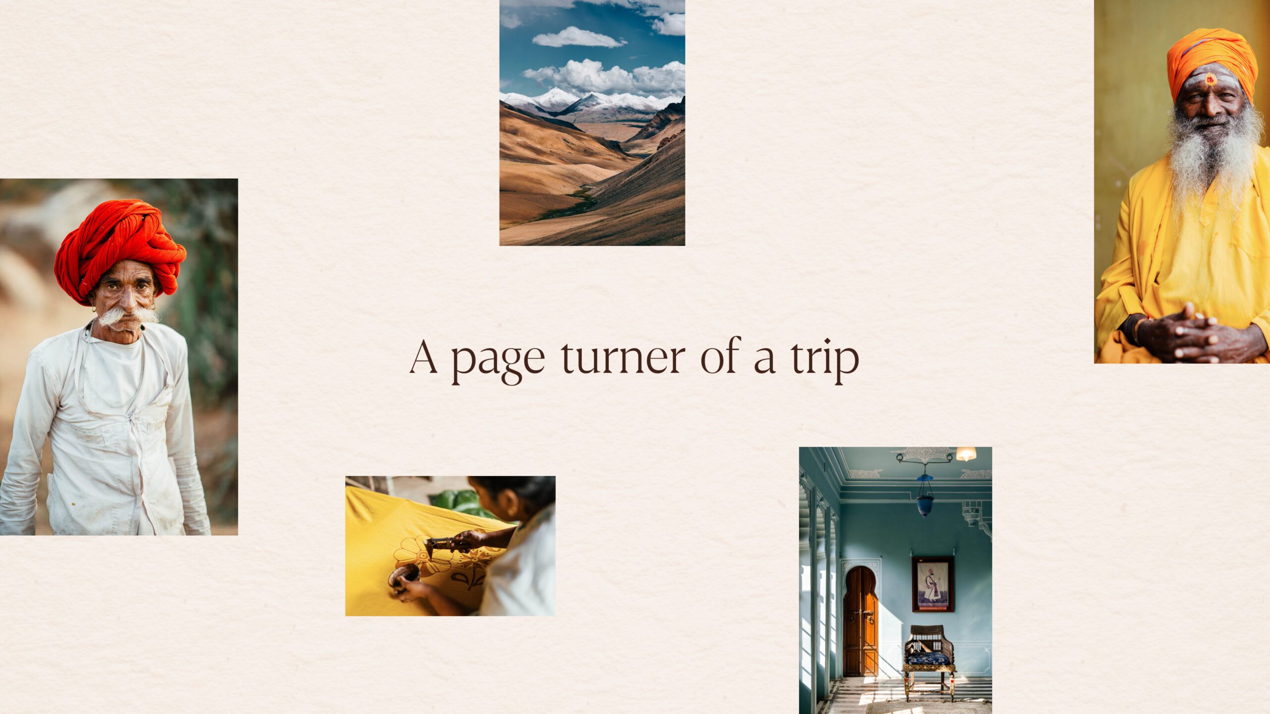
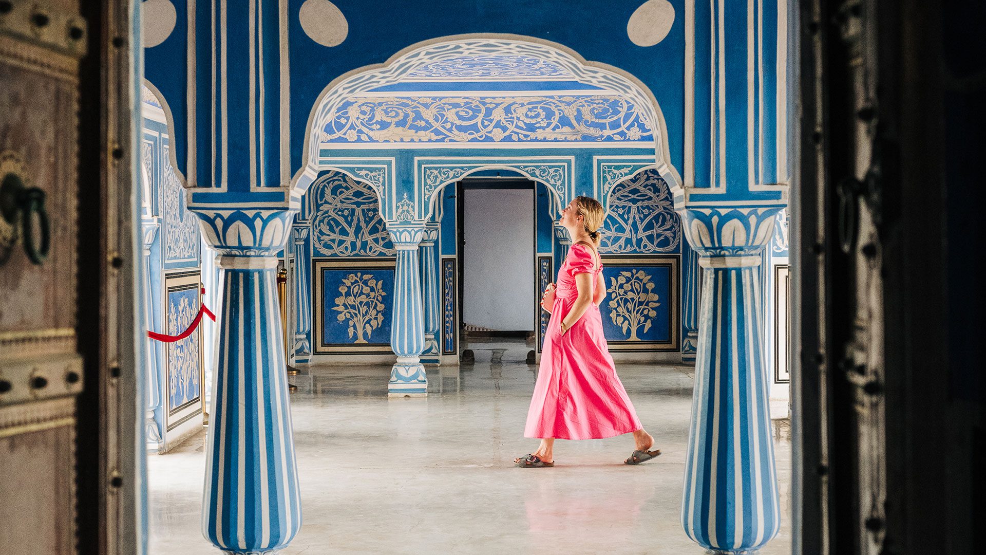
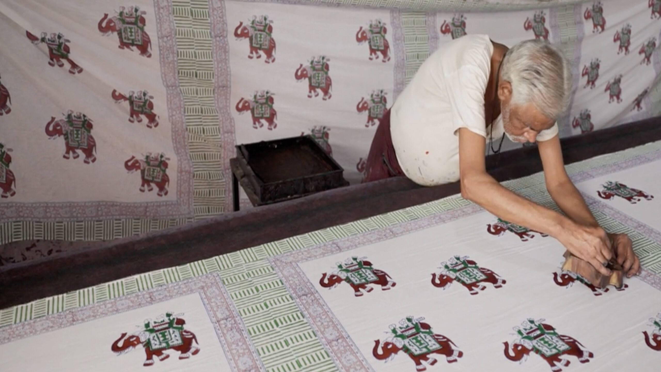
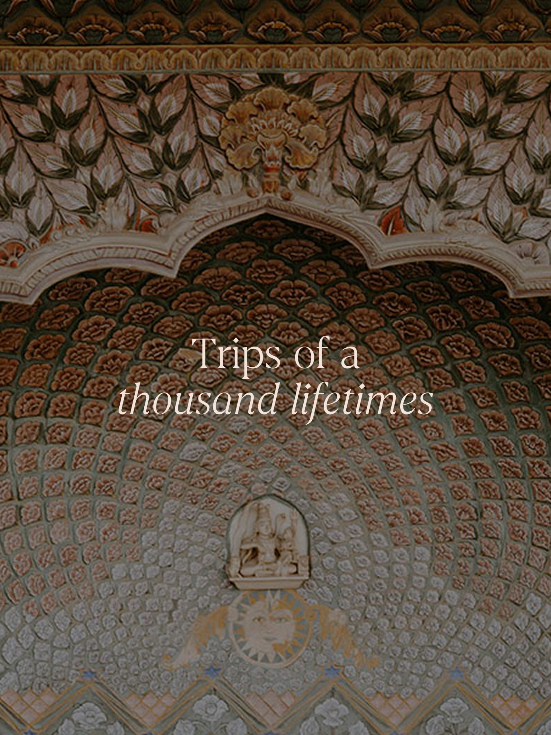
The project took us on a cultural deep-dive, exploring visual references from across the Indian subcontinent, of hand-painted typography, block-printed textiles, and ornate architecture.
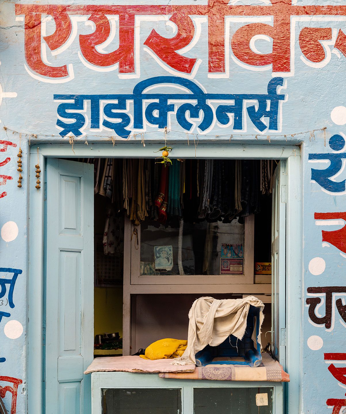
Working in collaboration with Kirsten Murray, we partnered with Red Dot to create a new positioning, identity and website that invites curious explorers to swap the guidebook for a good story.
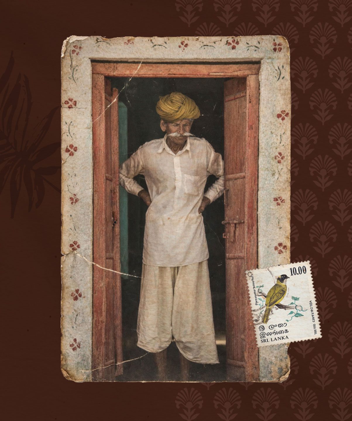
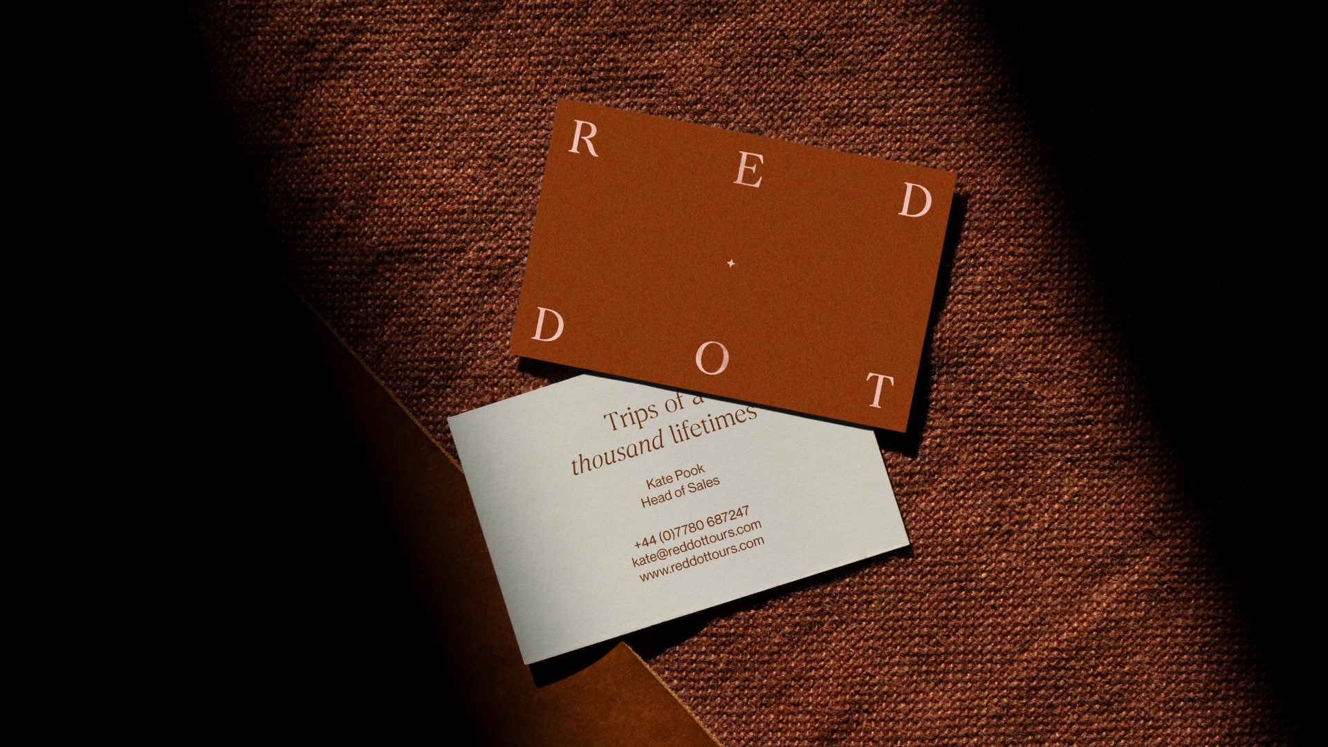
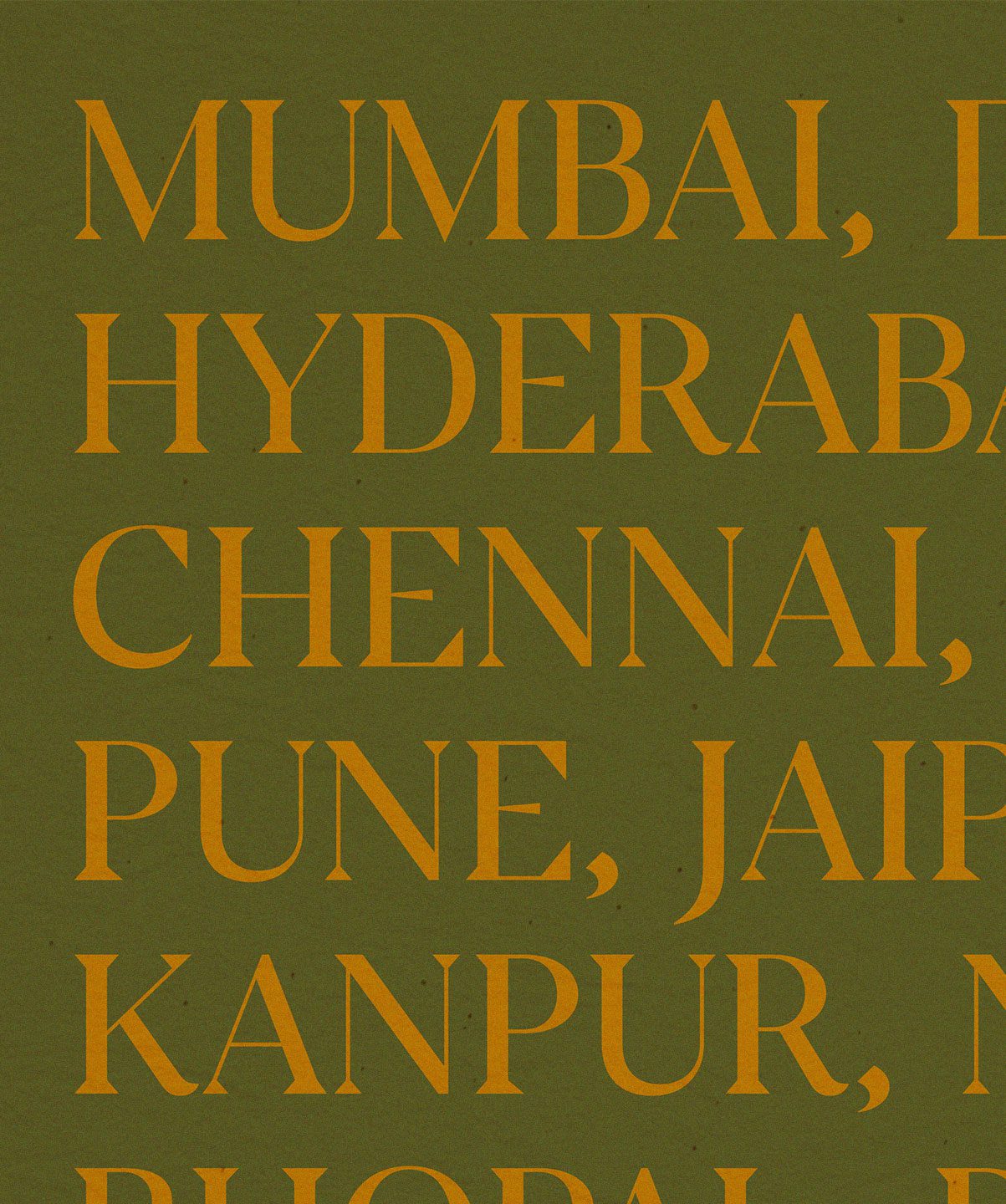
Typography is central to the new brand system, combining handwritten fonts for warmth and personality with contemporary serifs for refinement and sophistication. Together, they create a premium yet approachable feel across all applications.
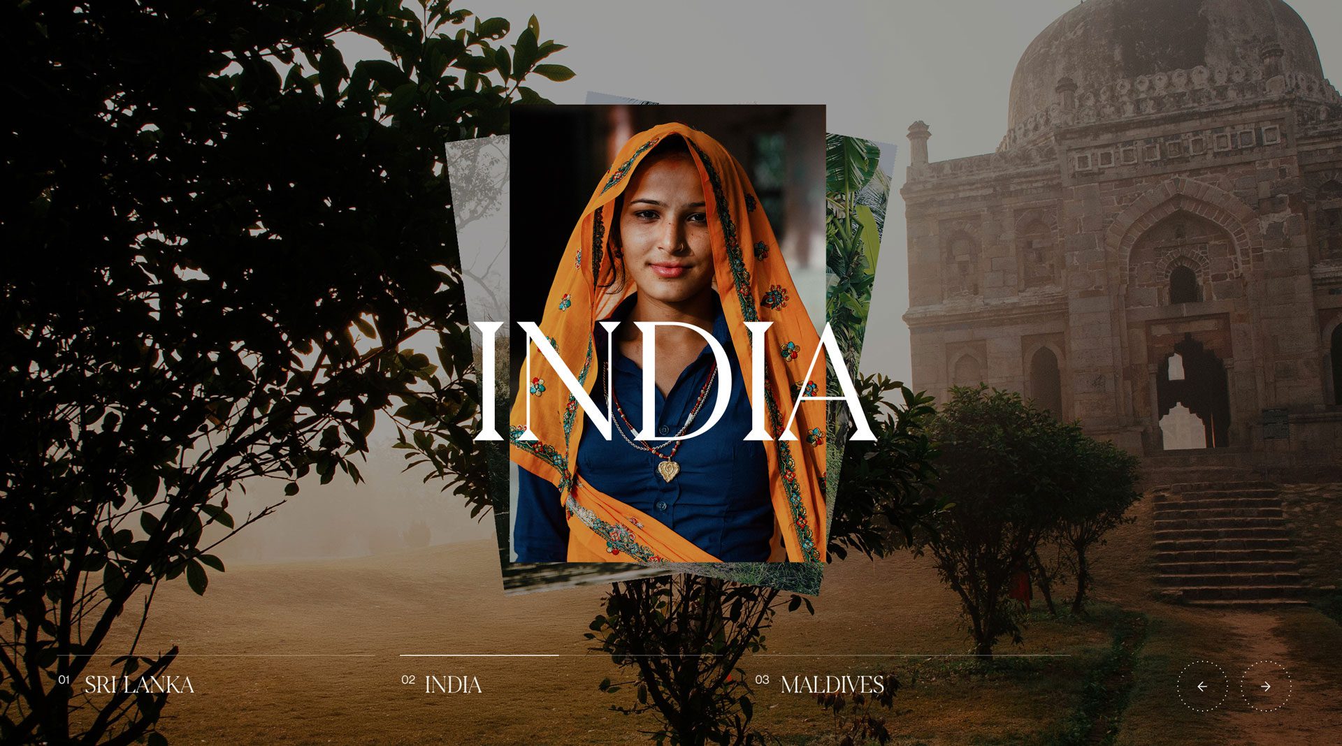
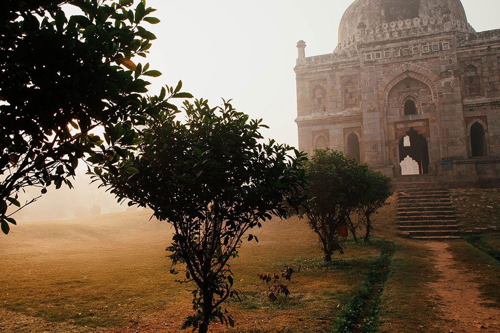
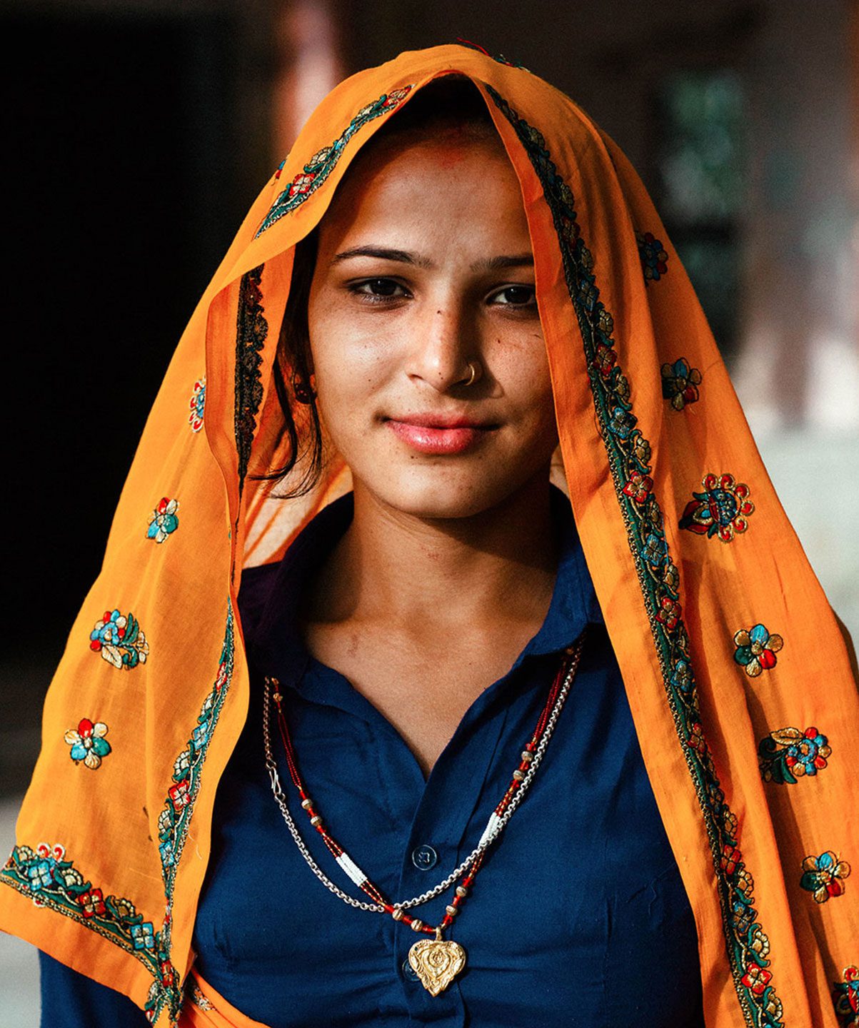
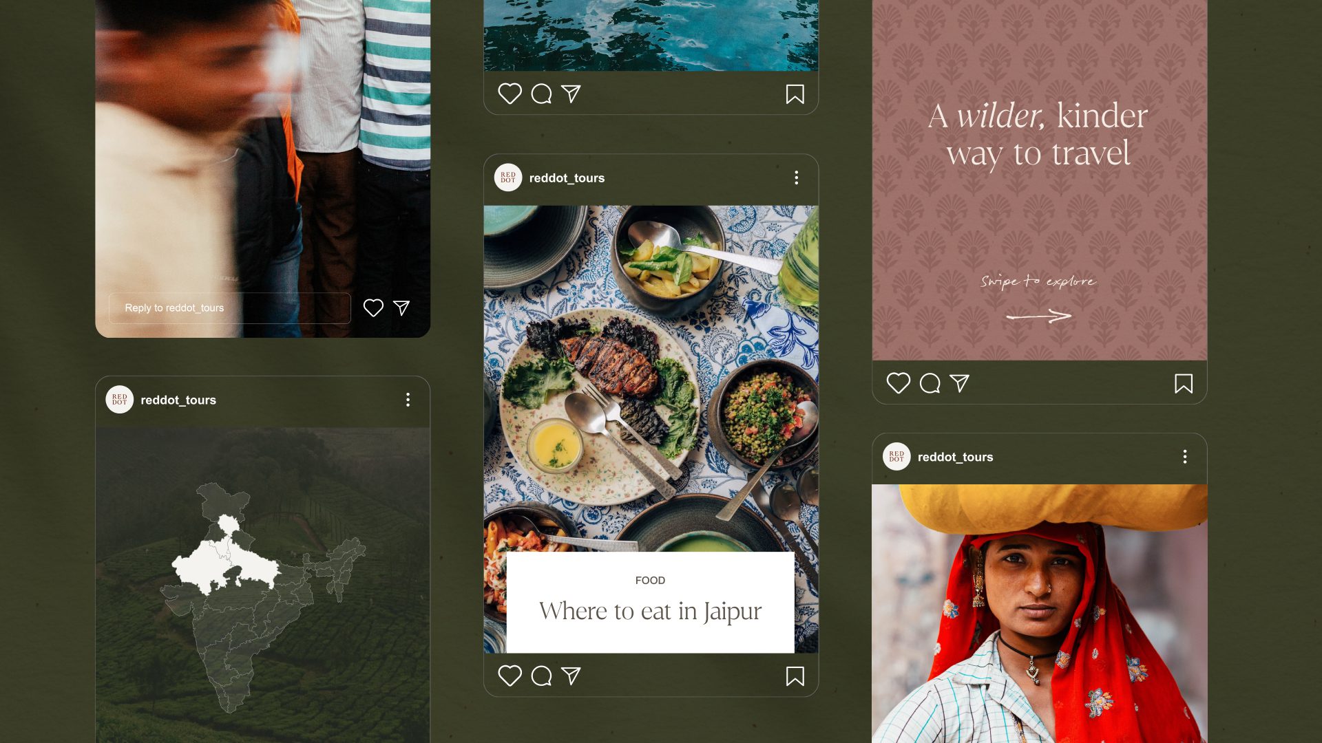
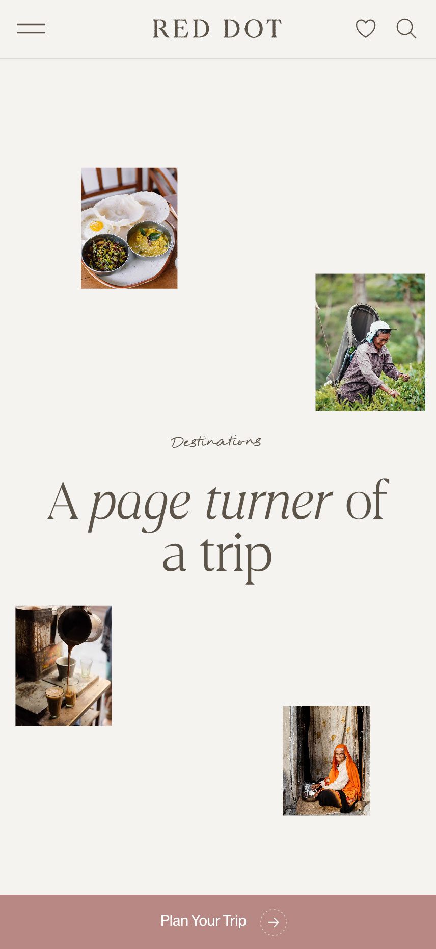
Authenticity was a defining principle throughout. In collaboration with the client, we developed an art direction rooted in real travel rather than polished luxury tropes. We worked with travel photographers, local photographers and videographers to capture the atmosphere, detail and everyday beauty of each destination, creating a more distinctive and credible brand presence.
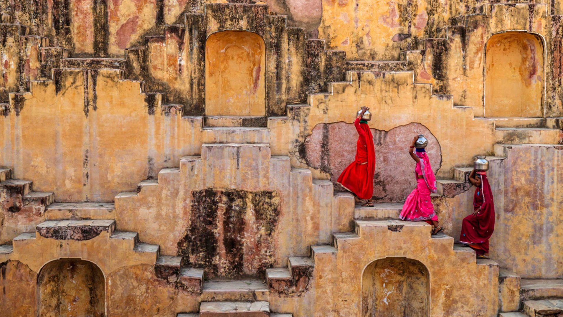
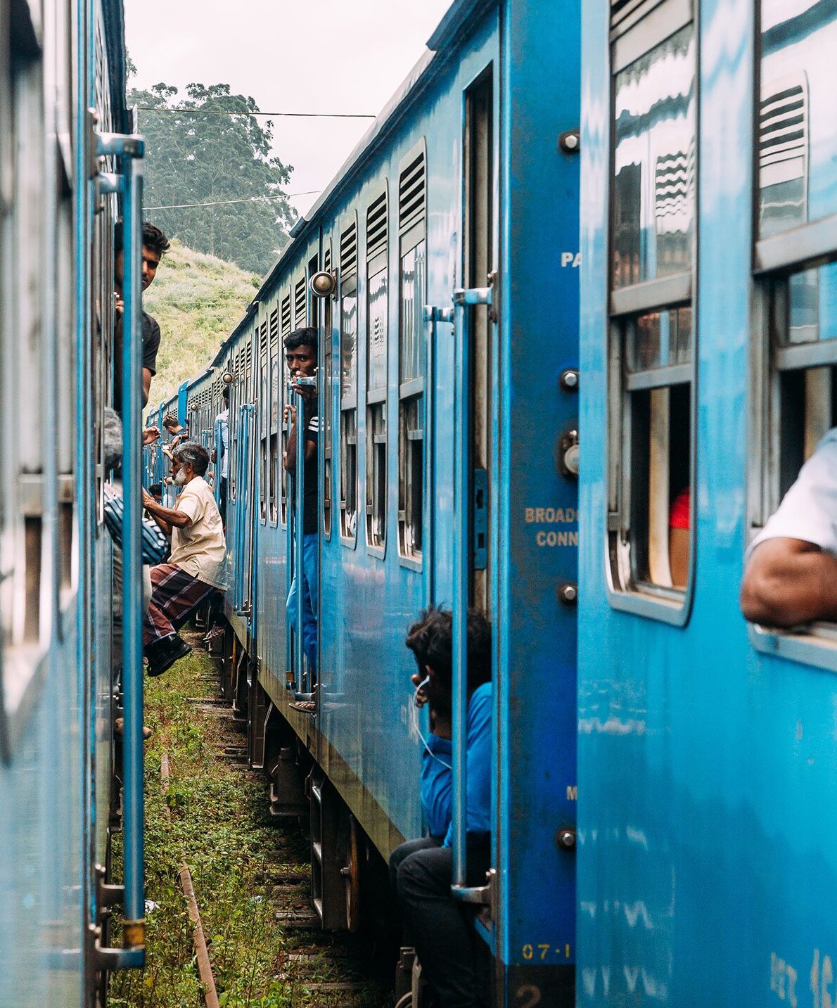
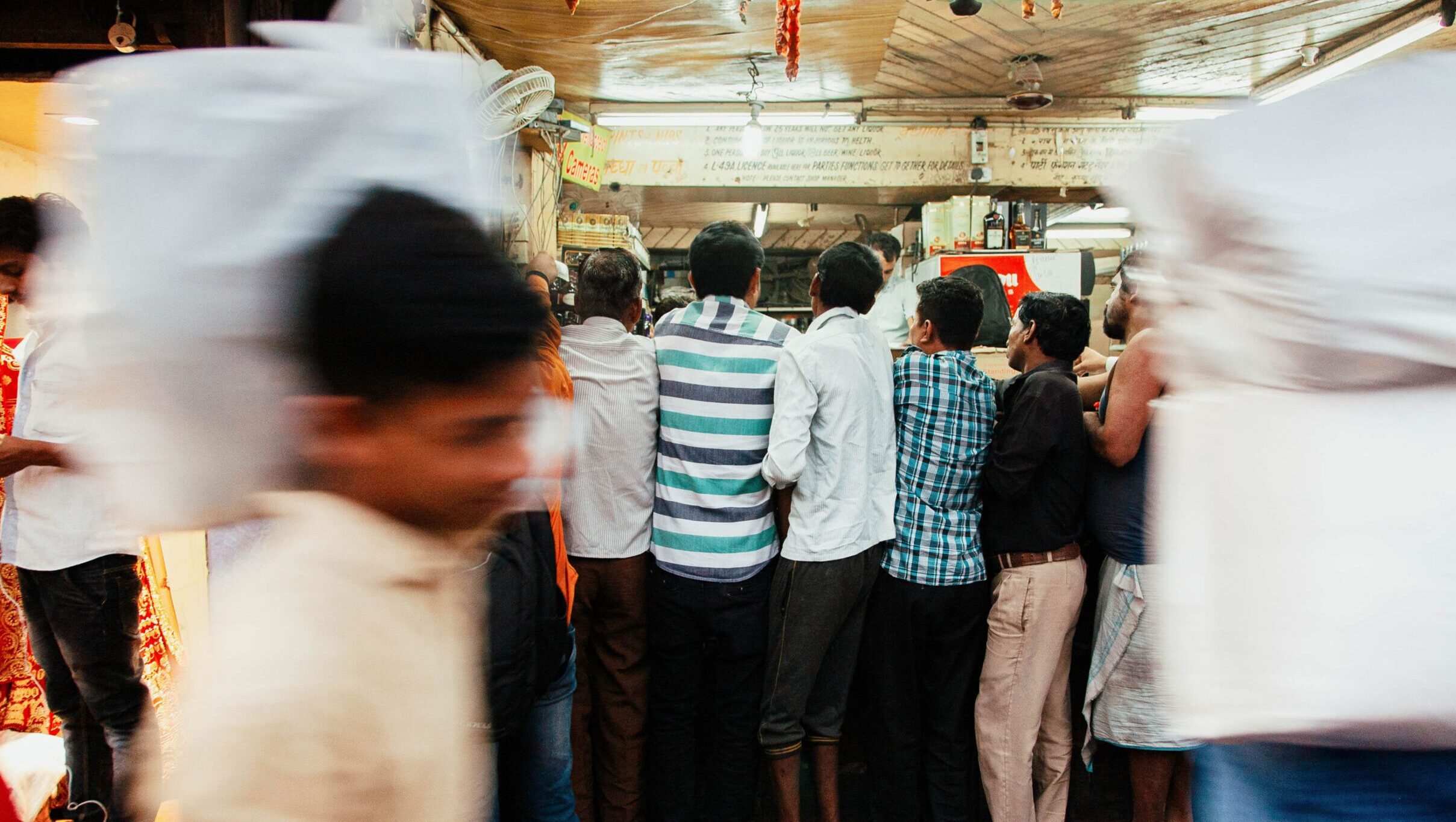
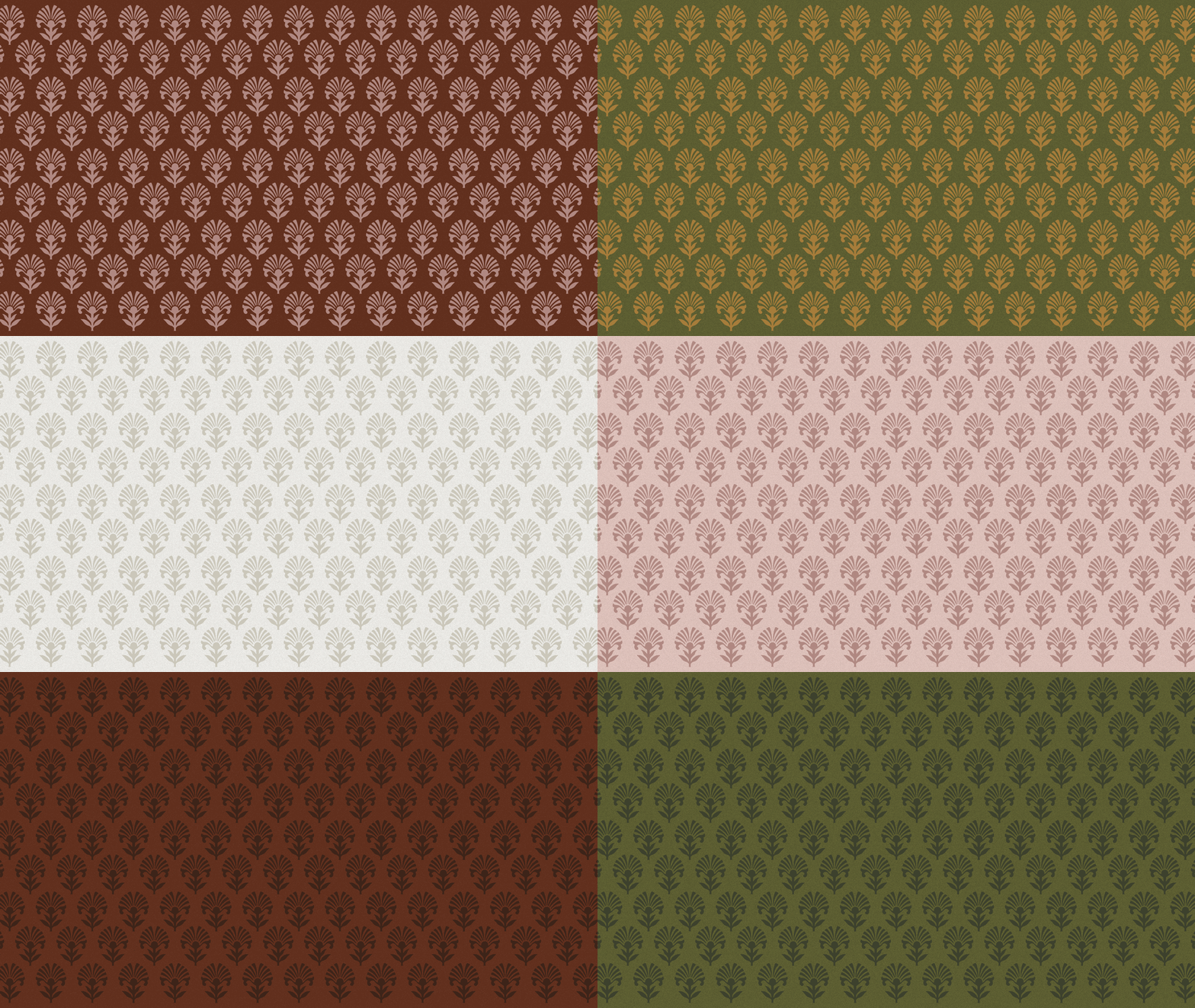
Inspired by traditional motifs, we created a bespoke brand pattern for printing on merchandise such as travel journals and neckerchiefs.
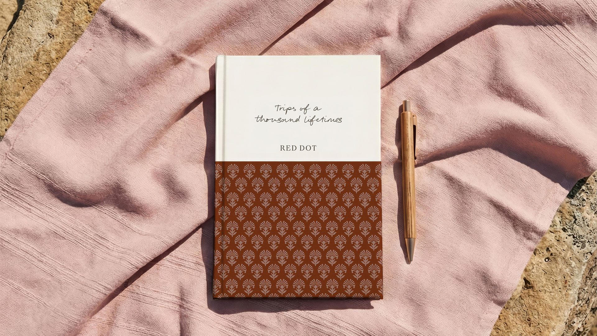

Today’s travellers are trading sightseeing checklists for meaningful experiences that bring them closer to local communities and culture. Drawing inspiration from our own travel journals, we created a voice with a pulse that lets Red Dot’s on-the-ground knowledge shine through.
Illustration
We collaborated with Harry Grove to create a series of loose line sketches to capture details like a purple-faced leaf monkey and Kandyan drummer, adding another layer of personality to the brand storytelling.
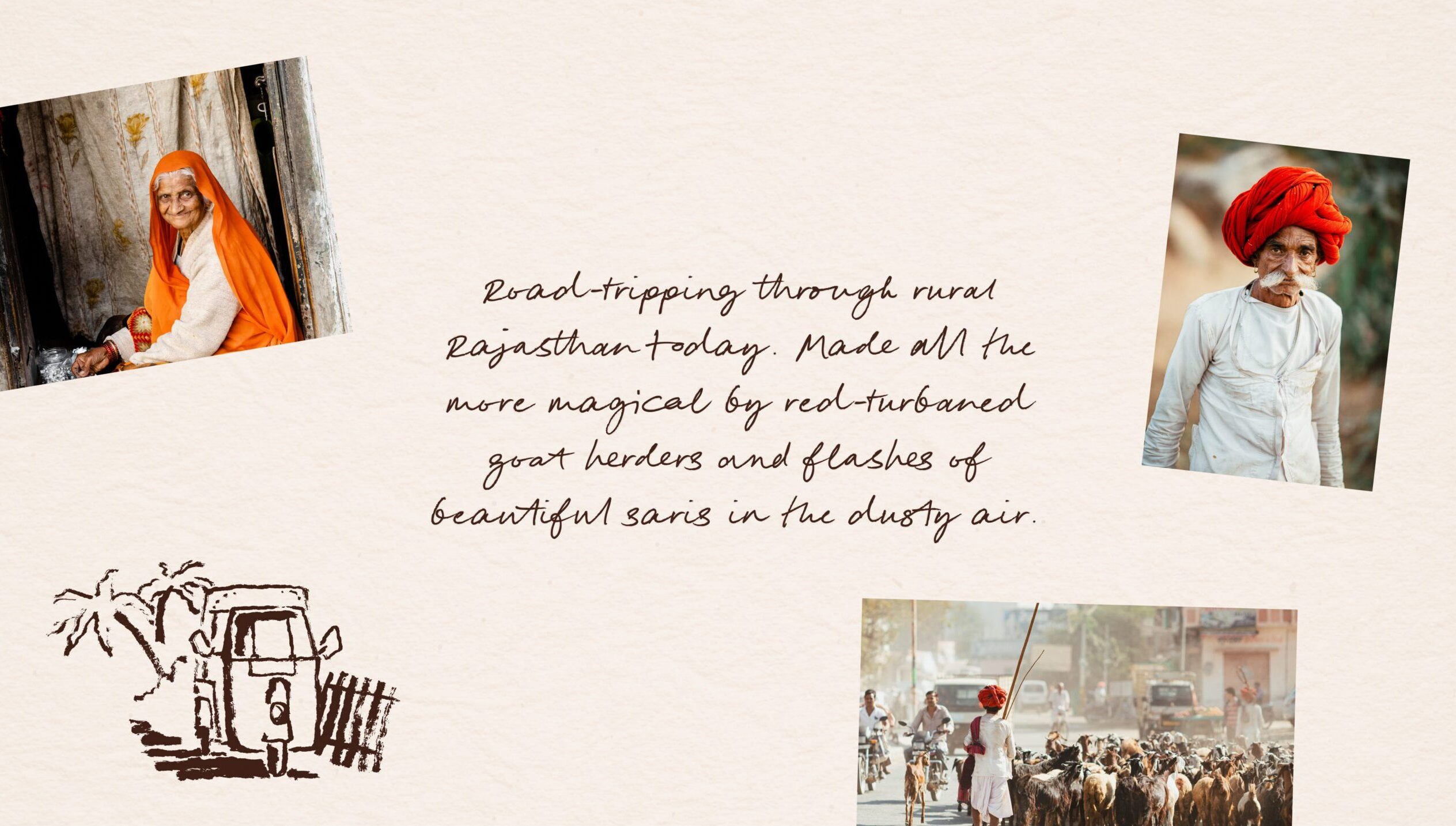


The result is a brand that now reflects the people, passion, and personal touches behind every Red Dot trip – from the peaks of the Himalayas to islands in the Indian Ocean.
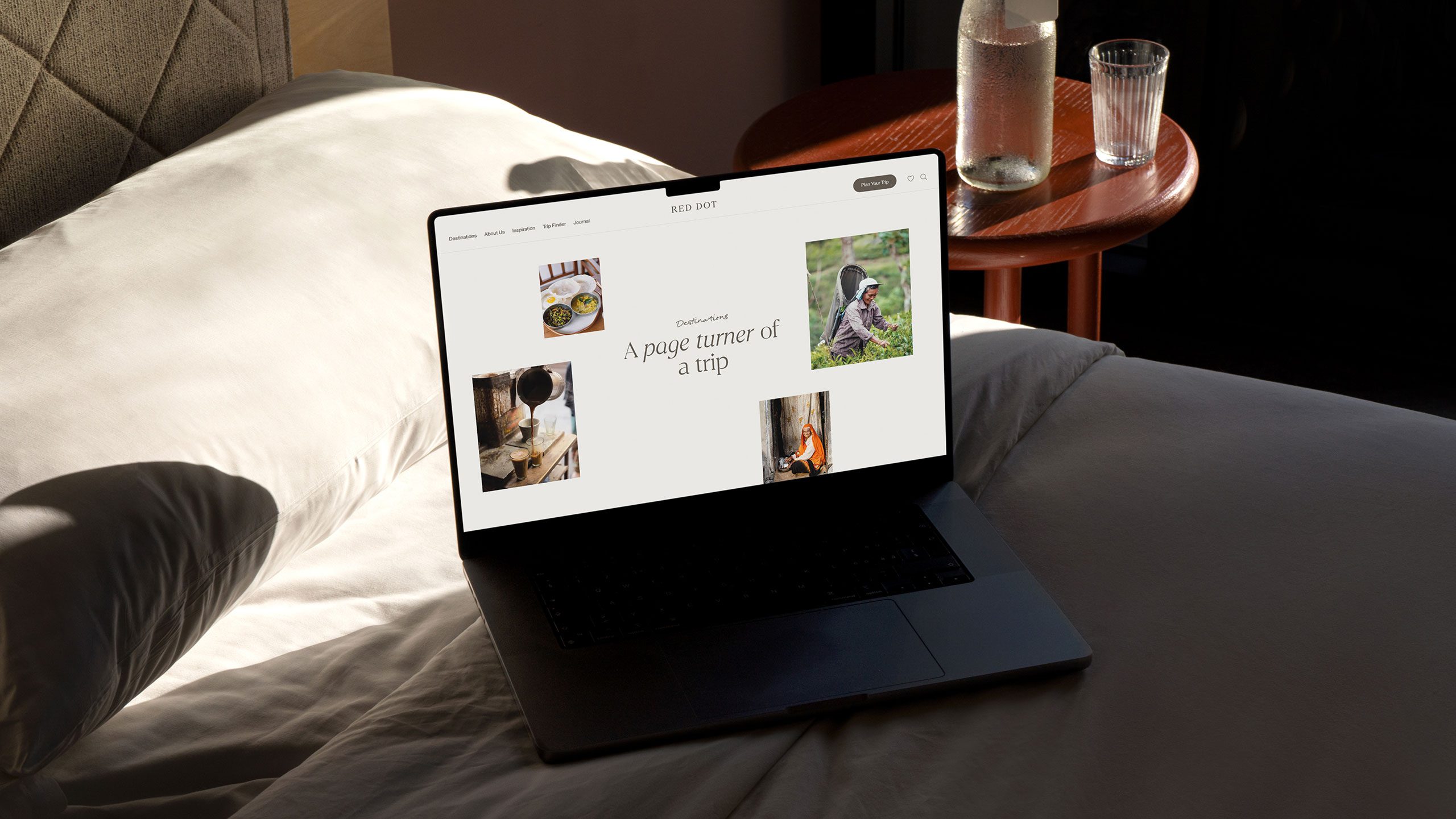
Digital
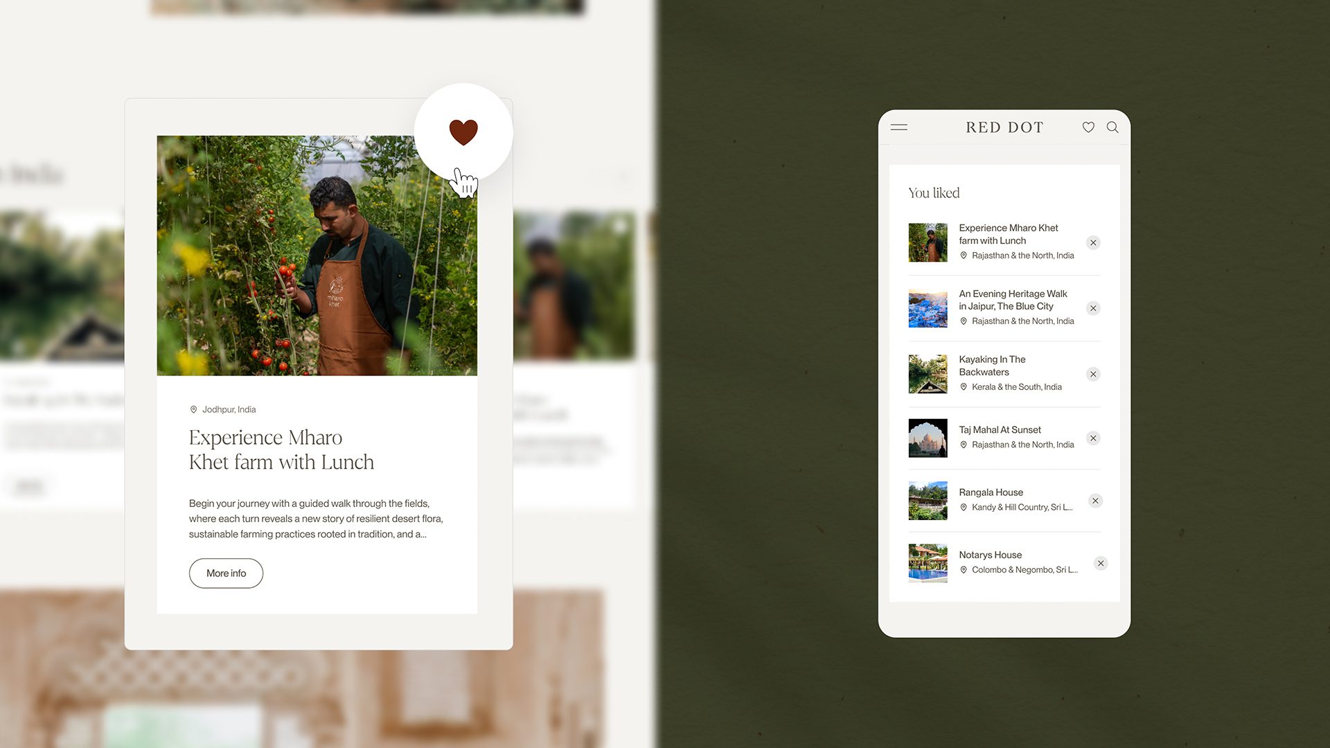
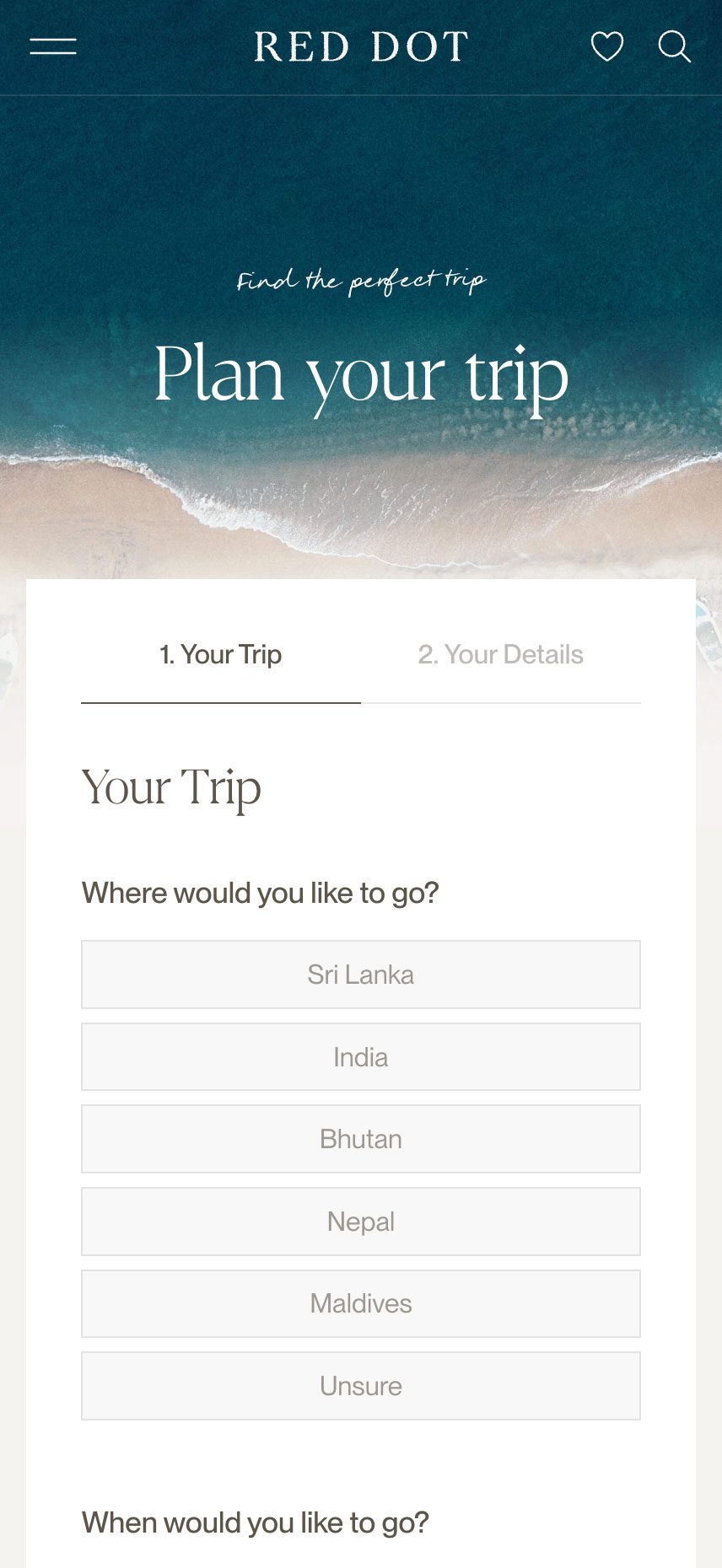
The new digital experience that matched the depth, quality and individuality of its travel offering. The existing website held strong SEO value, but with more than 750 pages it lacked a clear structure and intuitive user journey. Our challenge was to retain that search equity while transforming the platform into a more engaging, better organised and higher-performing experience.


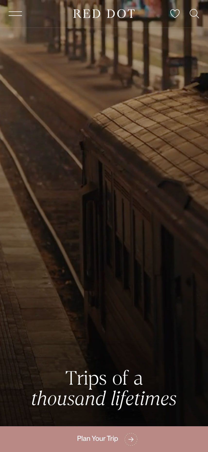
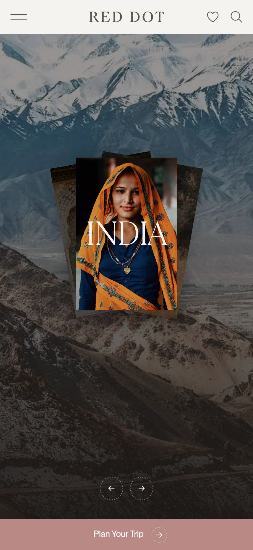
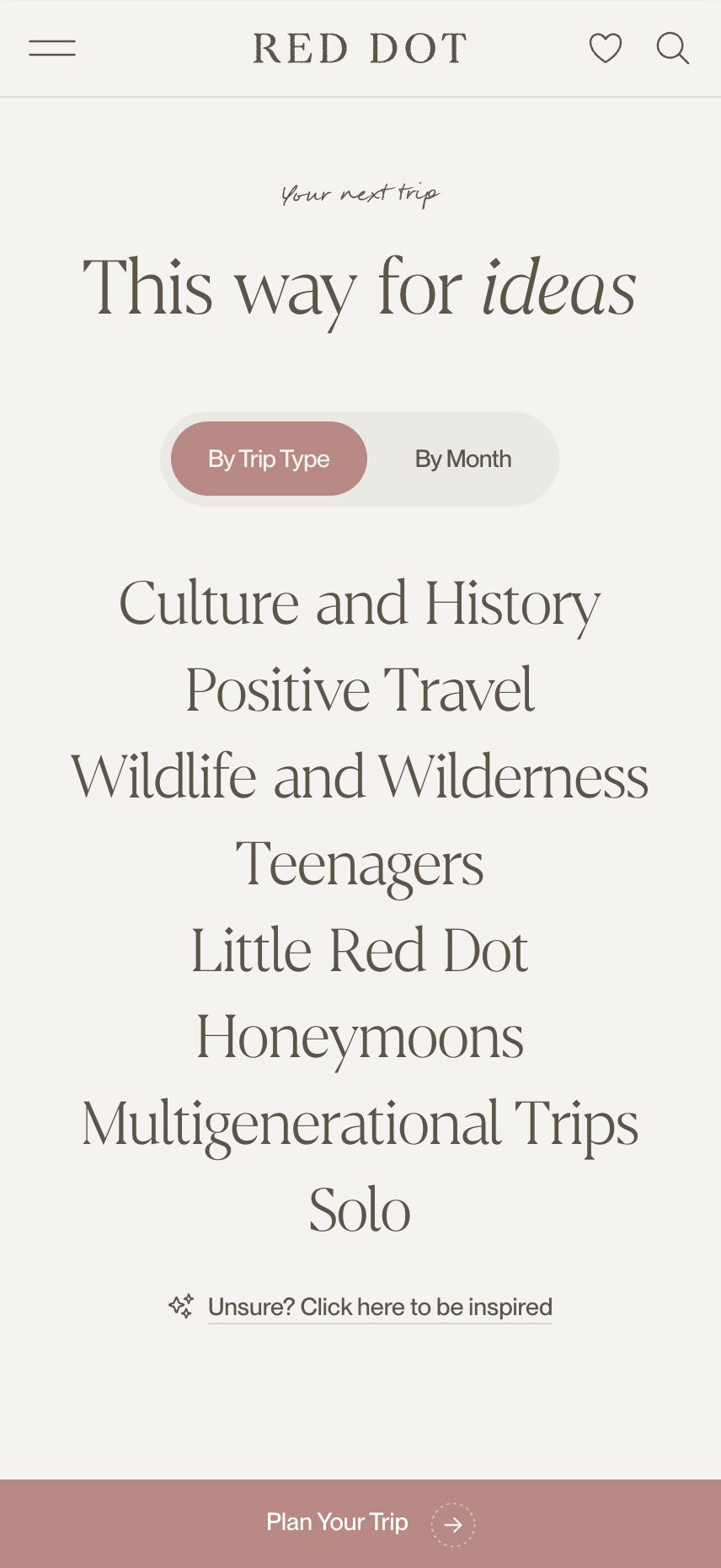
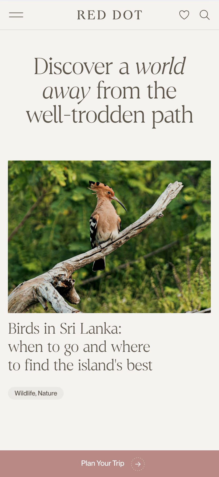
Our solution was to move away from the standard travel website model and instead build a platform centred on storytelling, discovery and immersion. We restructured the site architecture to make a large volume of content easier to navigate, while reshaping the journey around inspiration and intent. Rather than presenting countries simply as destinations, we positioned them as rich, layered experiences designed to spark curiosity and build trust
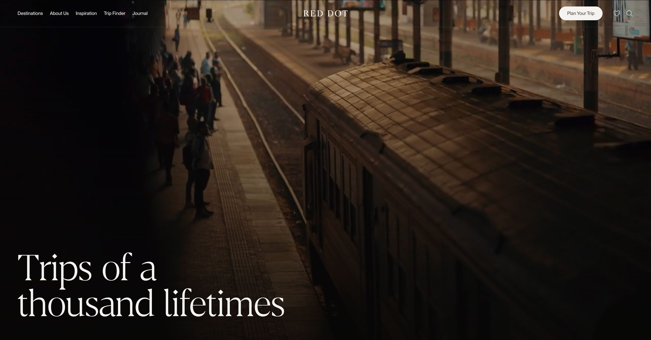
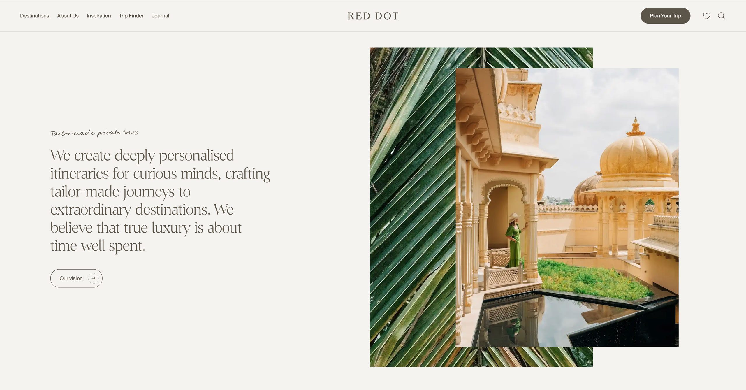
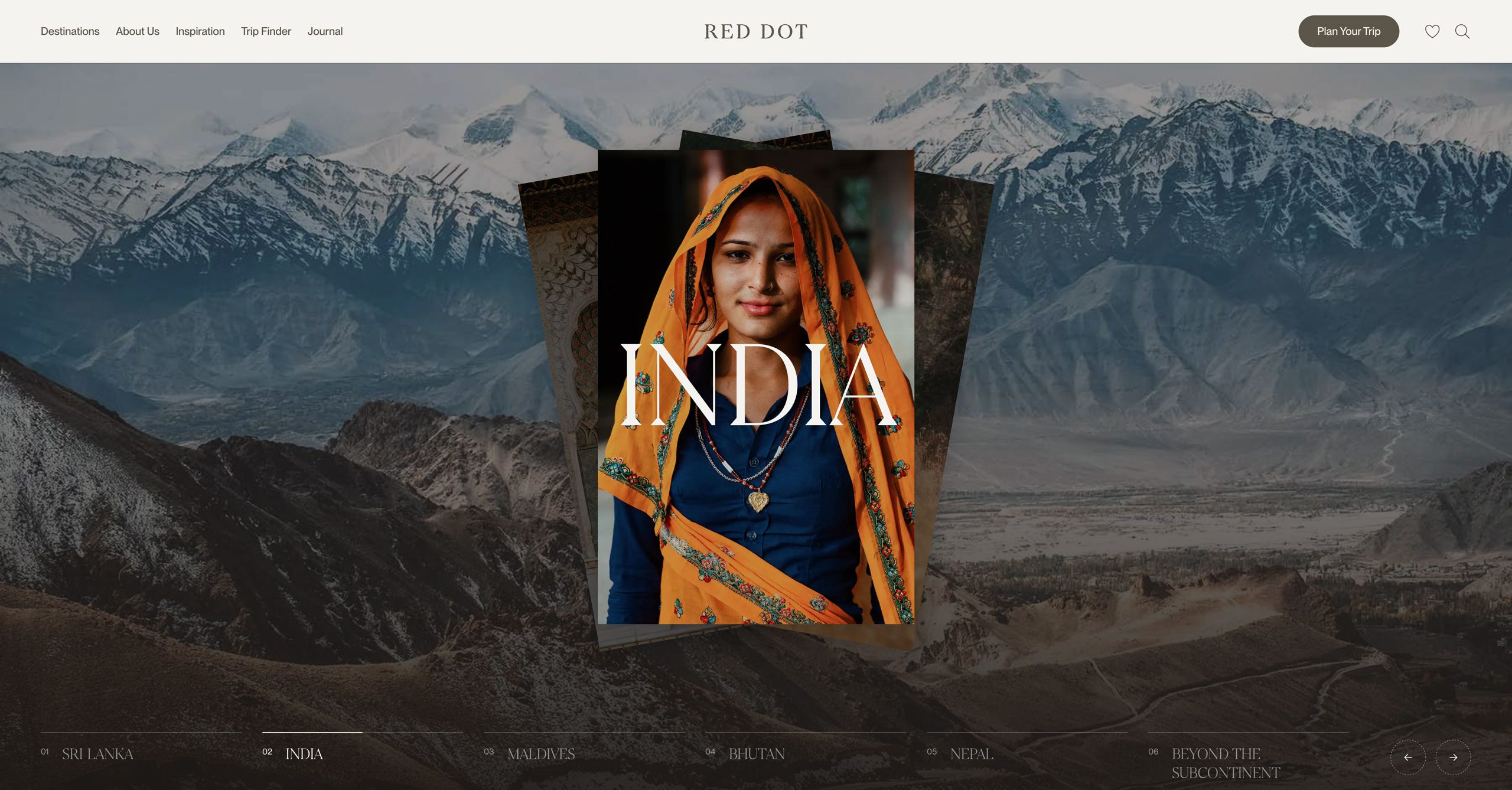
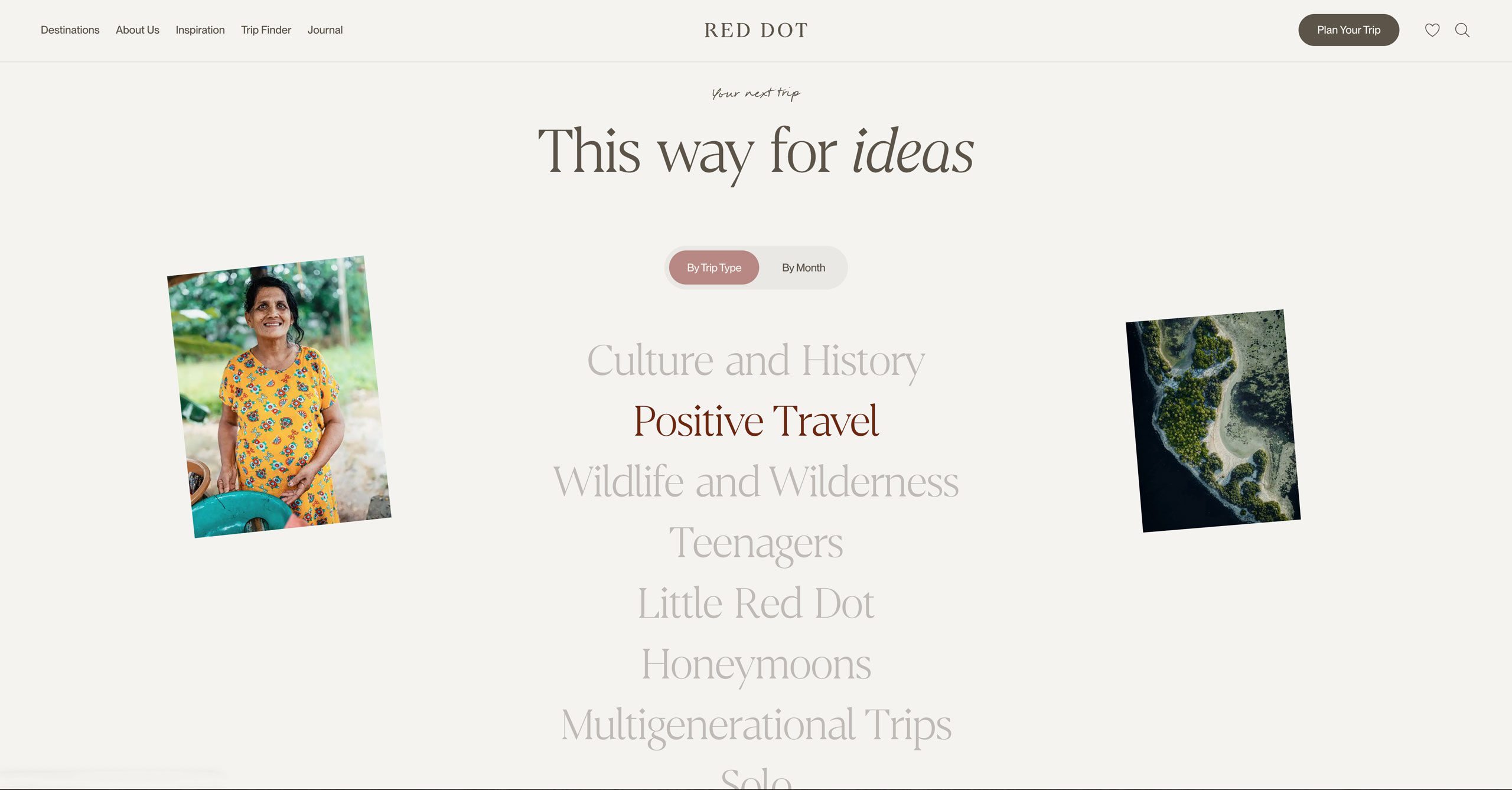
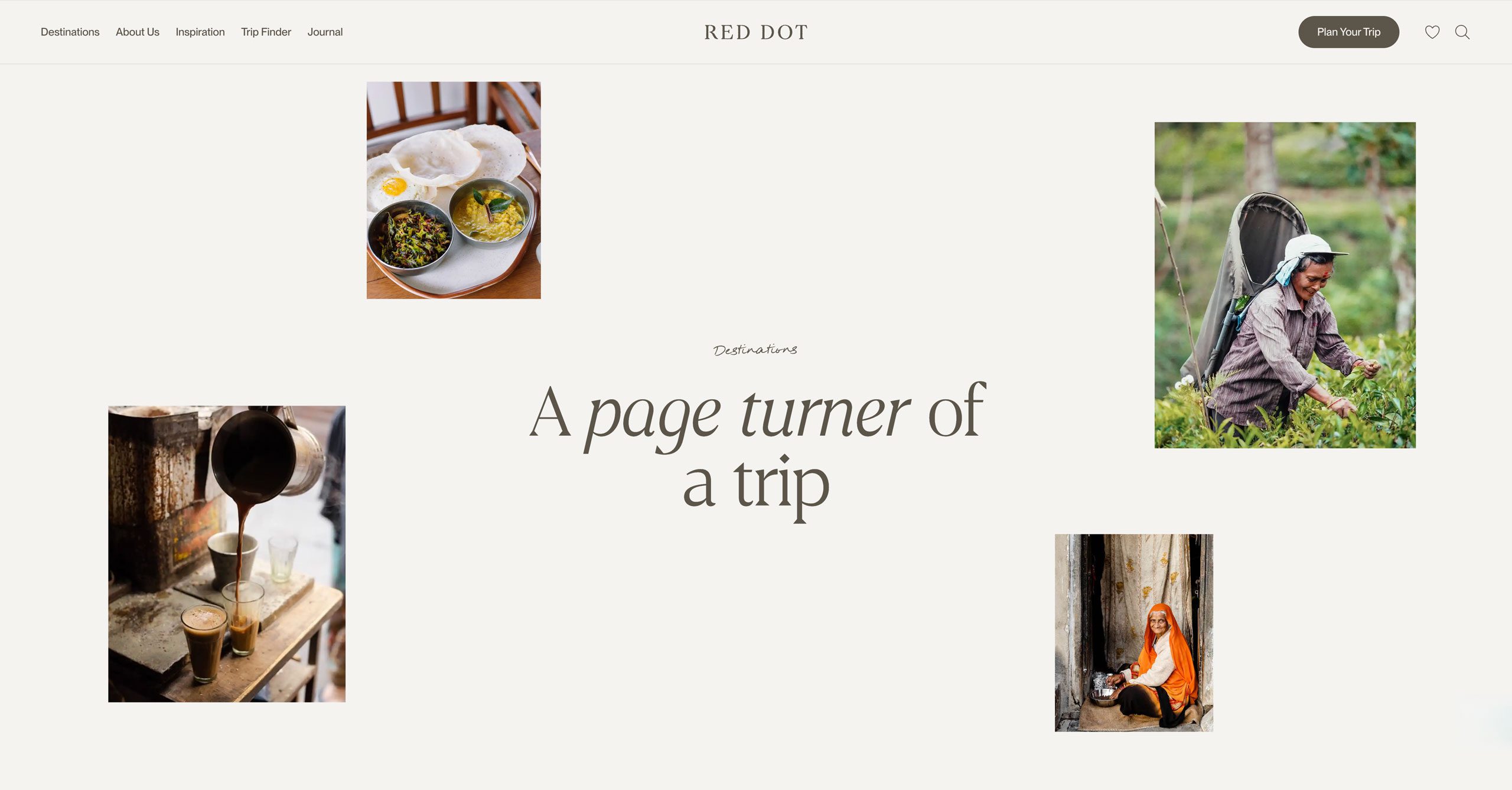
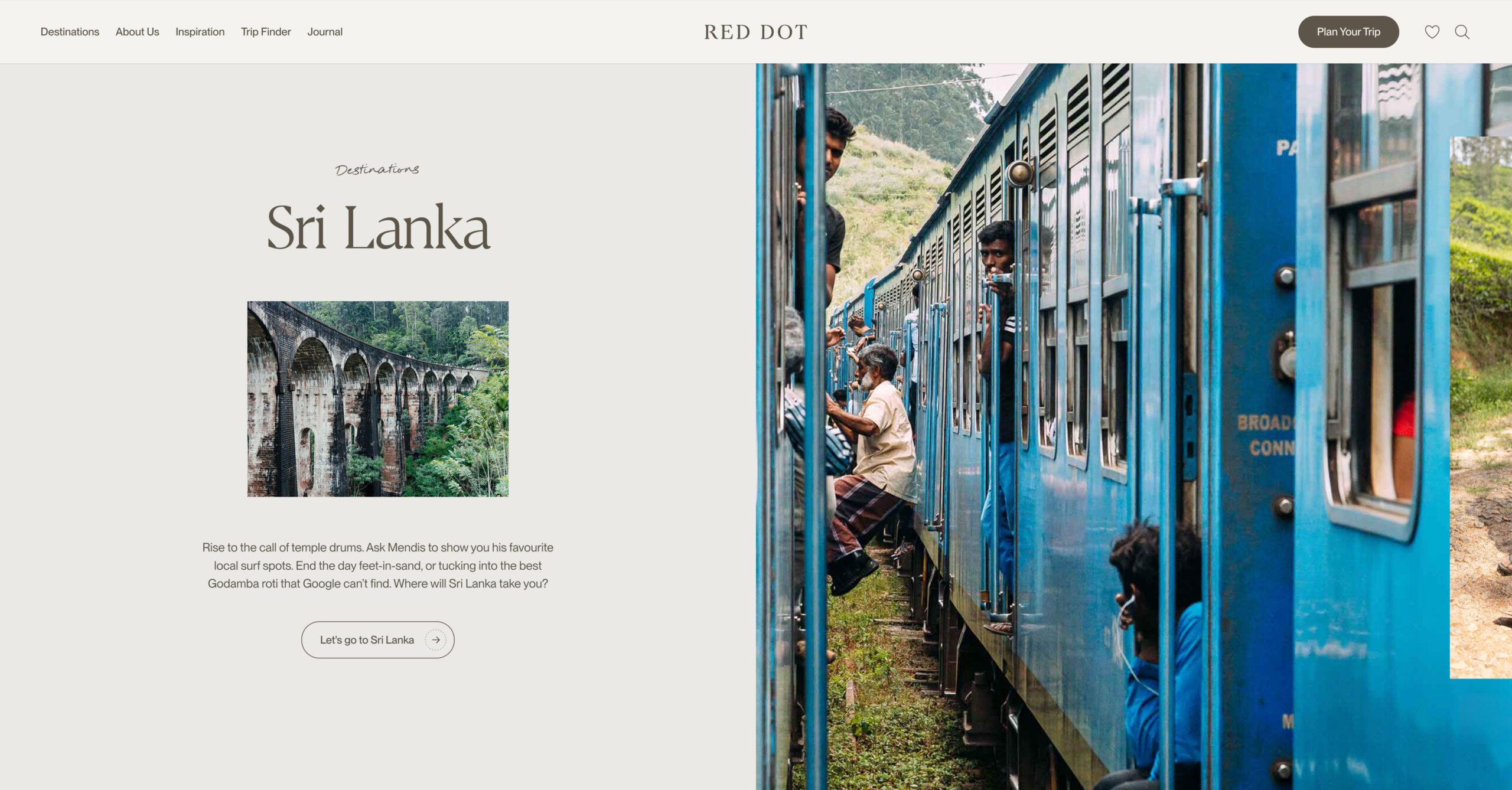
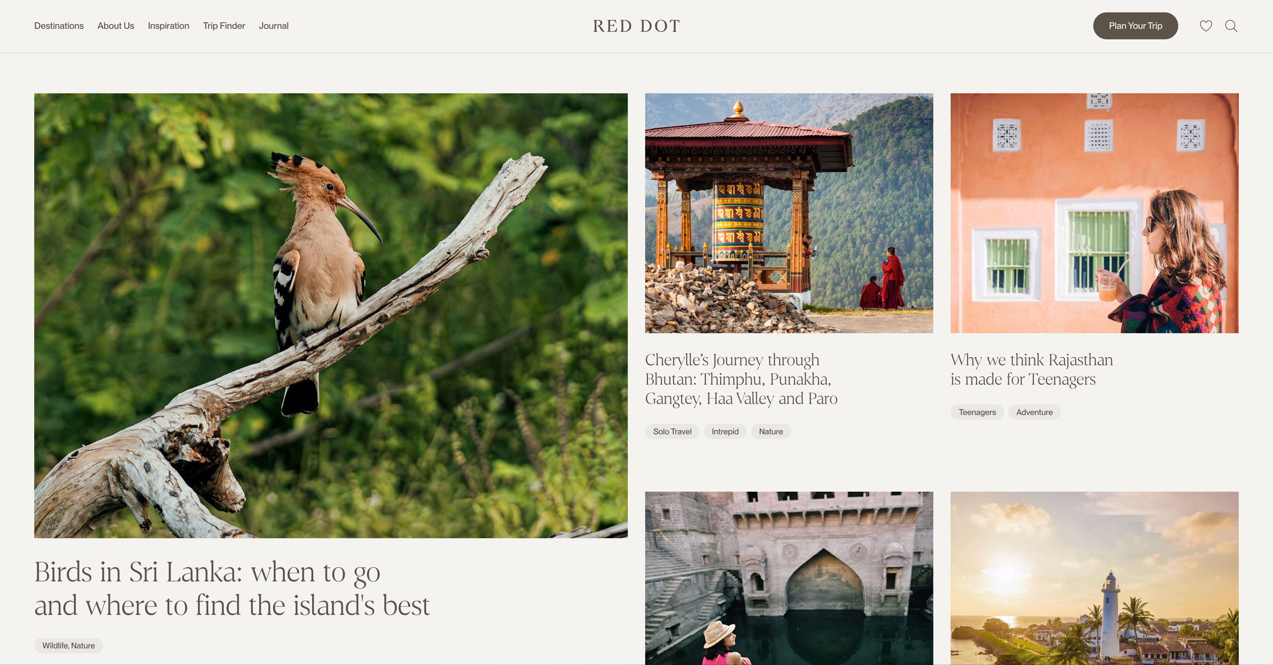
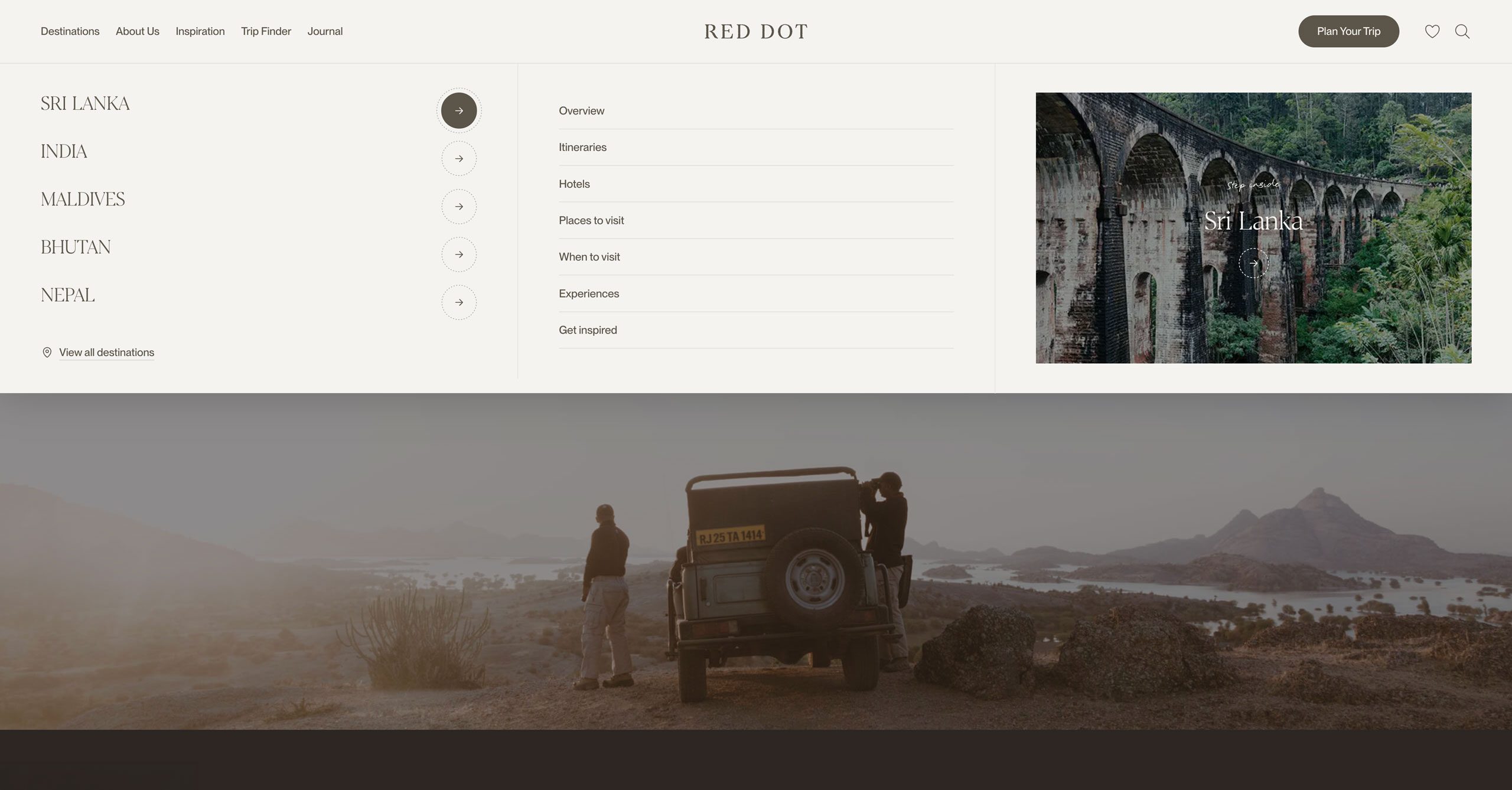
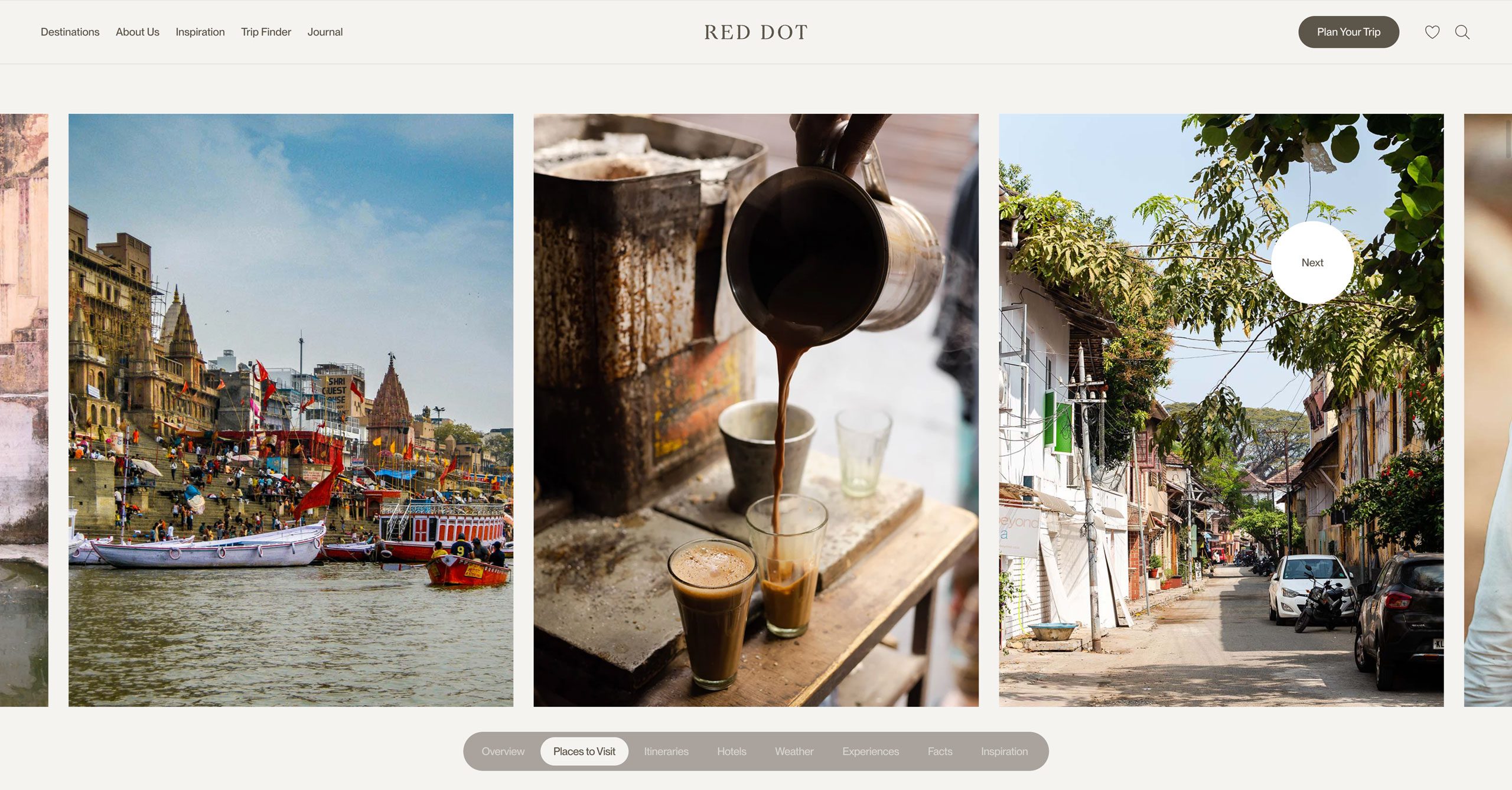
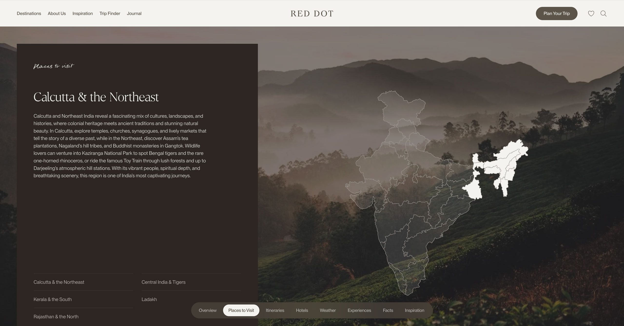
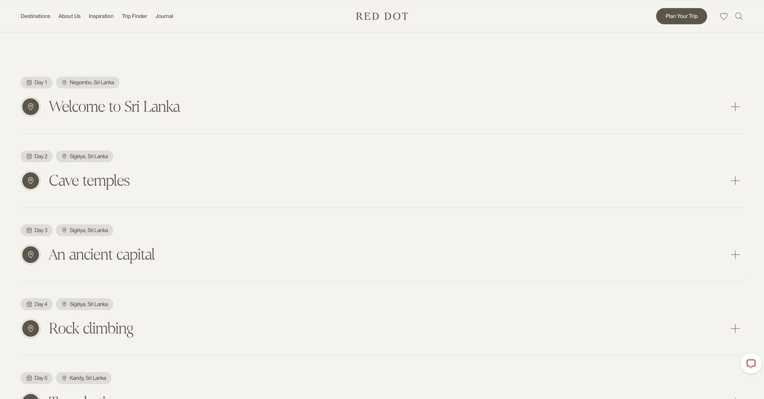
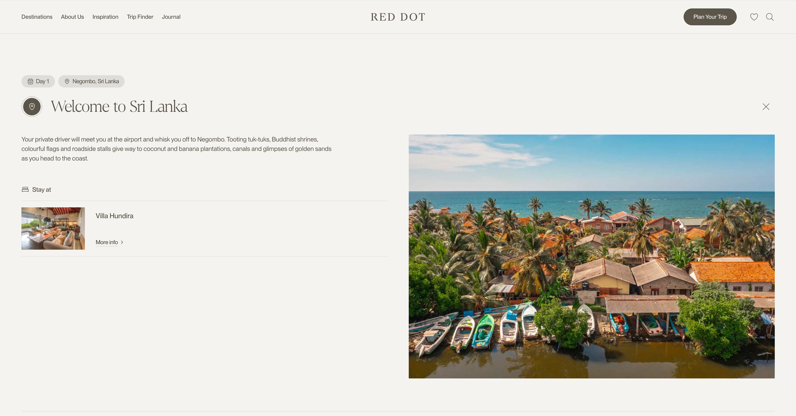
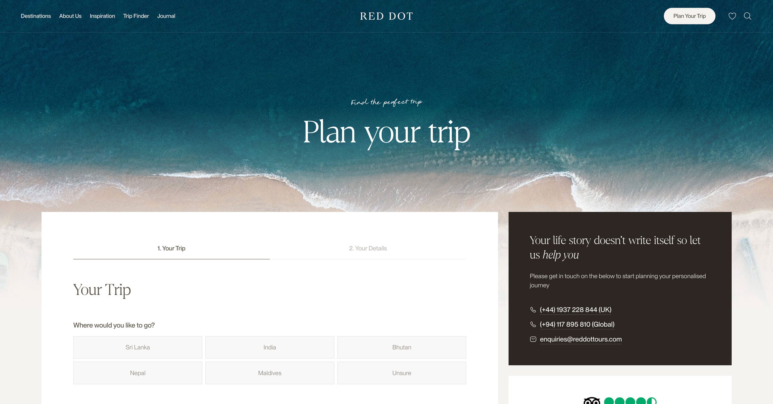
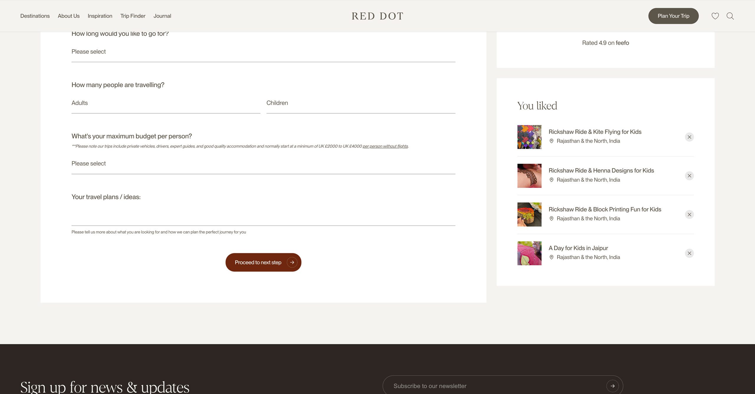
The visual approach drew on editorial design, creating a more elevated and immersive feel. Content was central to the experience, helping users answer key questions before making an enquiry. Information on seasonal weather, local festivals, transport, cultural insights, interactive maps and must-see highlights gave visitors the confidence to explore in depth and arrive better informed. This helped Red Dot’s travel experts spend less time answering basic queries and more time shaping highly personalised itineraries.
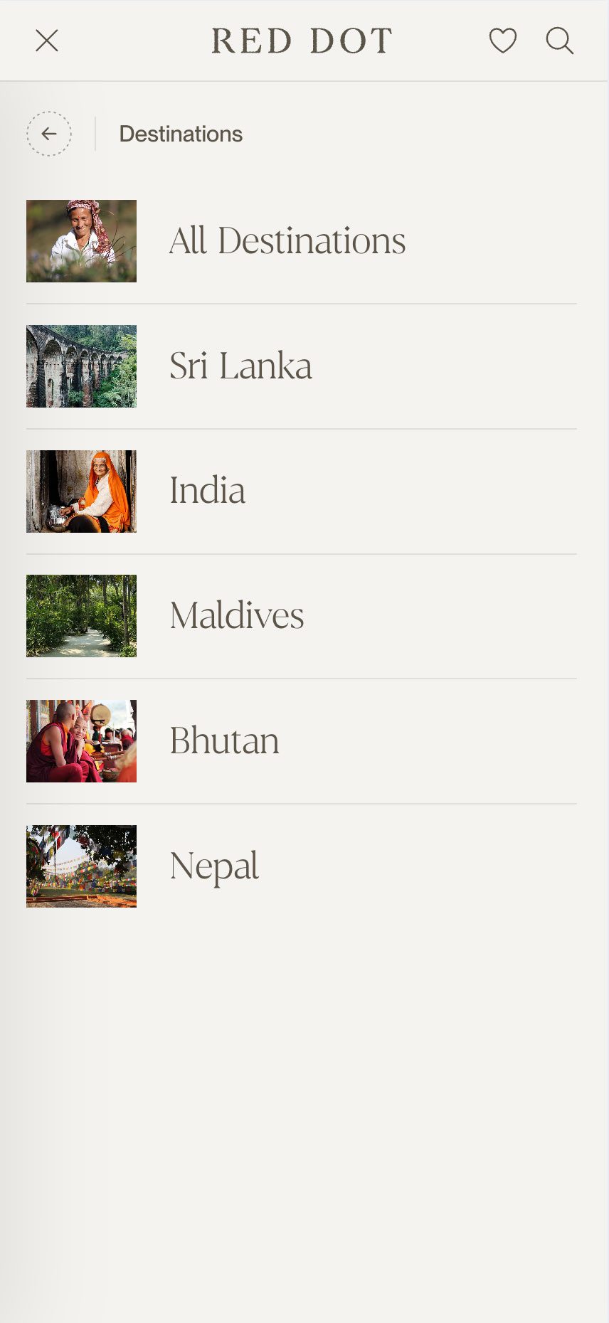
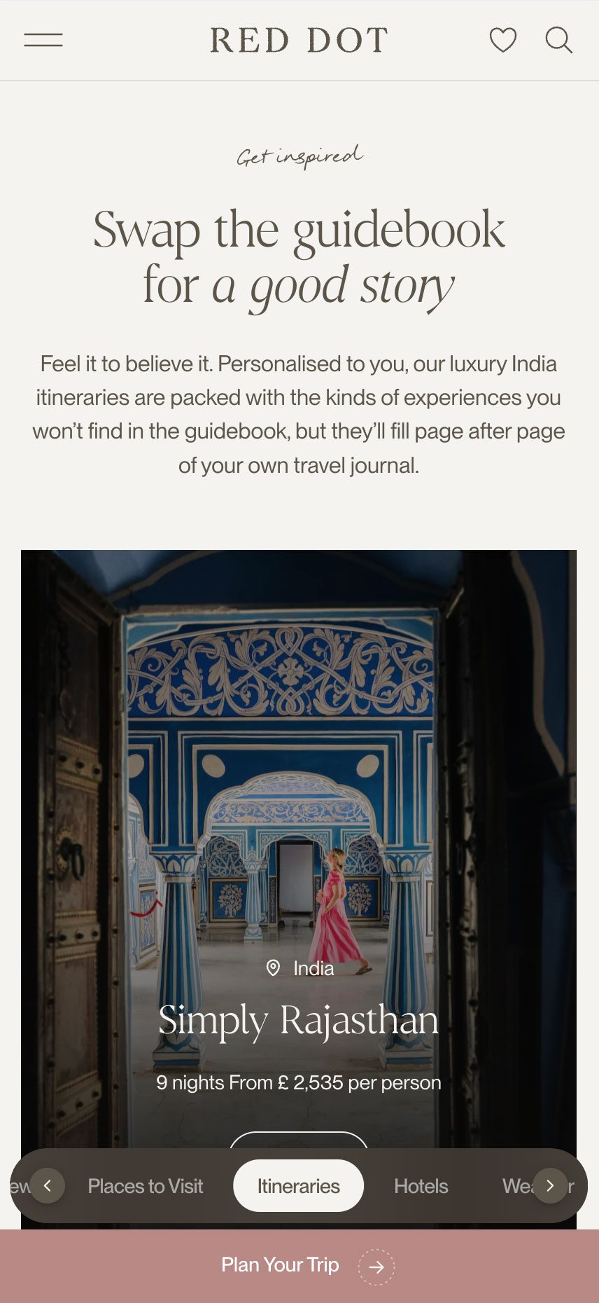
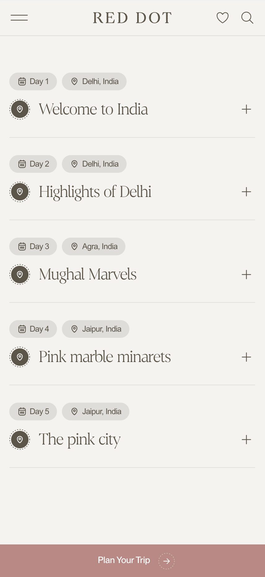
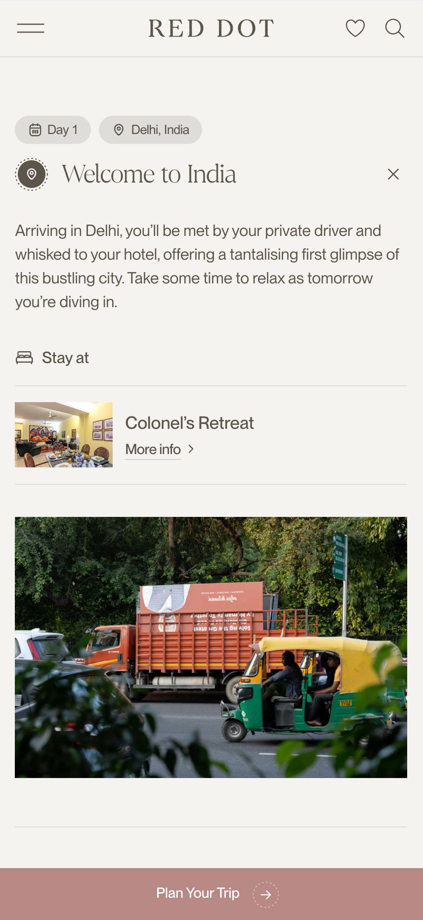
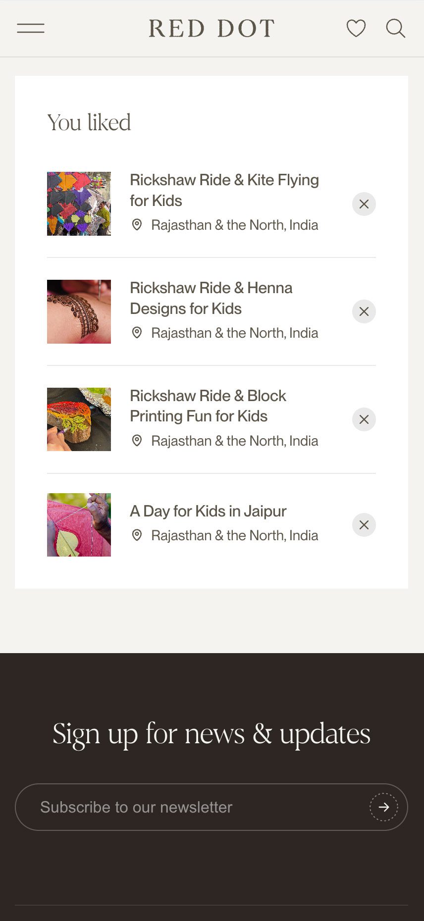
We also delivered an intuitive favourites feature, allowing users to save hotels and experiences as they browse and attach them to their enquiry, giving the Red Dot team a valuable starting point for trip planning.