Atholl Estates
Unearthing the historic tale of the 'Wild Man of Atholl'

Challenge
Atholl Estates is one of Scotland’s most widely renowned Highland destinations. Enriched with history, the estate dates back to the 13th century but has evolved and modernised consistently as an organisation throughout the years with a wide range of offerings including tours, activities, accommodation, weddings and events.
We were approached alongside fellow design studio, Union Creative to help reimagine the existing Atholl Estates brand and reposition them within the competitive travel and tourism market. Atholl Estates wanted to capitalise on the recent surge in popularity of Scottish ‘staycations’, seeking to showcase their various offerings via a cohesive visual identity for use across all aspects of the business and the creation of a new website to promote the Estate’s variety of offerings more succinctly and in a way that could convert users from browsing to booking with ease.
Approach
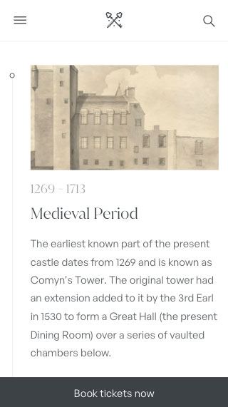
Central to our approach was the need to maintain a visual sense of the rich history that imbues the estate. In order to achieve this, we spent a lot of time in the early stages immersing ourselves in research – speaking with Atholl’s in-house historian and exploring the castle and estate grounds ourselves.


Brand
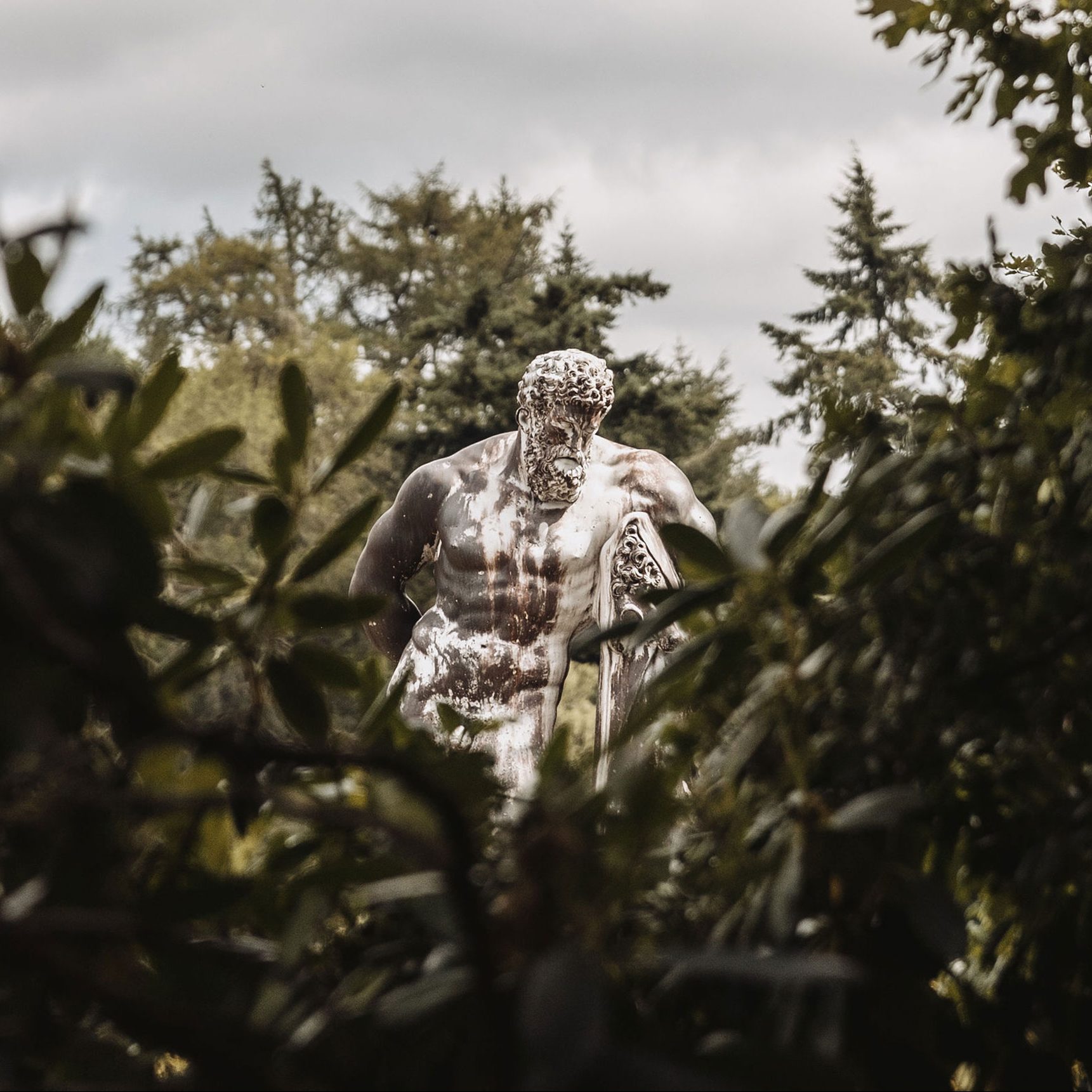
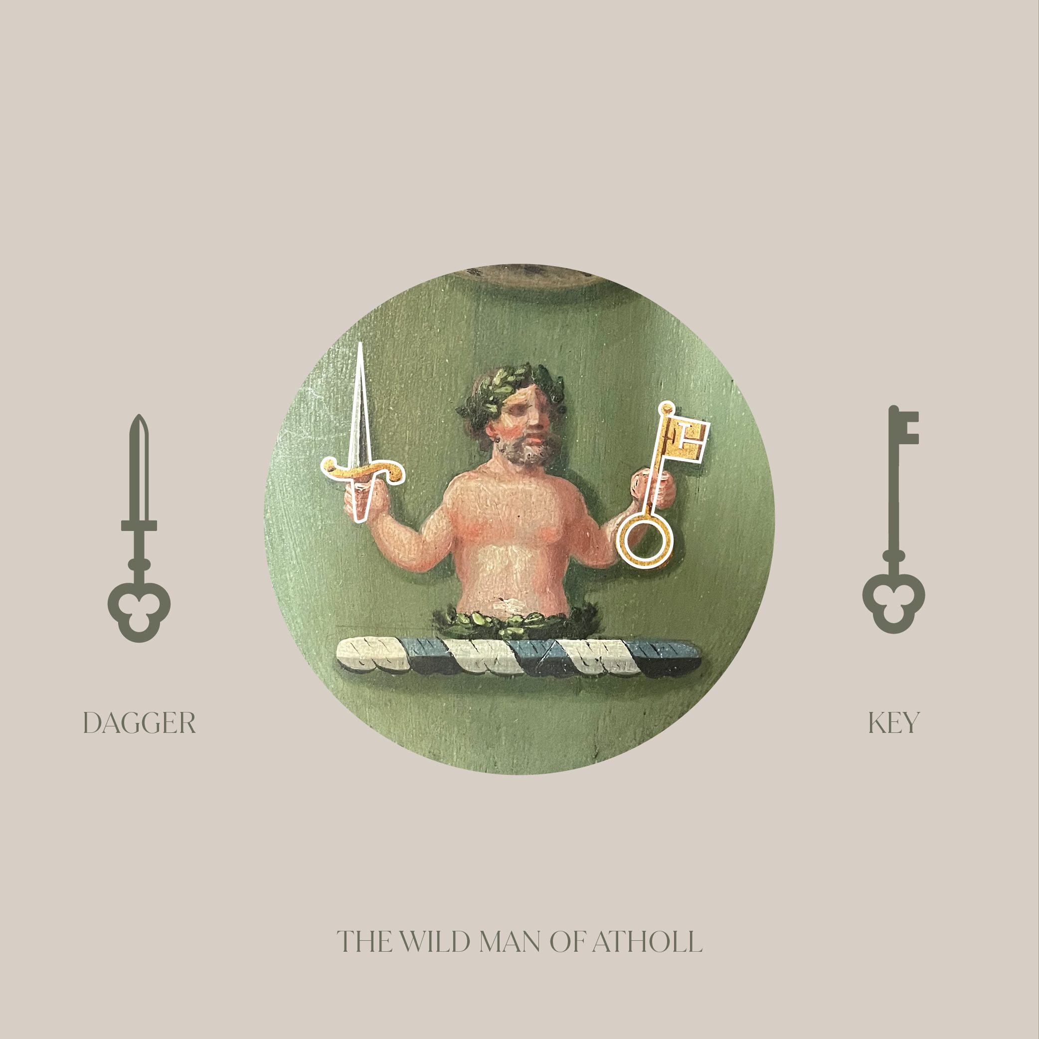
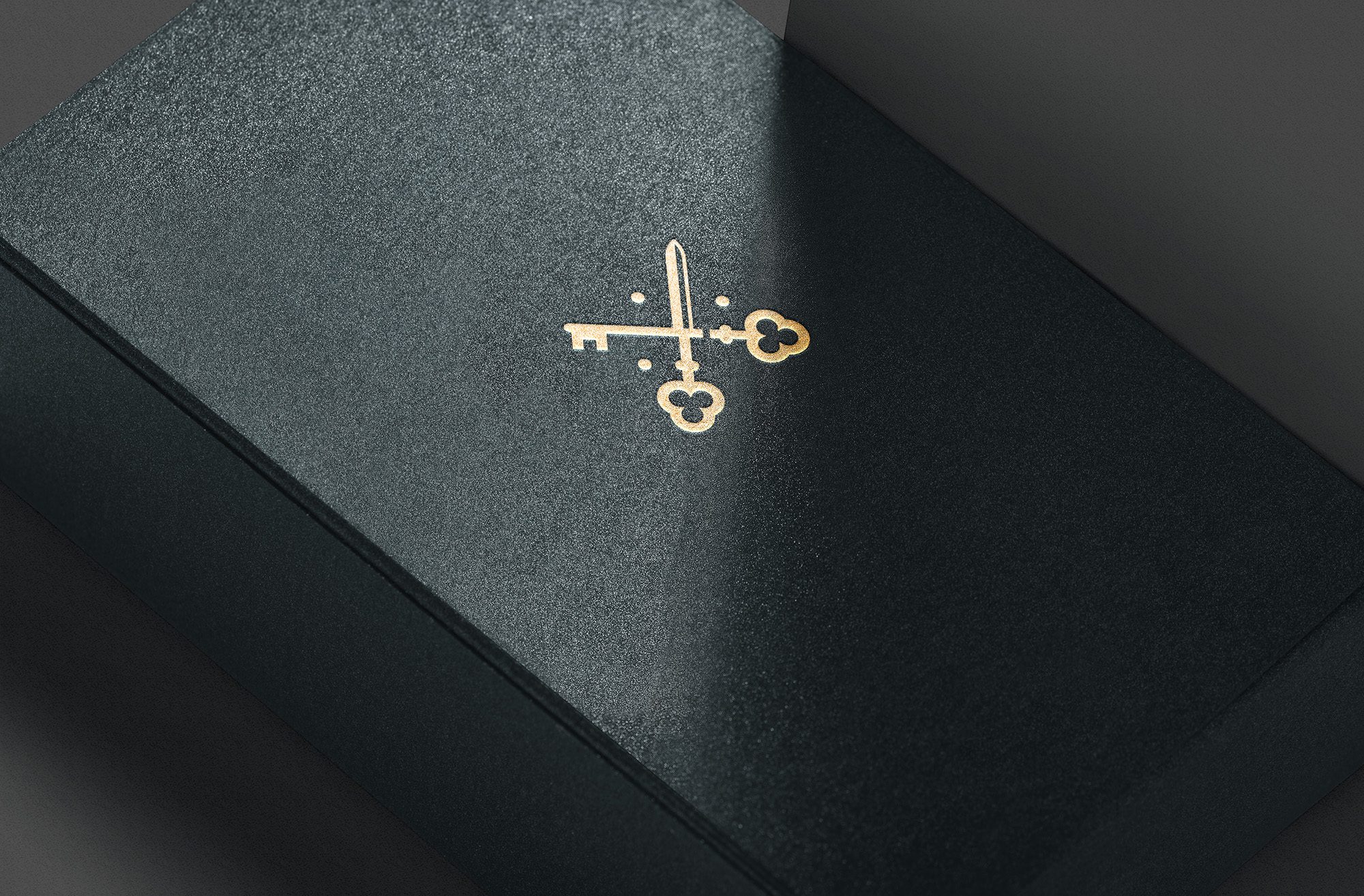
We were struck by the ‘Wild Man of Atholl’ who was visually depicted throughout the castle and estate on the Atholl crest. The crest depicts the wild man – a ‘demi-savage wreathed in oak’ – holding in his right hand ‘a dagger pommelled and hilted’, and in his left hand a key.
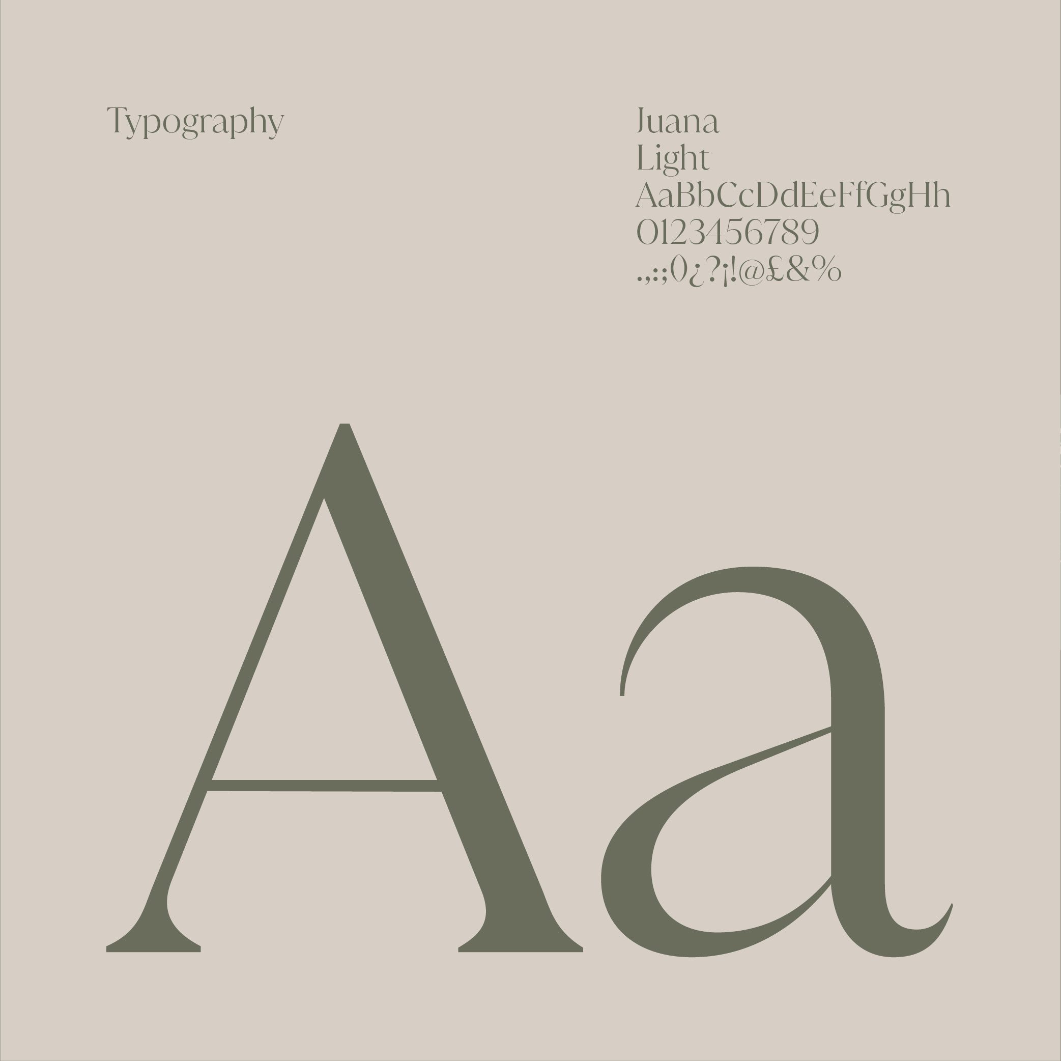
In heraldry, the dagger represents justice and valour; the key, representing the future. We derived our marque from this symbolism to channel the historical meaning and coupled it with a structured modern serif typeface ‘Juana’: a pairing that would reflect the blend of tradition and modernity that the estate prides itself on.

The marque functioned broadly as a unifying element to house a number of sub-brands for marketing purposes, from the Castle itself to the restaurant and the Estate rangers. A new flexible colour palette was created inspired by colours found on the estate itself, which combined with a strong type-based approach across print & digital applications to deliver a contemporary feel that we felt would appeal to a broad range of potential visitors.
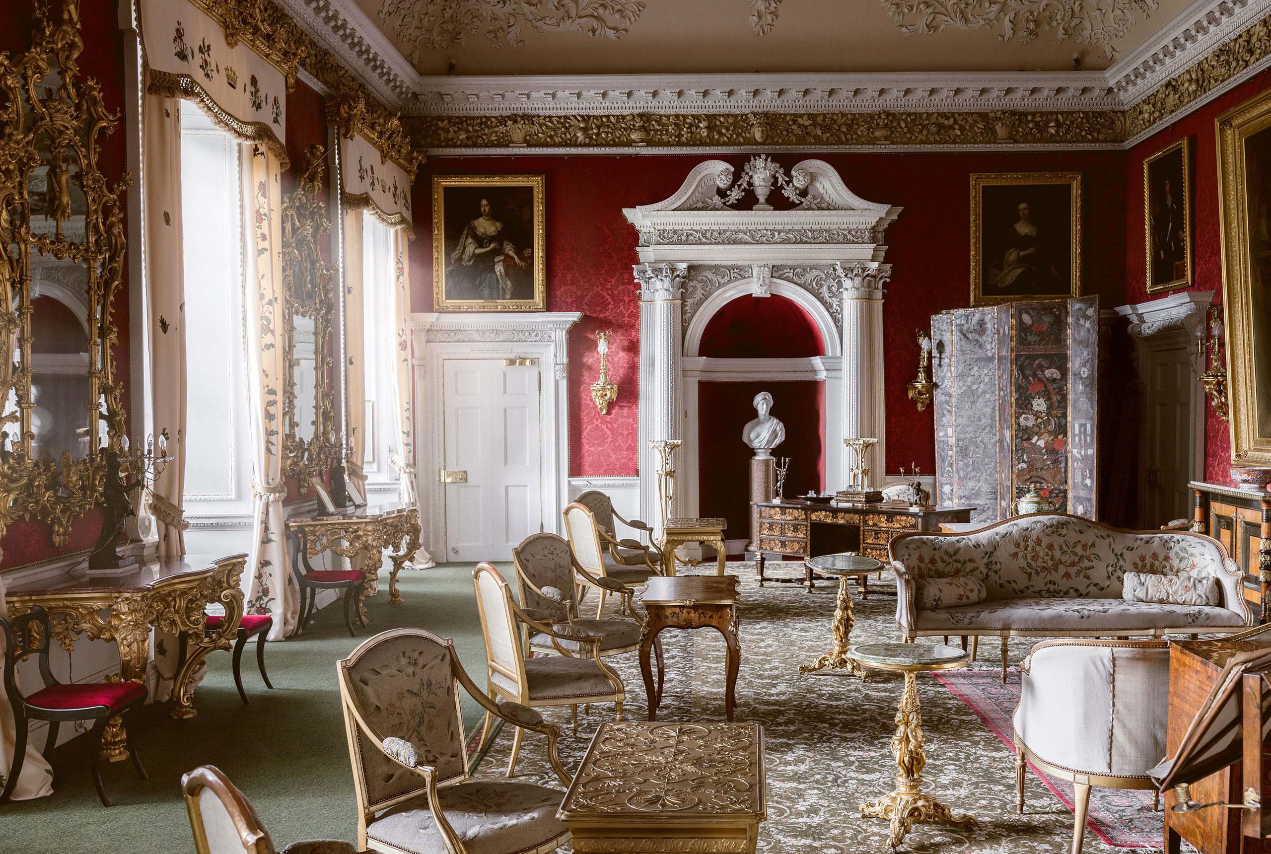
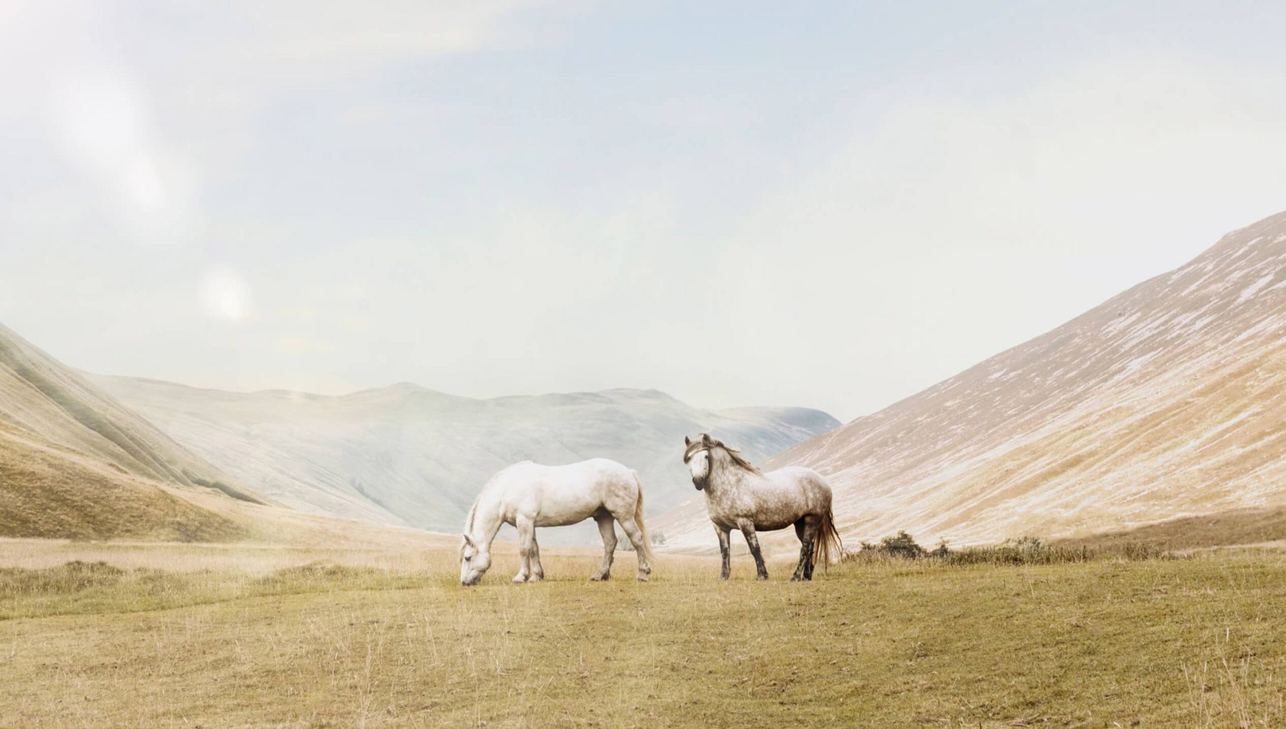
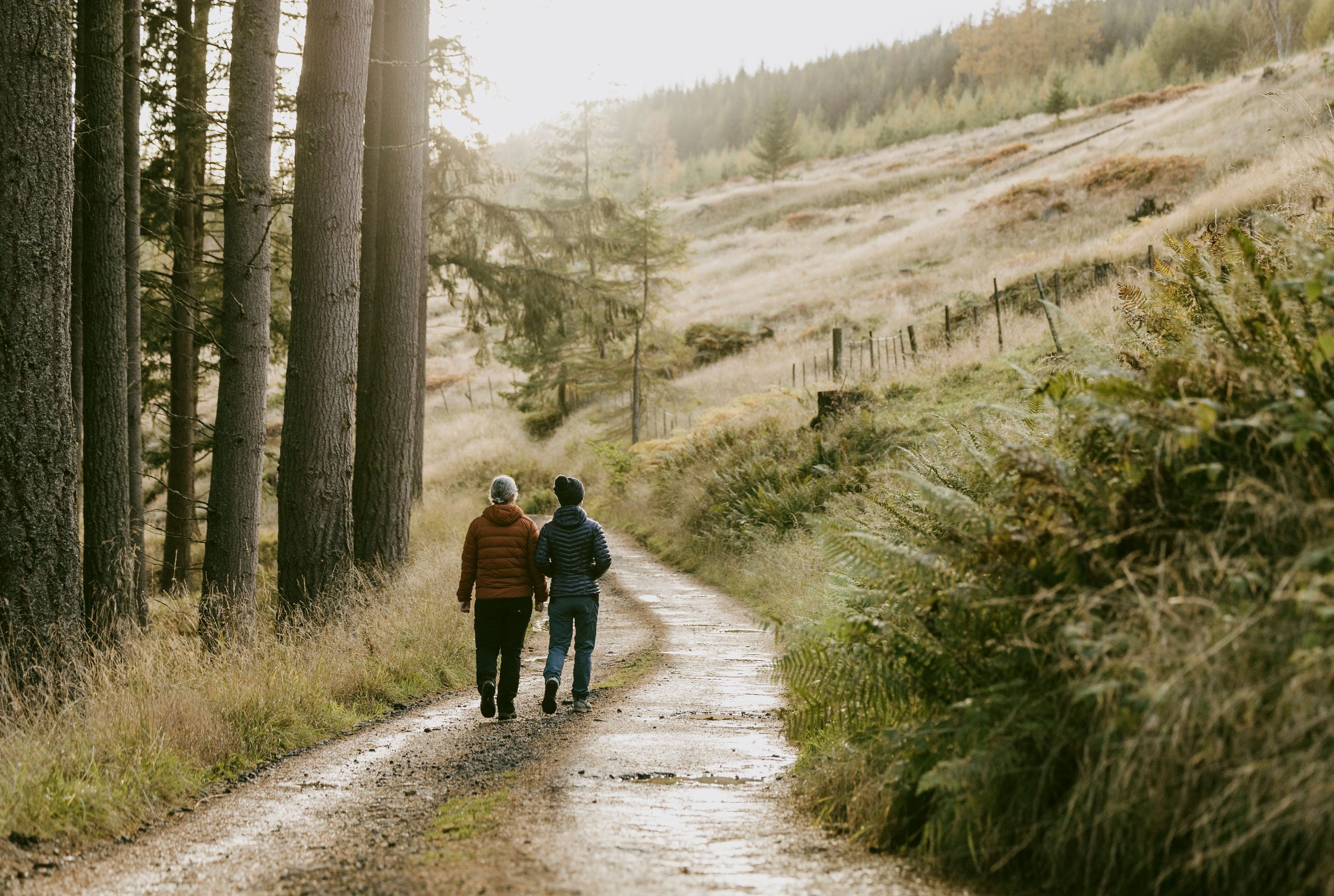
Photography
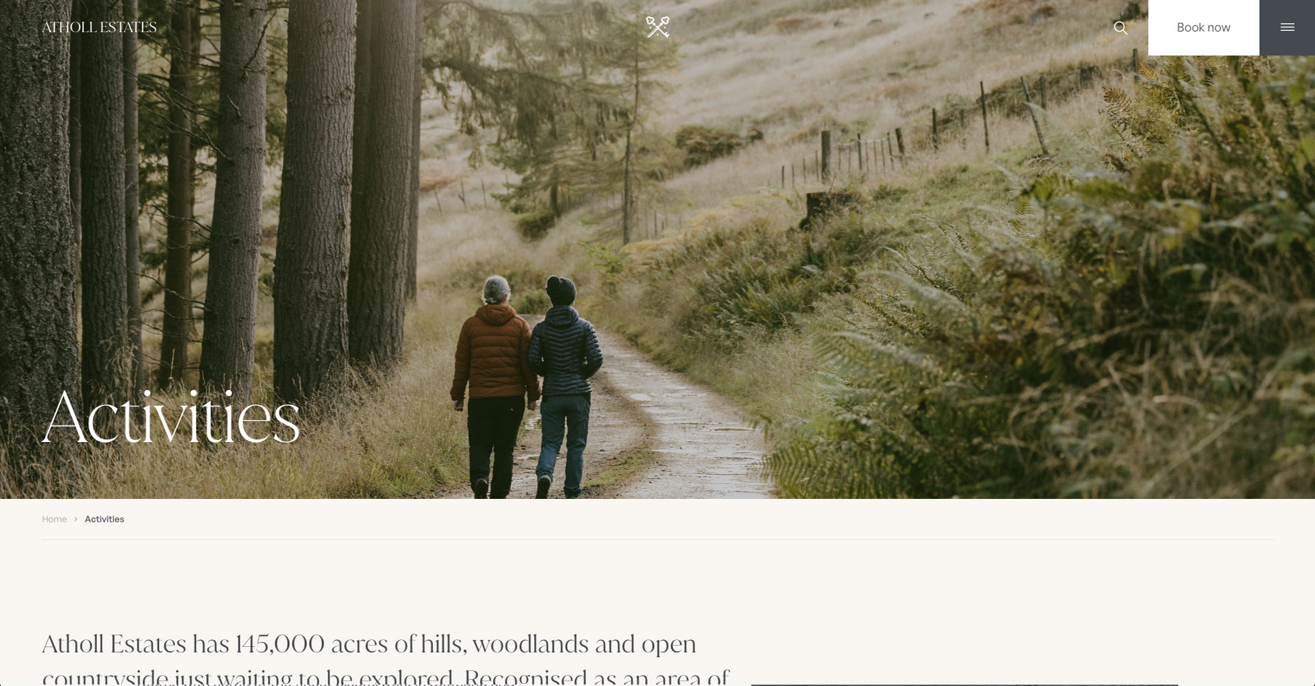
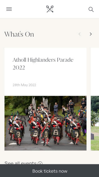
In aiming to build a website that would let the beauty of the castle and its surroundings do the talking, we quickly established that high quality photography would be a crucial element that needed to take centre stage. Working closely with local photographer Alexander Baxter, we commissioned a series of shoots to take place across the grounds.

Digital
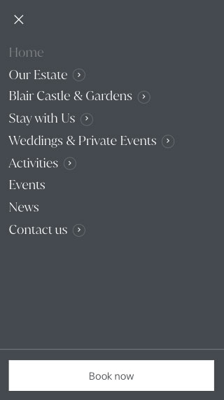
Alongside the creation of the brand, we were tasked with the creation of a new website. The existing website, which was home to over 400 pages had become clunky and confusing over time. Our job was to work out how we could streamline the user journey while ensuring the new site had the best possible UI/UX in place from day one. It was also important for the Atholl Estates team to have the ability to expand on the site themselves, while maintaining an intuitive user experience.
In light of the recent surge in popularity of Scottish ‘staycations’ Atholl Estates wanted their website to more succinctly showcase the Estate’s variety of offerings in a way that could convert users from browsing to booking with ease. Their aim was to streamline the website and allow users to explore the grounds virtually, as well as simplifying the functionality of booking tickets to visit, stay or attend one of their many events.


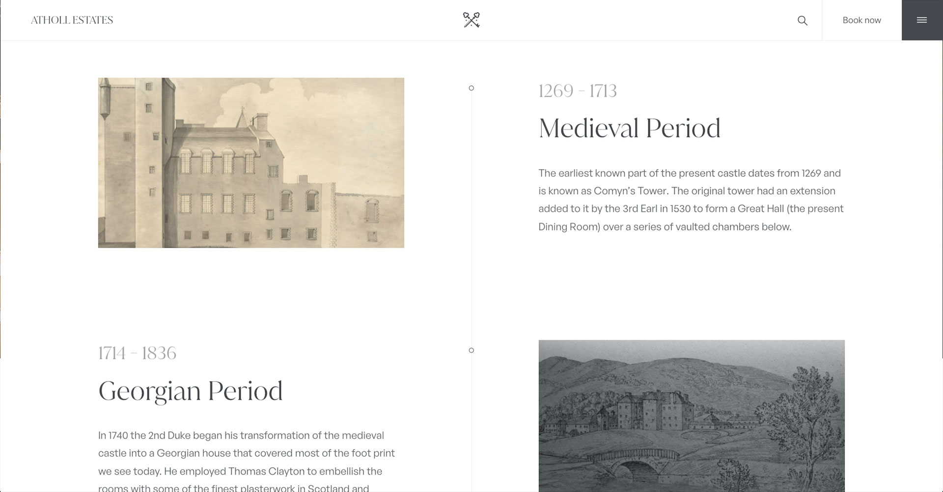


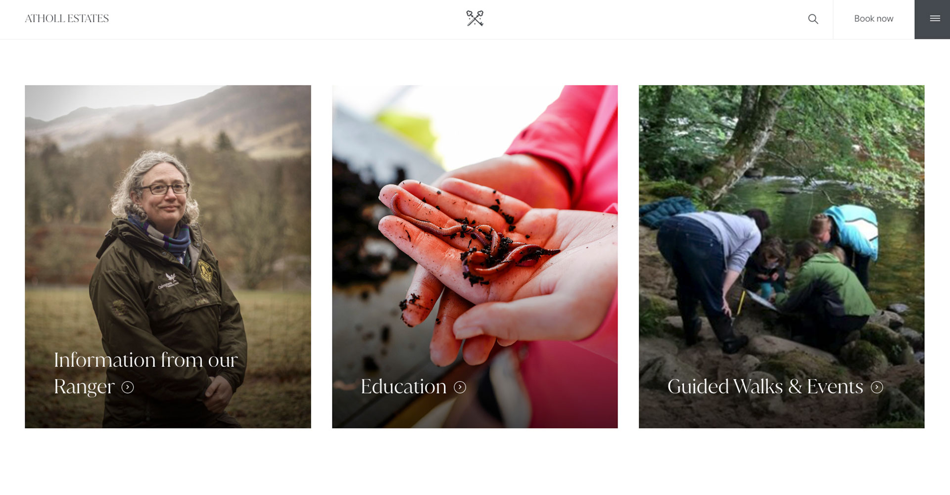
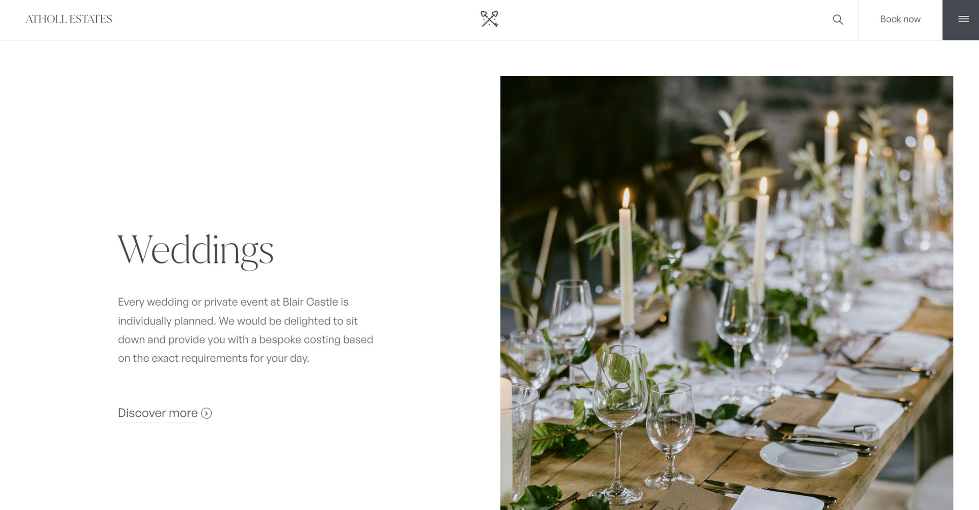
The Estate has a lot to offer, and that meant there was a lot for us to include. From their restaurant, to their variety of accommodation types and wedding facilities, we needed to coalesce the information and visuals in a way that meant the site could still be navigated with ease. We therefore opted to create a ‘mega menu’ that allows users to drill down into the different sections of the website in as few clicks as possible: mitigating user frustration. We then worked with the team to streamline bodies of text to ensure concise messaging which we reflected through clean minimalism in our design, in order to elegantly frame the visuals.


Results
The final result was a modern yet traditional brand identity that took inspiration from the distinctive and unique estate which was reflected throughout all aspects of the business. The new website is condensed, creating a seamless user experience in which the estate is able to be showcased to online visitors.

This project was a great opportunity to showcase Perthshire as the desirable location within Scottish tourism that it is, whilst acknowledging the importance now more than ever to take on projects that endorse and support the local economy.