FG Burnett
Built for the next 100 Years
Challenge
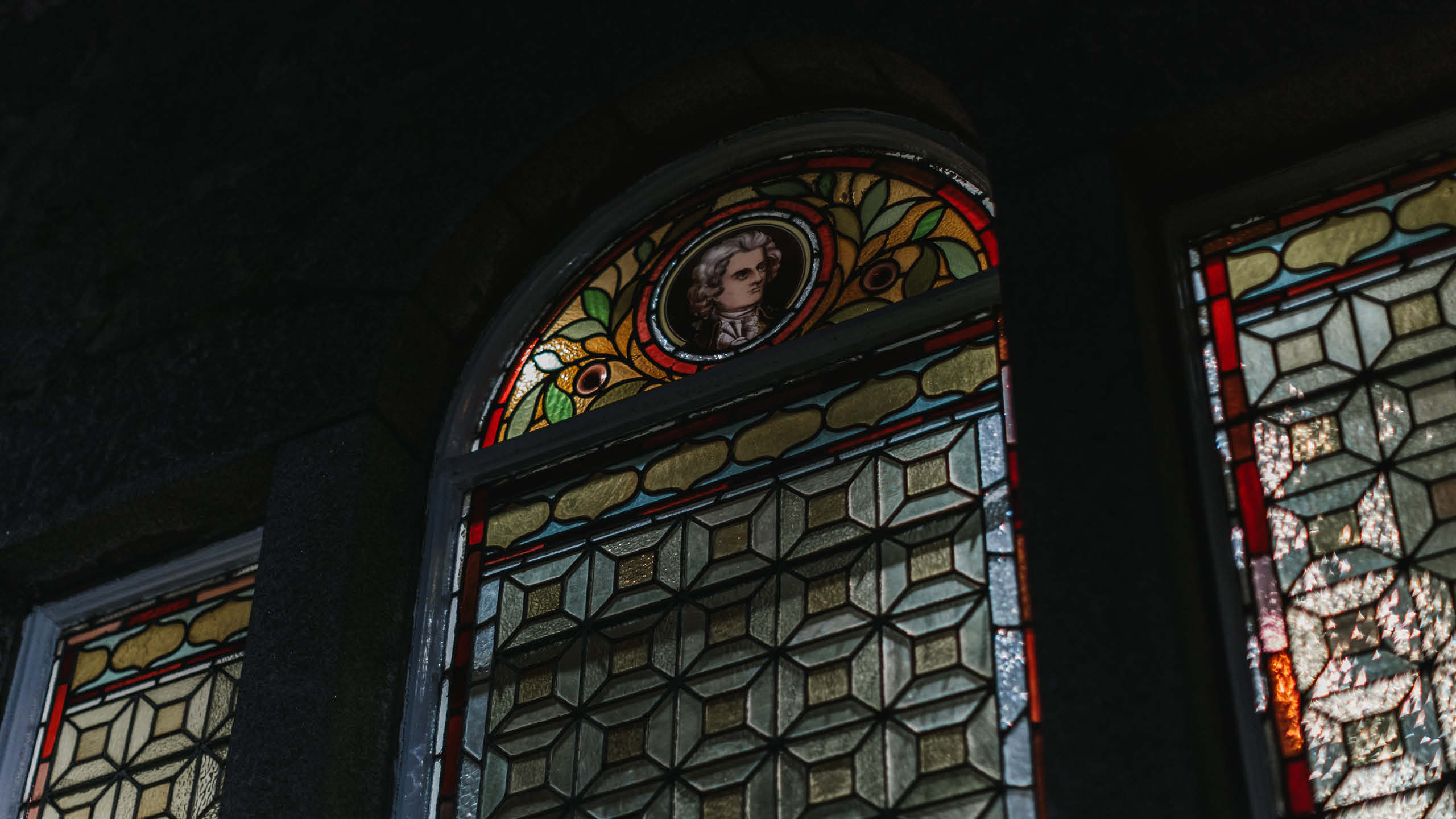
With more than 64 years of heritage, FG Burnett had built a reputation as one of Scotland’s leading commercial property consultancies. The challenge was not to reinvent the brand, but to evolve it with care.
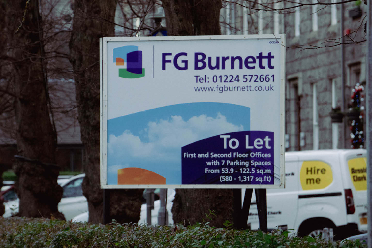
The existing identity carried significant recognition and trust, yet it no longer reflected the confidence and ambition of the modern business. Our task was to create a refined visual identity that respected the company’s legacy while providing a stronger platform for future growth.

Approach
From the outset, our focus was on understanding the business from the inside out. Through research, stakeholder conversations and strategic workshops, we explored what had made FG Burnett successful for more than six decades and identified the qualities that needed to remain at the heart of the brand.
Rather than pursuing change for its own sake, every design decision was measured against a single objective: creating an identity that felt both established and progressive. The result is a carefully considered evolution that strengthens recognition while introducing greater clarity, consistency and flexibility across every touchpoint.

Brand
The refreshed identity extends far beyond the logo itself.
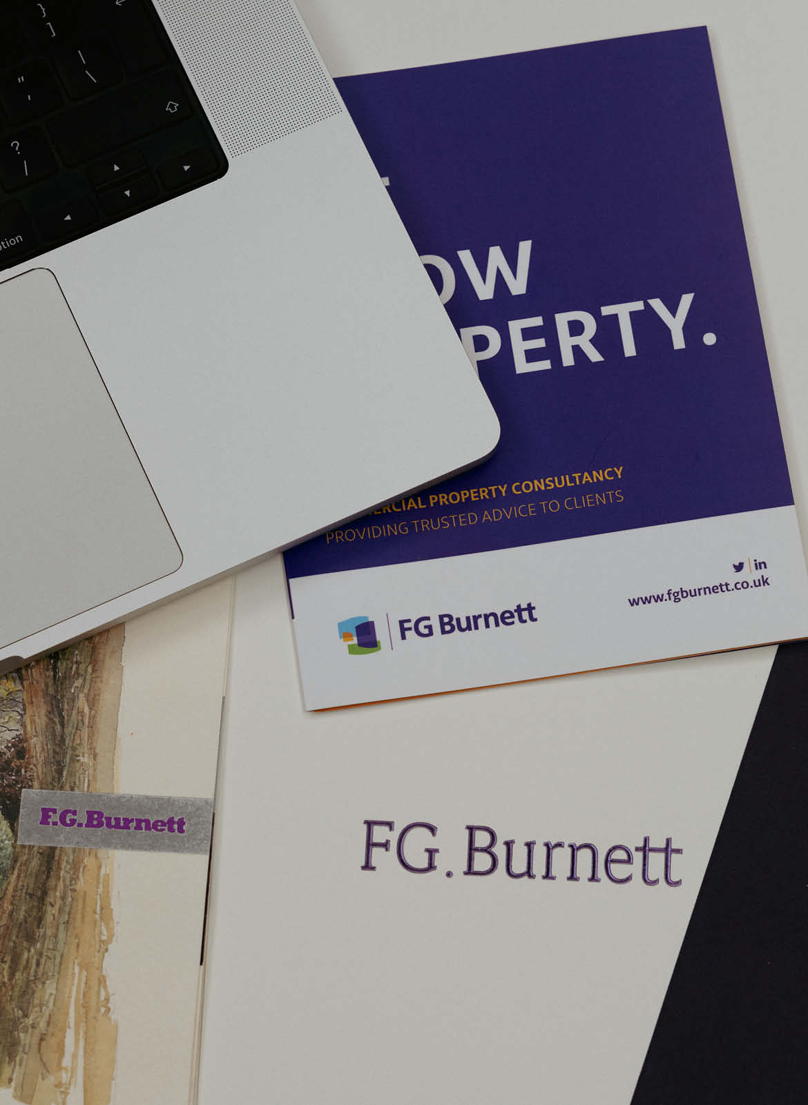
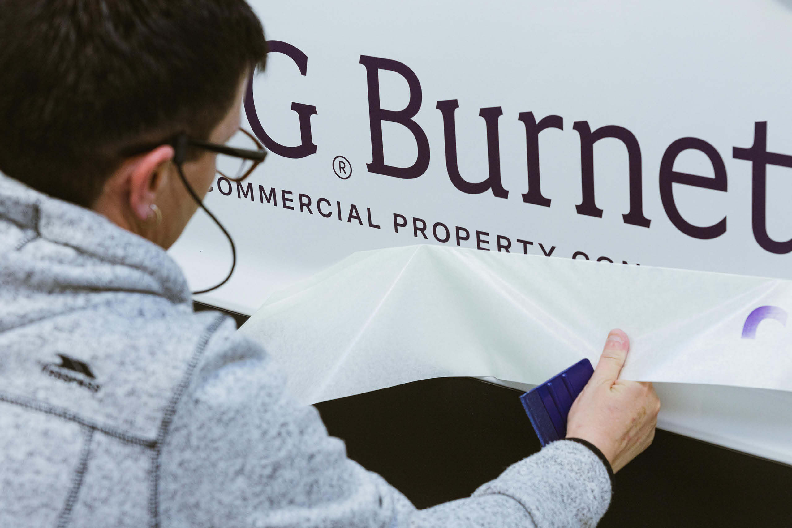
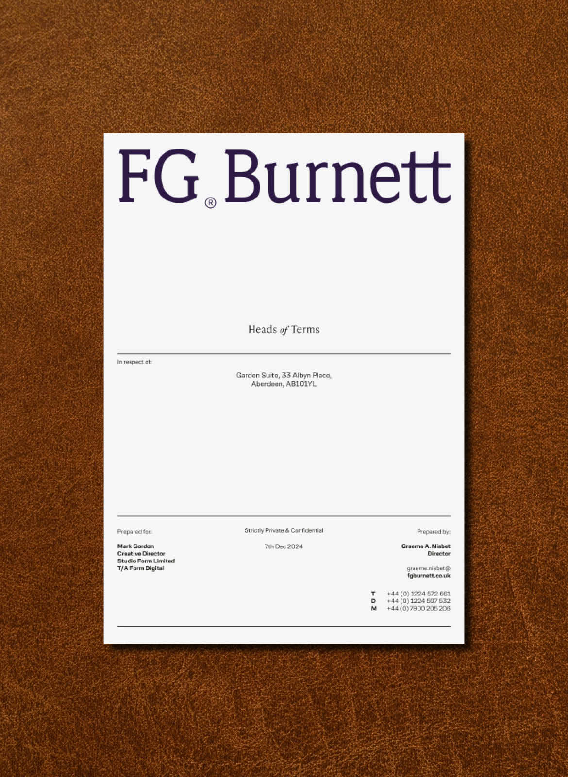
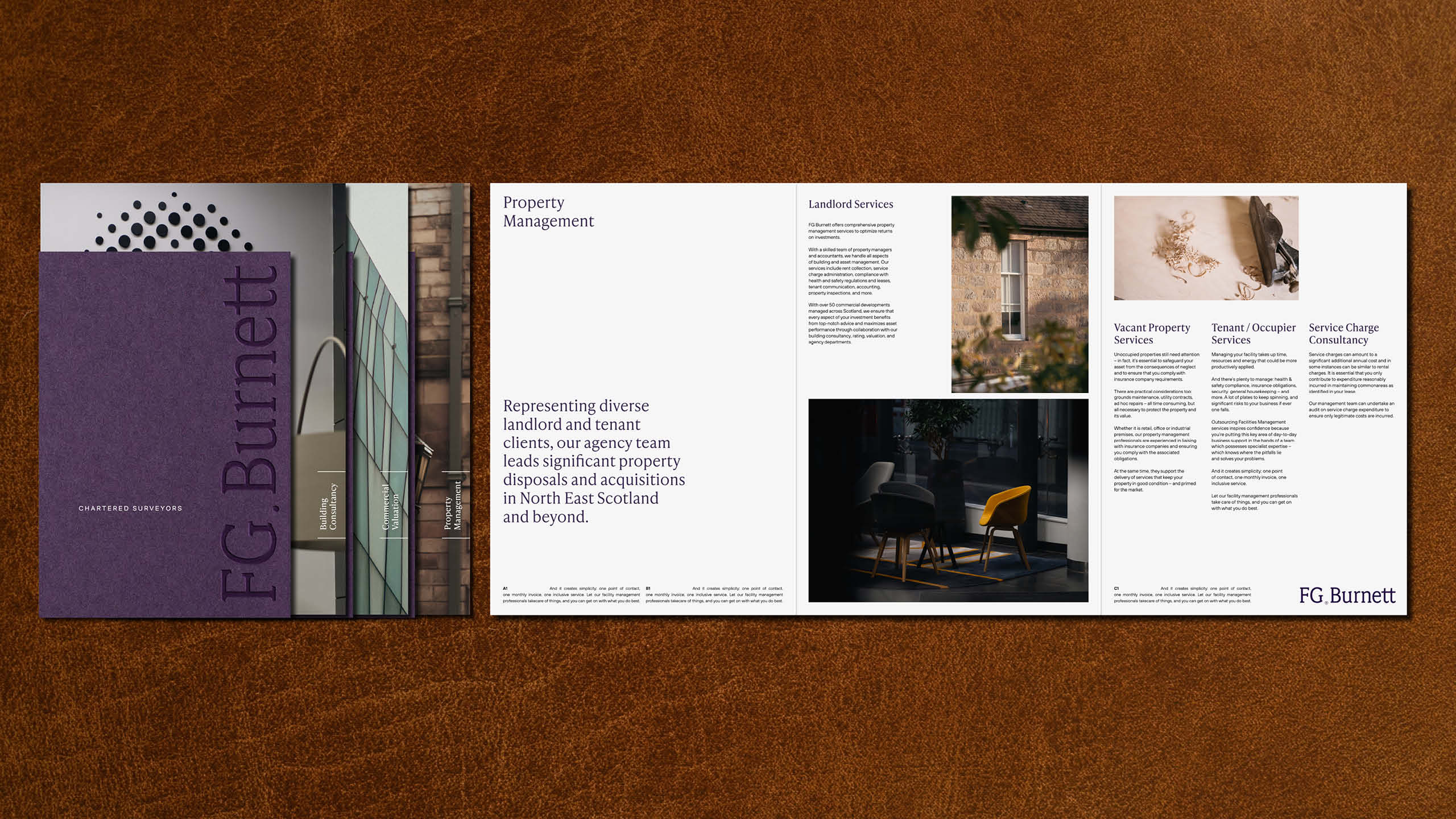
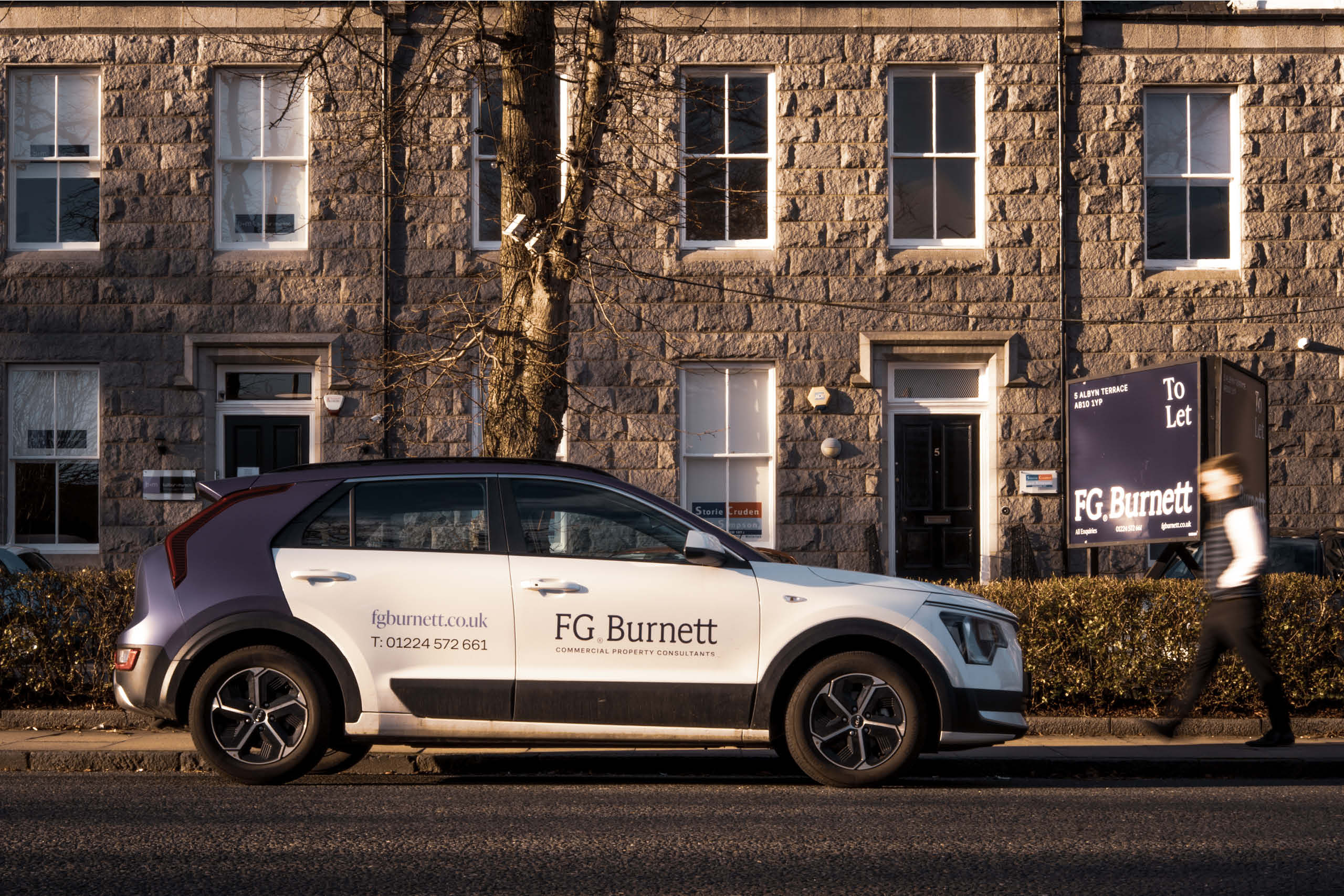
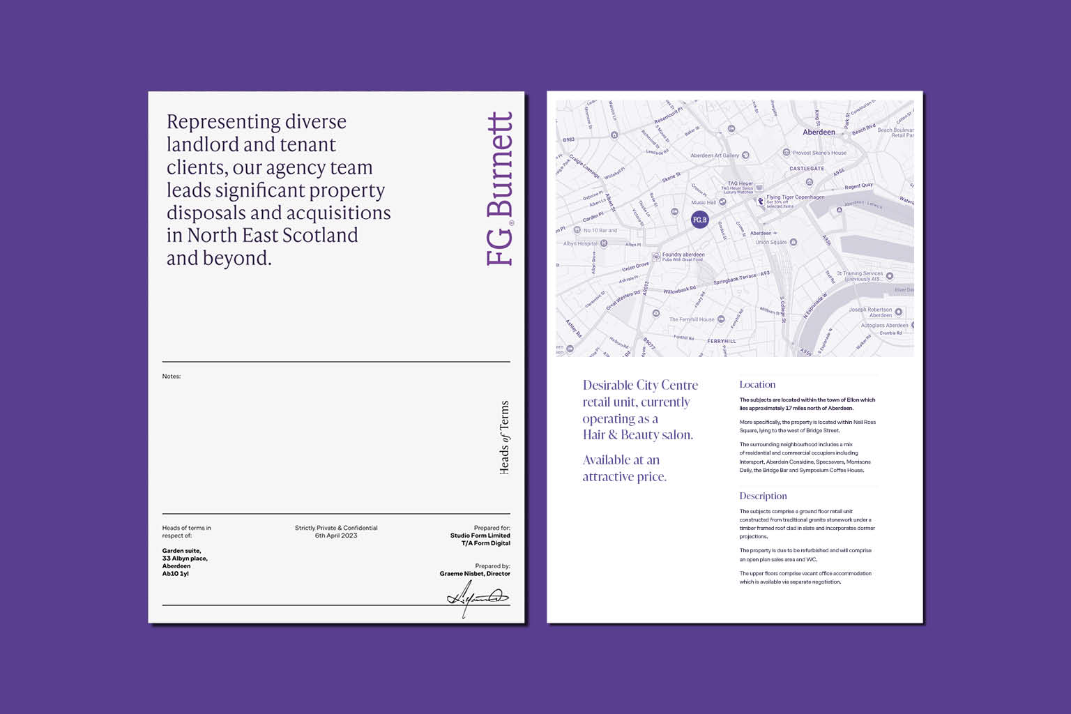
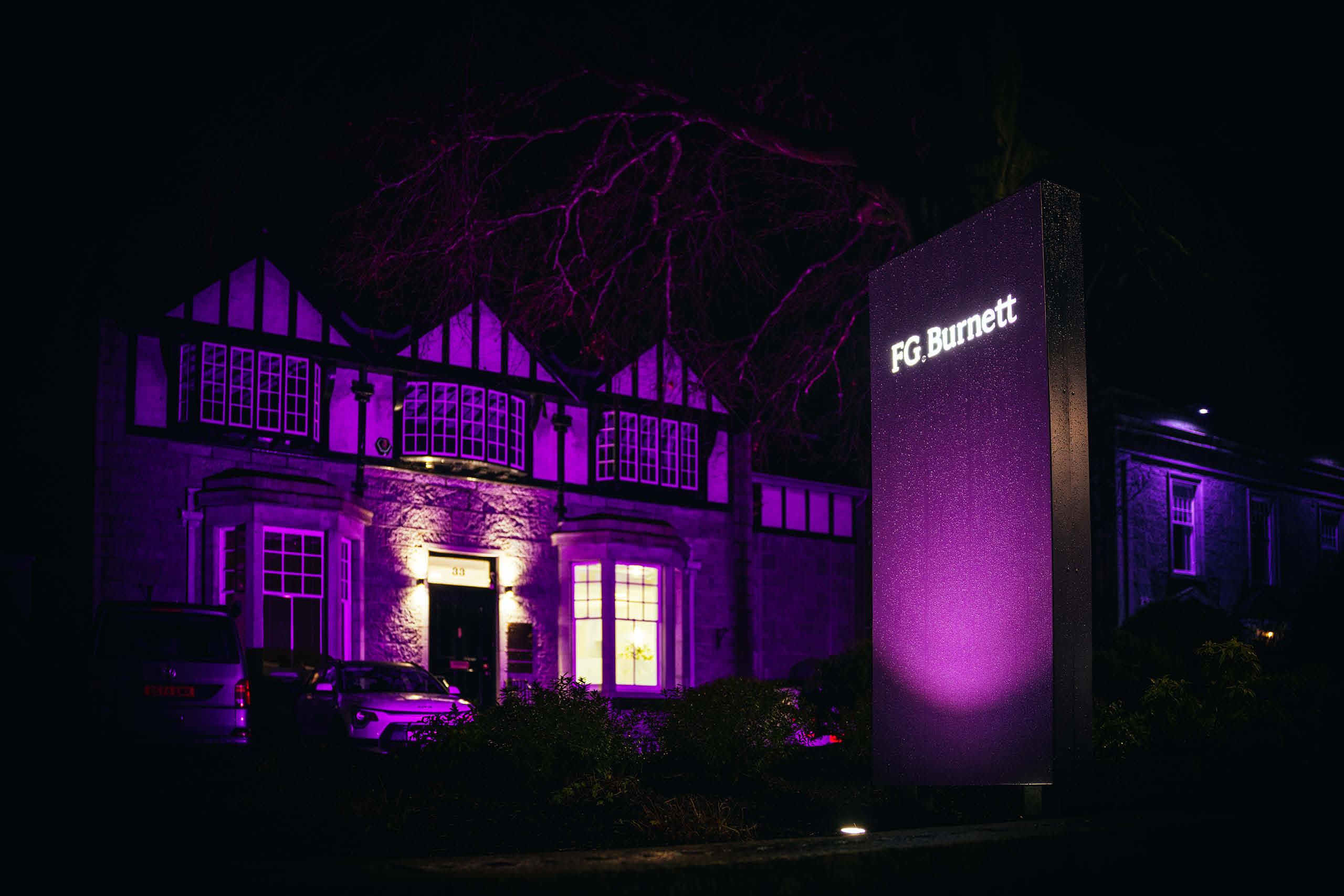
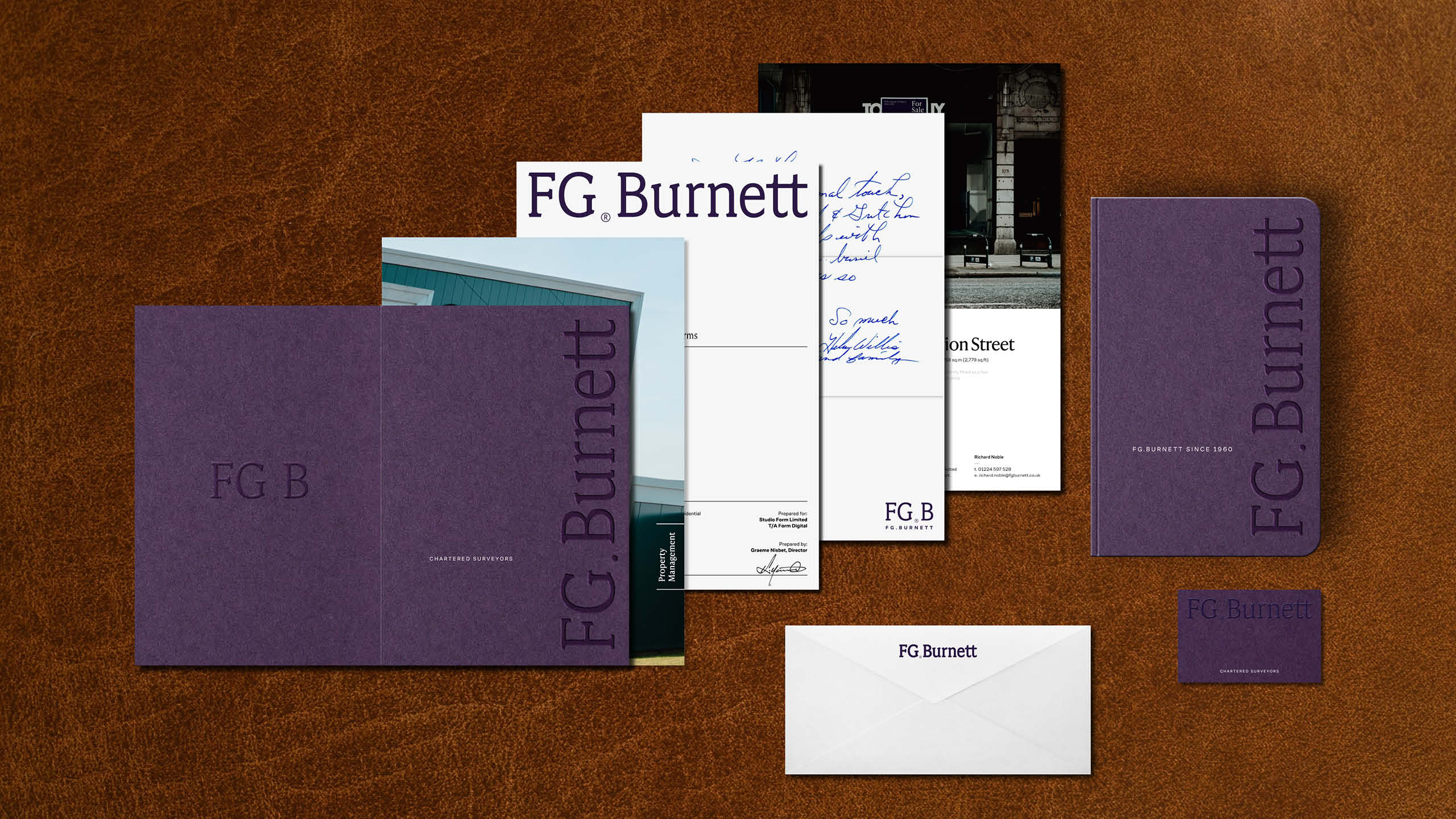
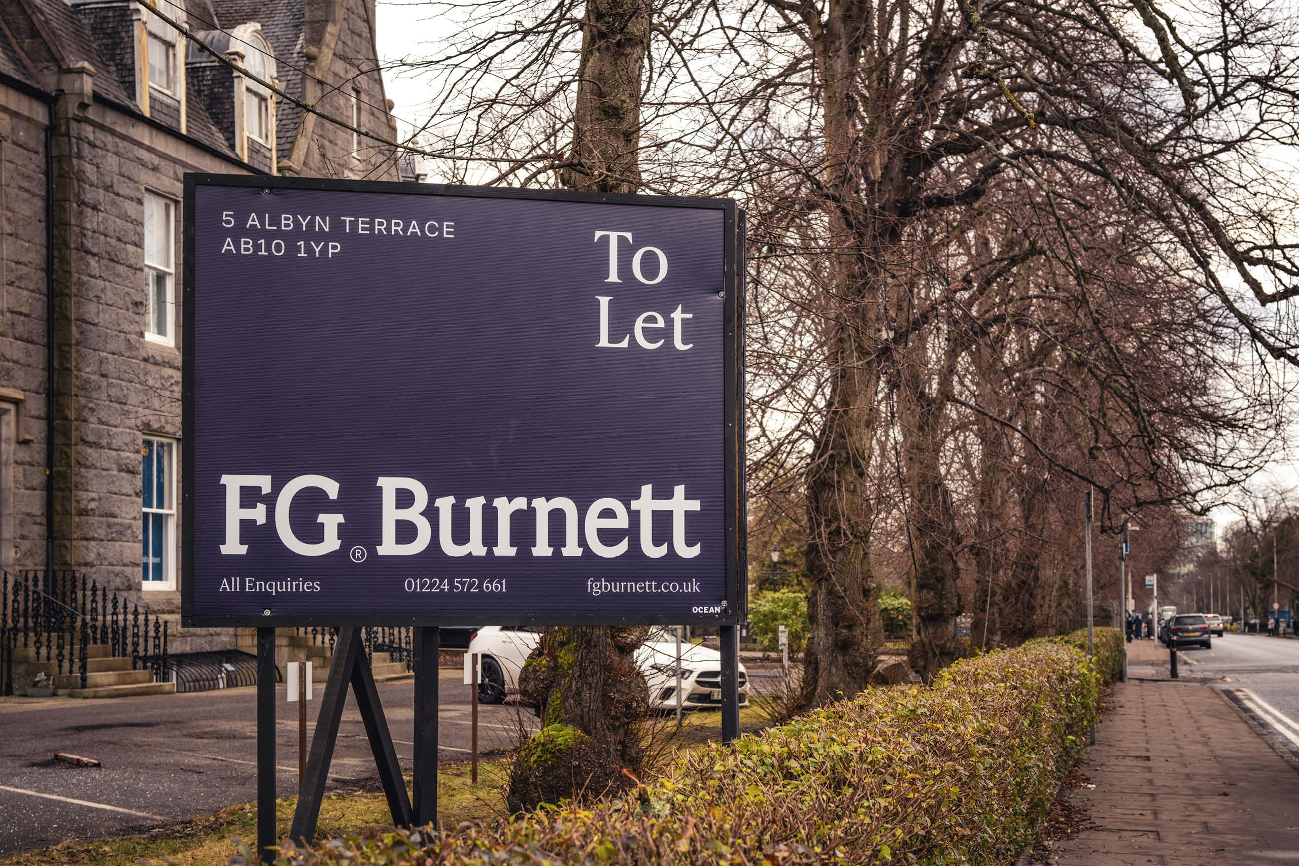
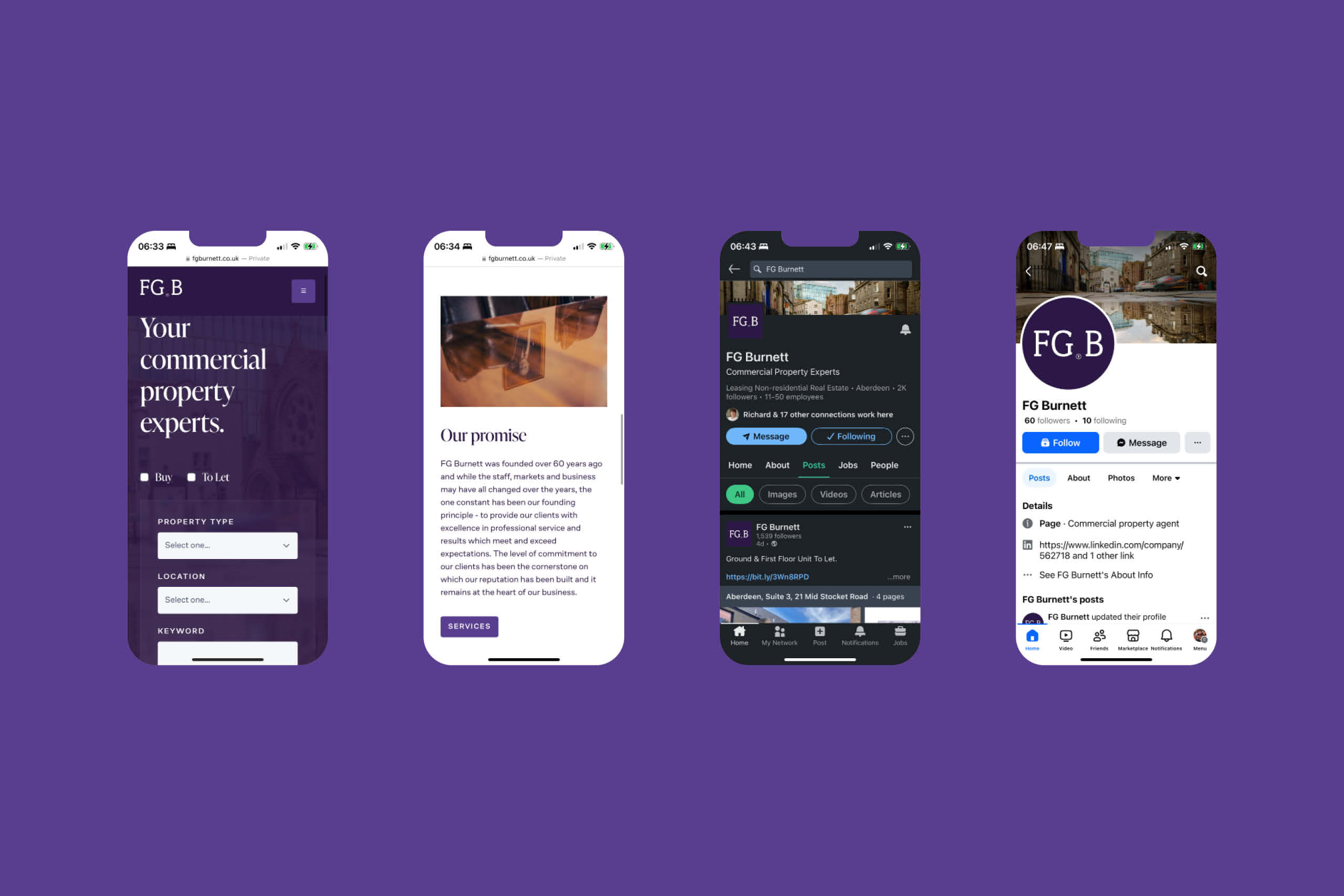
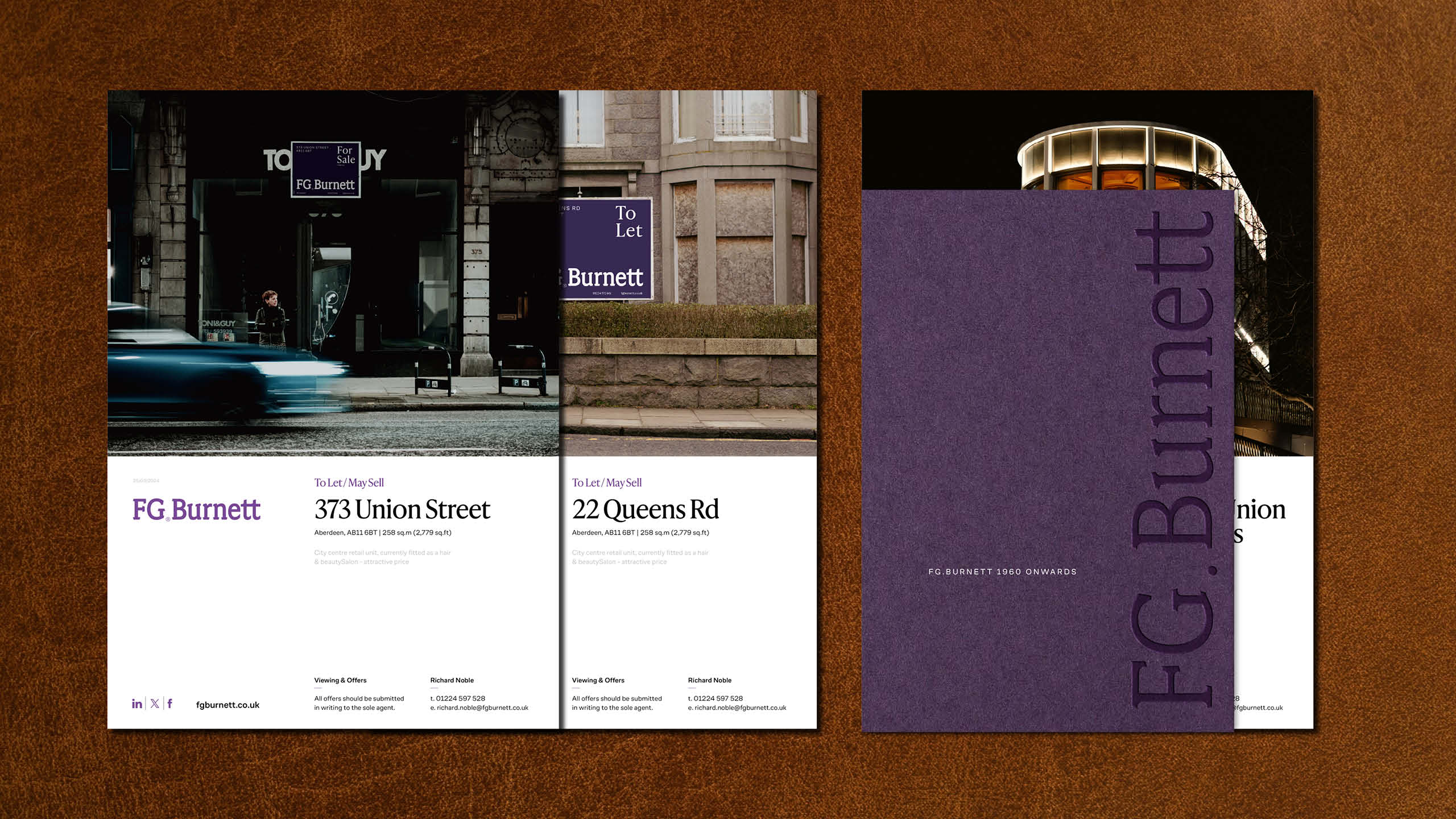
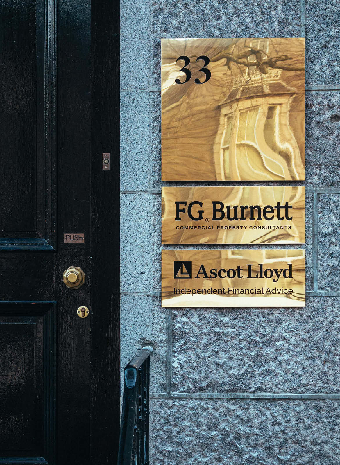
We developed a cohesive visual system that provides consistency across digital, print and environmental applications while allowing the brand to adapt confidently across every customer touchpoint. Carefully considered typography, colour, spacing and graphic principles combine to create an identity that communicates professionalism, authority and confidence in every application.
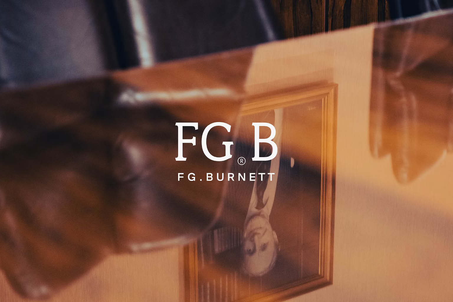
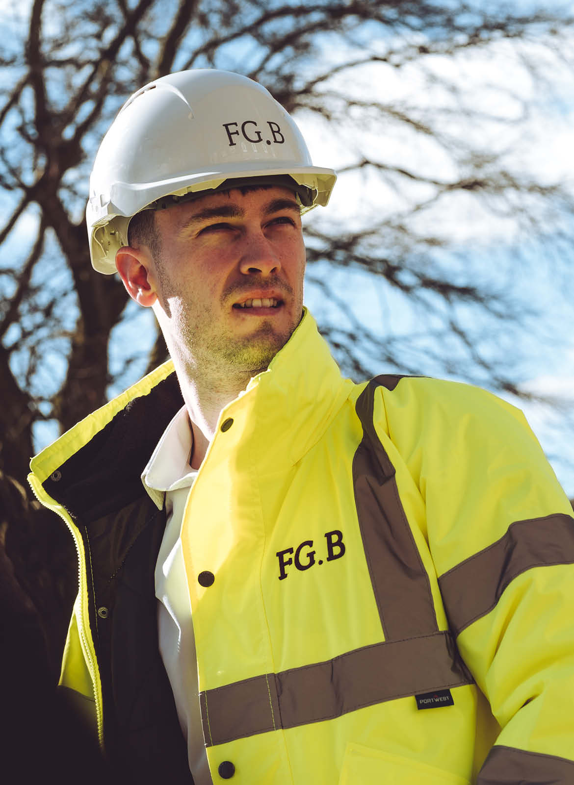
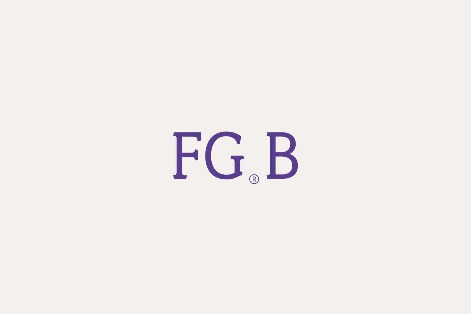
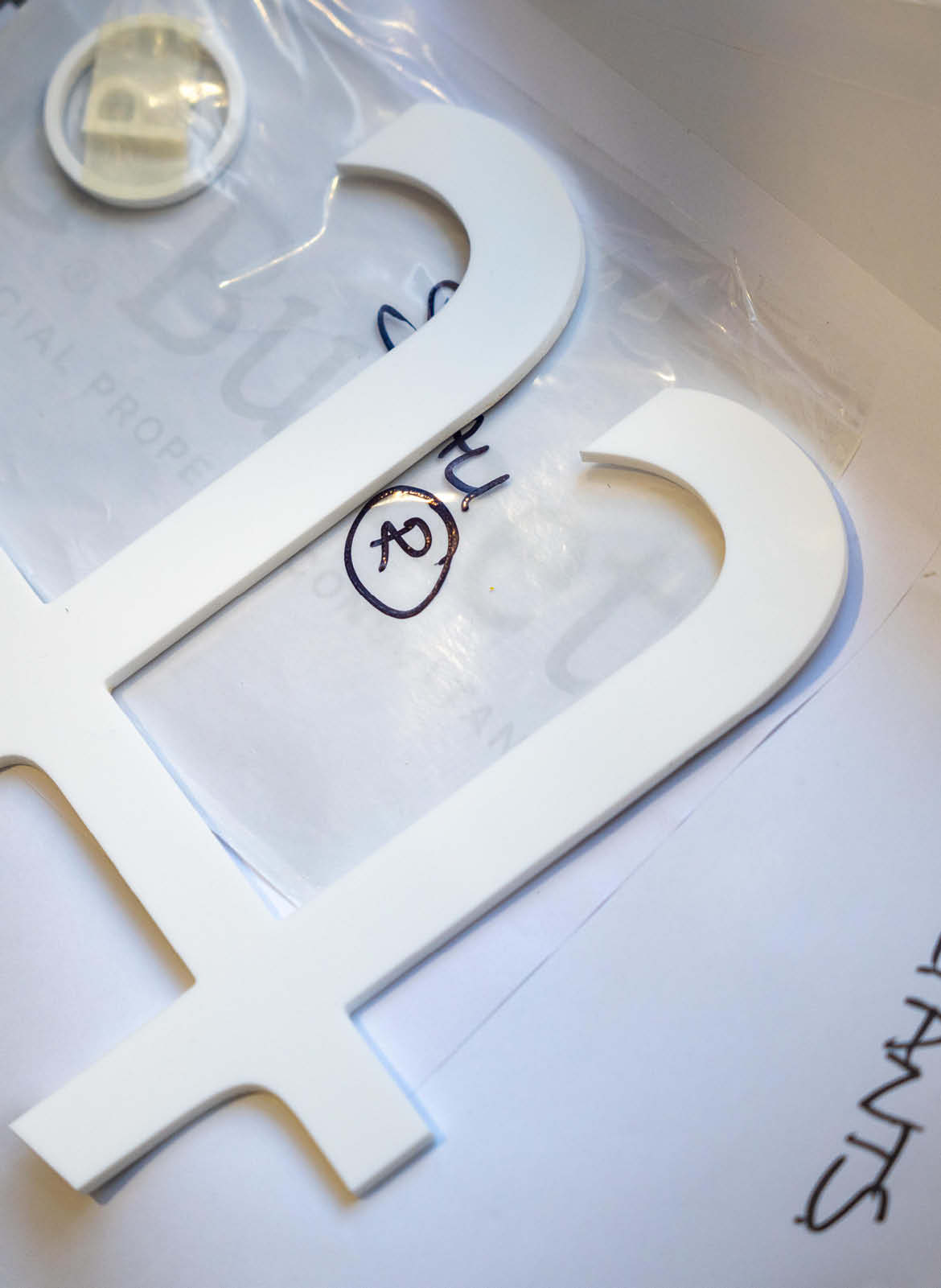
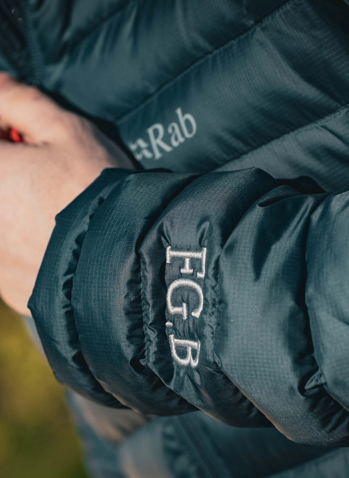
As part of the system, the abbreviated FGB marque works alongside the primary identity to provide a recognisable shorthand for the brand. By integrating the registered trademark symbol into this secondary marque, it becomes a distinctive graphic asset that can be used across digital platforms, social media, merchandise and other applications where a more compact expression of the identity is required.
Custom Logo Marque
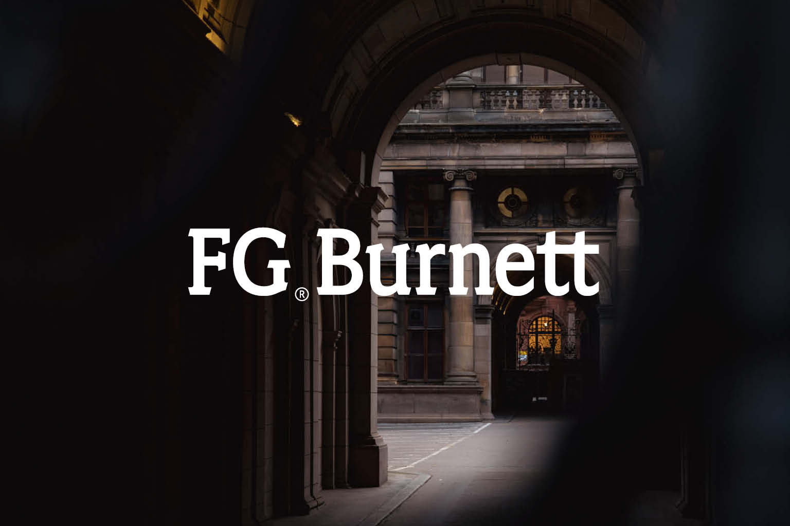
The bespoke word marque forms the foundation of the new identity.
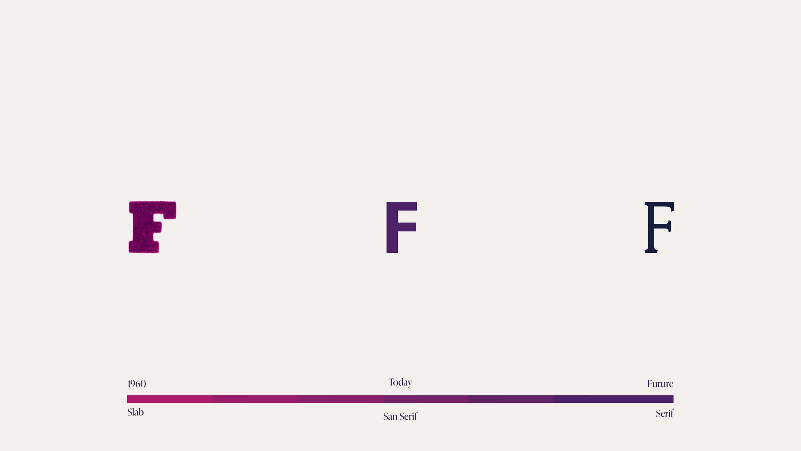
Every character was carefully refined to improve proportion, balance and legibility while retaining the familiarity and equity of the existing brand. The result is a timeless marque that performs consistently across everything from digital platforms and printed literature to signage and large-scale environmental graphics.


Typography
Typography became one of the defining features of the identity.
Working in collaboration with Scottish type foundry Polytype, we developed a bespoke typeface that balances contemporary character with a sense of permanence. The custom type system introduces a distinctive voice to the brand while improving readability and consistency across every application, reinforcing FG Burnett’s reputation for professionalism and expertise.
Photography
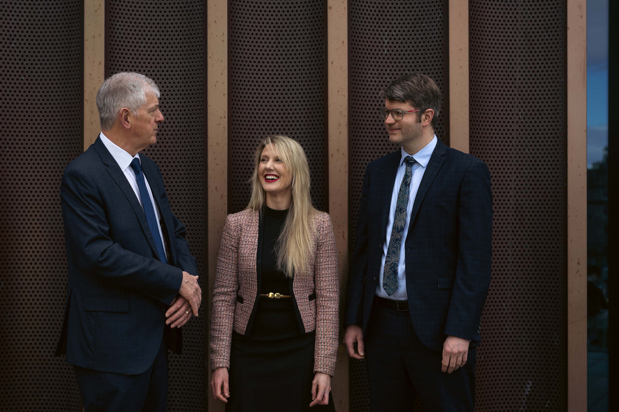
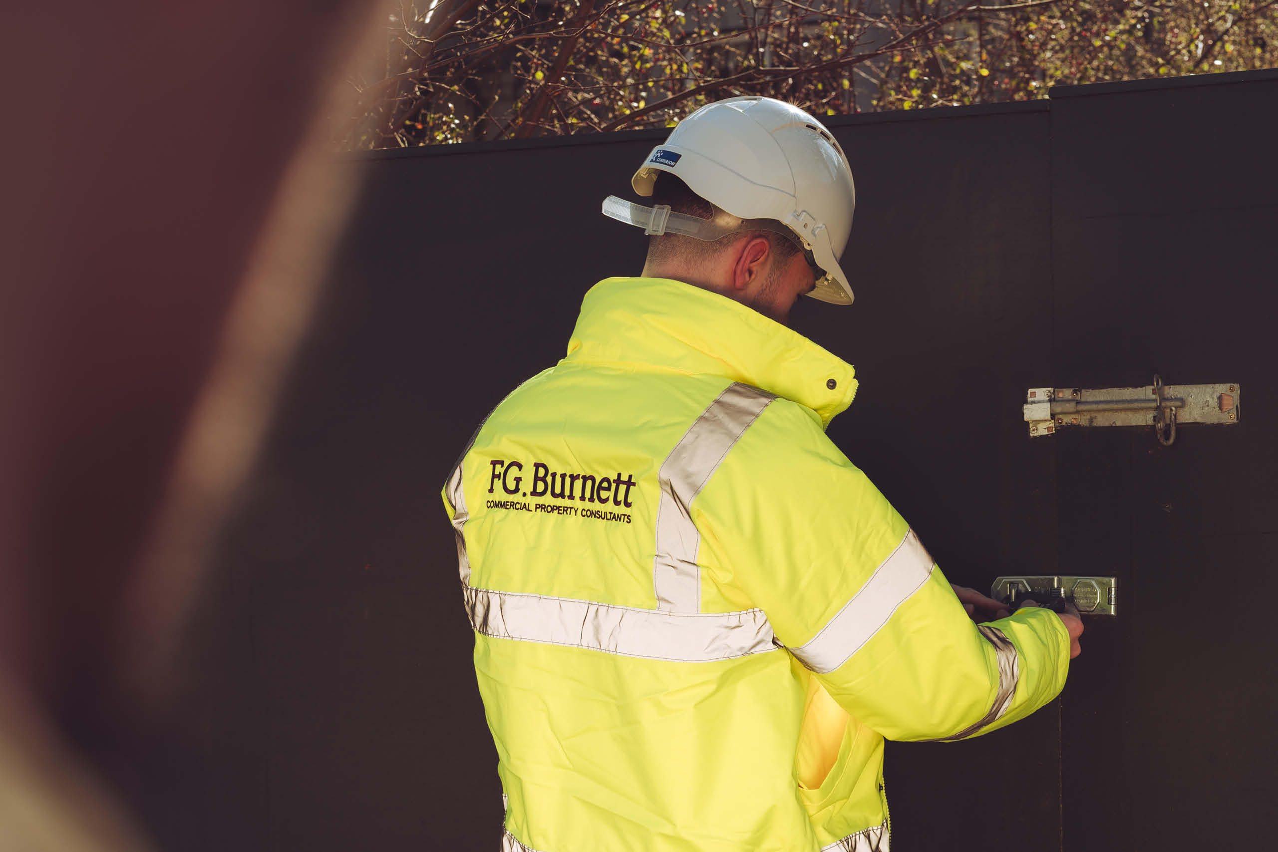
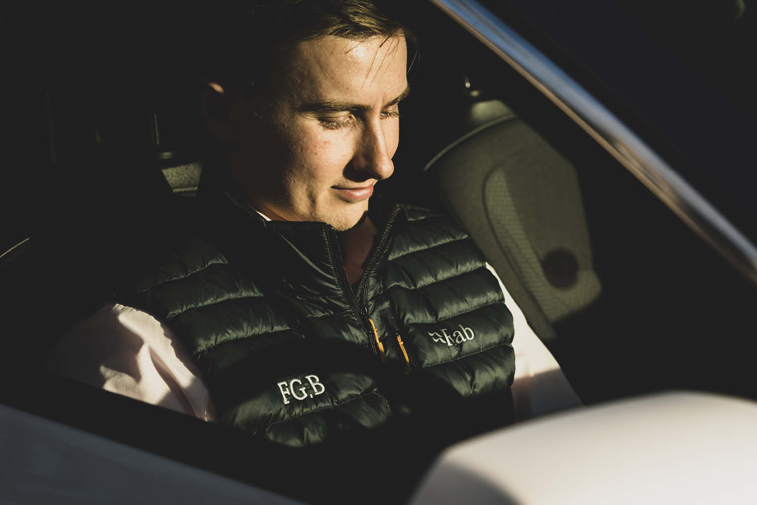
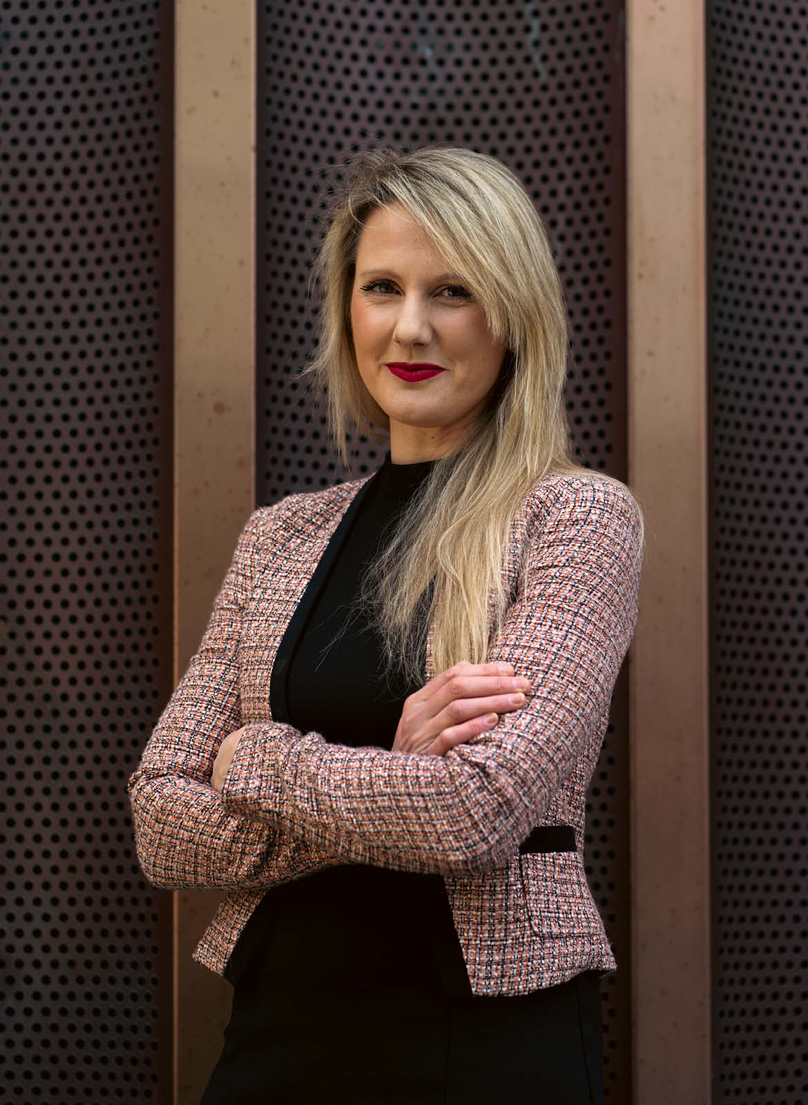
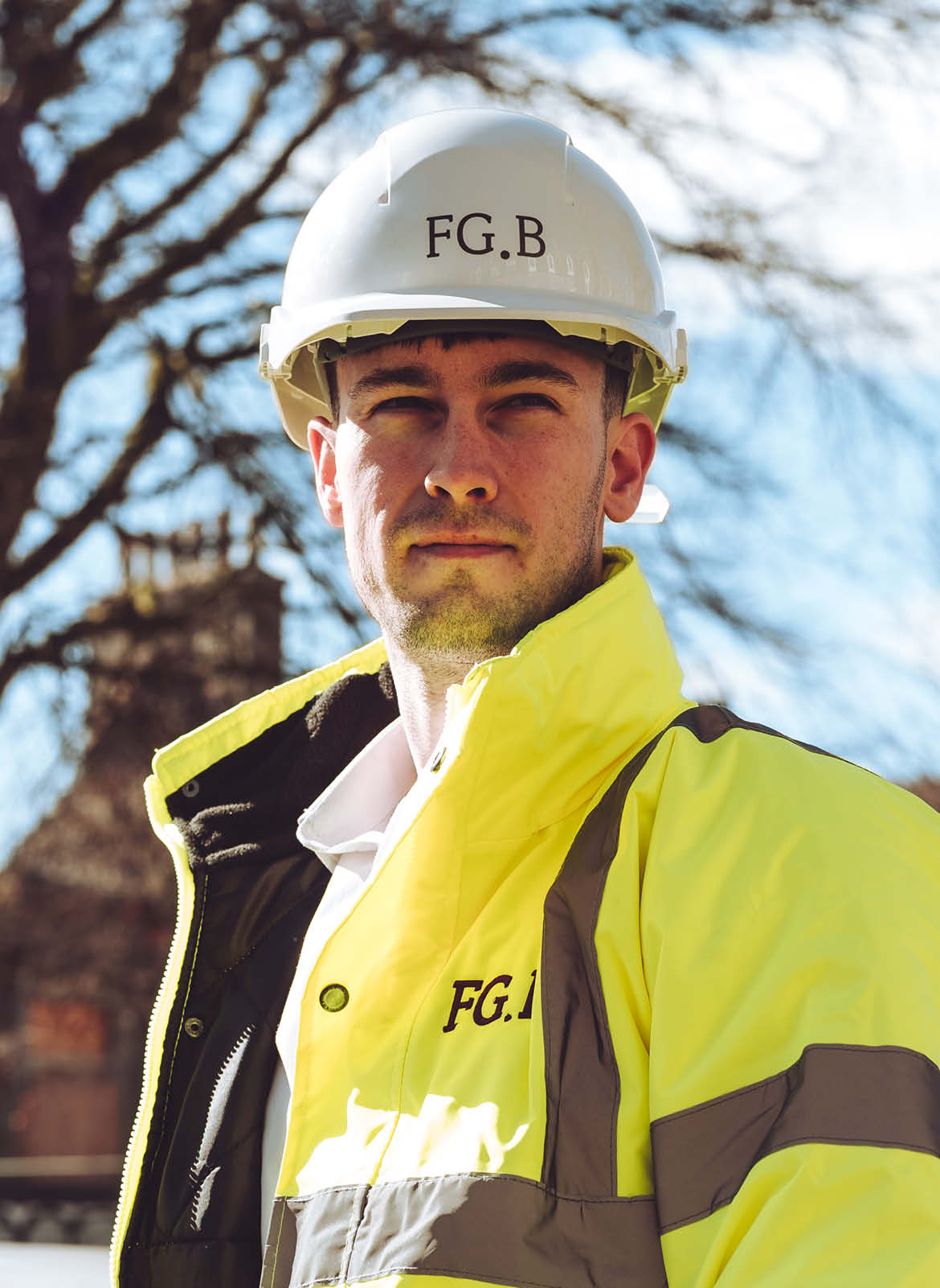
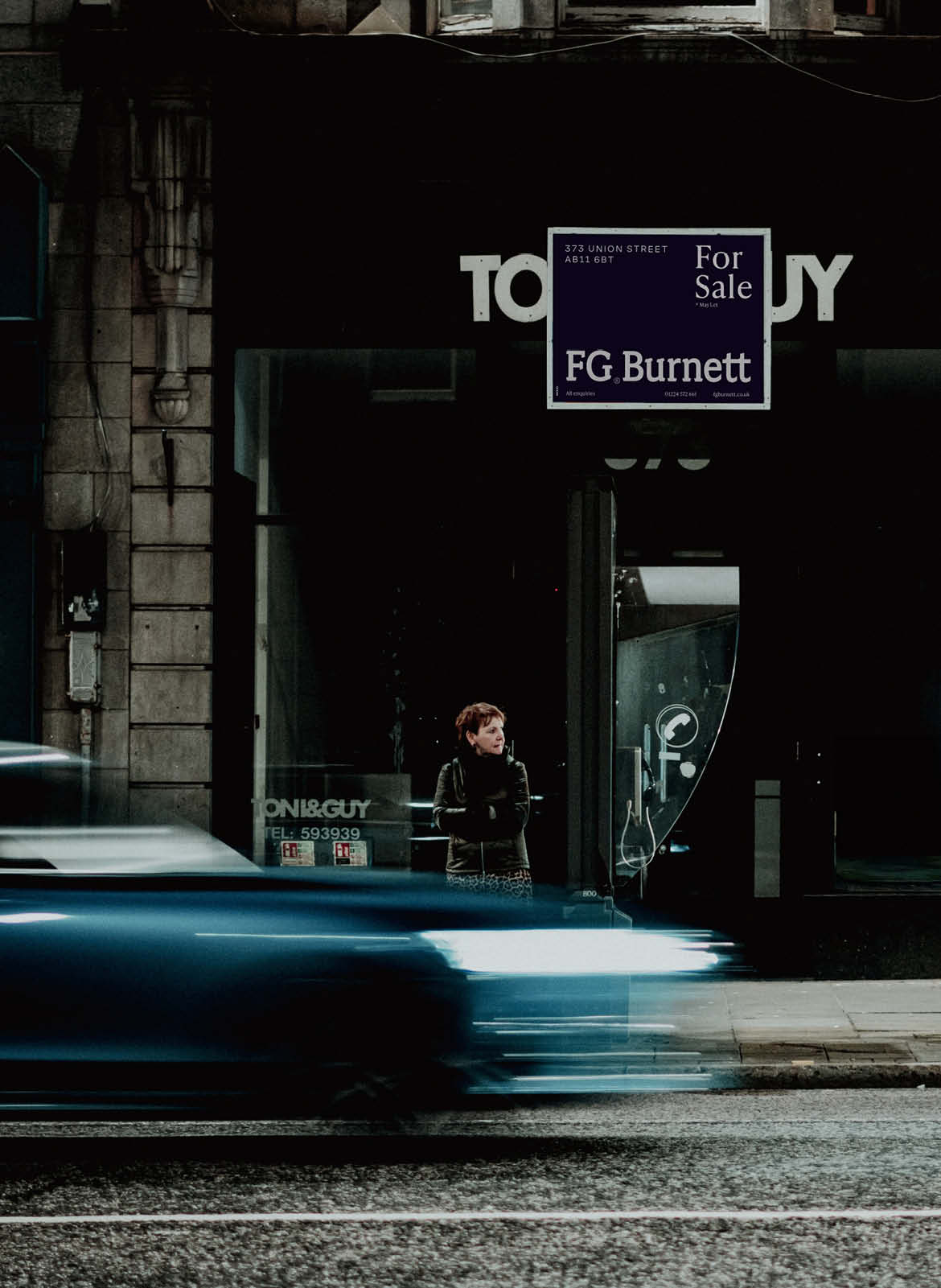
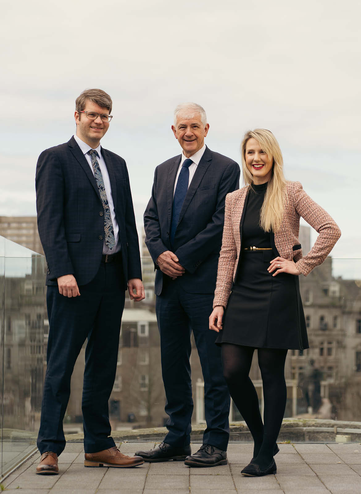
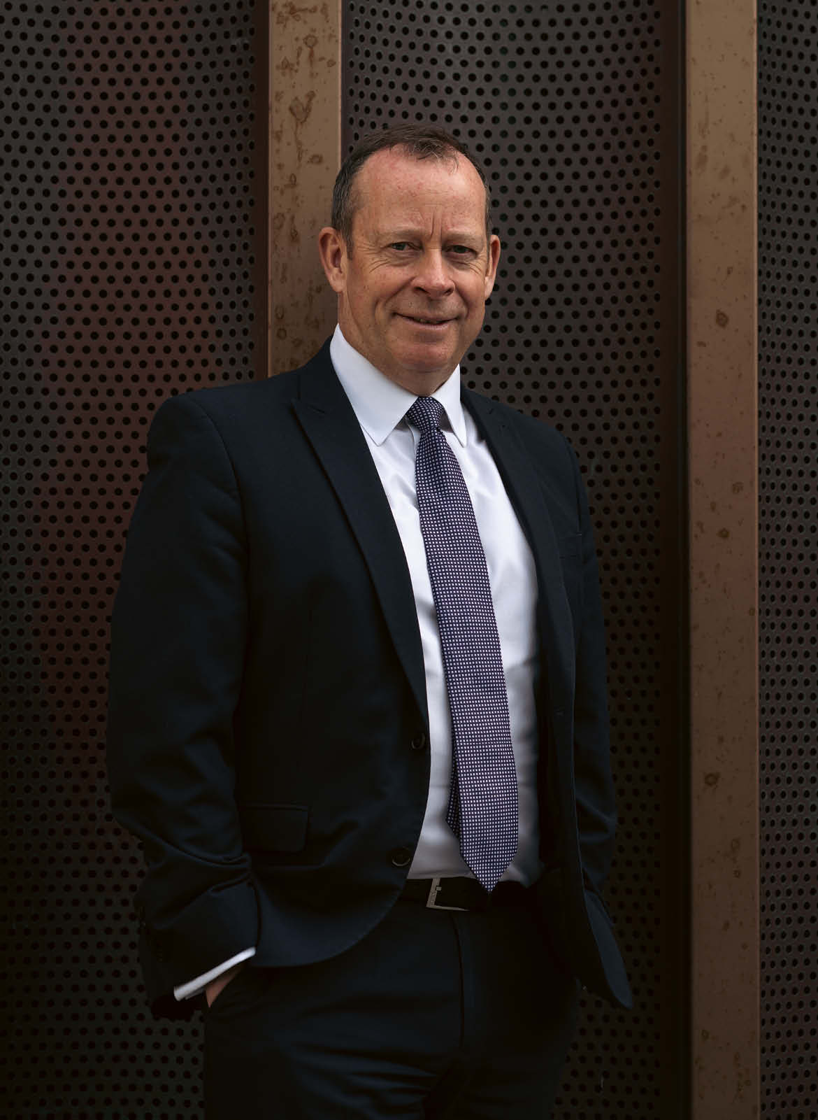
To bring the brand identity to life, we developed a custom photography style, led by our Creative Director Mark, who also served as the photographer. The imagery combined FG Burnett’s heritage with a modern outlook, focusing on real people, environments, and moments. Mark’s expert eye ensured the photographs captured both the craftsmanship and expertise of the company, while also resonating emotionally with current and future customers.




Results
The result is a considered evolution that respects more than six decades of heritage while positioning FG Burnett confidently for the future.
By combining a bespoke word marque, custom typography and a flexible visual identity, the brand now communicates with greater clarity, confidence and consistency across every touchpoint. The refreshed identity has been embraced internally and positively received by clients and the wider commercial property community, providing a platform that reflects the strength and ambition of the business today while remaining built to endure for decades to come.