Finn Thomson Whisky
Eye On The Past, Vision For The Future

Challenge
Finn Thomson Whisky is a new brand that has been 300 years in the making. Since James Thomsons illicit potstill in the 1700s, the Thomson family has pursued a different element of whisky through the ages – distilling, blending, trading, selling – helping to shape the very story of scotch itself. Now the family cask collection (one of the rarest in Scotland) is being presented to the public for the first time by its ninth generation, Finn Thomson.


But while Finn has a reverence for the past, his vision is set firmly on the future. Finn Thomson Whisky will continue to present new casks, unexpected experiences and creative collaborations under Finn’s curation as Master Bottler. The brand’s core identity, therefore, had to encompass a foundational contrast: centuries of heritage with a youthful founder; a family collection with individual accountability; a new name bottling rarities from Scotland’s best-known distilleries.
Approach
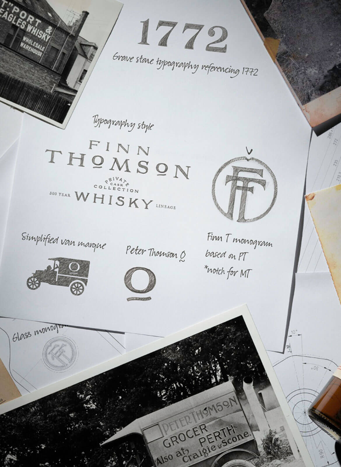
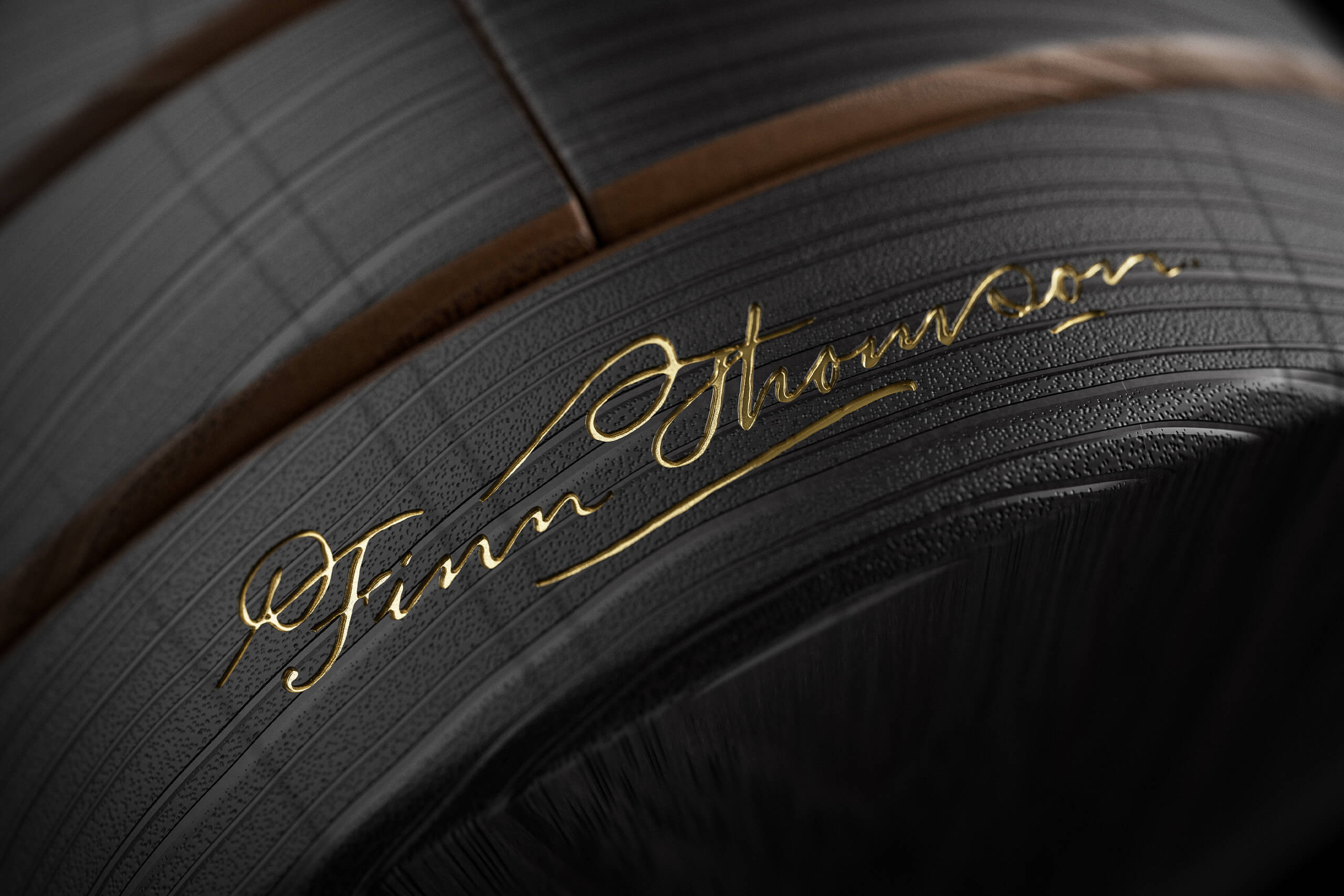
To meet this challenge we started at the beginning, researching hundreds of years of family archives to inform design decisions that would echo Finn’s whisky lineage while subtly enforcing his own authority. From the nine-sided bottle (a side for each generation) that still strikes a traditional whisky silhouette, to the FT monogram – a hand-drawn marque that incorporates all nine Thomsons’ initials.


For this brand, family history goes beyond points on a timeline. Each Thomson was a living, breathing, vibrant character with a story to tell. So we wanted to create an identity that celebrates not just the idea of family but also the stories of the individuals themselves. This is why we hand-drew custom typography for the main logo and number set, inspired by the letter form of Alexander Thomson’s grocery advertisements (late 1800s), Peter Thomson’s iconic sign-painted van (1920s) and even the chiseled gravestone of James Thomson, the founding member of Finn’s whisky lineage (late 1700s).
As managing director of Beneagles Golden Blended Whisky (1960s and 70s) Finn’s grandfather, Michael Thomson, pioneered collectable drinking vessels made from ceramic; in turn we have created a collectable set of keepsake stoppers for every bottle, a different ceramic per range.


Finn Thomson’s personal ambition is to ensure his family’s whisky lineage is enshrined but to present it in a new form. Our mission was the same.
Core & Rare Custom Packaging
We created three tiers of packaging for the Core, Rare and Crown ranges – all based around this notion of “uncasking”. In each instance we turned the hypothetical cask inside out, bringing the charred interior to the fore. We brought this to life for the Core range through the textural charcoal grain of a carton with nine sides, each side uniting like staves in a cask – one for each Thomson in the lineage. A simple gold lining inside the carton elevates the feeling of occasion when the whisky bottle is withdrawn.


For Rare, we opted for a more modern and luxurious box, with a nine-sided black satin finish displaying only the monogram and Finn’s signature. We created a participative “uncasking” experience by implementing a tactile opening mechanism, encouraging the consumer to unlock the whisky within. The bottle is then revealed on an internal pedestal which is lined with a nonagon cask pattern, a nod to the whisky’s dunnage storage and, again, the nine members of the lineage.


50YO Custom Packaging
The Crown packaging fully embodies “uncasking” by physically re-encasing the whisky back into oak. The cylindrical textured black-fumed exterior is pierced by nine rings and Finn’s signature in gold. A polished brass number 50 invites the consumer to pry open the “cask” and reveal the whisky within, cocooned in a warm solid oak interior and accompanied by an inscription on each side: “Eye On The Past” // “Vision For The Future”.


Digital
Following establishing the branding, we wanted to digitally translate this to a platform that would showcase their exclusive rare bottlings, drive sales and strengthen their position as a leader in private cask bottlings. Our challenge was to design and build a website that effectively reflects the rich history, premium craftsmanship, and passion for scotch that the Thomson family pride themselves on.


Storytelling and design were at the heart of the website to ensure an immersive experience for the user, delivered through a modern and minimal design. Working closely with the team, we streamlined bodies of text for concise messaging, mirroring the clean design and allowing the product and brand story to take centre stage. This permitted us the autonomy to craft every element of the experience from the ground up. We cohesively combined copy, film, 3D visualisation and motion to successfully convey a single story: 9 generations of Scotch bottling.


For micro interactions, we used a custom nonagon mouse cursor which mimics the bottle’s design and expands when interacting with clickable elements. These small yet impactful details help to continually reinforce the brand identity throughout the customer’s journey.

Combining 3D animations and web technologies, we exceeded the brief to digitally depict the products in a way that would optimally engage users. Our brief was to create a series of 3D rendered whisky bottles in isolation as well as placed in unique environments art-directed by our team.


The 3D visualisation allowed us to have complete control over the image output and showcased the items in a way that could not have been done through photography or videography. Animation and interactions also played a key role in creating a digital experience, including type animation.
