Glenrothes 51
Everything has beauty, but not everyone sees it
Redefining luxury
The Glenrothes 51 is more than a rare whisky. It is an experience defined by craftsmanship, precision and anticipation.
Commissioned to create the complete presentation for one of The Glenrothes’ most exclusive releases, our role extended far beyond packaging design. From strategy and structural development through to material selection, artwork, production and launch assets, every element was carefully considered to create an object worthy of the whisky it protects.


The Concept
Luxury packaging is often designed to preserve. Boxes remain unopened, seals stay intact and pristine condition becomes part of an object’s value.
The Glenrothes 51 set out to challenge that convention.
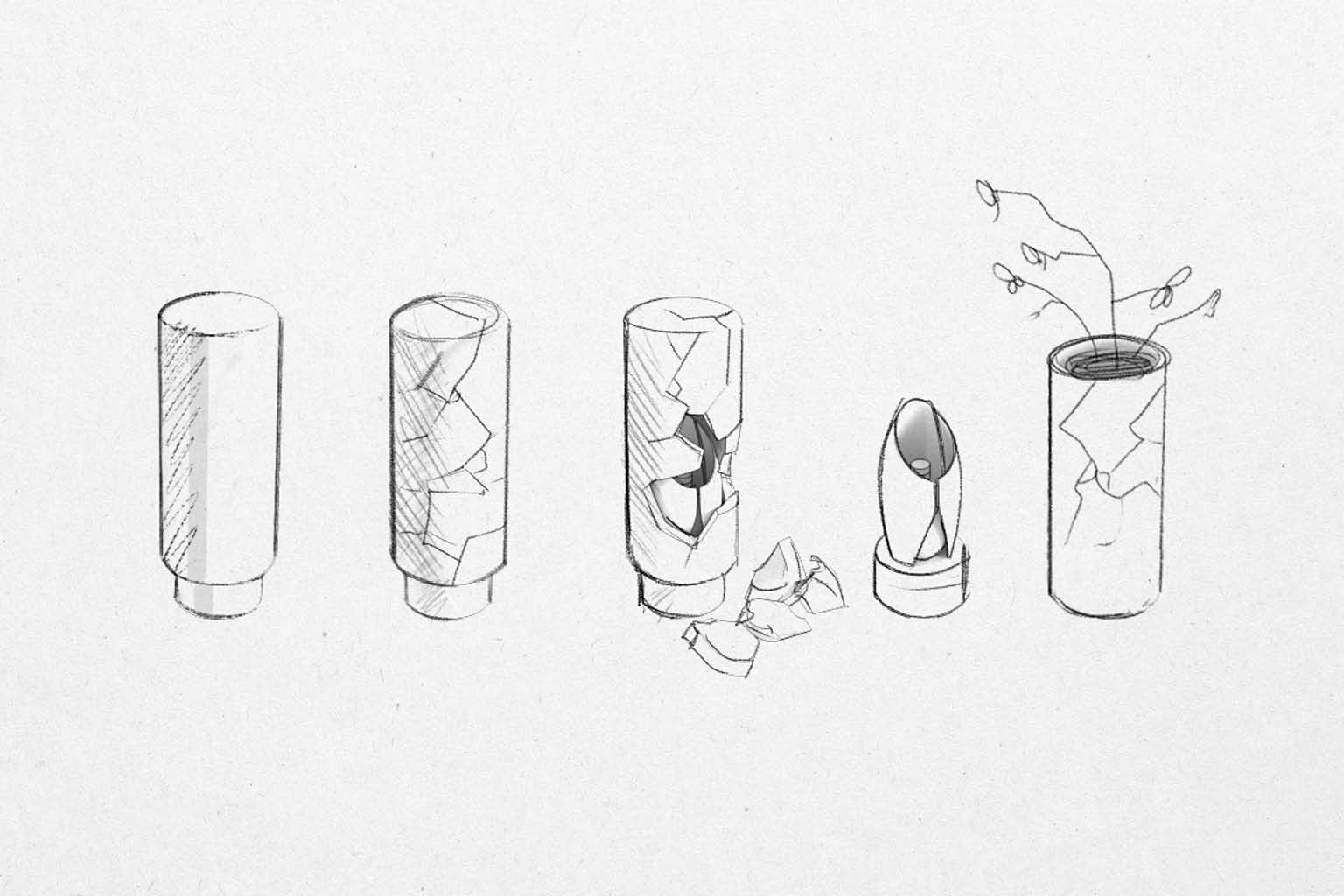
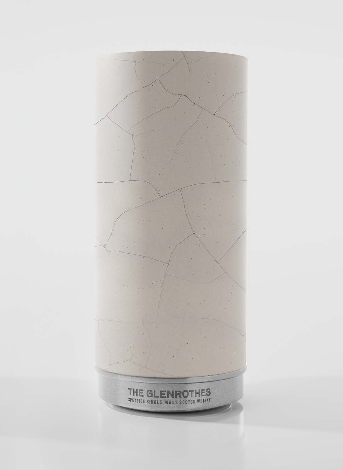
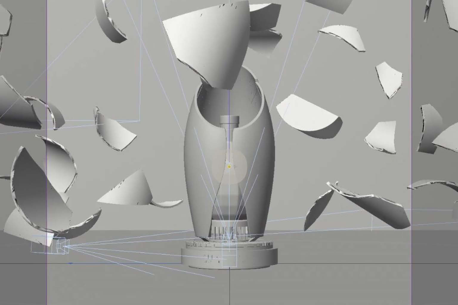
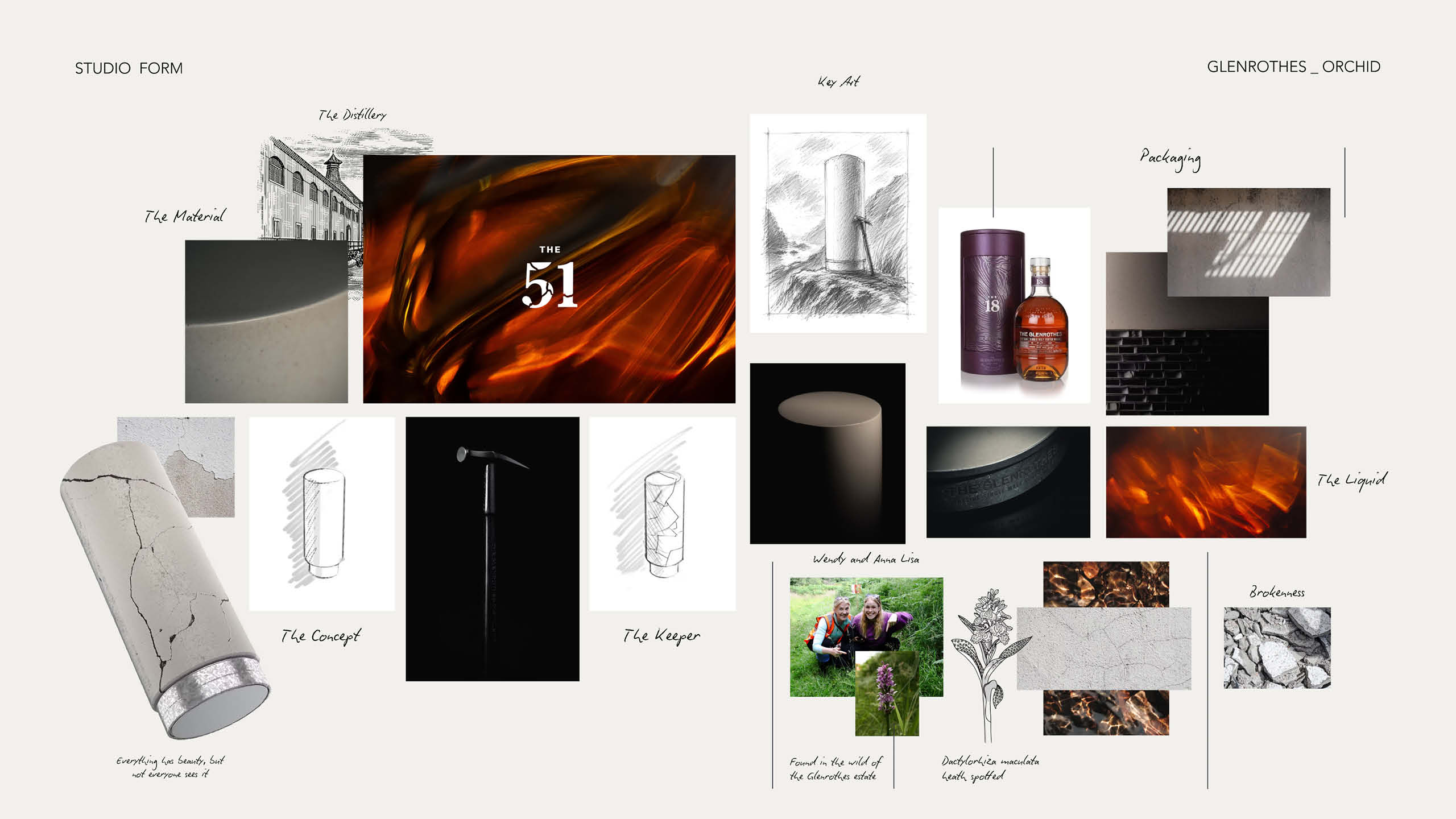
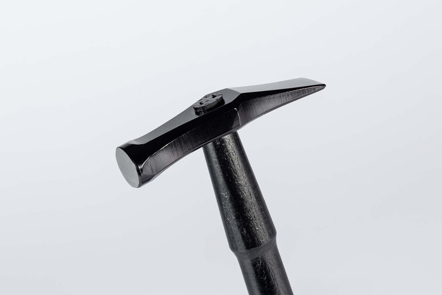
Rather than creating a presentation case to protect a rare whisky, we designed an experience that could only be completed through participation. The bottle is entirely concealed within a solid Jesmonite sculpture, remaining invisible until the owner chooses to break it open. Until that moment, the whisky does not visually exist. Opening and destruction become inseparable.
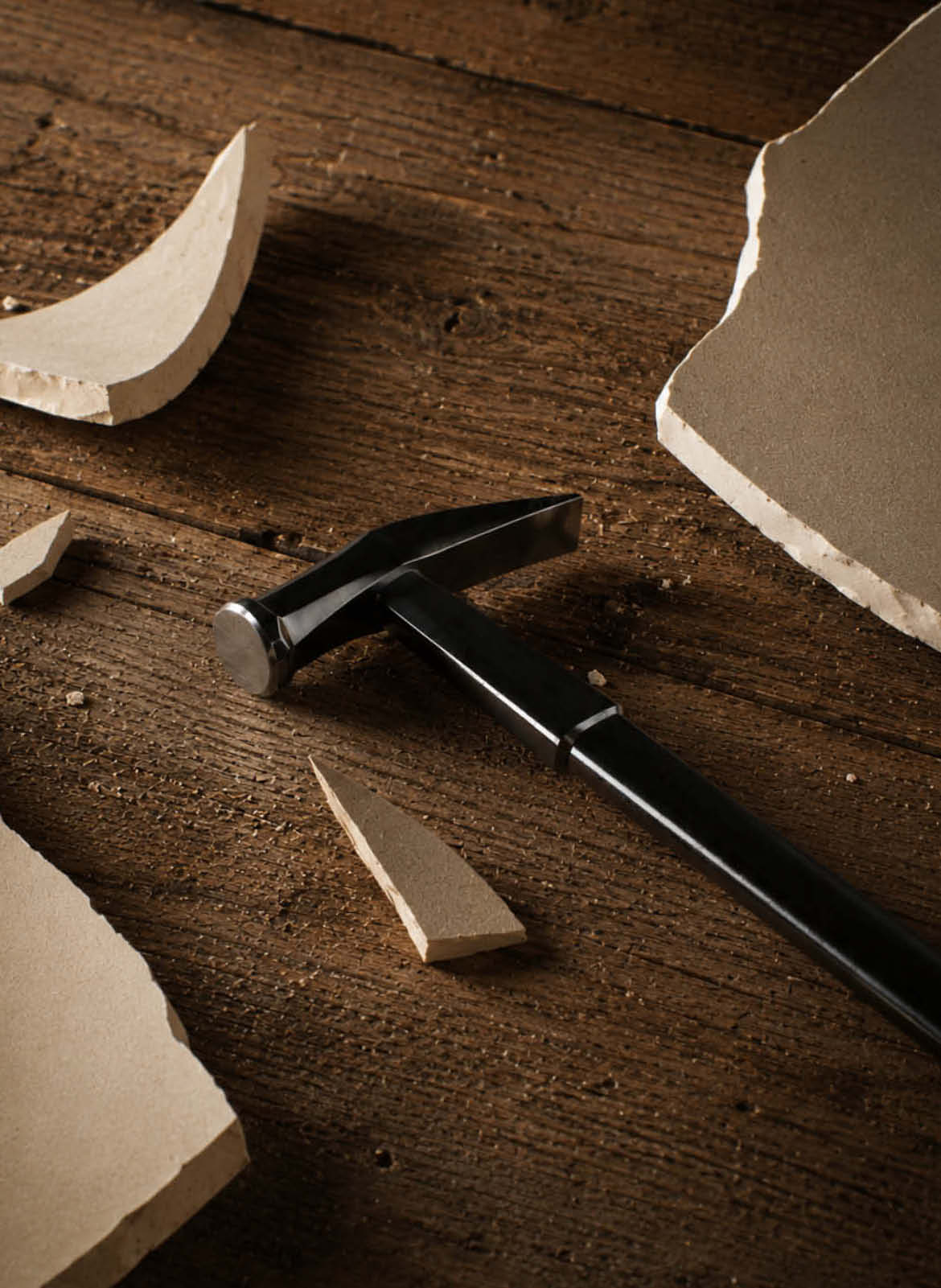
This deliberate act transforms access into ritual. The packaging asks the owner to make a conscious decision, replacing passive ownership with a moment of commitment. Every fracture becomes unique, ensuring no two opening experiences are ever the same.
The concept draws inspiration from the Heath Spotted Orchid, a rare wildflower found on the Glenrothes estate. Thriving only under precise conditions, it became a metaphor for rarity, patience and reward. Rather than expressing these ideas through decorative graphics, they became embedded within the behaviour of the object itself.
Limited to just 102 bottles worldwide, The Glenrothes 51 was conceived as more than a collector’s release. It became an exploration of how luxury can be experienced rather than simply possessed.
Challenge
Launching a whisky of this rarity required more than an exceptional bottle. The presentation needed to reflect over five decades of patience and craftsmanship while standing confidently amongst the world’s most prestigious luxury spirits.
The challenge was to create a packaging experience that felt timeless rather than trend-led, balancing heritage with contemporary luxury. Every interaction, from the first impression through to the final reveal, needed to communicate rarity, precision and authenticity without relying on unnecessary embellishment.
Approach
Rather than approaching the project as a conventional packaging exercise, we designed the entire ownership experience.
Every stage of the journey was carefully choreographed, considering not only how the product would appear on display, but how it would feel to receive, handle and ultimately open.
Working closely with The Glenrothes and manufacturing partners Zone Creations, we developed the project collectively from initial concept through to production, ensuring every structural, graphic and material decision supported a single creative vision.
Mechanical Design
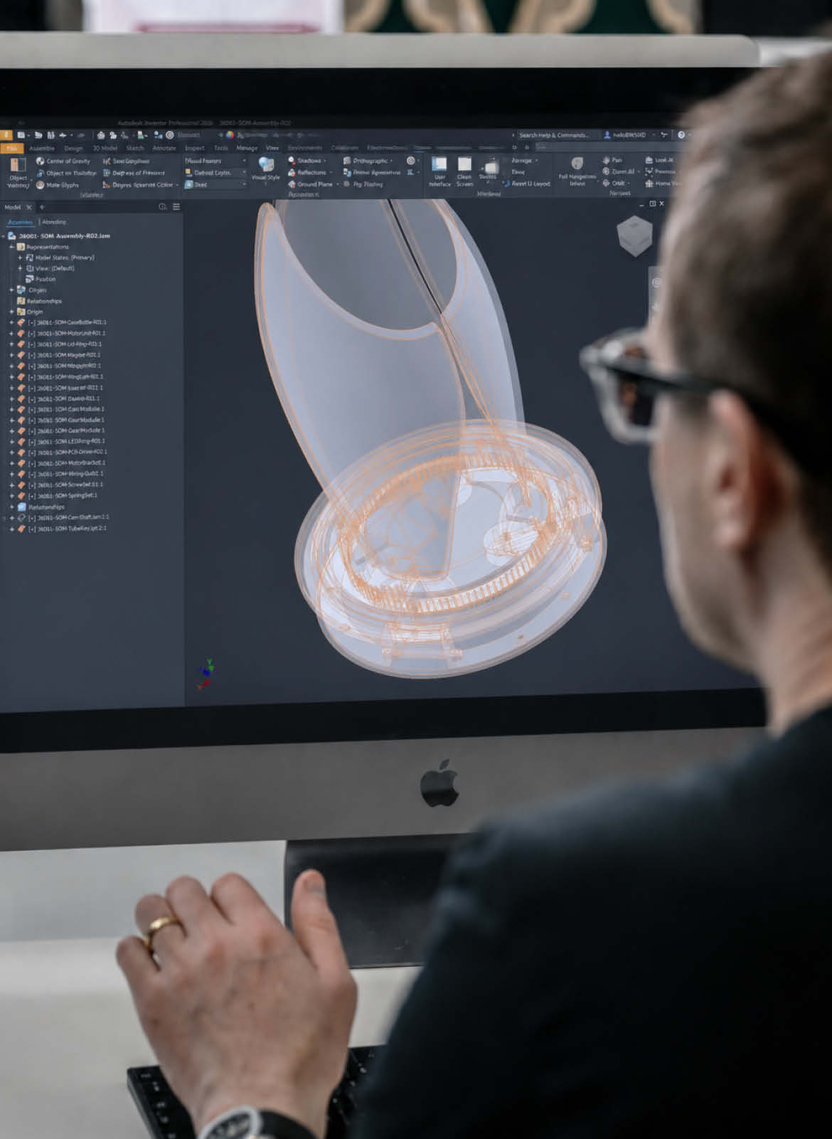
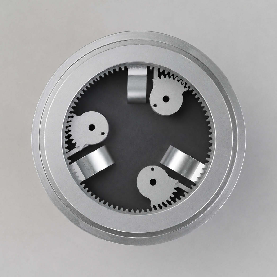
The presentation case was designed to slow the opening experience, creating a deliberate sense of anticipation before revealing the whisky within.
Structural engineering, proportion and sequencing were considered together, ensuring every movement felt natural and purposeful. Hidden details, precision tolerances and carefully controlled reveals transformed the act of opening into part of the ownership experience itself.
Teasing the Unknown
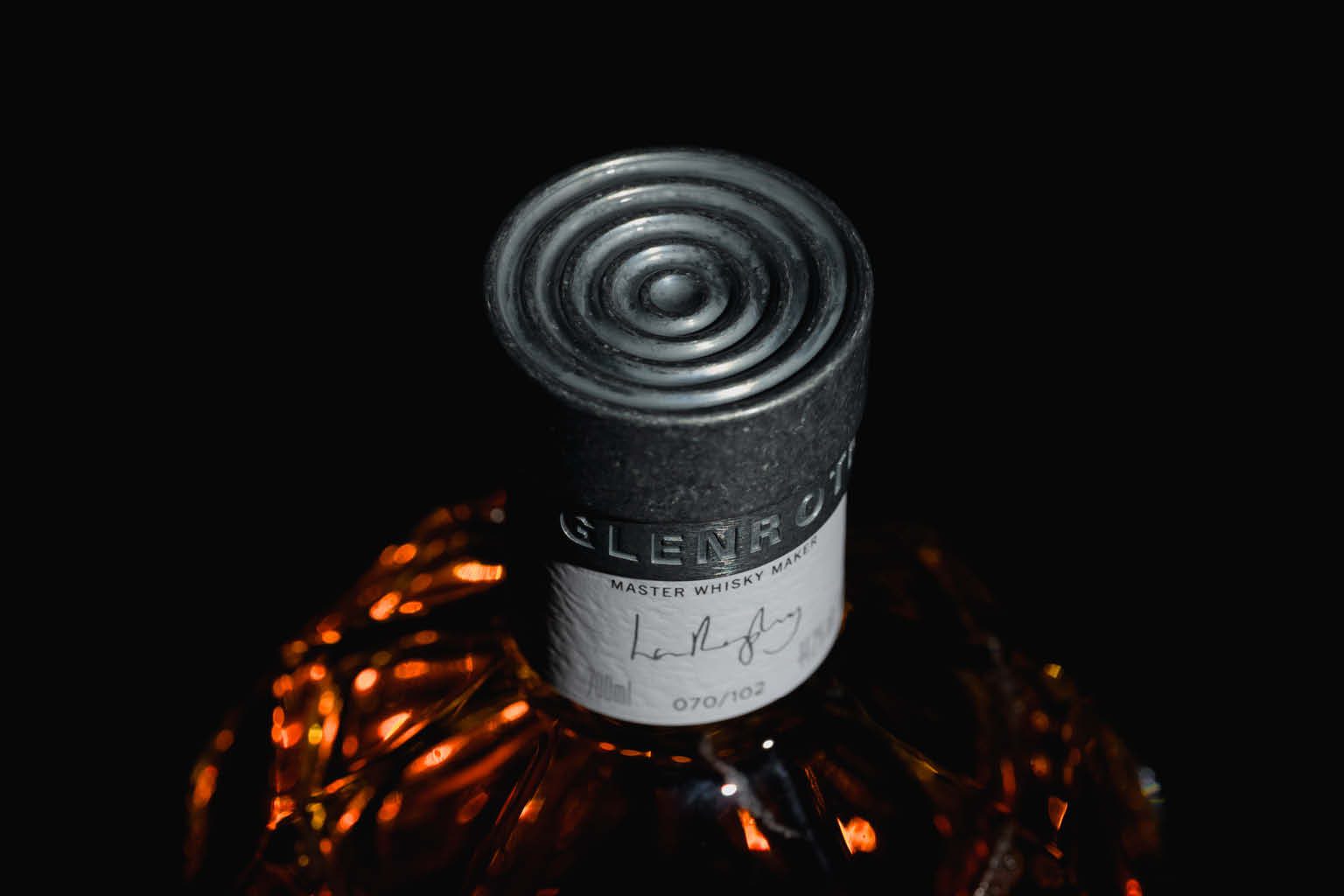
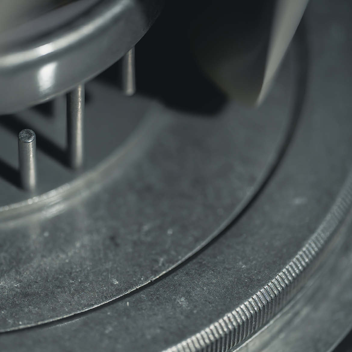
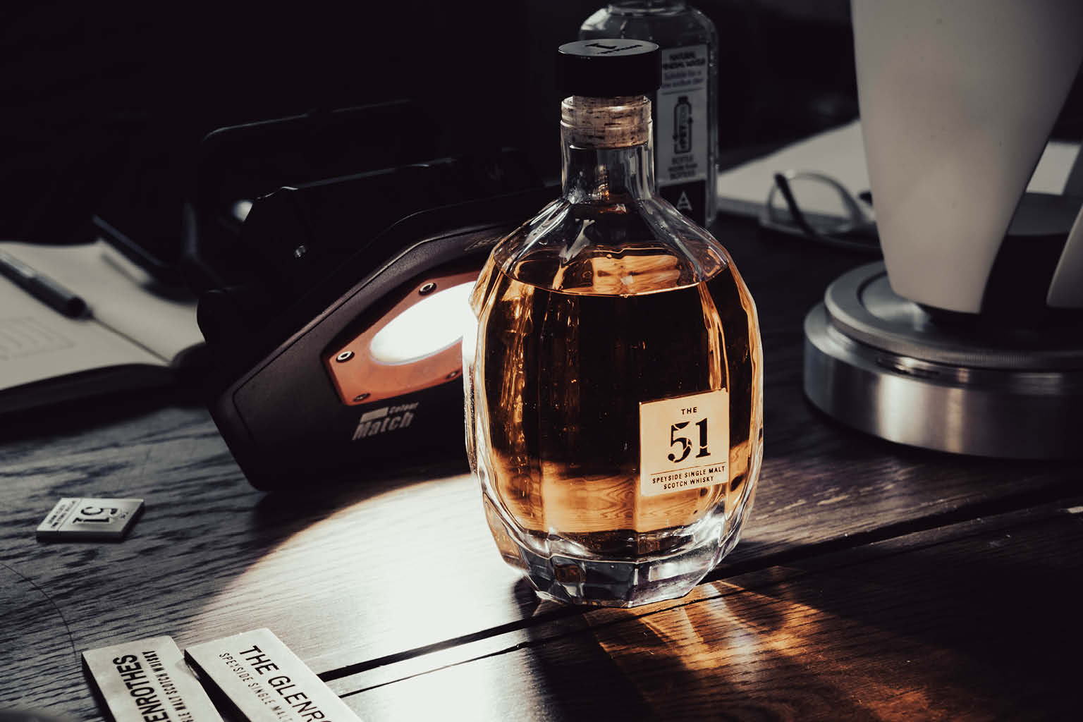
With the product remaining strictly under embargo, conventional launch photography wasn’t an option. The bottle, packaging and opening experience couldn’t be revealed before release, yet the campaign still needed to generate intrigue and anticipation.
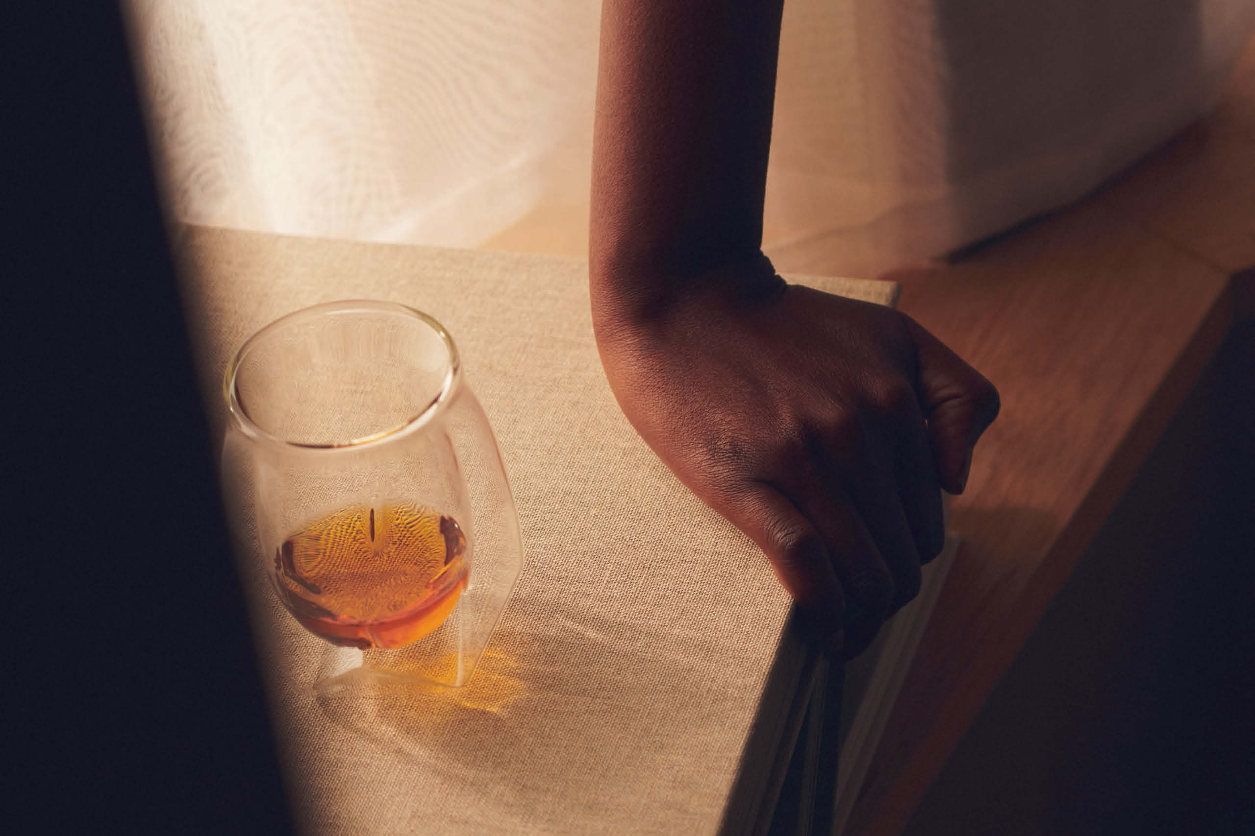
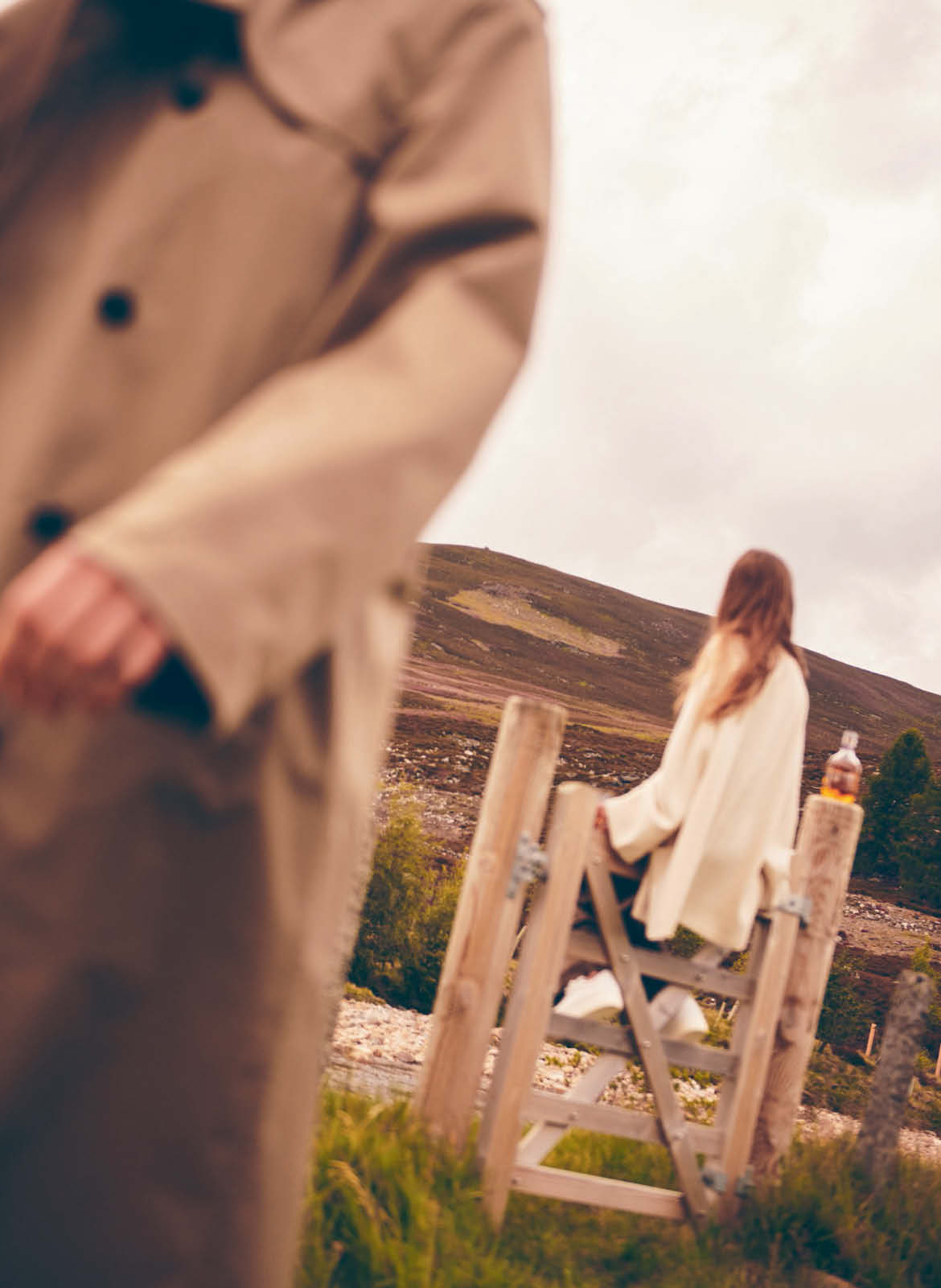
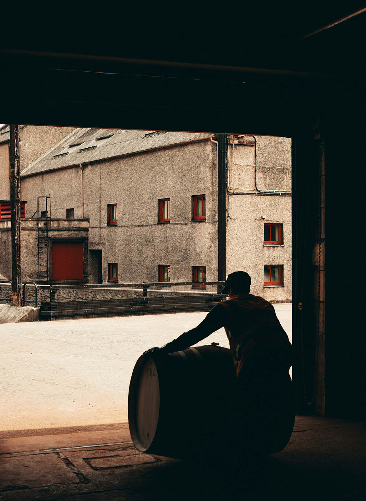
Working closely with photographer Ryan Johnston, we developed an art direction centred around concealment rather than disclosure. Instead of showing the product, the imagery explored atmosphere, texture and fragmented details, revealing just enough to spark curiosity without compromising the story.



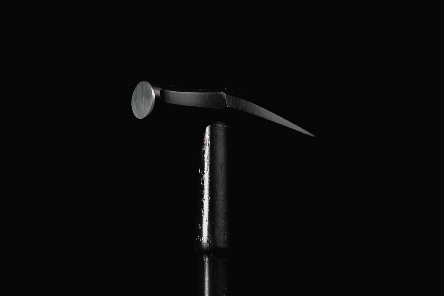
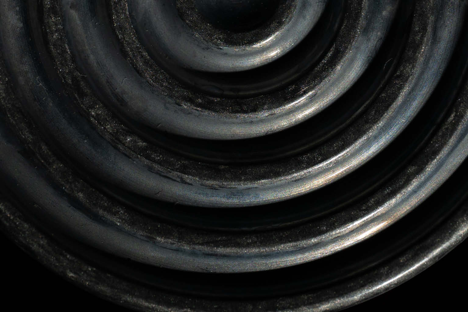
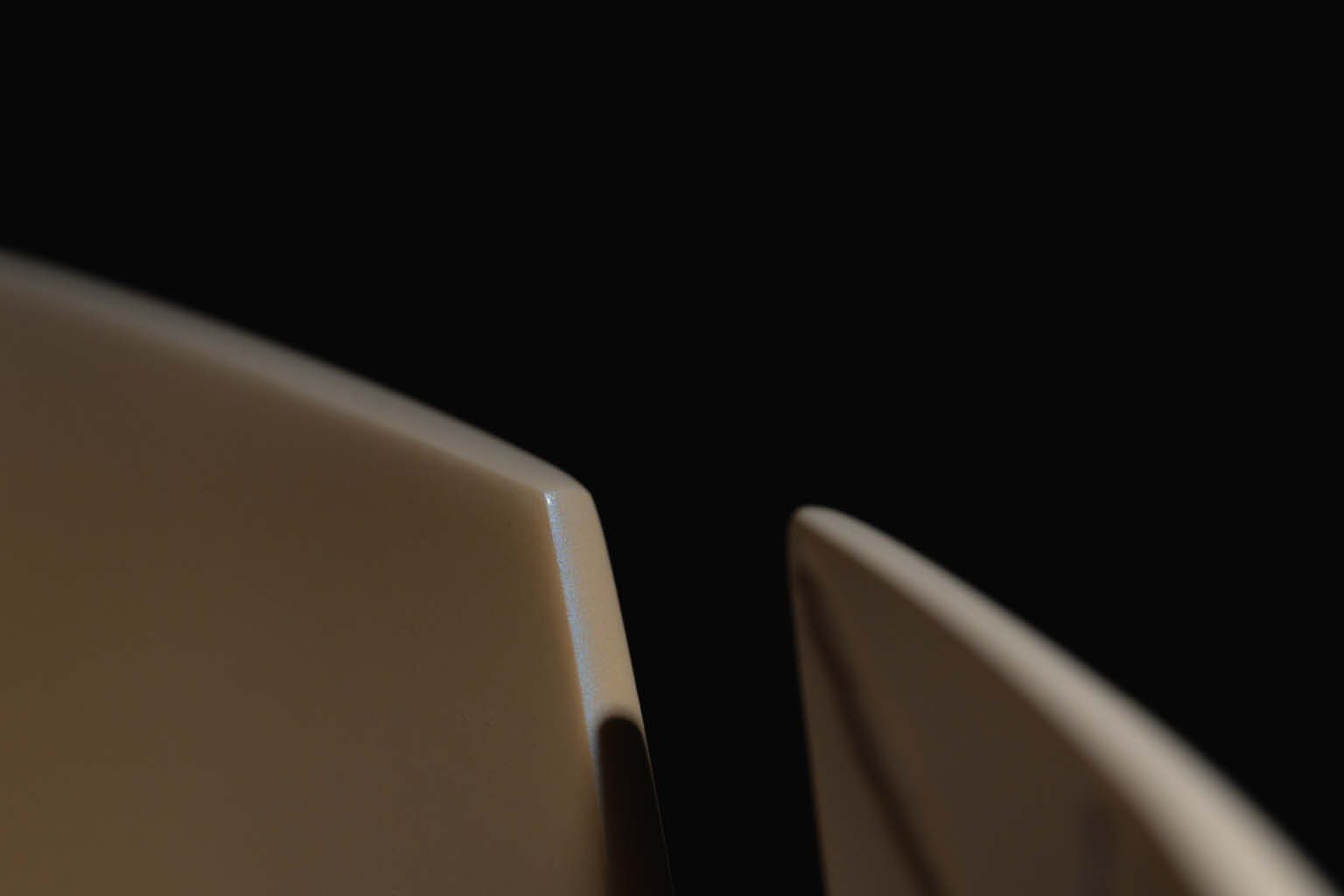
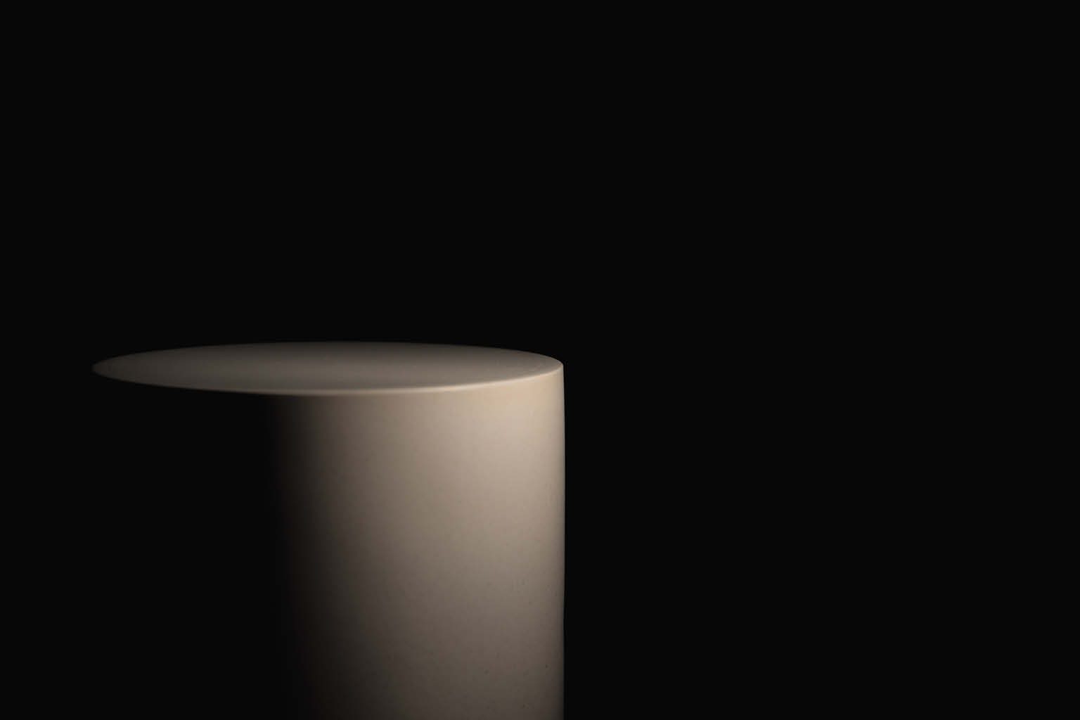

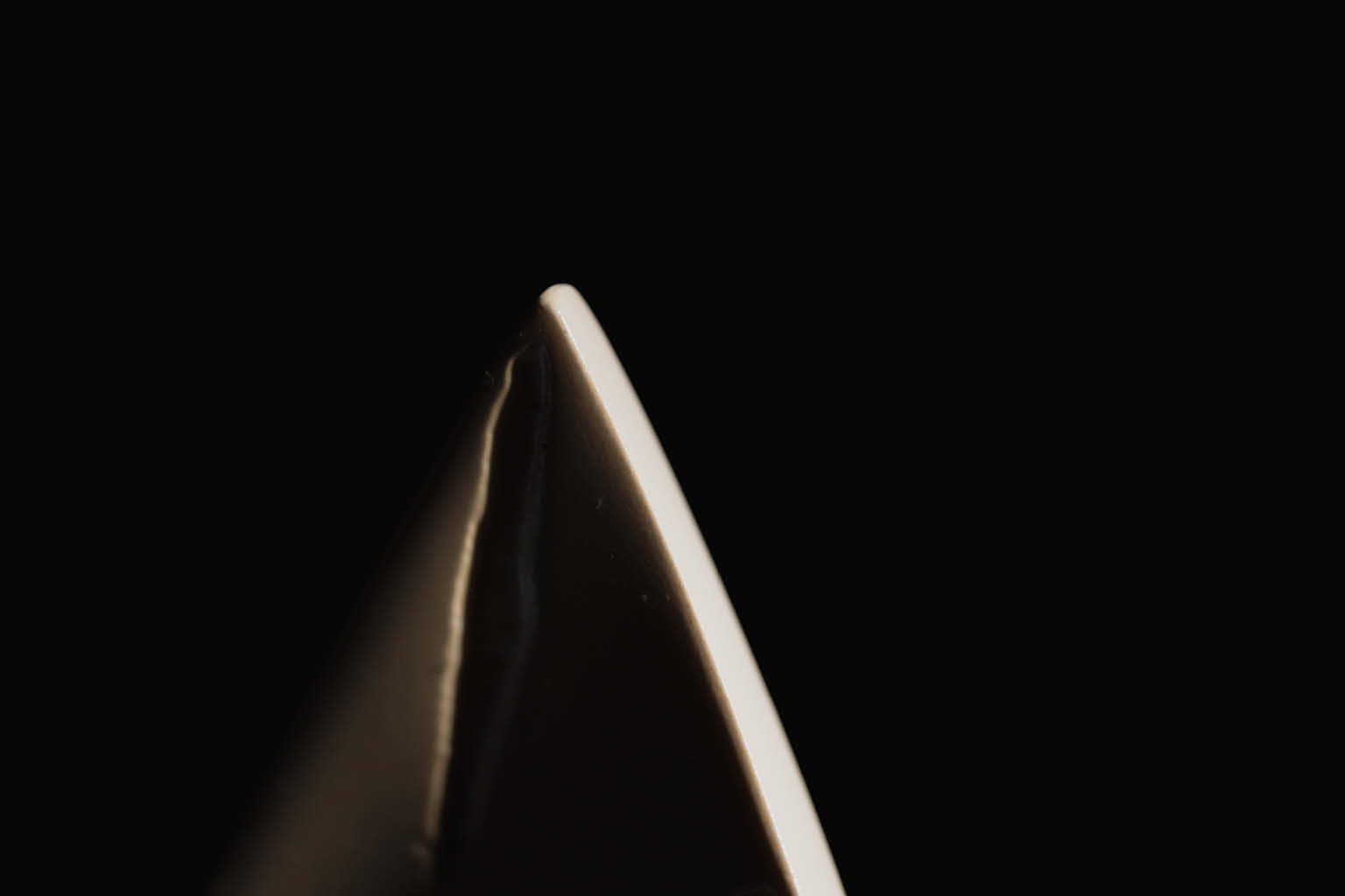

Light, shadow and material became the focus. Abstract compositions, close-up studies and carefully controlled framing hinted at the craftsmanship behind the project while preserving the mystery at its core. Every image was designed to ask questions rather than answer them, allowing anticipation to build naturally ahead of the official launch.
The resulting campaign demonstrated that effective product photography doesn’t always require the product itself. By embracing restraint, the teaser imagery became an extension of the concept, inviting audiences to imagine what lay beneath the surface before the reveal.
Materials & Craftsmanship
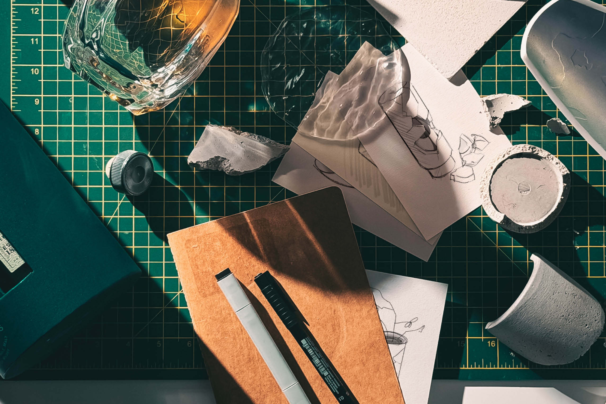
Material selection became one of the defining aspects of the project.
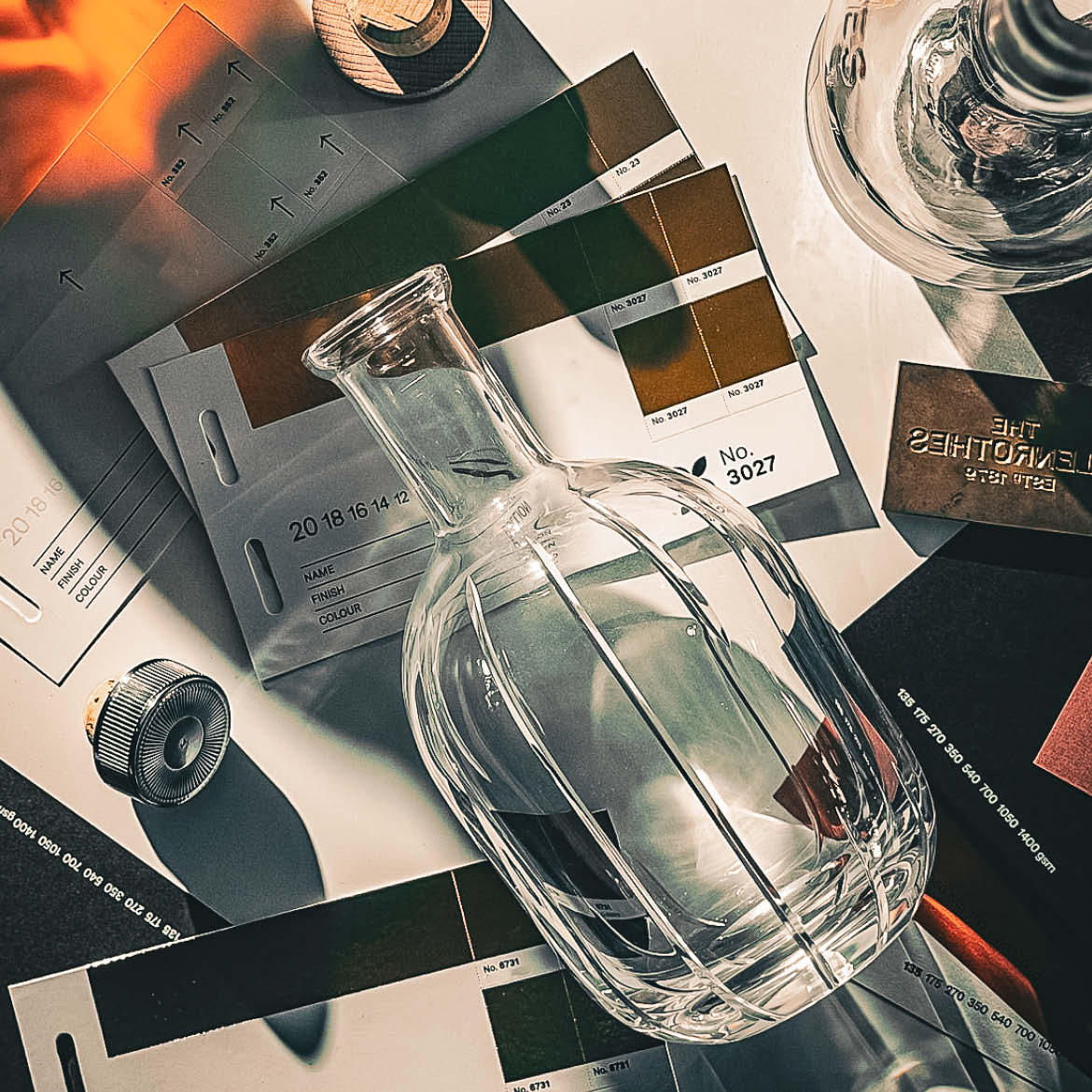
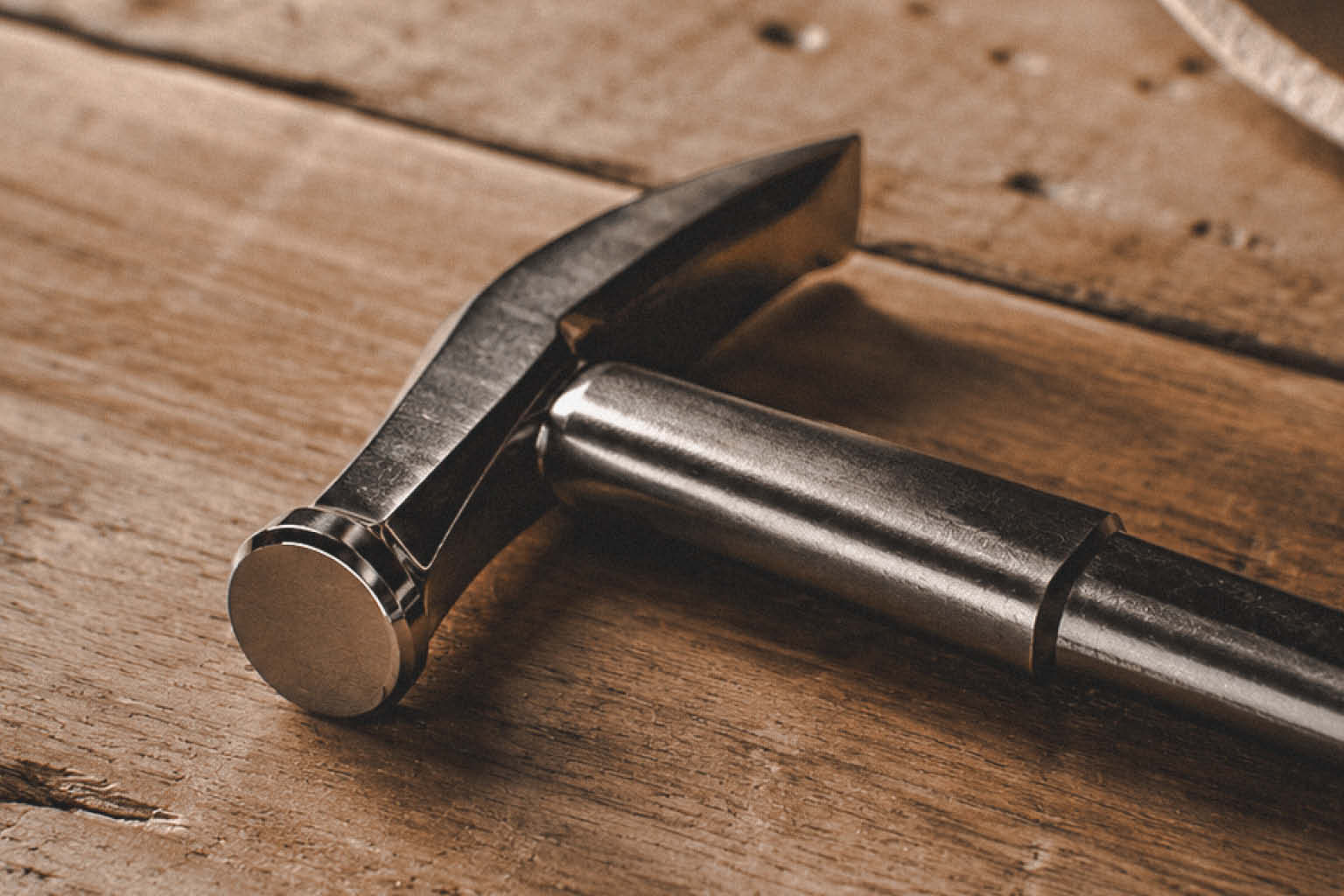
Every finish was chosen for its tactile qualities as much as its appearance, creating an object that felt substantial, refined and enduring. Premium materials, precision manufacturing and carefully specified finishes worked together to communicate the same level of craftsmanship invested in the whisky itself.
Rather than competing for attention, each material was selected to complement the product, allowing quality and restraint to become the defining characteristics.
Brand Expression
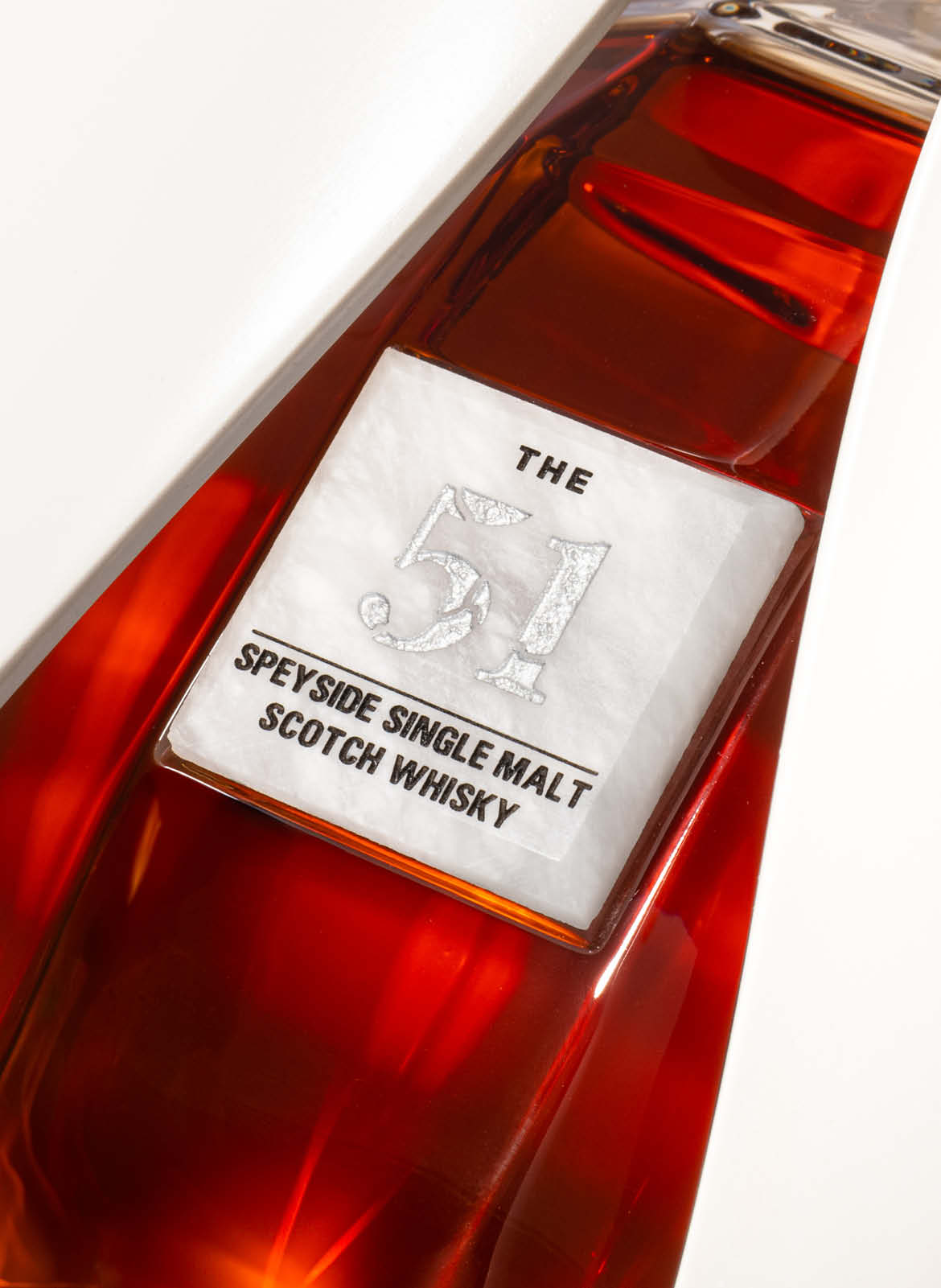
The visual language was intentionally understated.
Typography, graphic detailing and colour were reduced to only what was necessary, allowing the craftsmanship of the presentation and the significance of the whisky to remain the focus.
Every graphic element was carefully positioned to reinforce authenticity, provenance and collectability while maintaining consistency across every component of the presentation.
Production
Luxury packaging is only successful when creative ambition can be realised through manufacturing.
Throughout development we worked closely with specialist suppliers to refine construction methods, material specifications and finishing techniques, ensuring the final product matched the original creative intent without compromise.



Completing the Story
Breaking the vessel is only half of the experience.
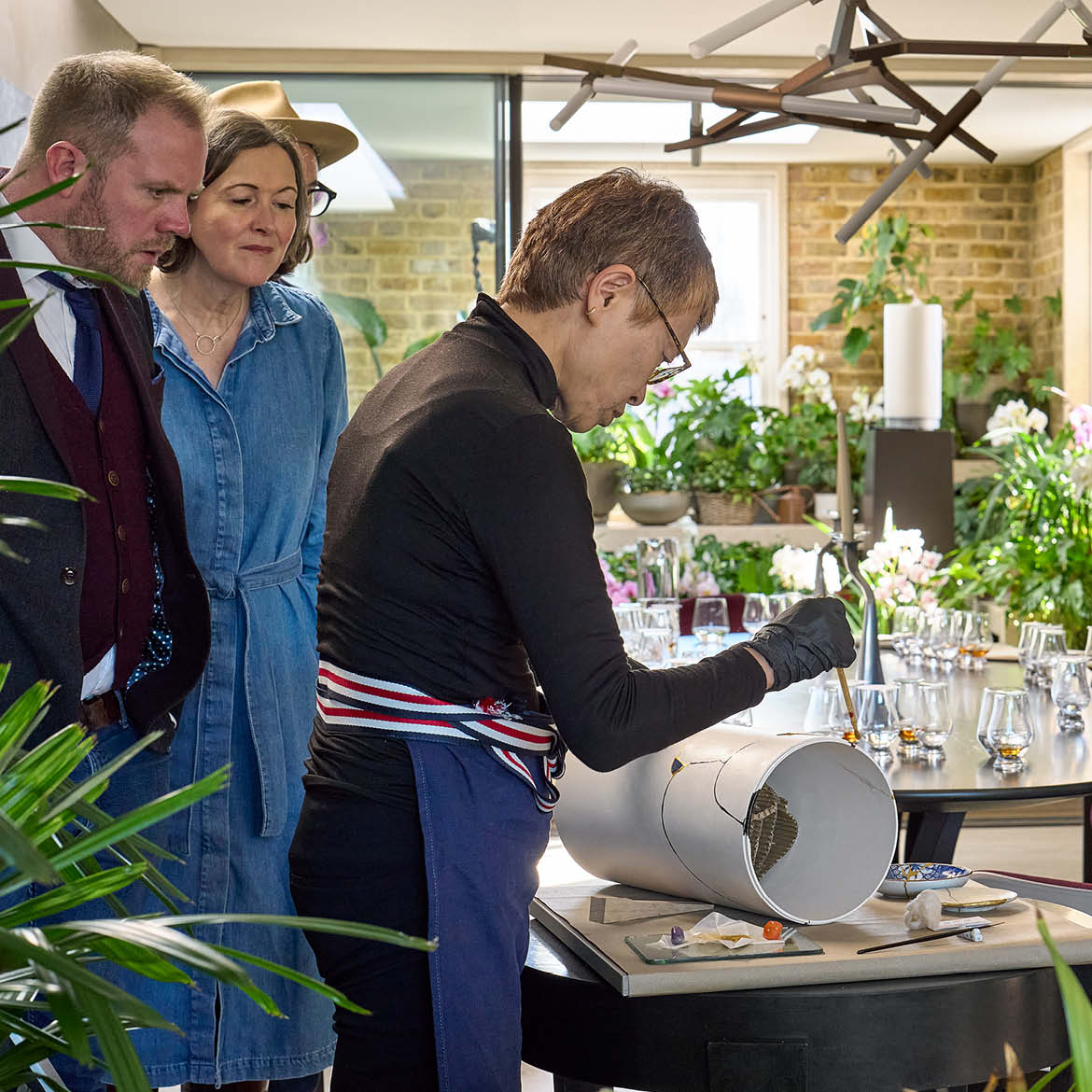
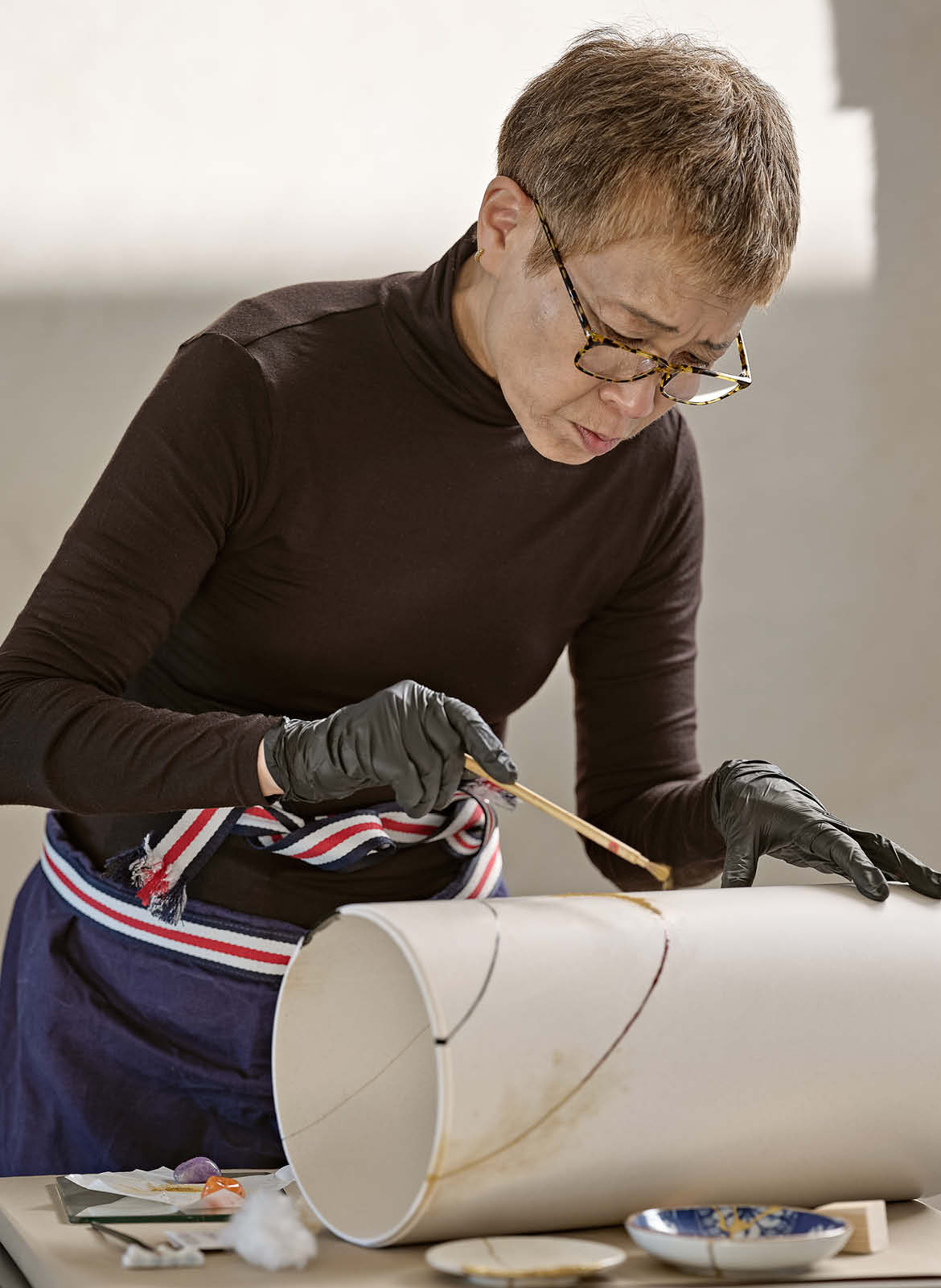
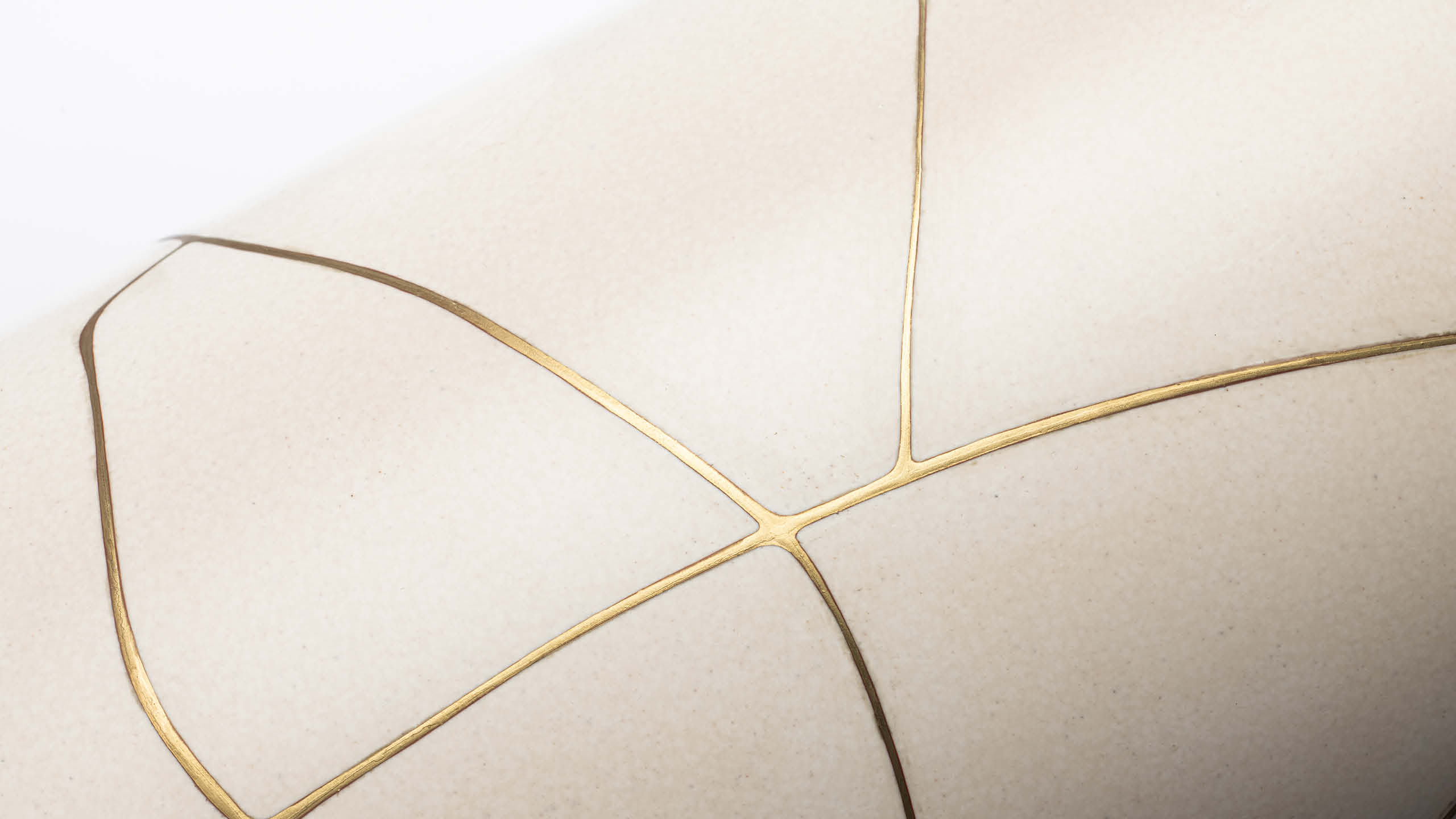
Owners are invited to return the fractured Jesmonite pieces to be restored using a kintsugi-inspired process, where cracks are repaired and celebrated using precious metal. Rather than hiding damage, the repair permanently records the moment the Whisky was opened.
Inspired by the Japanese philosophy of embracing imperfection, the restored object becomes a unique artefact. No two can ever be the same, with every fracture telling the story of a single bottle and a single owner.
This final stage transforms what might have become discarded packaging into a lasting keepsake, reinforcing the central idea that value comes not from preservation, but from experience.
Results & Recognition
The Glenrothes 51 redefined what a luxury whisky experience could be, transforming packaging from a protective object into an integral part of the product itself. Every interaction, from the anticipation of breaking the Jesmonite column to the restoration of the fragments through kintsugi, was designed to create a lasting emotional connection between the owner and the whisky.
The project has received international recognition for both its creative vision and technical execution, winning Gold at the Scottish Design Awards, DIELINE Luxury Packaging, and Paris Packaging Week Hyper Luxury. Together, these awards recognise not only the craftsmanship of the finished piece, but the ambition to challenge conventional luxury packaging through storytelling, material innovation and experience-led design.
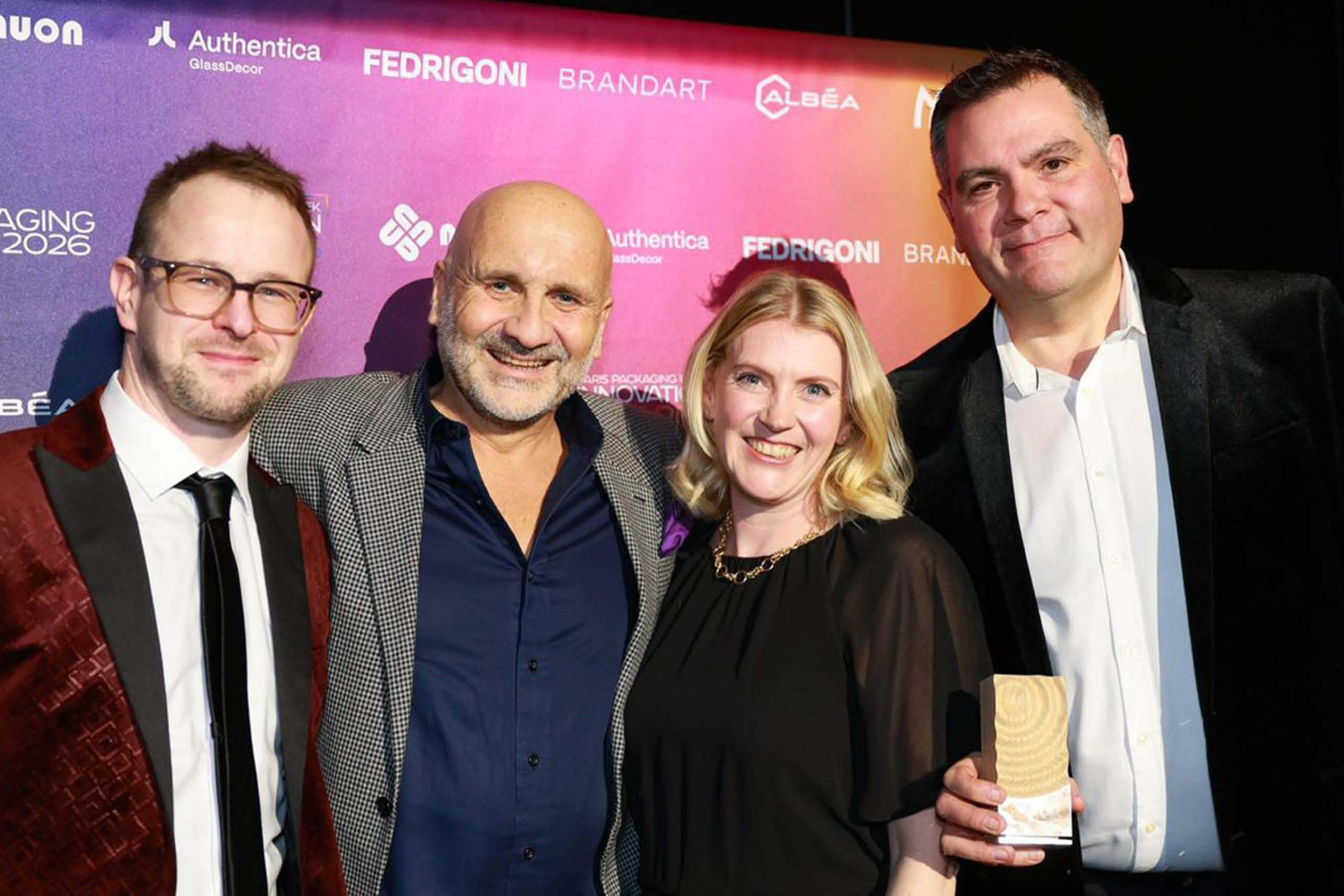
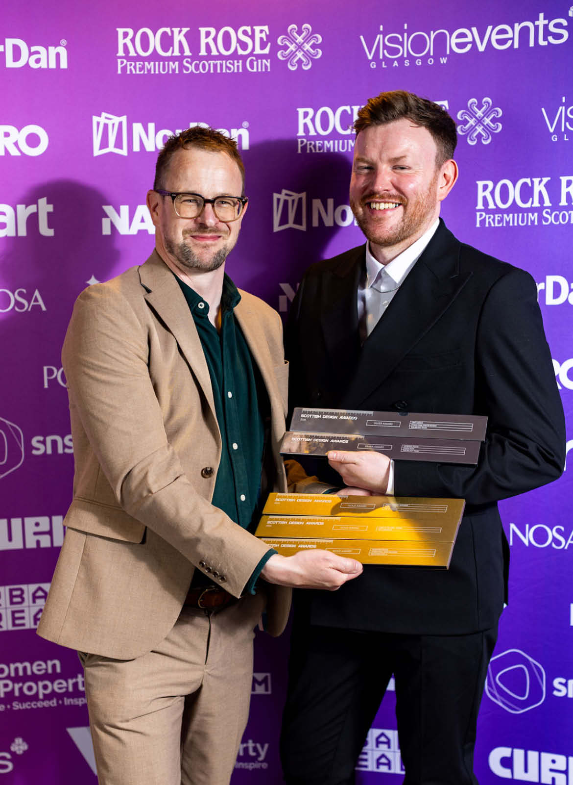
Beyond the design industry, the project attracted significant international editorial coverage, appearing in leading publications including Bloomberg, Forbes, and Robb Report, where it was recognised as one of the year’s most innovative luxury whisky releases.
The concept also earned praise from Jonny Fowle, Global Head of Whisky & Spirits at Sotheby’s, whose recognition reinforced the project’s relevance not only as a piece of design, but as an important contribution to the world of rare and collectible whisky.
“Collectors are looking to be incentivised to drink their whiskies, and herein lies a great new approach to this very problem. The 51 is for the true lovers of whisky; those who interact, drink, and enjoy Scotch.”
Jonny Fowle
Global Head of Whisky & Spirits, Sotheby’s