Harley of Scotland
Pioneers of exceptional Scottish knitwear since 1929
Brand
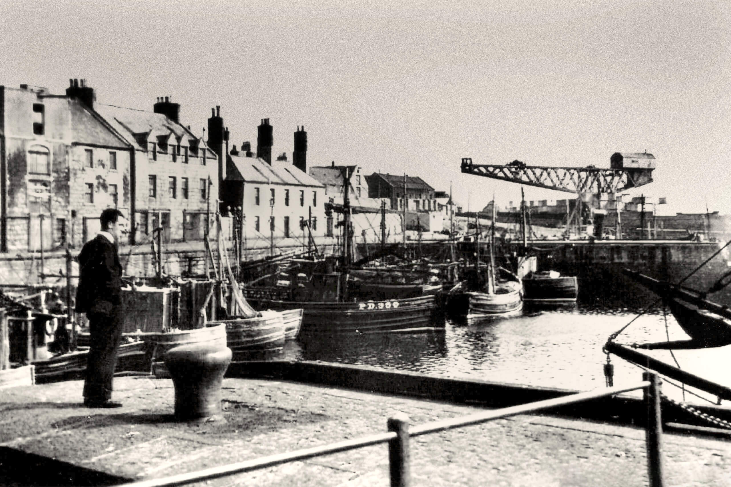
Pioneers of exceptional Scottish knitwear since 1929, Harley of Scotland have gained global recognition for excellence and progression in their advanced knit technology. Harnessing almost a century of textile knowledge and technical expertise spanning three generations of the Harley family – Harley of Scotland are market leaders in seam free whole garment knitwear. With a heritage anchored in fair isle knitting techniques, Harley garments draw inspiration from the local landscapes and culture of the North-East and Northern Isles of Scotland.
Harleys originally approached us with the ambition to build a new modernised website, but after engaging the team in an initial workshop we established the need to holistically redefine their brand in a way that would communicate the craftsmanship, sustainability and innovation that their knitwear company celebrates, as well as conveying the inspiring story of this now third generation family-run business.
The Brief
Harley’s original visual identity had remained relatively unchanged since its conception in 2000, and as the company evolved over the last 20 years, a lack of unification between look, feel and voice had transpired. We worked in close collaboration with the team at Harley’s to implement a comprehensive overhaul of the brand, creating a necessary consistency and cohesion between their on and offline presence, whilst illuminating the meaningful family-oriented legacy of the business.
Our Approach
We allowed Harley’s inspiring heritage to govern our brand refresh, with storytelling and design at the heart of their new visual identity. We began by interviewing key yet diverse members of the family and staff, to capture an authentic sense of their collective experience of working within the company throughout the years. This formed the basis of brand guidelines we created to establish Harley’s tone of voice, positioning, and values, in addition to brand assets such as colour palette, typography and illustrations. All of these elements would guide packaging, print and exhibition design, as well as the new website and associated digital applications.

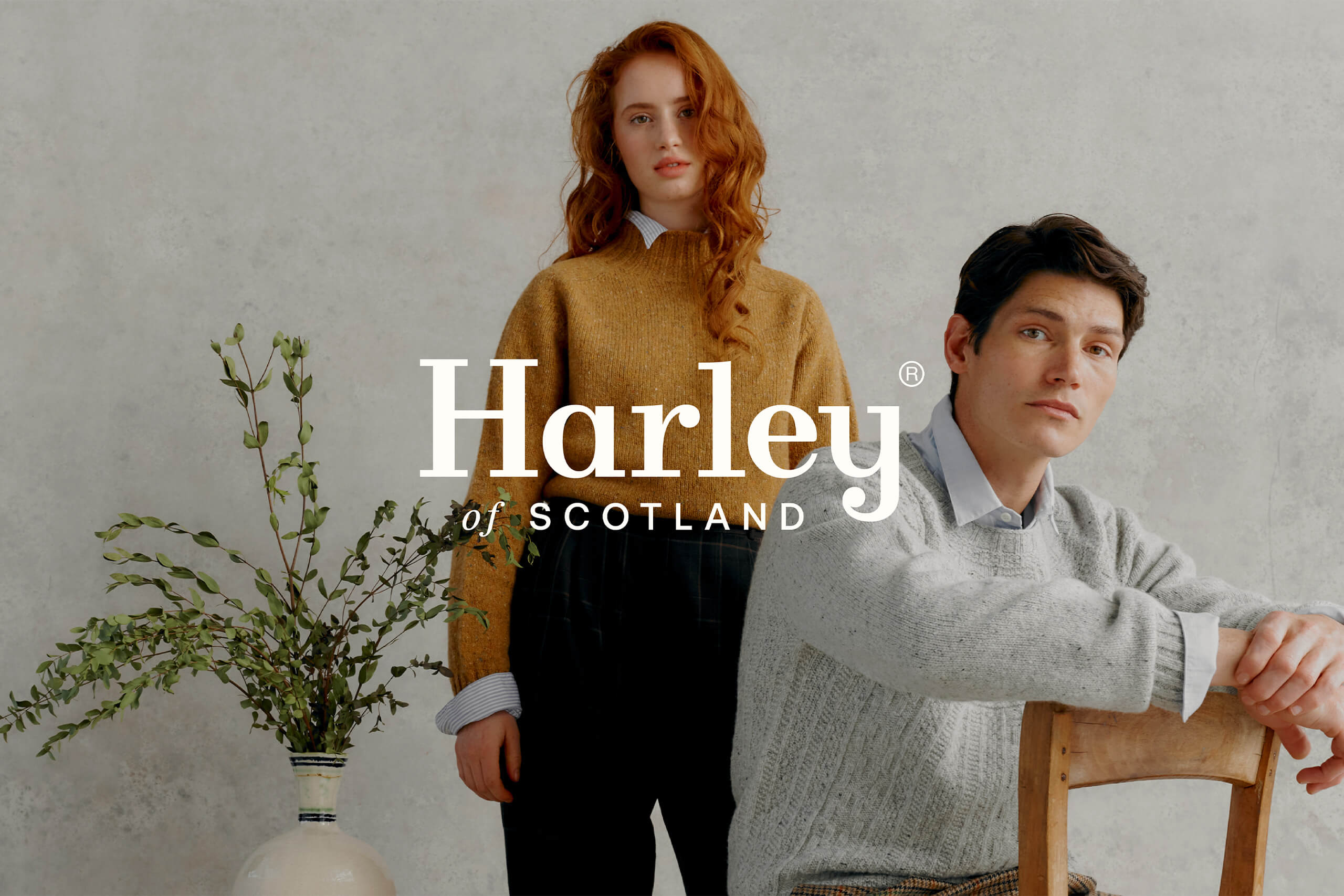
Brand Identity
We believe that often evolution rather than revolution can be more effective for clients with an established global customer base like Harleys, which is why when the team expressed their wish to preserve the essence of their brand identity, we were in total agreement. We therefore focussed on modification as opposed to stark change, in order to improve usability and adaptability, particularly across digital applications.
We worked in collaboration with Scottish type foundry Polytype to refine the Harley’s existing word marque and rework the statement line for balance and legibility at smaller scales. Although subtle, this adaptation significantly elevates the word marque, allowing it to function effectively across a diverse range of brand materials.
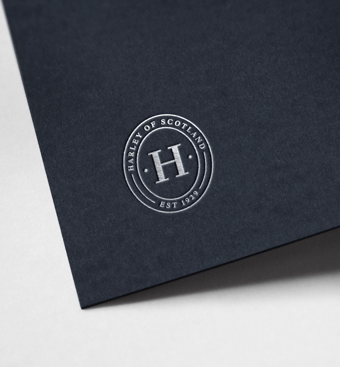
Logo marque
We also developed a recognisable word marque for use across smaller applications such as social media profile images or for packaging where the full logo wasn’t required. During the research stage of the brand refresh, we uncovered a Peterhead Skipper’s license dating back to 1928 – drawing inspiration both from the ‘Board of Trust’ crest and the typography used on the license, we created a marque that truly has roots in the past.
Colour/Typography
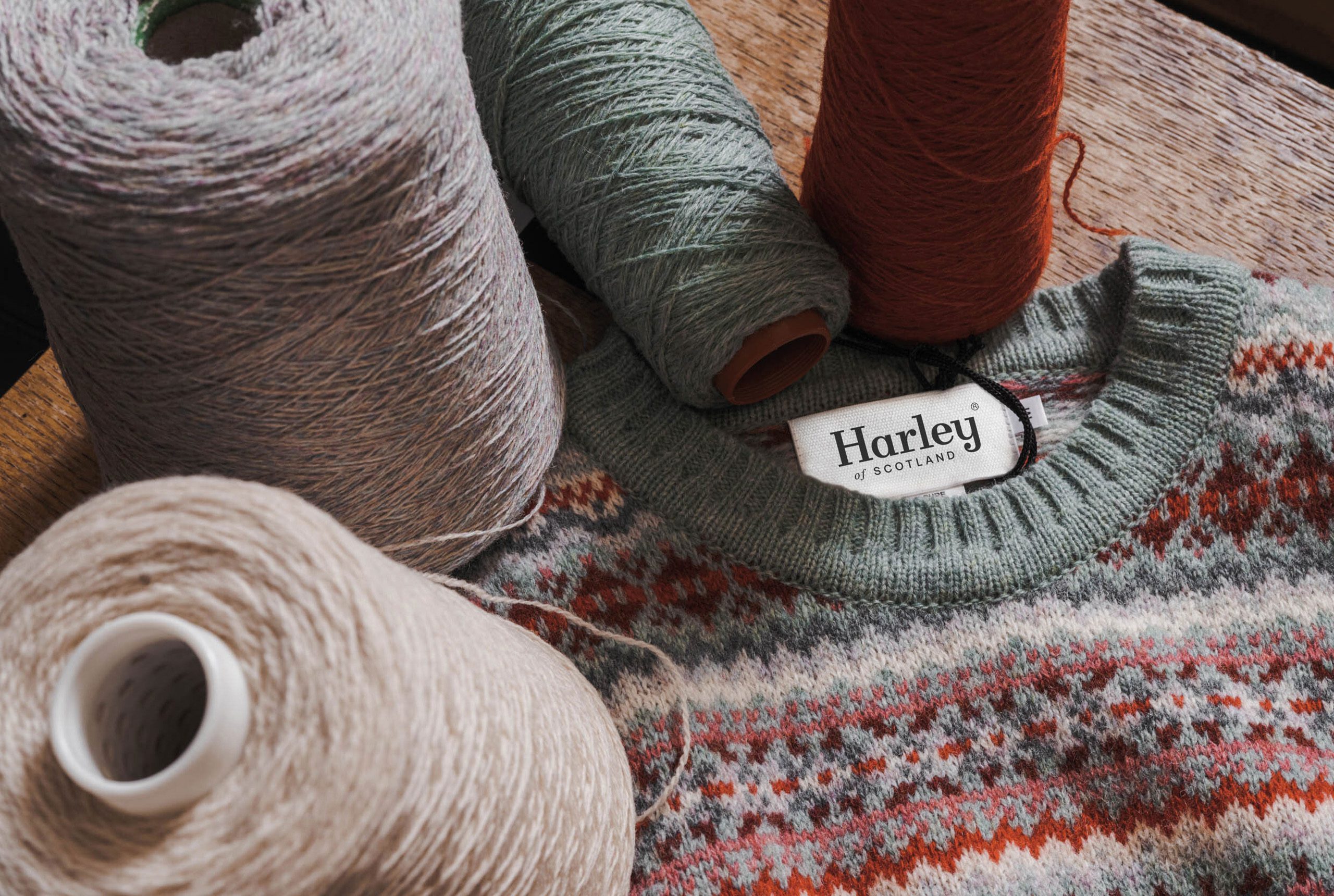
The new colour palette reflects the rich hues of the Northern Isles’ distinctive landscape, using carefully selected natural tones that would perfectly complement Harley’s beautiful knitwear. With an existing typeface that needed revitalisation, we sought typography that would blend modernity with tradition, echoing the company’s unique offering of contemporary garments created using historical methods. We settled on Rhymes Display, a serif font that would revive the brand’s marketing through a more type-driven aesthetic whilst sustaining the traditional allure so central to the brand’s identity.
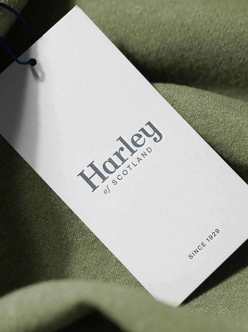
Print Material
We worked with Harleys to update their marketing materials with the revised brand identity, with a key focus on using sustainable materials wherever possible for printed items such as biodegradable jumper bags.

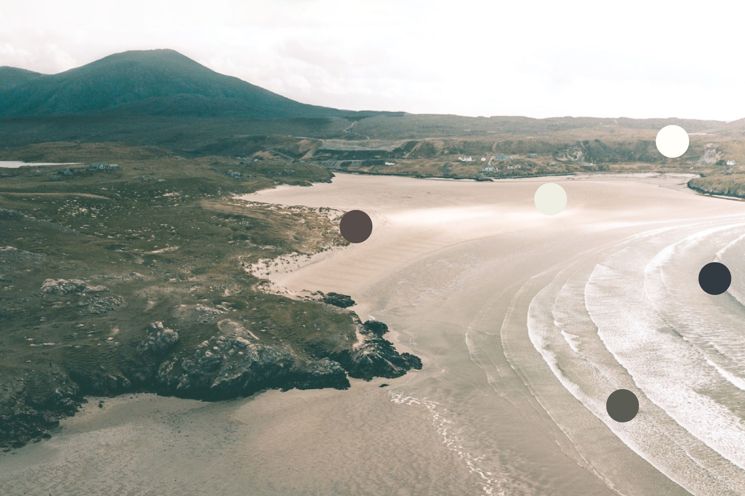
Photography
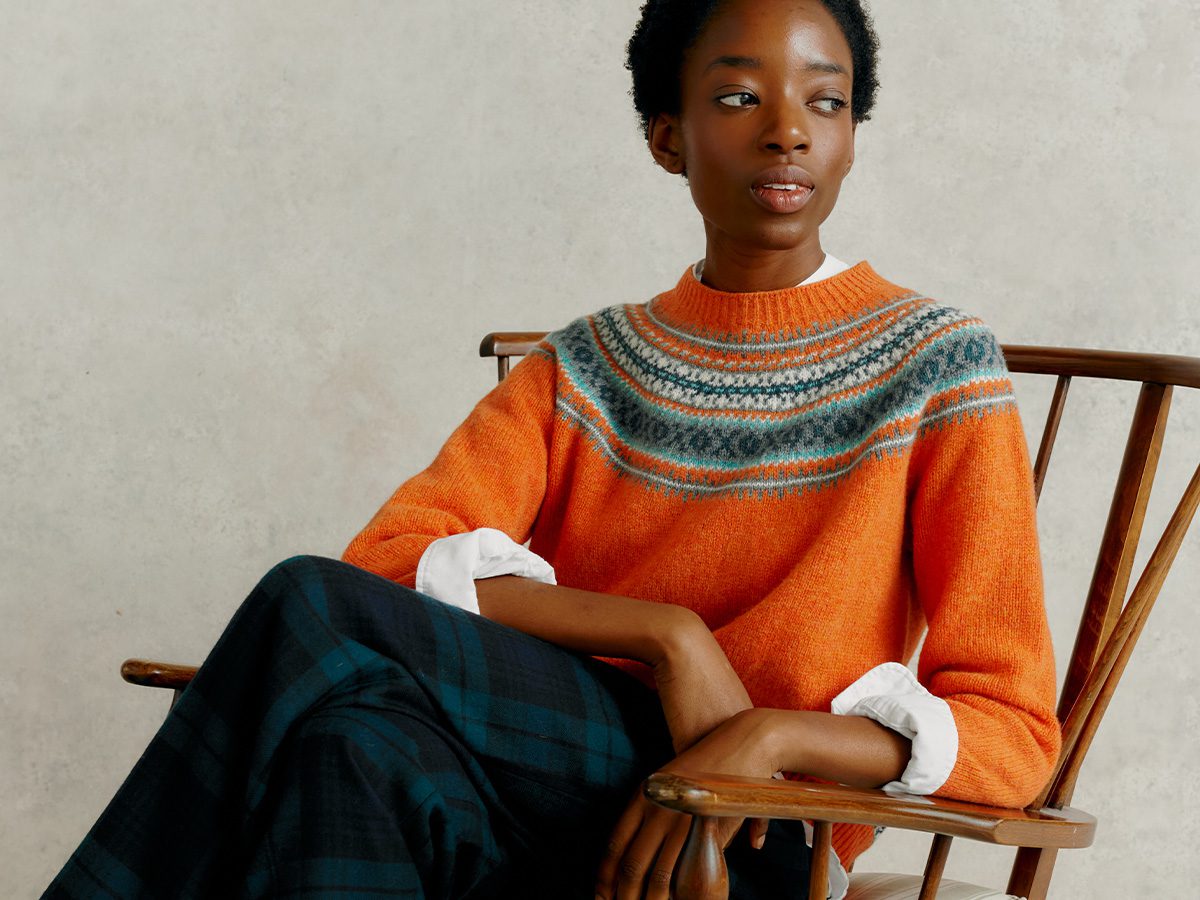
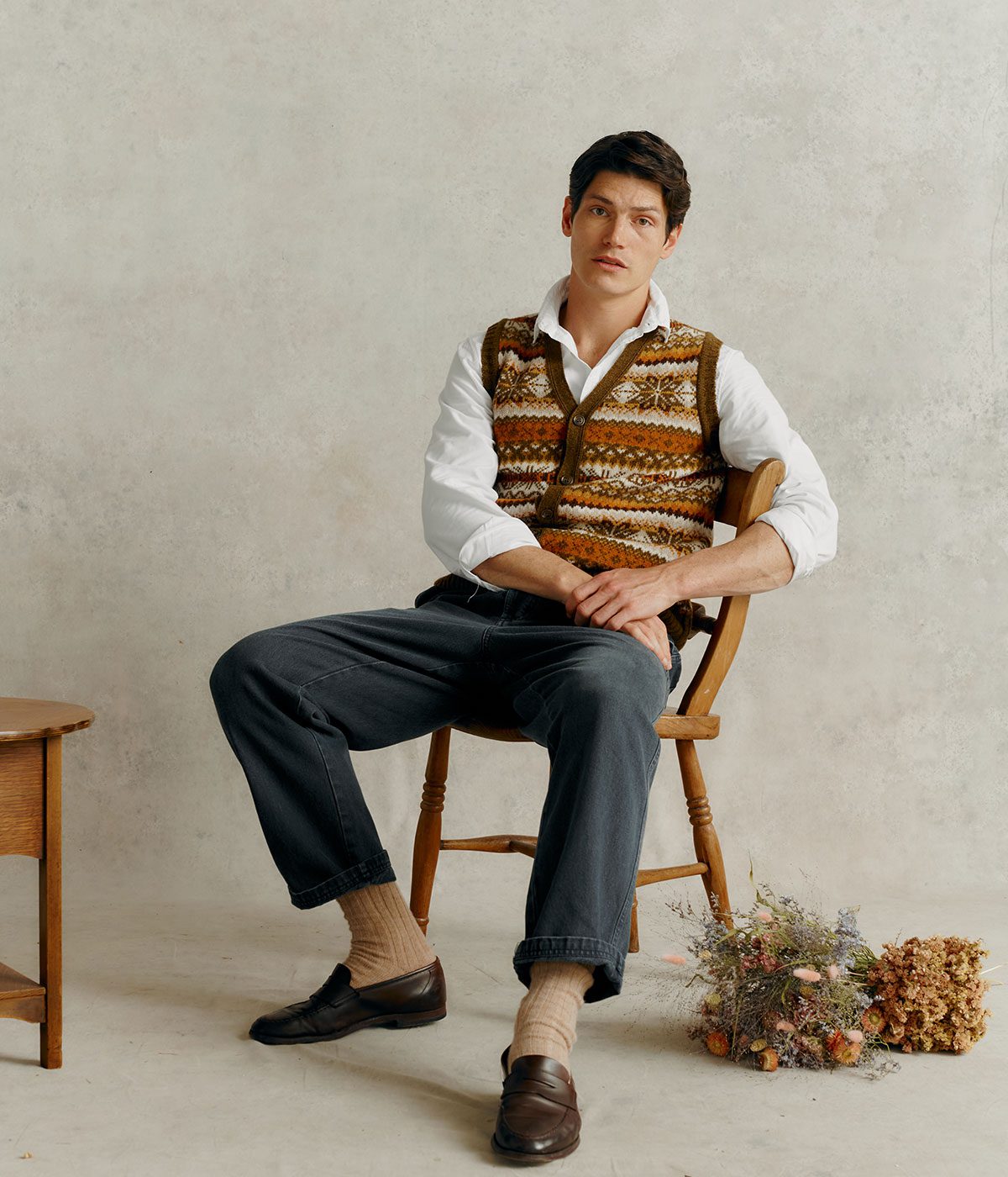
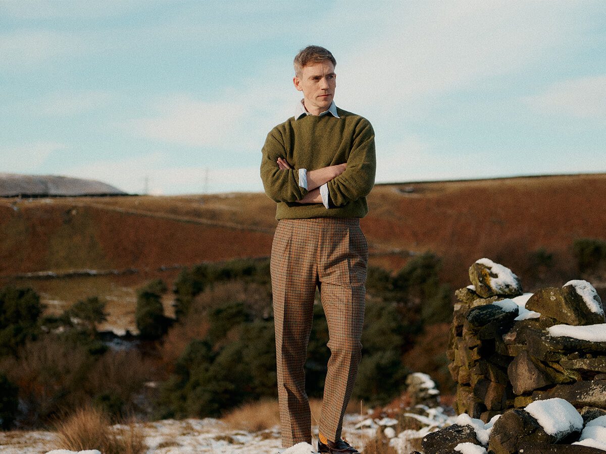
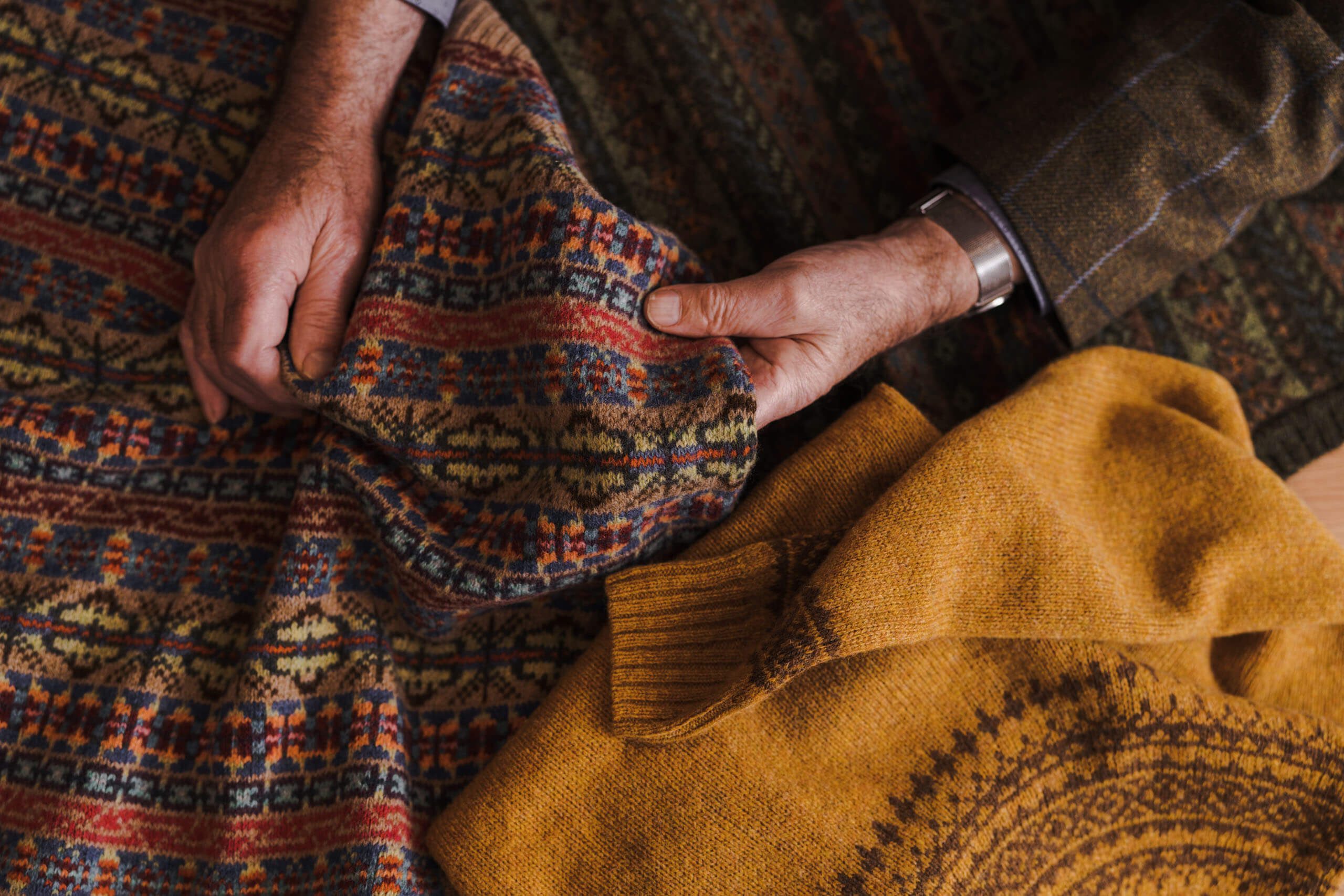
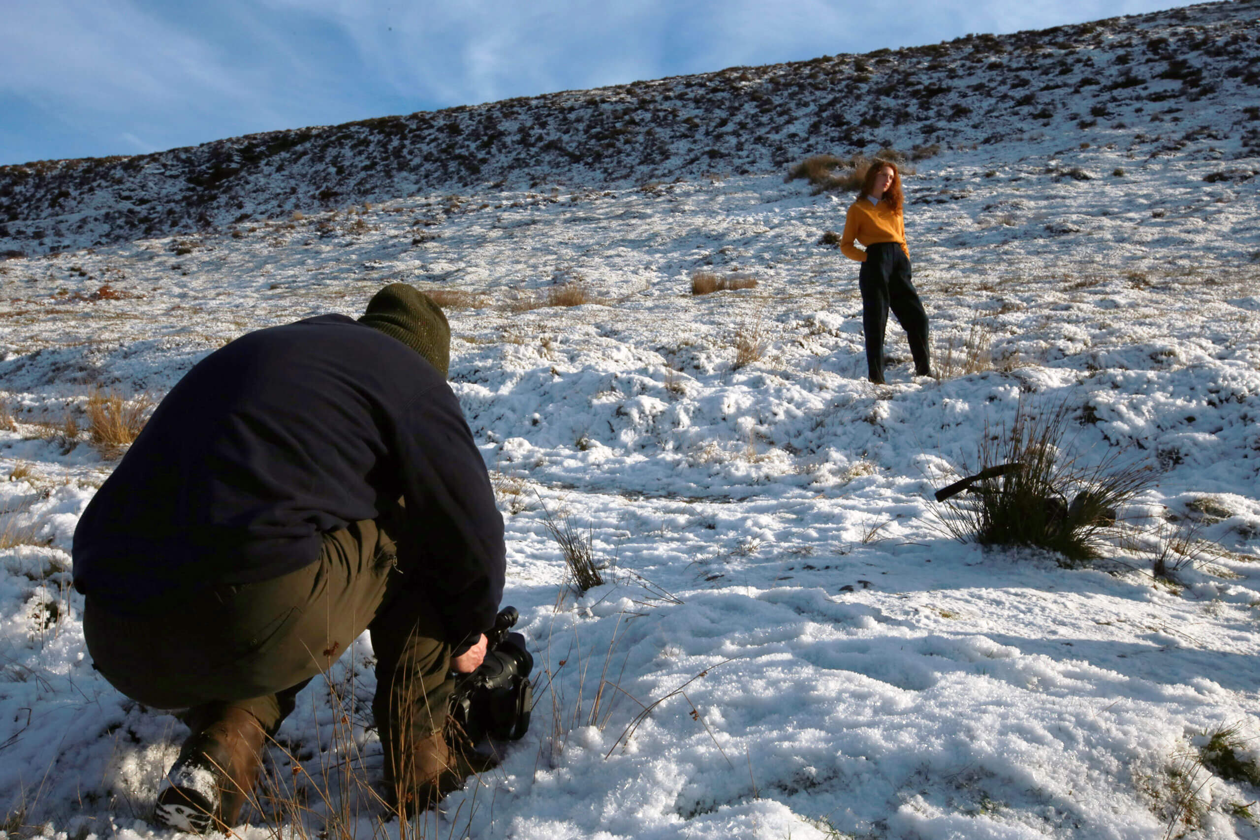
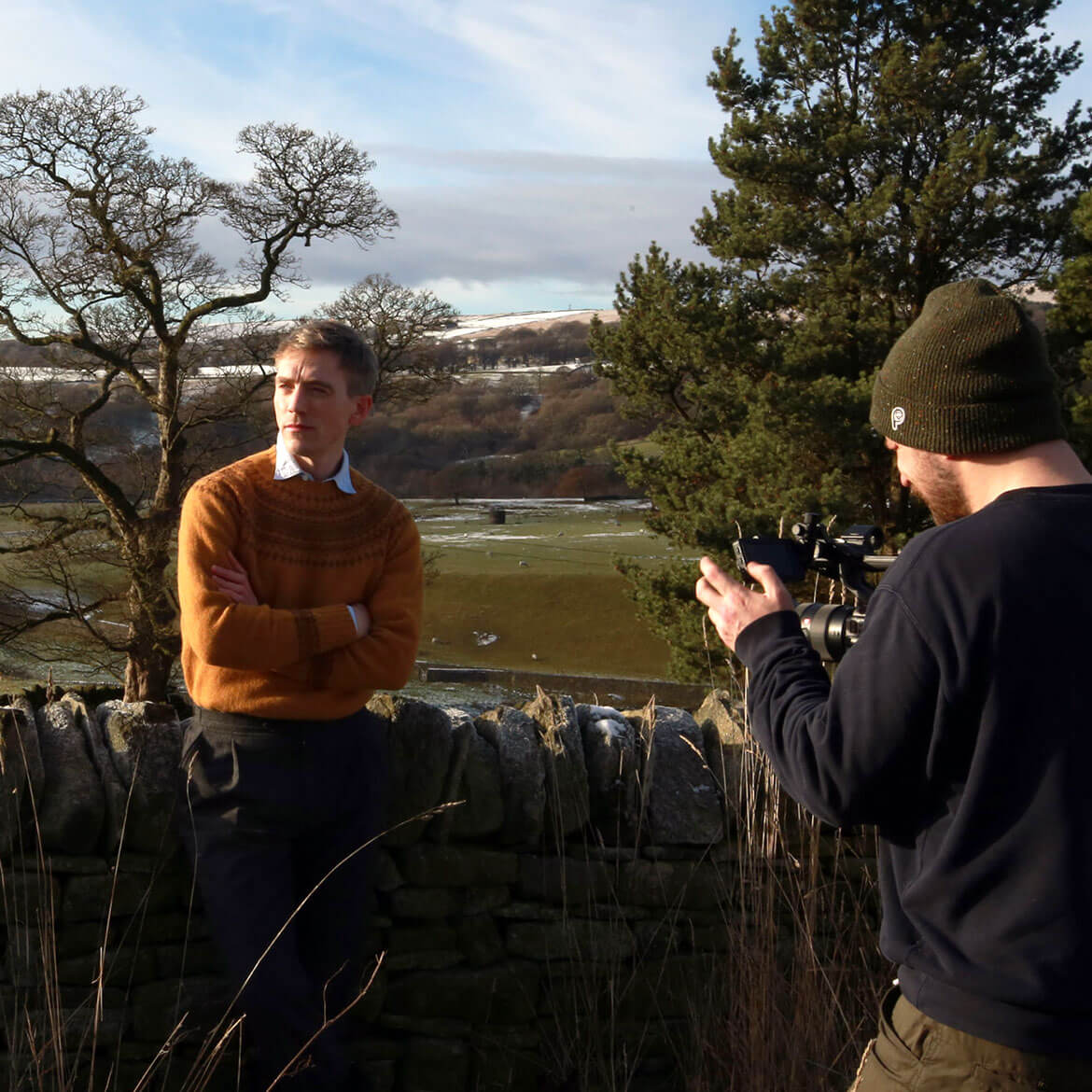
With knitwear that speaks for itself in quality and appeal, we knew that considered photography would play a significant role in this project. Working alongside talented art director Tom Leeper and photographer Jack Grange, Harley’s commissioned a series of studio and location shoots to ensure the brand’s heritage and inspiration was visually captured whilst evoking the contemporary edge we were working to convey.

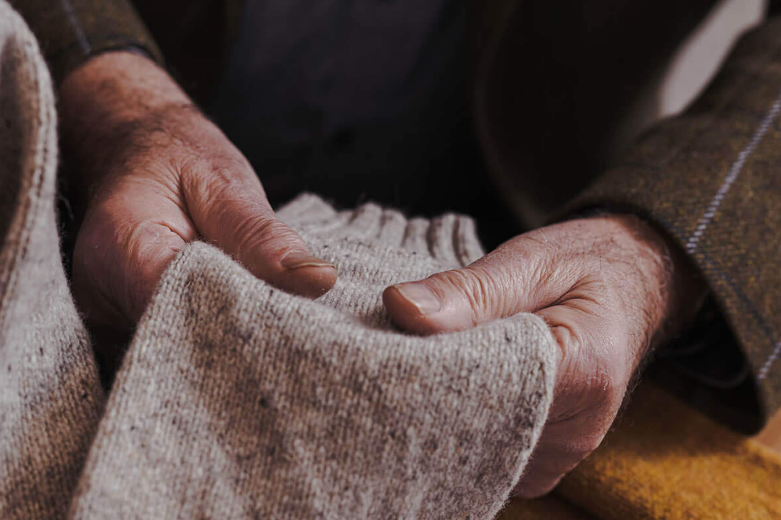
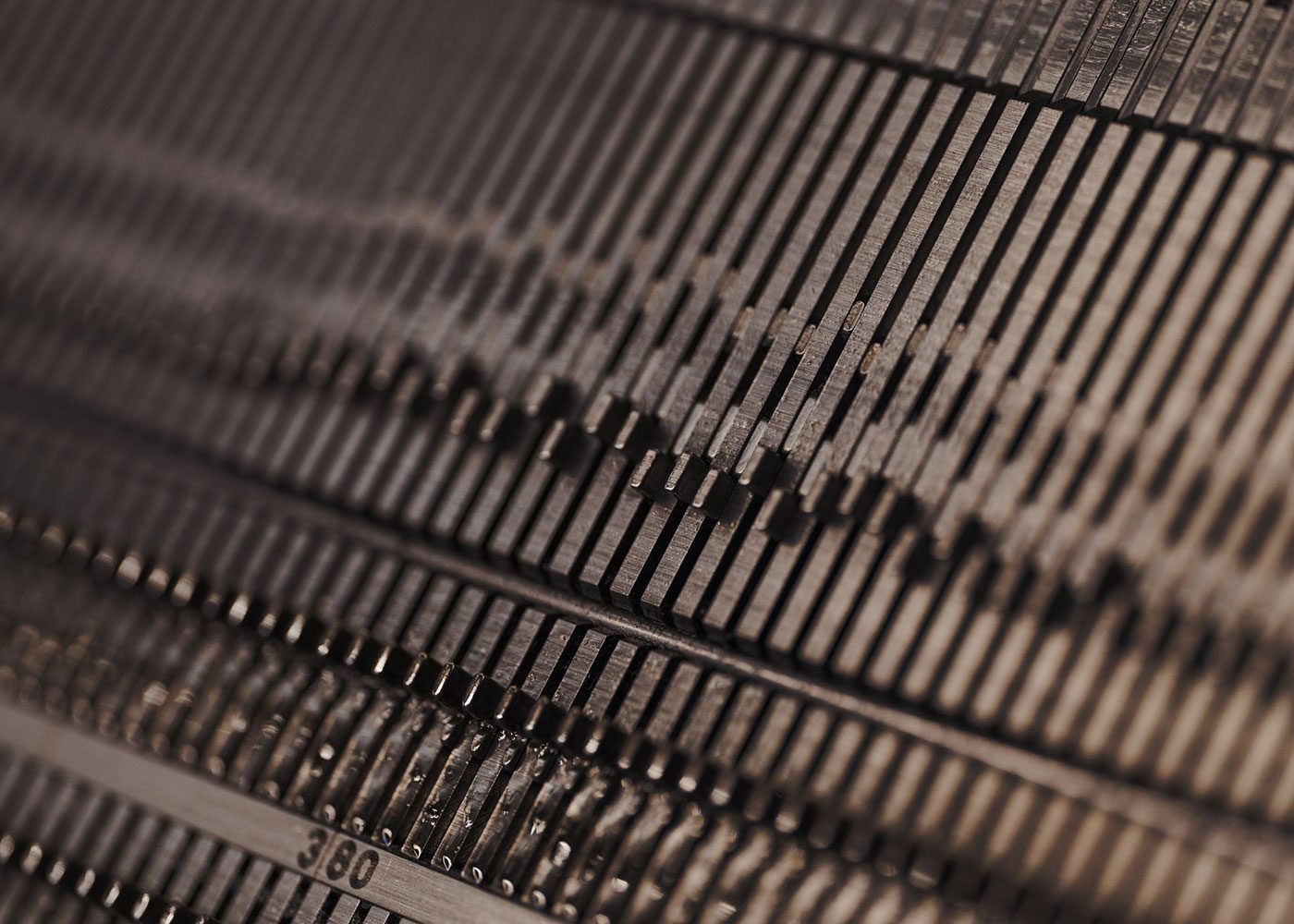
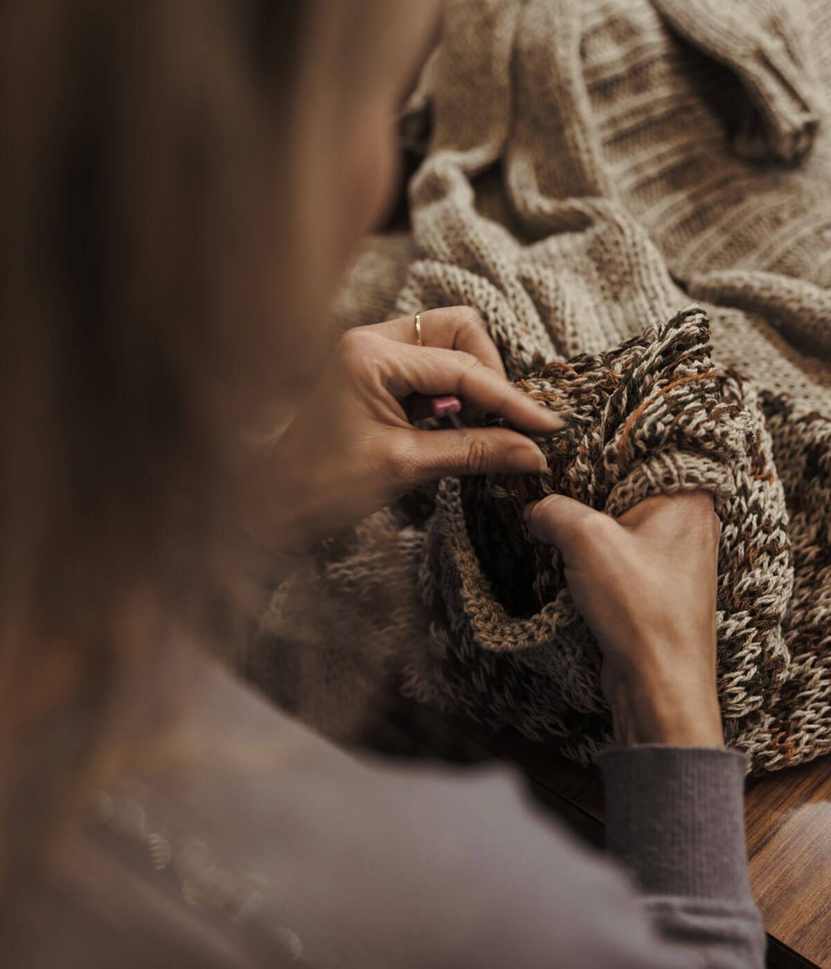
We also commissioned local photographer Connor Gault to take a series of photos at the factory itself to showcase the craftsmanship that goes into every garment they create. From loading the machines, and hand-finishing each item through to the inspection process, every item is treated with the utmost care before it is sent to its final destination.
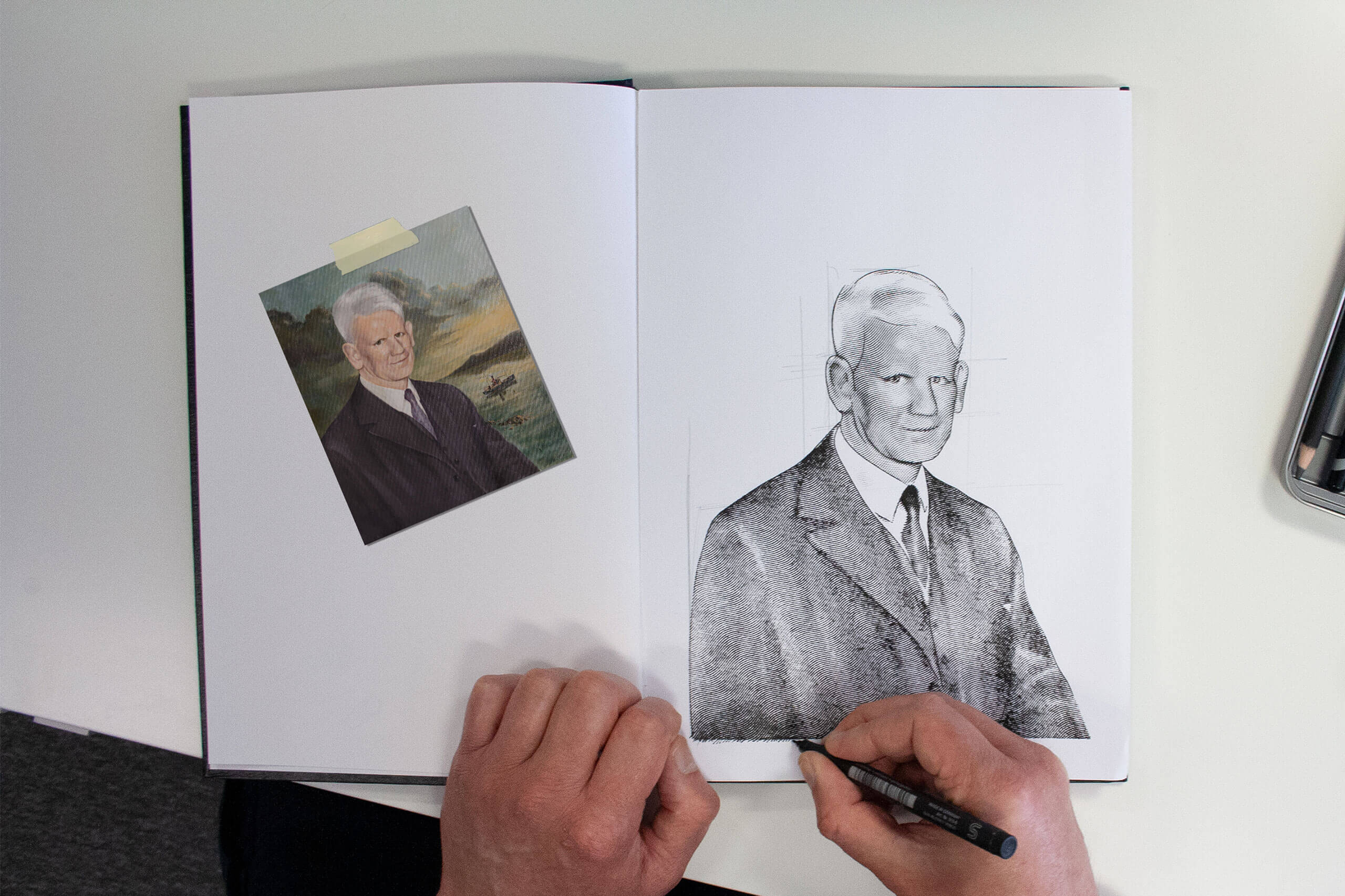
Illustration
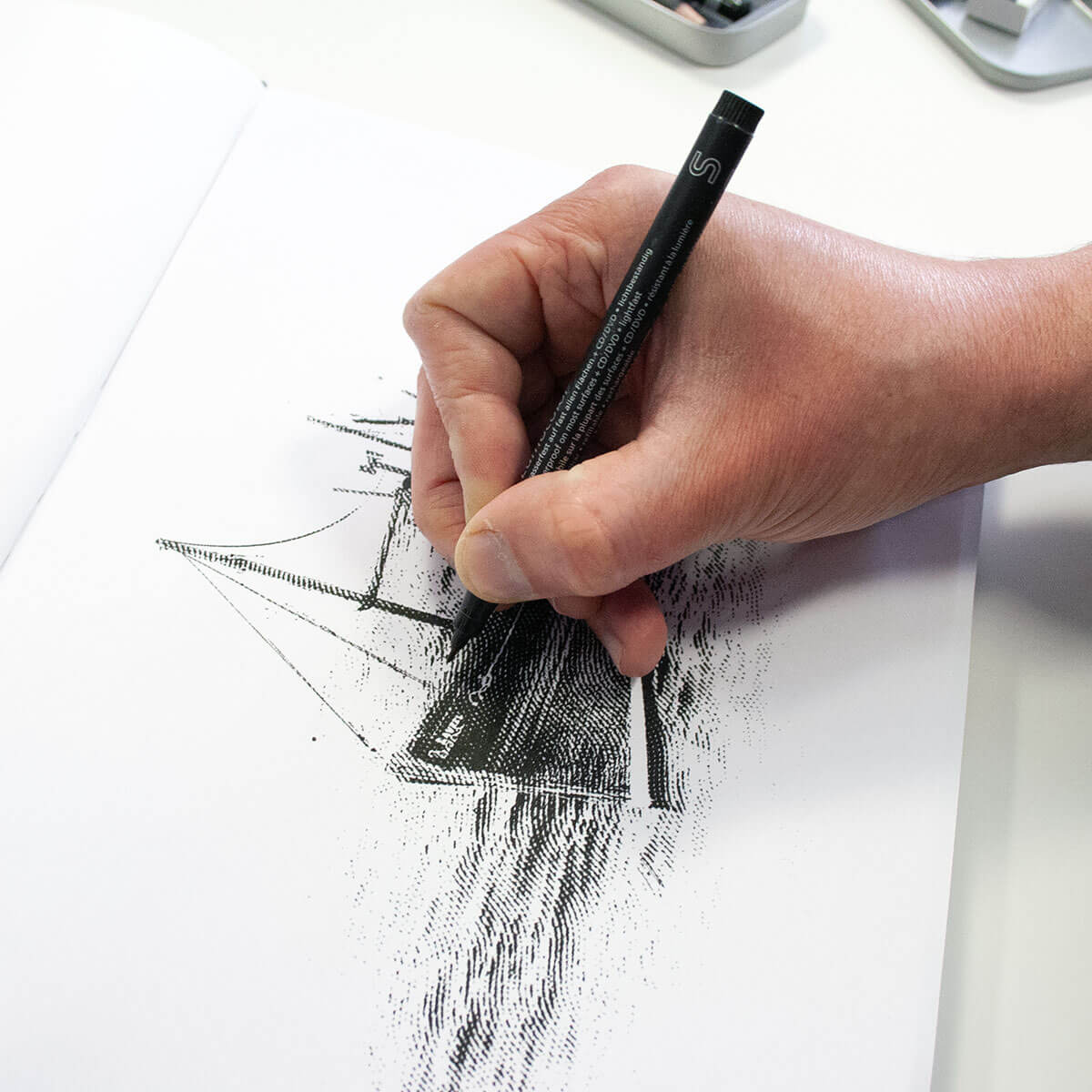
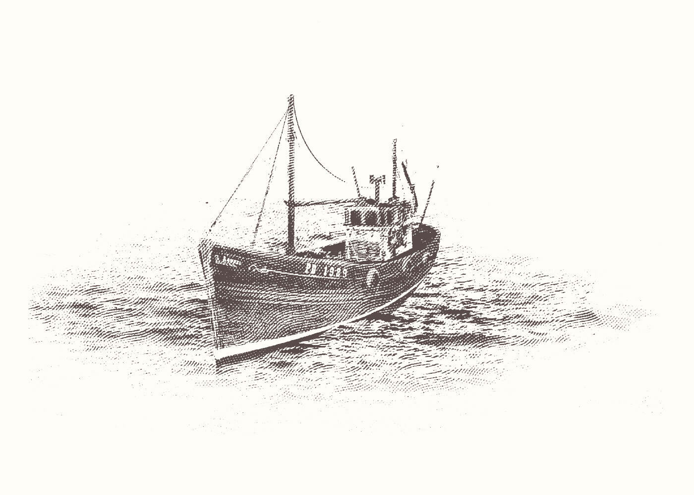
To reinforce the heritage element of the brand, we worked with local North East artist Terry Cook to create a series of custom illustrations for use in brand elements that would help communicate the company’s rich history. Three key images were chosen to epitomise this legacy; a fishing boat, a nod to both the geography and original product line, a teasel, a traditional tool to represent the sustainable techniques still used there, and finally Peter Harley, a portrait of the original founder. We chose etch illustration to mimic the style popularly used at the time of the company’s genesis. The ragged illustrations accompanying the striking clean typography creates a pleasing visual contrast with deeper meaning
Digital
Having established the branding, we worked to digitally translate this to a platform that would best showcase their exquisite, luxurious product range, drive brand awareness and collaborations, and cement their global position as leading producers of seamless knitwear. Our challenge was to design and build a website that would function as a contemporary celebration of a brand rooted in rich history and passionate, premium craftsmanship that the family-run business prides themselves on.


Harley’s proudly work with some of the world’s largest fashion brands, providing a B2B service alongside their own range. This meant that rather than functioning as a direct sales tool, the website needed to focus on informative storytelling about the individuals behind the brand, communicating the values of the company, and how the same family who built its legacy will propel it in the future. Understanding the potential engagement generated by an interactive lookbook, we reworked what was a simple PDF document to create a captivating interactive experience that would encourage users to explore the range.


Videography
The final piece of the puzzle was the creation of a brand film that would exhibit Harley’s reinvigorated new look, whilst celebrating the brand’s legacy and showcasing the skilled craftsmanship behind their beautiful knitwear. Collaborating with our long standing partner Flux Video, we developed two brand films, one to focus on the holistic brand identity, the other to communicate the story of Harley’s. We captured additional footage whilst on location for use across social media, to elevate an immersive and consistent user experience.
The result
The result showcases a thoughtfully crafted identity that reflects the confident innovation of the brand, through a design that balances the company’s rich heritage with the modern market positioning they desire.