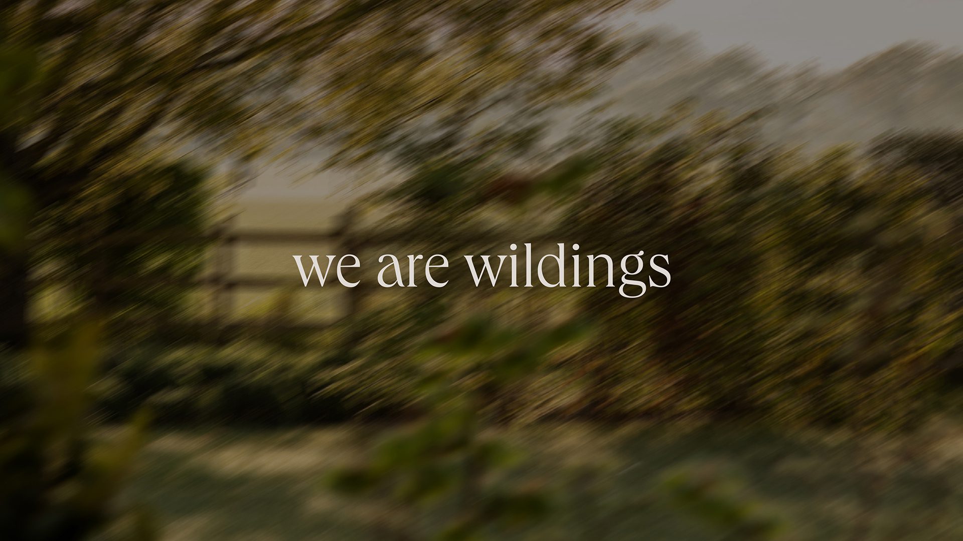
We Are Wildings
Reawakening the folklore of the Lincolnshire countryside
Challenge
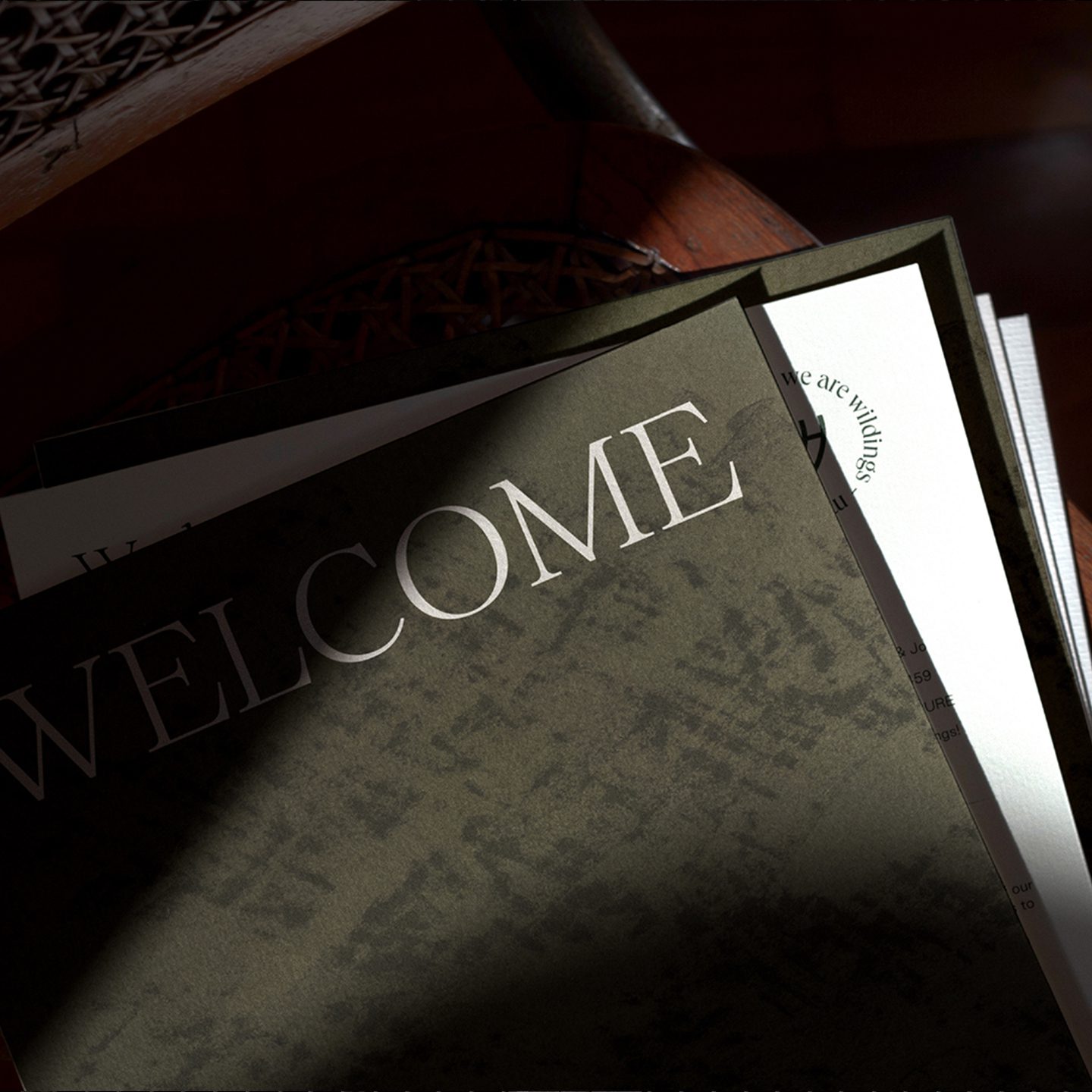
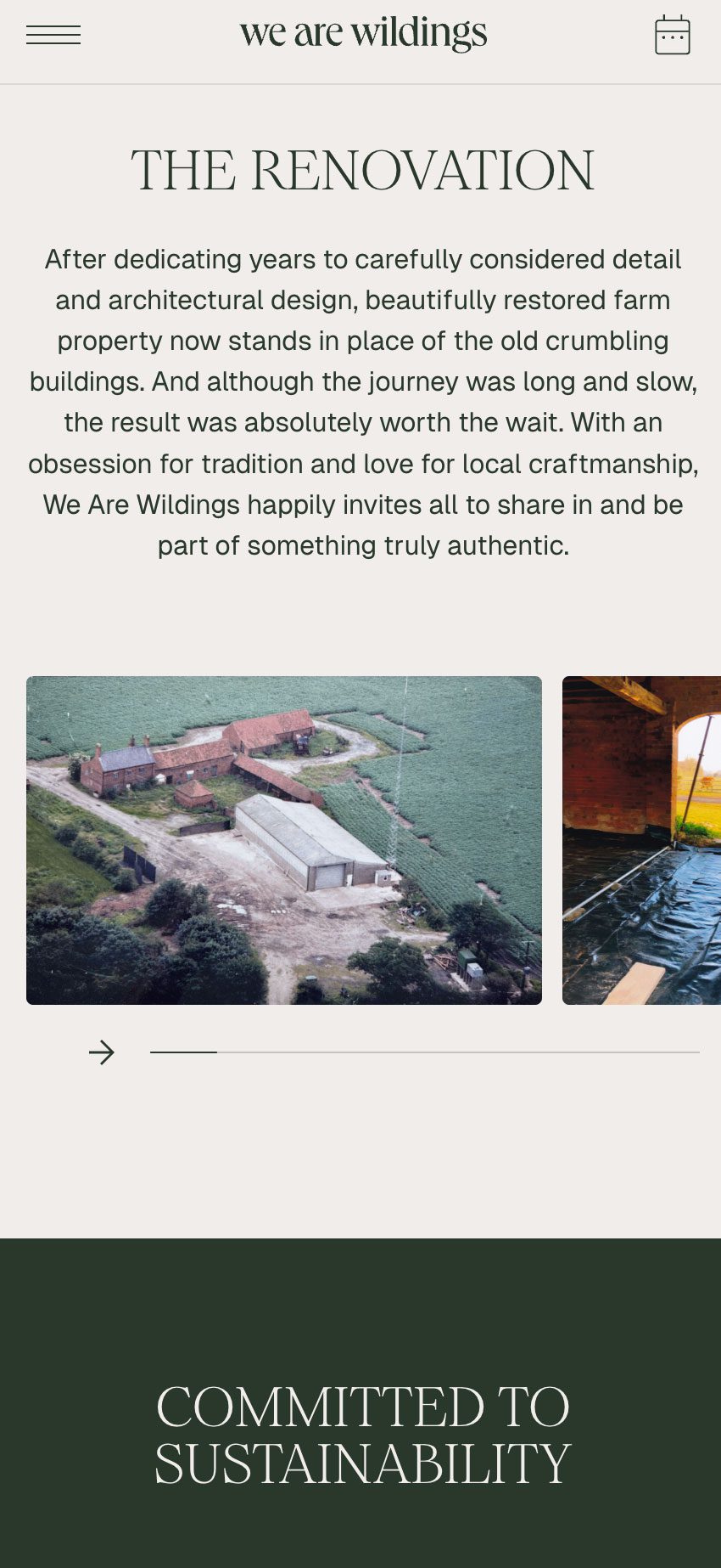
When Wildings came to us, the business was still in its infancy. The Arden family had a clear vision for creating a distinctive rural retreat, but needed a brand identity that could capture its spirit, tell its story, and shape the guest experience from the outset.
Approach
Our process began with immersion. We visited the site to understand the landscape, atmosphere and sense of place firsthand, then ran collaborative workshops with the family to uncover their ambitions, values and aesthetic instincts. From the beginning, it was clear this brand needed to feel deeply rooted in its environment while reflecting the warmth, craft and character of the people behind it.
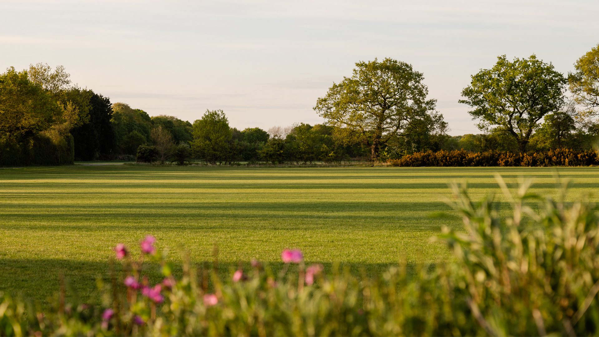
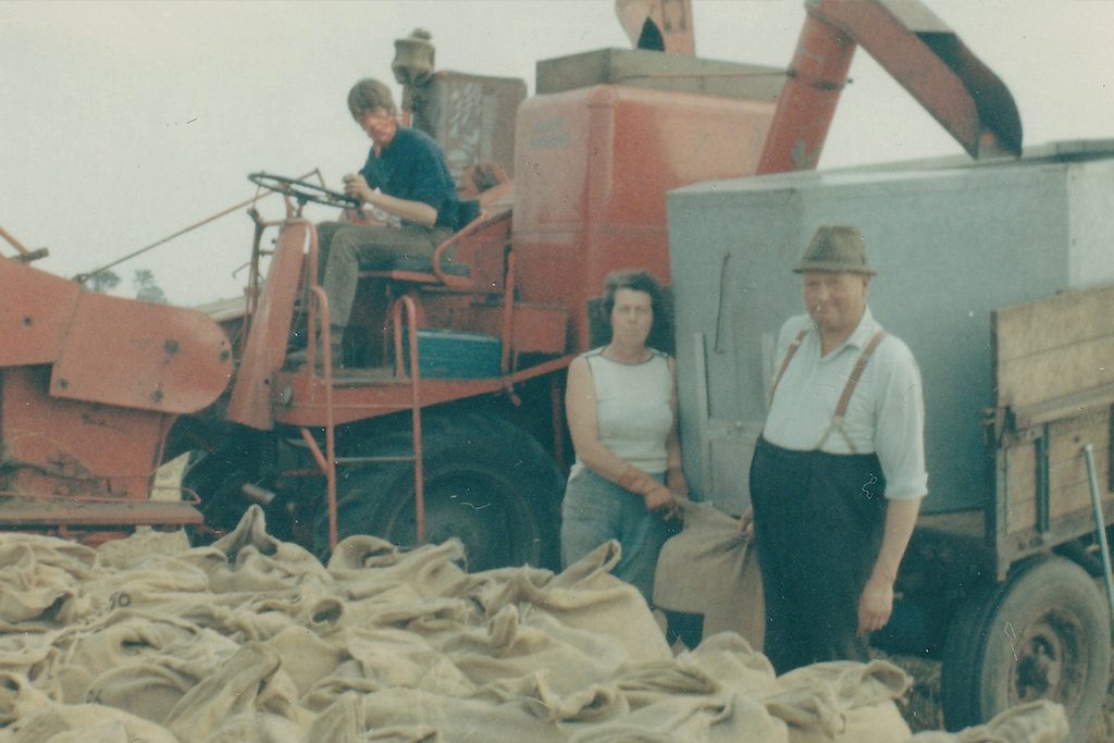
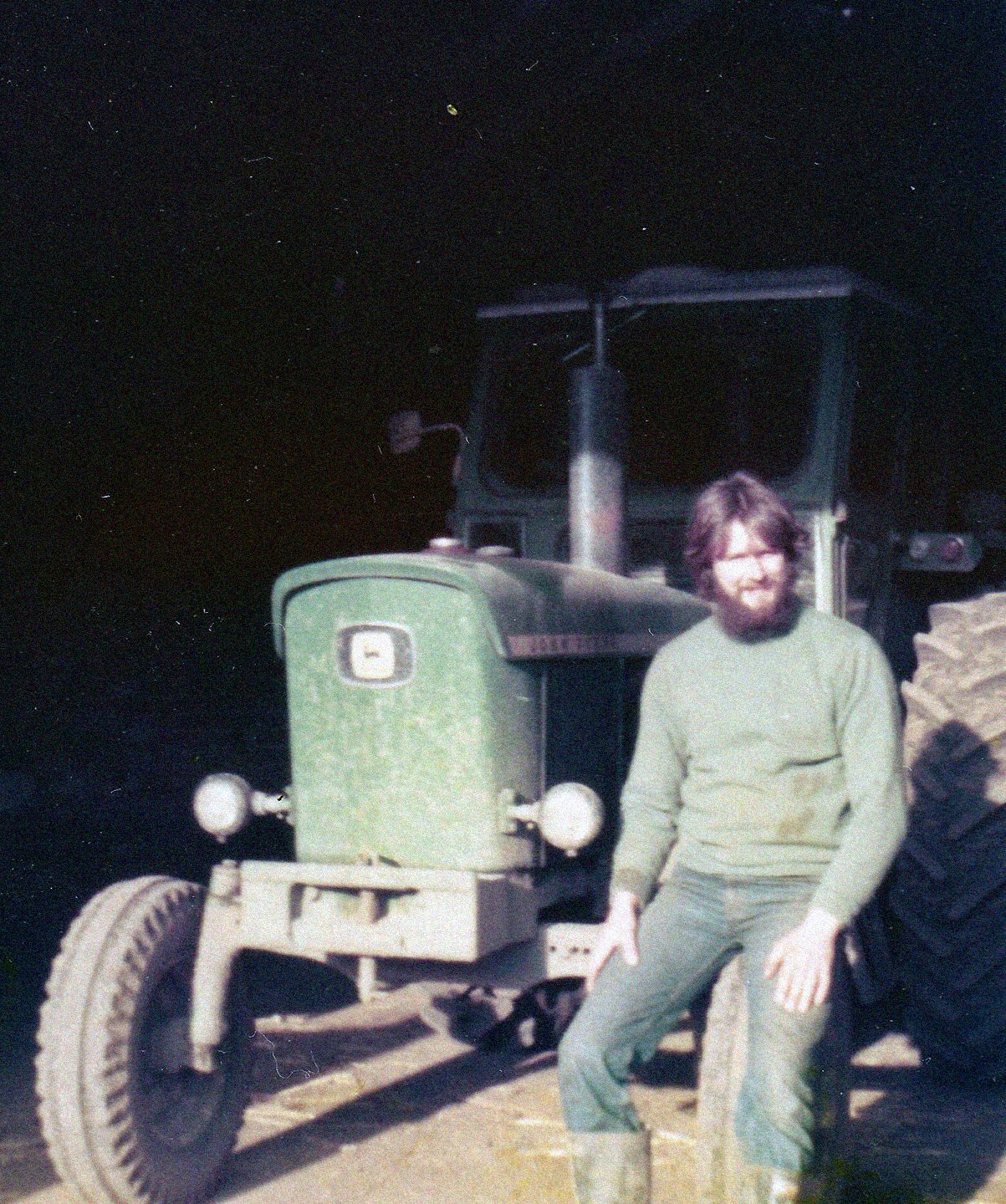
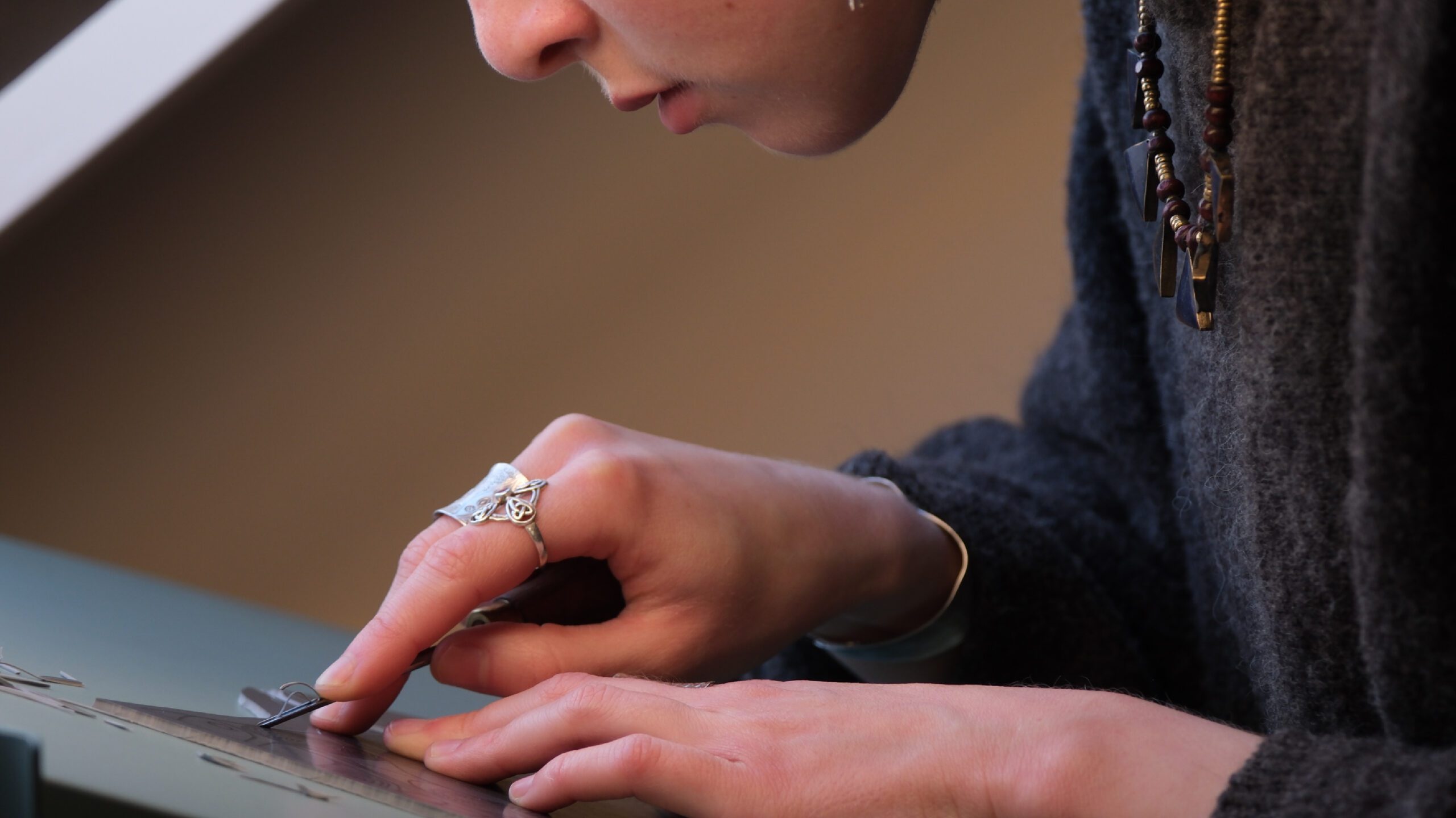
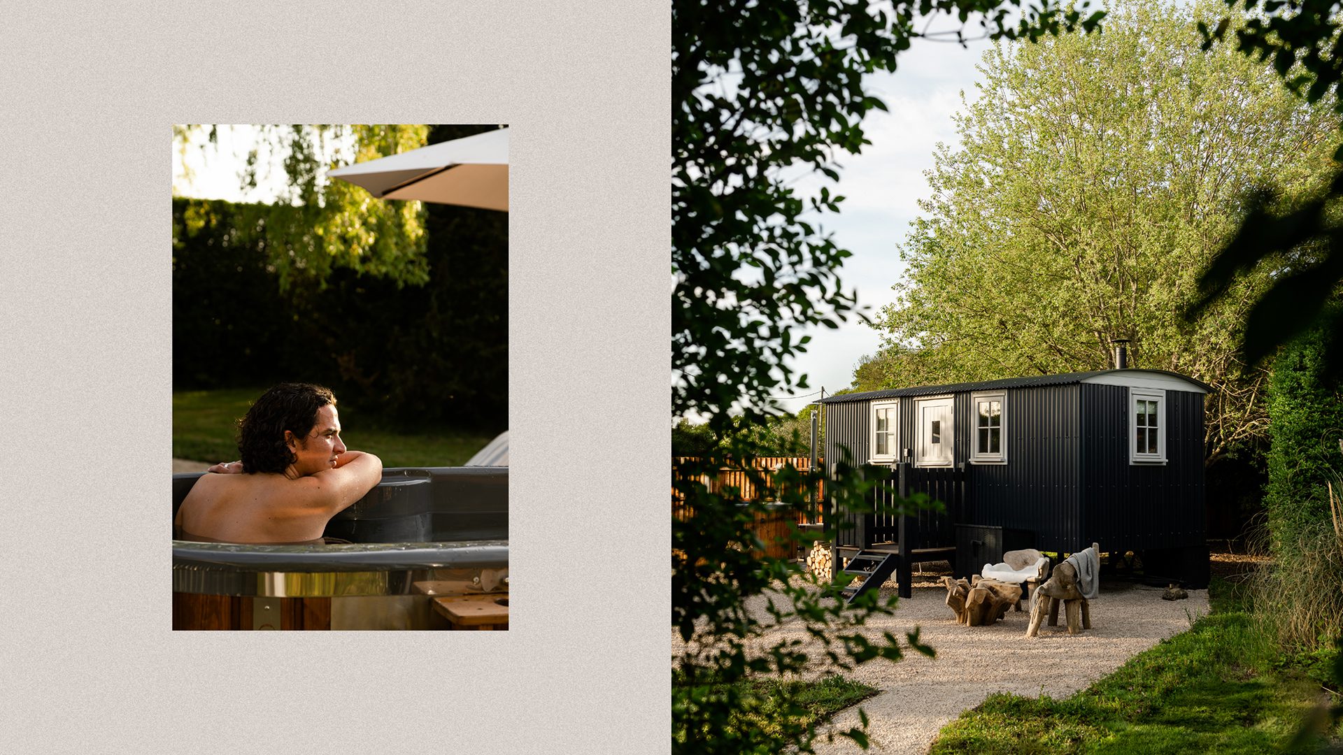
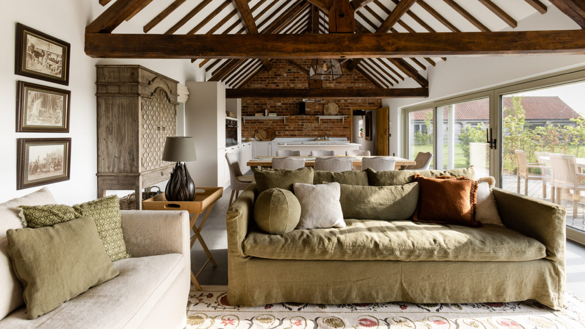
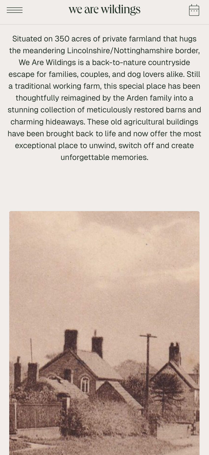
Set on a working family farm passed down through three generations, Wildings is grounded in heritage. The Ardens have built much of the furniture themselves, marking each piece with a bespoke ‘A’ maker’s stamp. We used this as the starting point for the identity, designing a distinctive ‘W’ marque constructed from three interwoven ‘A’s’ — a subtle reference to family legacy, craftsmanship and pride of place.
For the wordmark, we selected Queens, a soft yet elegant serif with graceful, slightly idiosyncratic forms. Its characterful letterforms, particularly the lowercase ‘a’, echo the organic shapes found in the surrounding landscape and bring a sense of refinement without losing warmth.


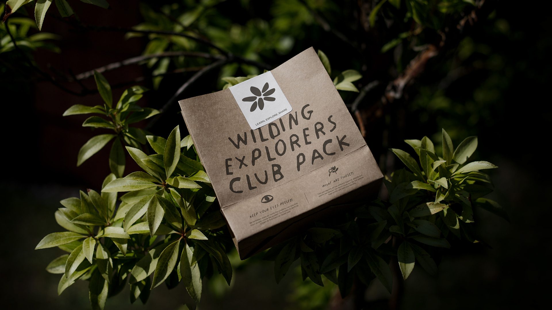
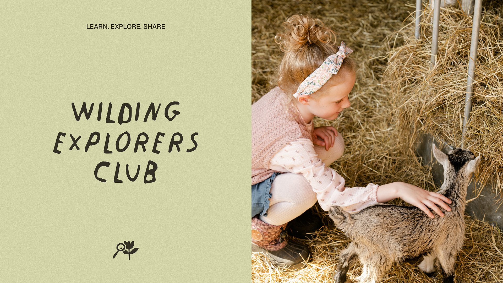
We also extended the identity through The Wildings Explorers Club, a sub-brand designed to help children engage with the farm and its wildlife through activity packs, puzzles and educational materials. This gave the brand a family-friendly dimension while reinforcing its connection to nature, learning and adventure.
Illustration
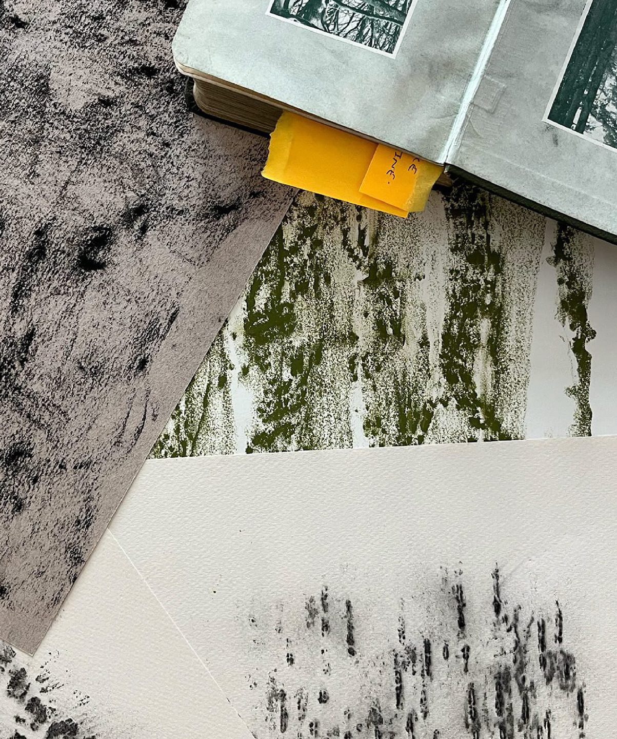
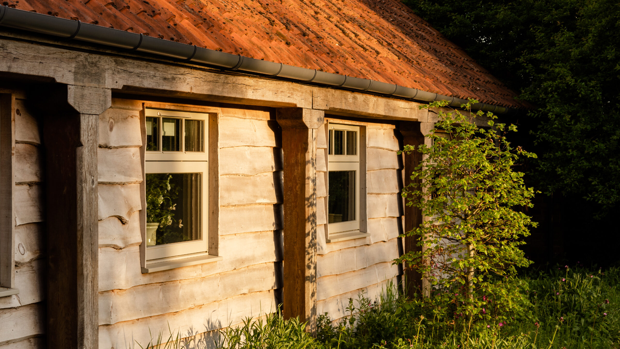
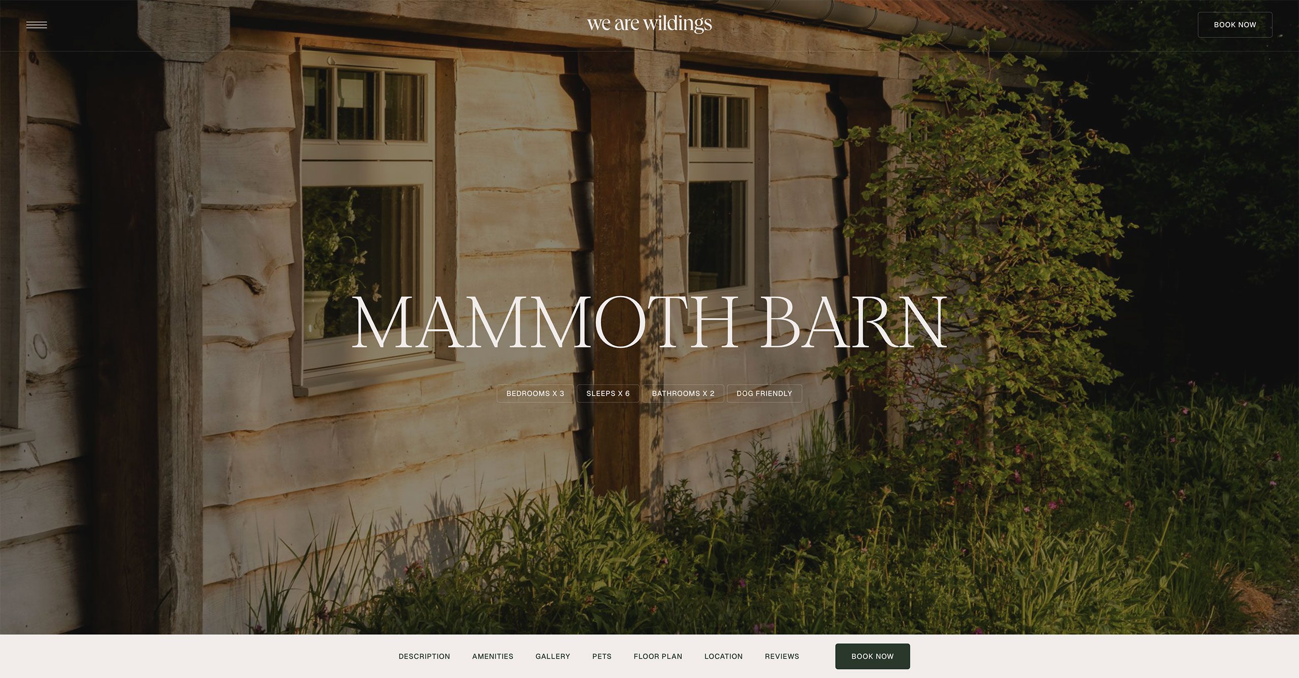
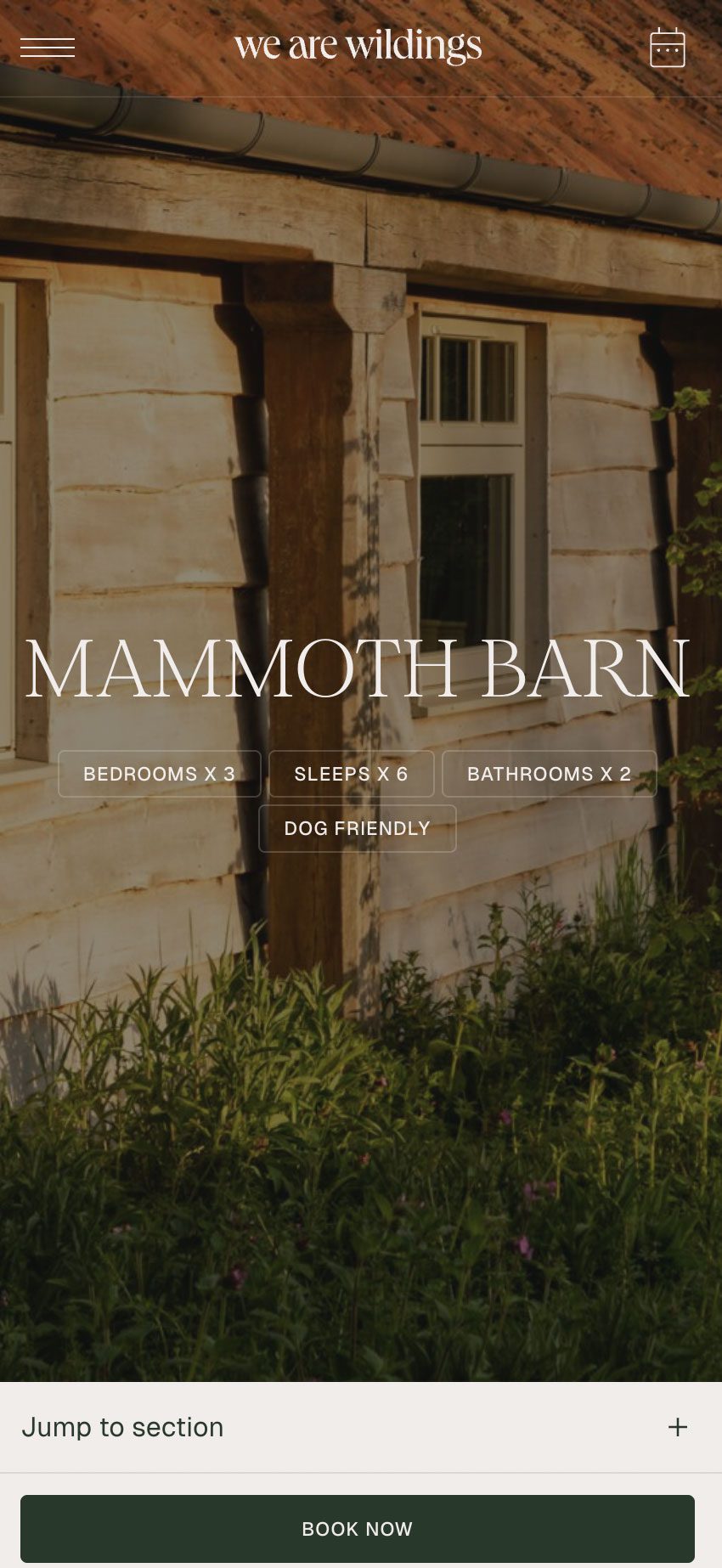
The wider brand world was inspired by local folklore, natural beauty and the educational potential of the site. To deepen this sense of place, we collaborated with illustrator Morvern Graham to create a suite of artwork informed by local myths, flora and fauna. These included symbolic creatures tied to earth, sky and water, as well as references unique to the farm itself, such as Mammoth Barn, named after a mammoth tusk was discovered on the land. These illustrations added richness, storytelling and a layer of discovery to the guest experience.


To extend the storytelling into the family experience, we also commissioned Morvern to create a bespoke colouring-in illustration for the Wilding Explorers Club packs. Designed for children to enjoy during their stay and take home as a keepsake, the artwork offered a playful way to engage with the farm’s landscape, wildlife and sense of discovery, helping younger guests remember their time on the farm long after they had left.


Photography
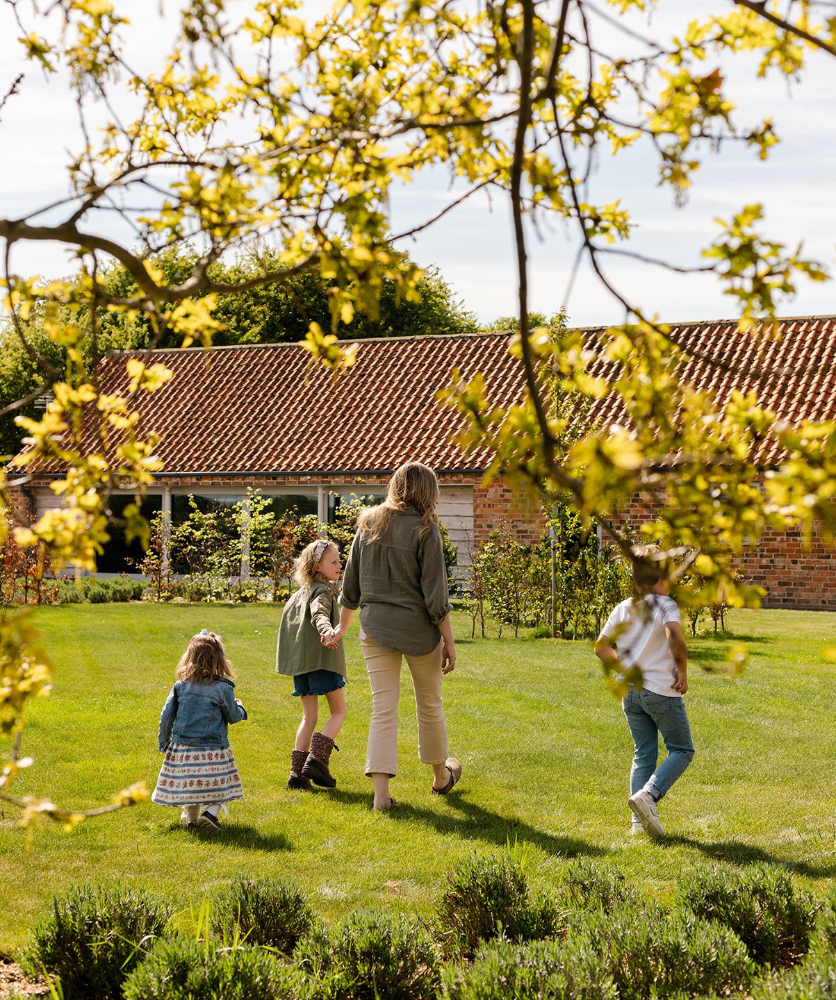
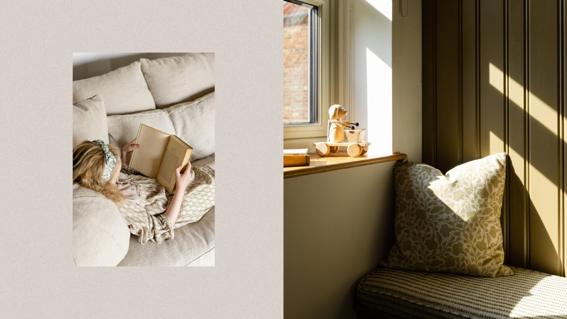
With the brand assets in place, it was time to capture the spirit of We Are Wildings through photography. We partnered with London-based food and travel photographer Holly Farrier, whose relaxed, natural, and warmly inviting style beautifully reflected the Ardens’ thoughtful details and brought the brand story to life.


The result is a brand identity that feels considered, original and emotionally resonant — one that transforms Wildings from a collection of properties into an immersive consumer brand shaped by heritage, storytelling and place.
Digital
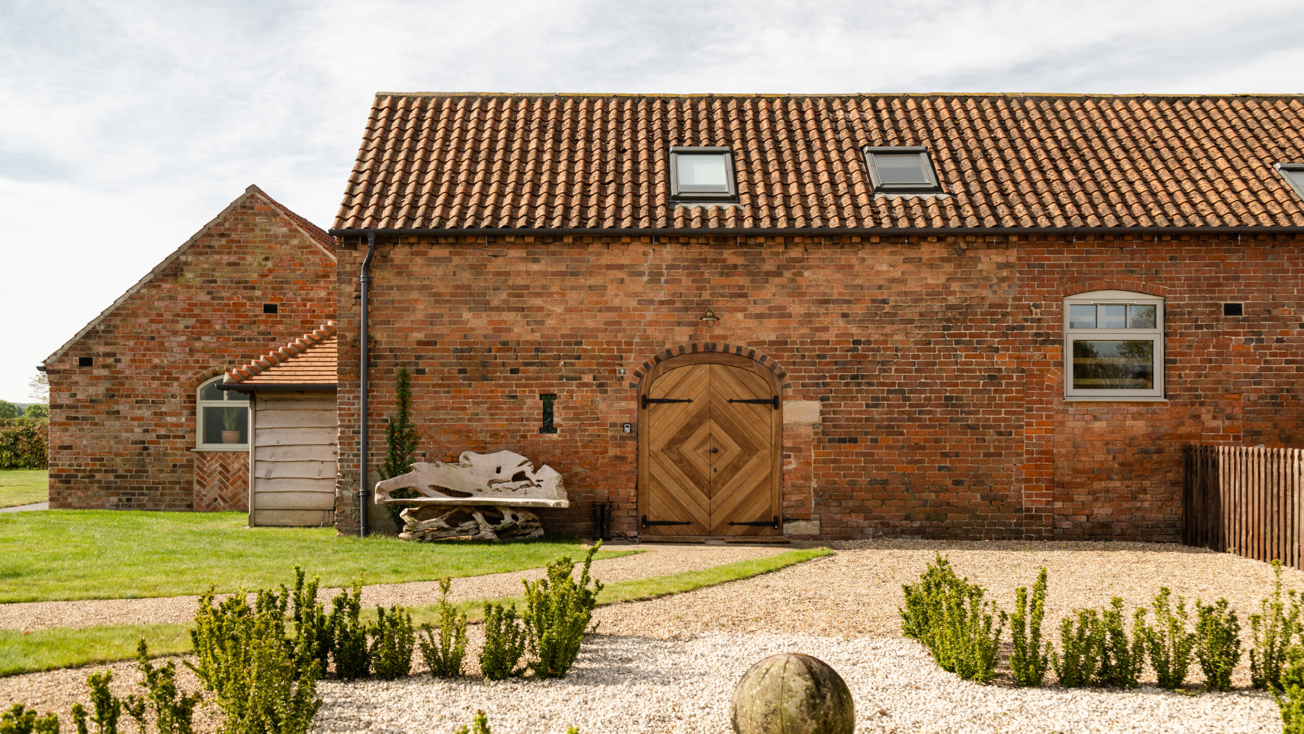
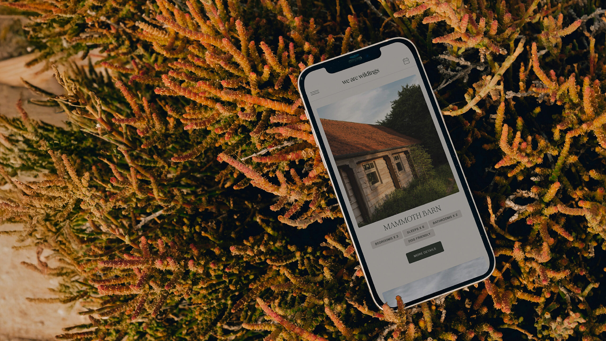
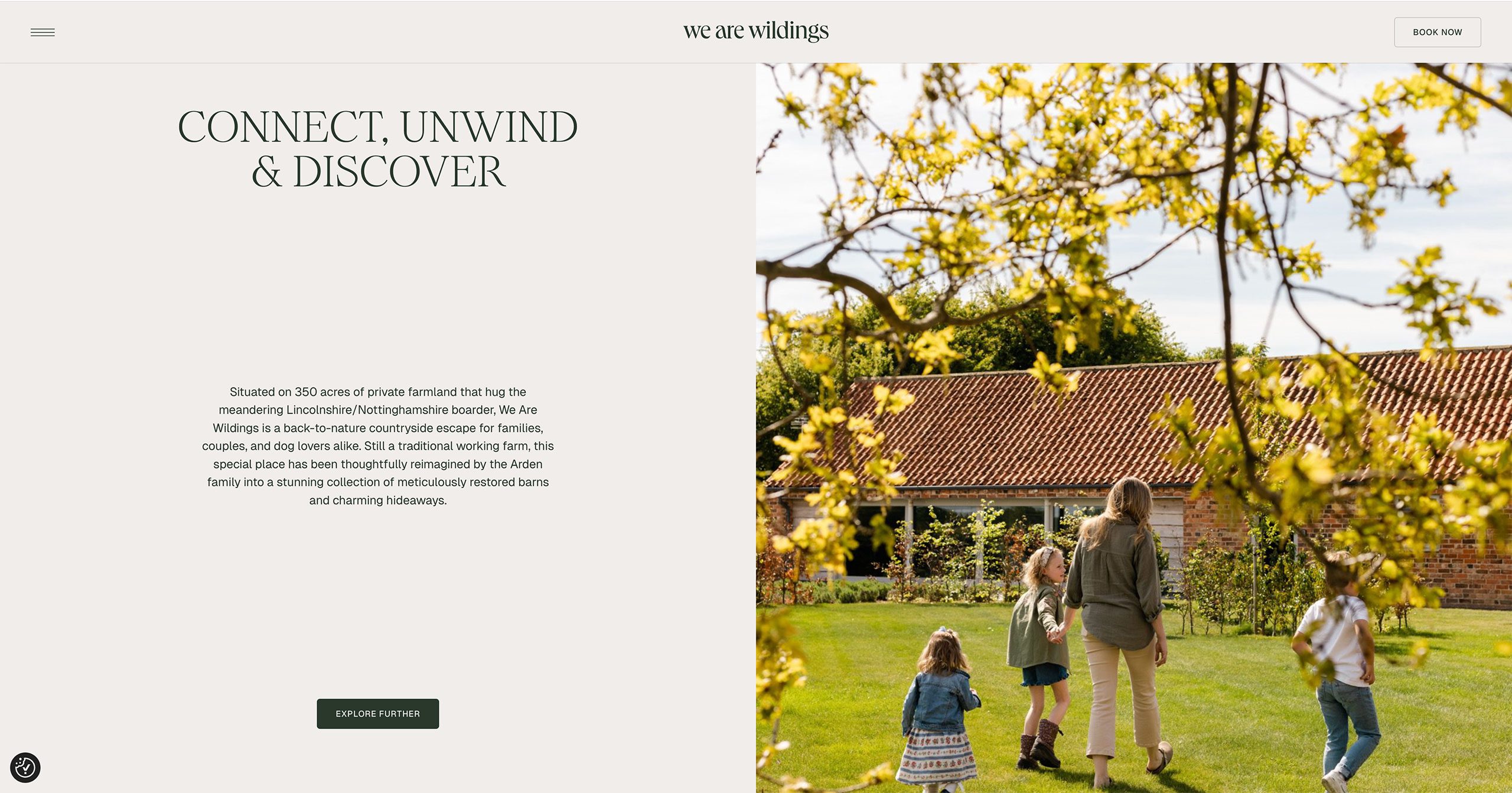
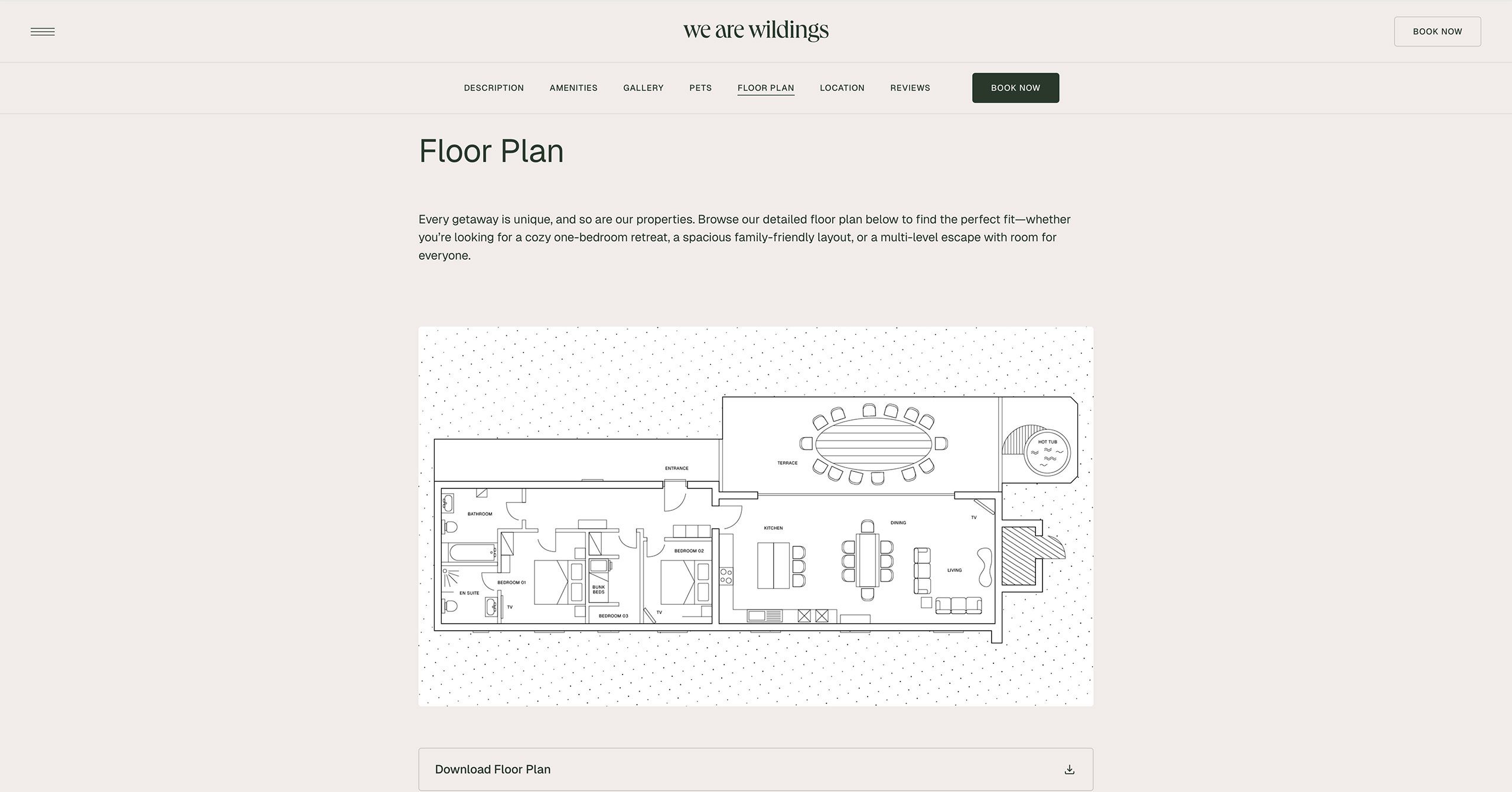
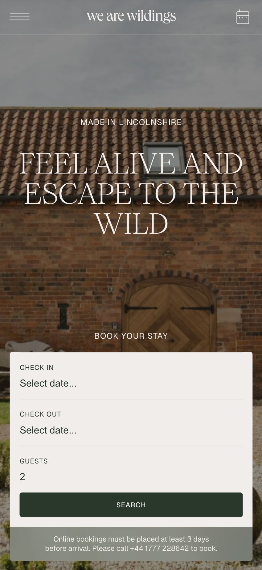
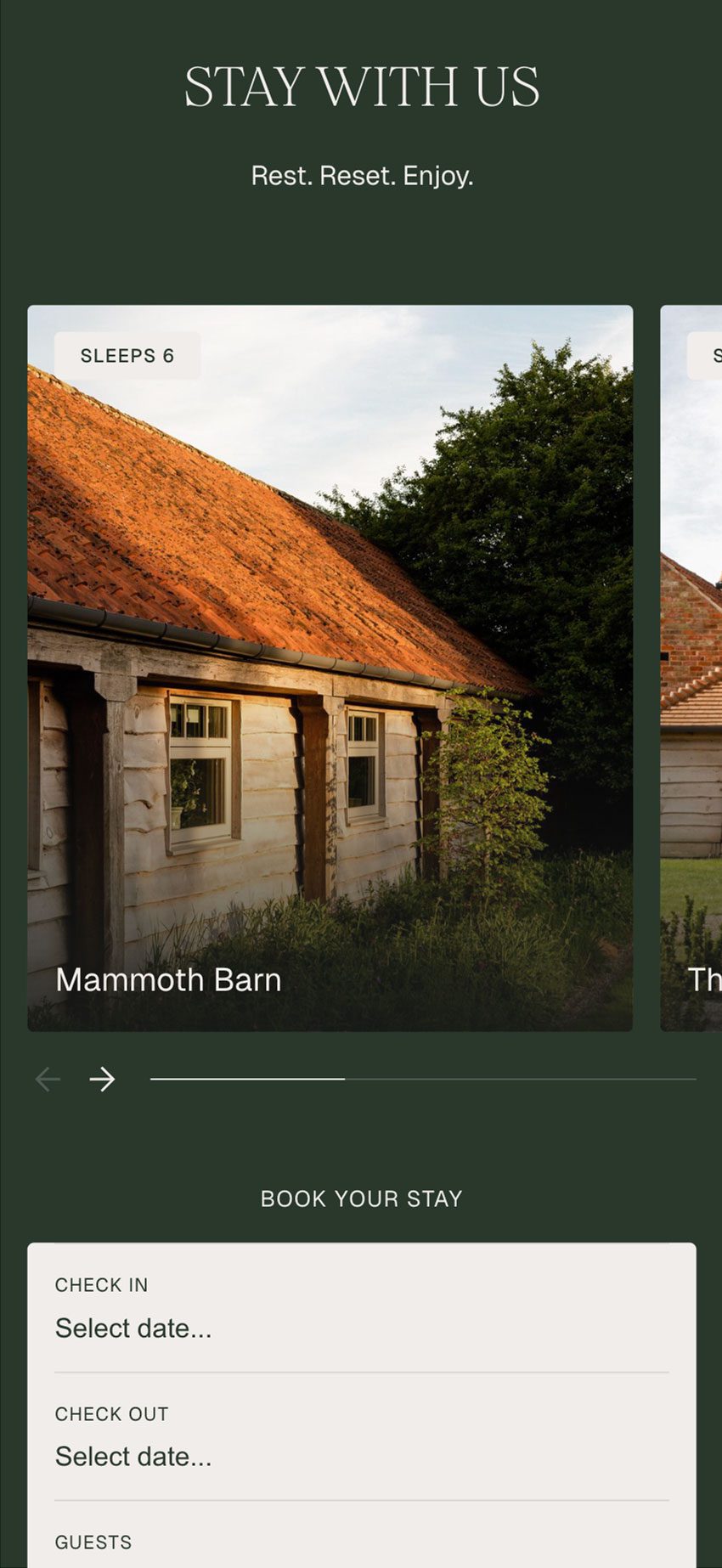
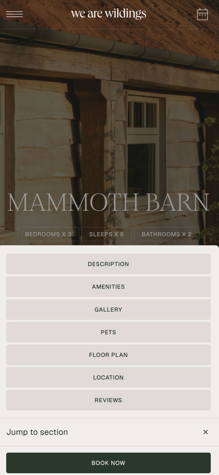
The final stage of the project focused on the creation of a new website, carefully designed to showcase the Wildings’ beautiful homes in a way that felt both elegant and easy to navigate. The site needed to capture the quality and character of the properties while giving visitors a clear, intuitive journey from browsing to booking.
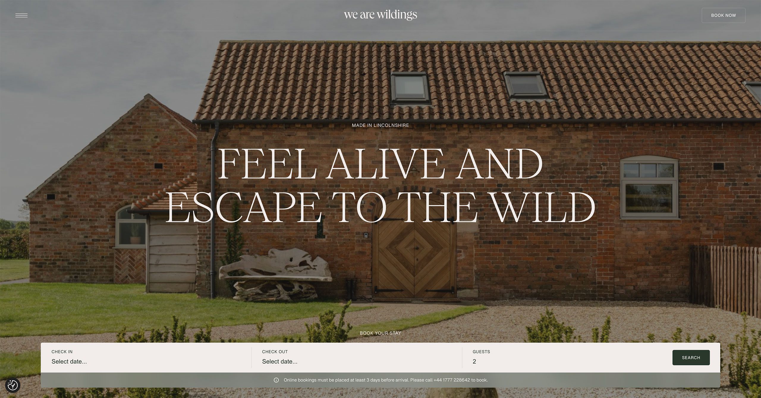

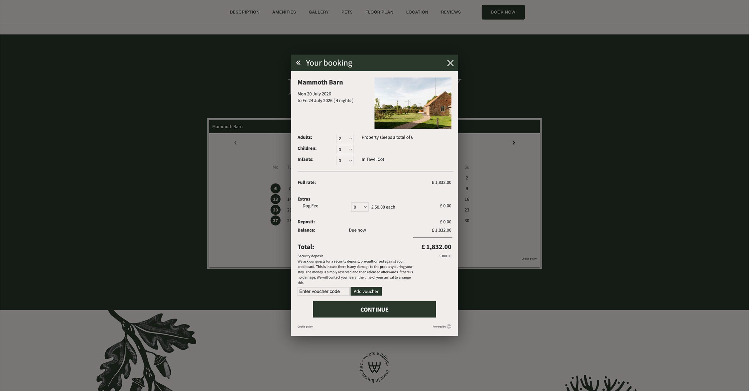

To support this, we integrated the SuperControl Property Management System, chosen for its smooth functionality, reliability and scalability. This ensured the booking process was as seamless as possible for guests, while giving the business a flexible platform that could grow effortlessly alongside its expanding portfolio.
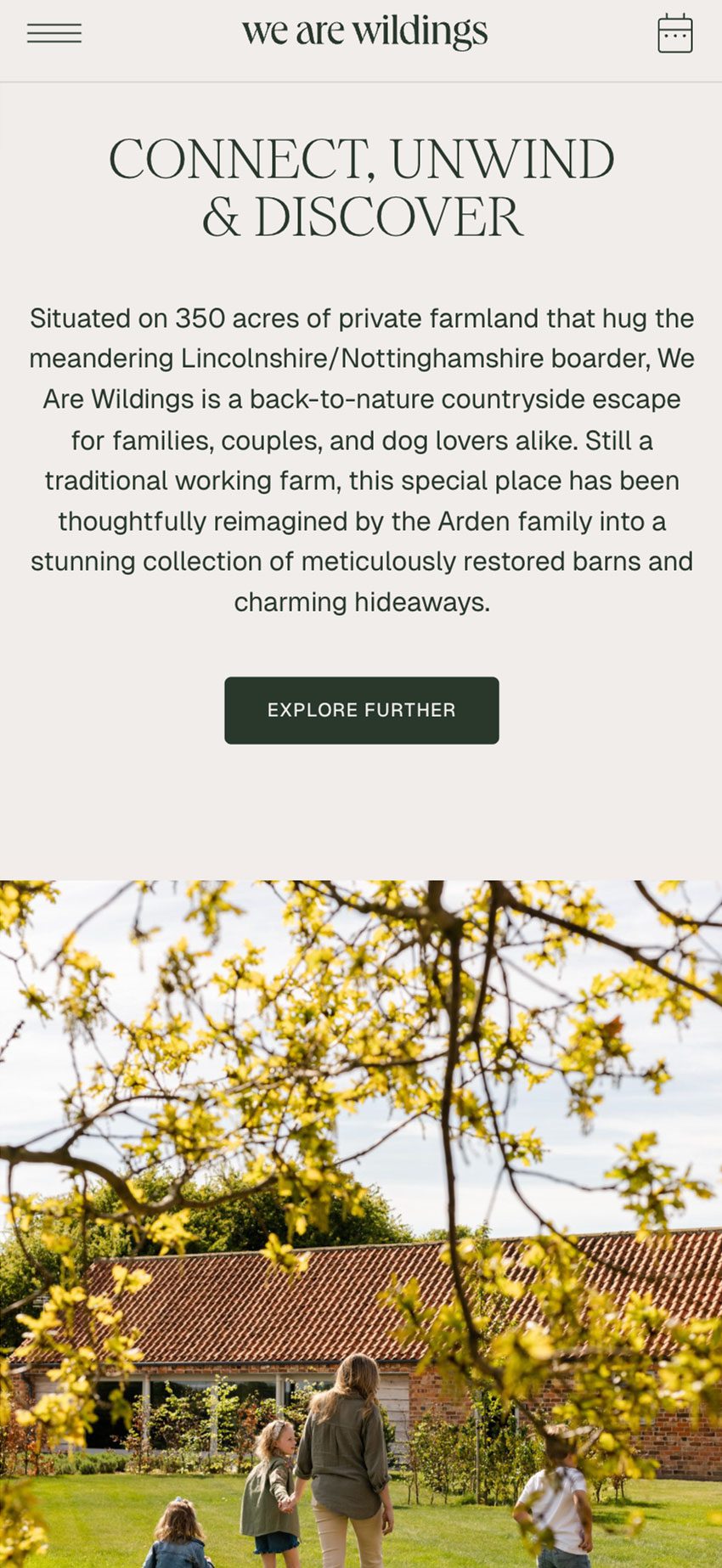


Rooted in family heritage, rural craftsmanship, sustainability and a deep connection to the Lincolnshire landscape, the brand brings together warmth, storytelling and a sense of quiet discovery. From the identity through to the website experience, every detail was created to feel authentic, welcoming and full of character, helping We Are Wildings share its next chapter with guests old and new.
