GRECO
Built for the pressure of the subsea world
Brand
Greco Developments designs and manufactures specialist life-support umbilical systems, custom cable moulding and engineered solutions for the offshore and subsea industries. As the business continued to evolve, it required a brand that better reflected the quality, precision and reliability behind its products, alongside a digital experience that could communicate the breadth of its expertise.

Greco had earned the trust of the offshore industry through decades of technical excellence, but its brand had remained rooted in the past.
The Brief
Greco approached Studio Form to develop a complete brand transformation that would reposition the business for its next chapter.
The existing identity no longer reflected the environment in which Greco operates or the technical excellence of its products. Alongside a new visual identity, the project included photography art direction and a complete website redesign, creating a unified brand experience across every customer touchpoint.
Our Approach
Operating in one of the world’s most demanding industries requires absolute confidence in every component.
Our approach was to build a brand that reflected that same level of confidence. Rather than leaning into traditional industrial branding, we developed a visual language that balanced engineering precision with the adventurous spirit of the environments Greco’s products are designed to perform within.
Every decision, from typography and colour through to photography and digital experience, was made to reinforce the quality, reliability and technical expertise that defines the business.
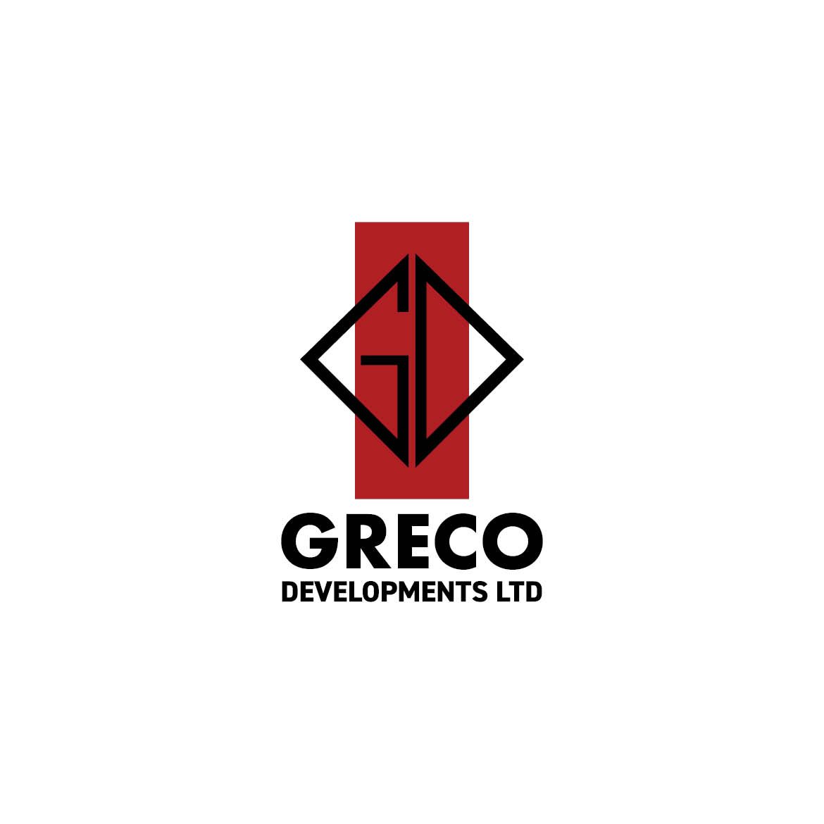
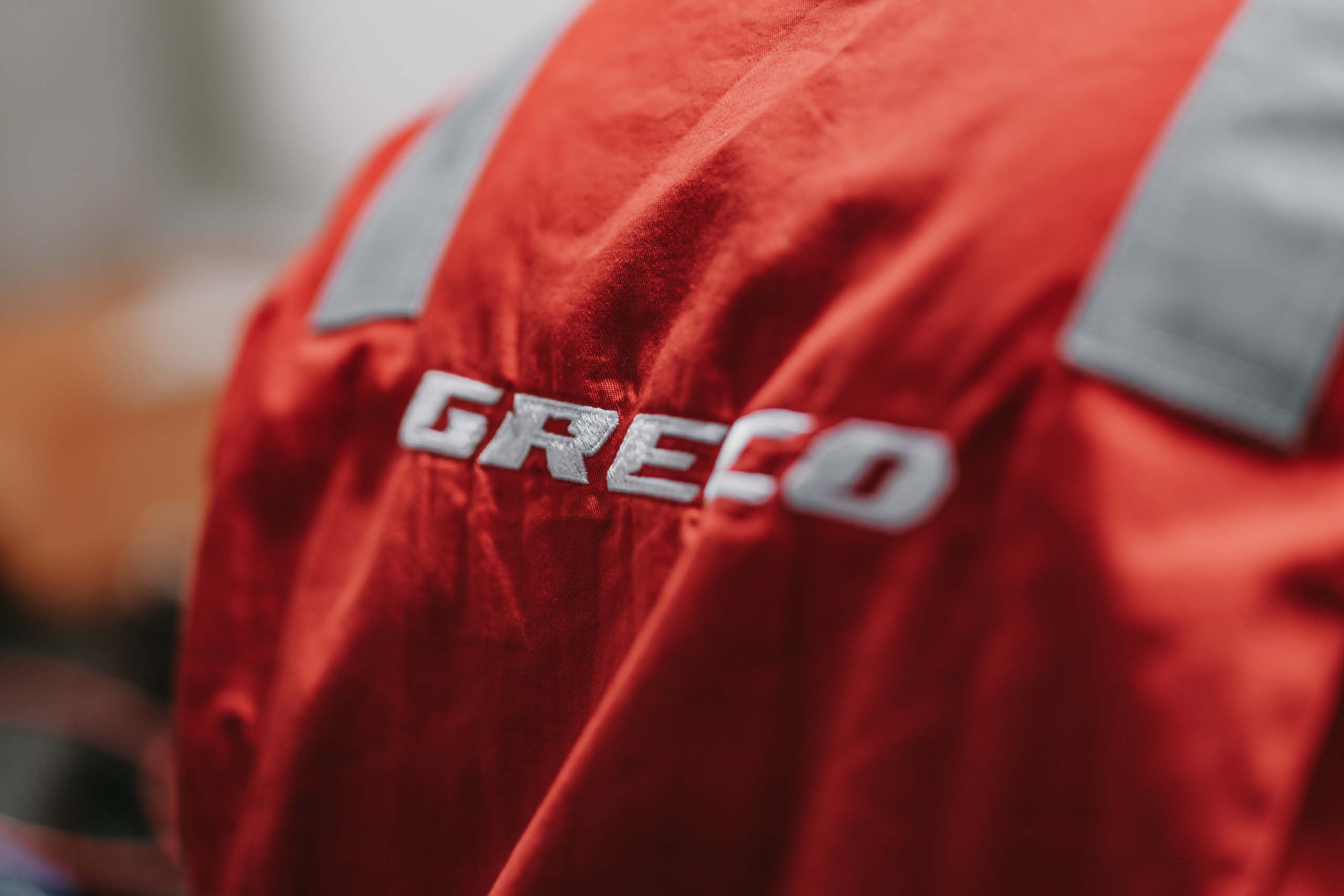
Brand Identity
The new identity was designed to feel bold, technical and uncompromising.
Strong geometric forms, confident typography and a restrained visual language create a brand that feels equally at home within the manufacturing environment and the offshore industries it serves. The system provides consistency across print, digital, signage, workwear and technical documentation while giving Greco a far stronger presence within the market.
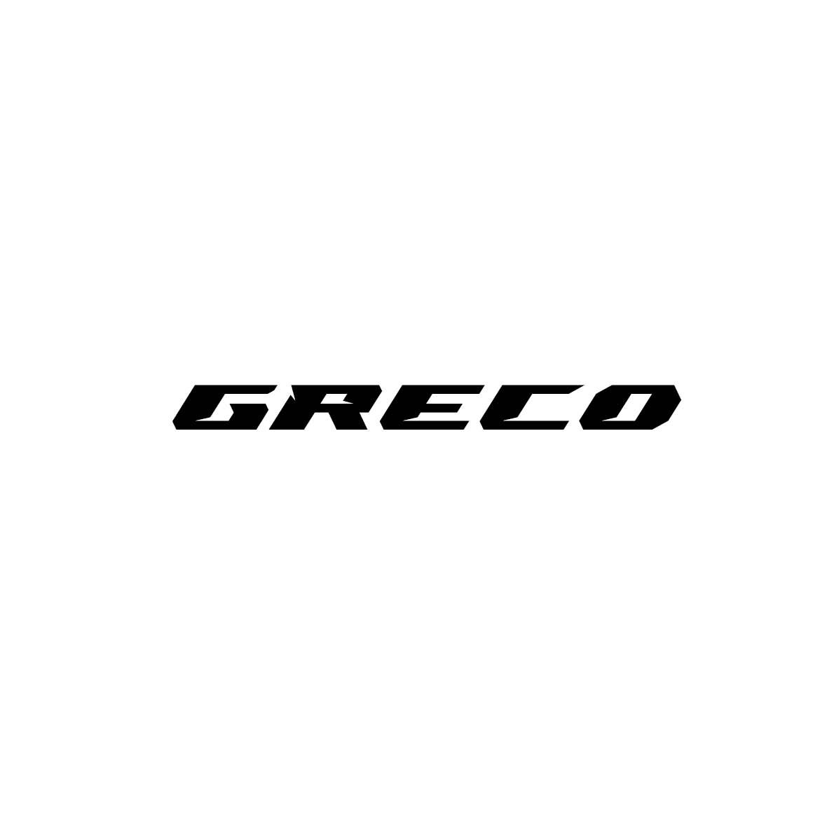
We further refined Greco’s word marque through an internal development process, carefully adjusting the typography to improve balance, clarity and consistency across all applications. Although subtle, these refinements strengthen the overall identity, ensuring the marque performs confidently at both large and small scales while maintaining its bold, technical character.
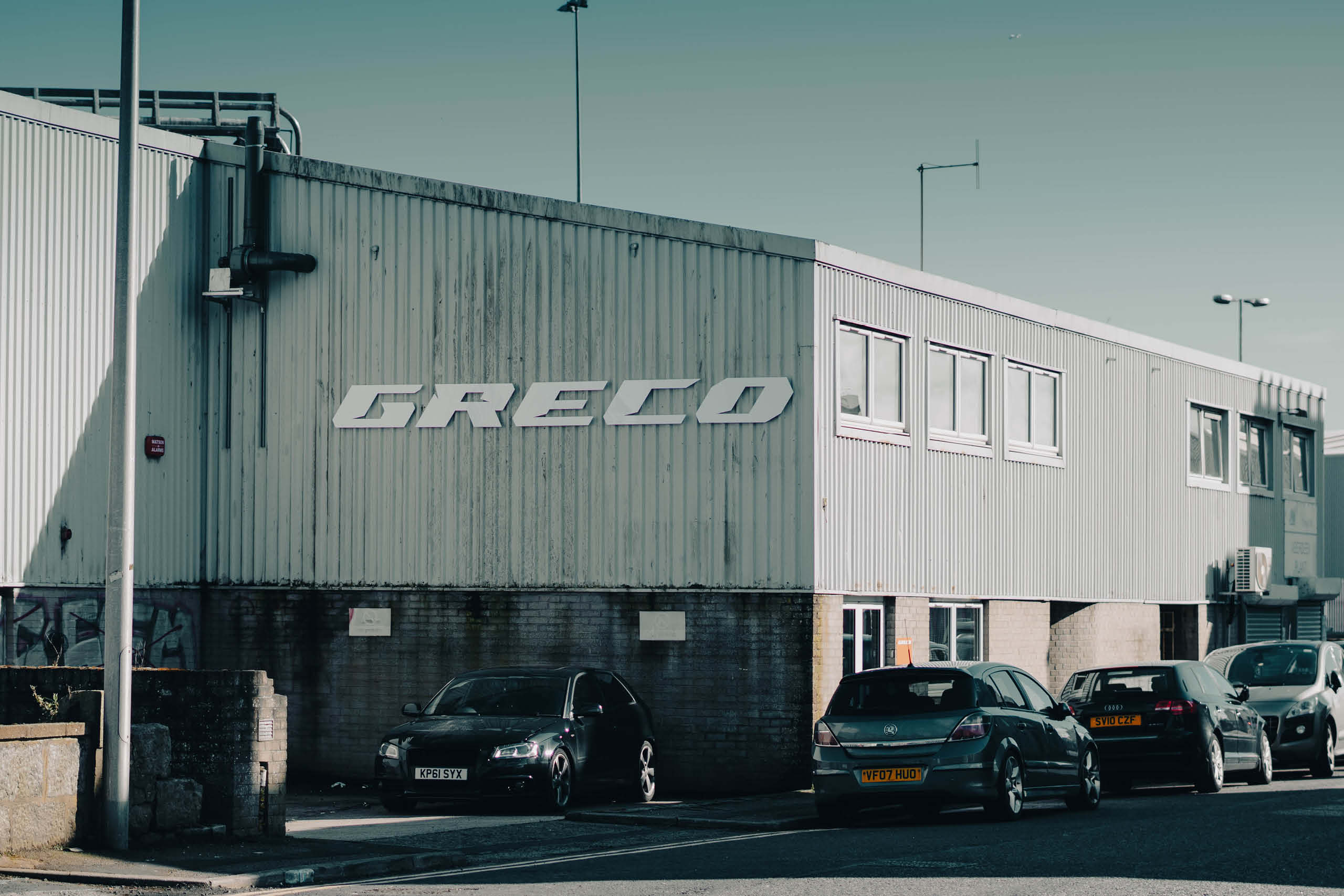
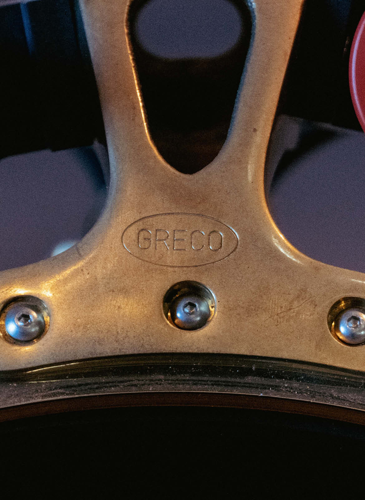
Logo marque
The marque was designed to be simple, distinctive and highly functional.
Built around clean geometry and balanced proportions, it reflects the precision and reliability of Greco’s engineering while providing a recognisable word marque that works confidently across every application, from machinery and vehicle livery to digital platforms and product literature.
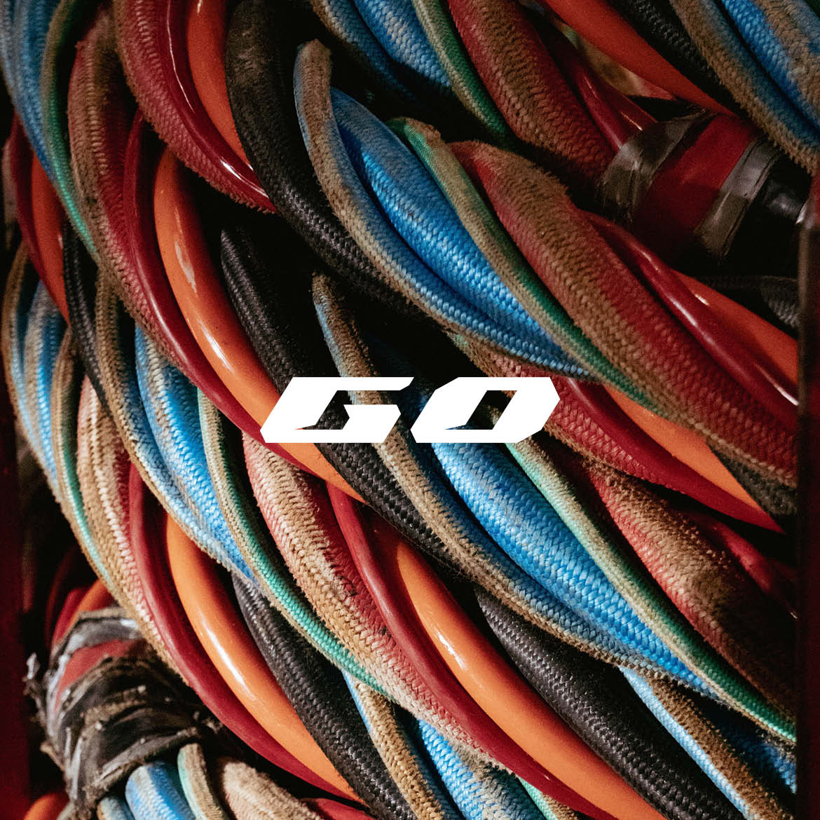
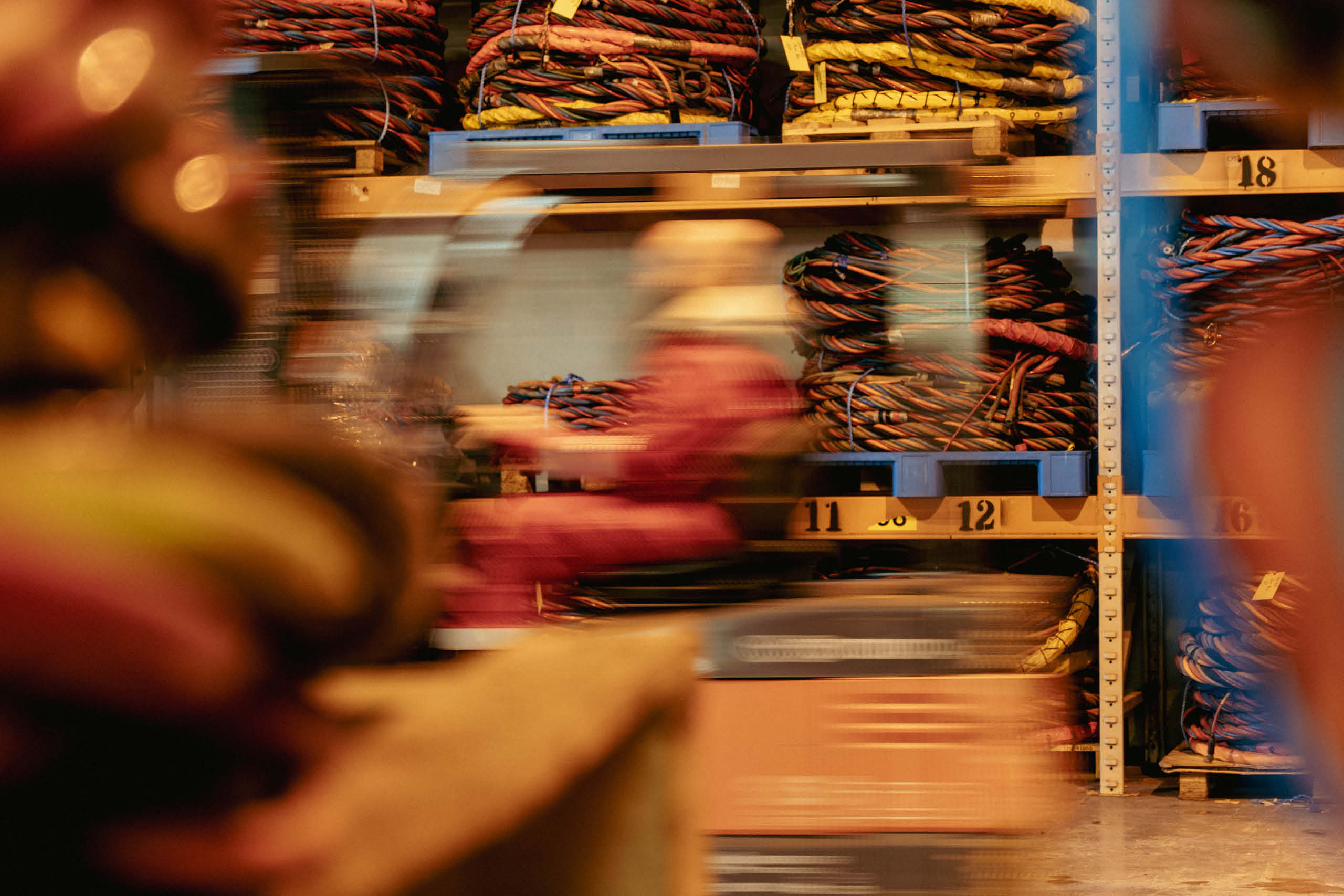
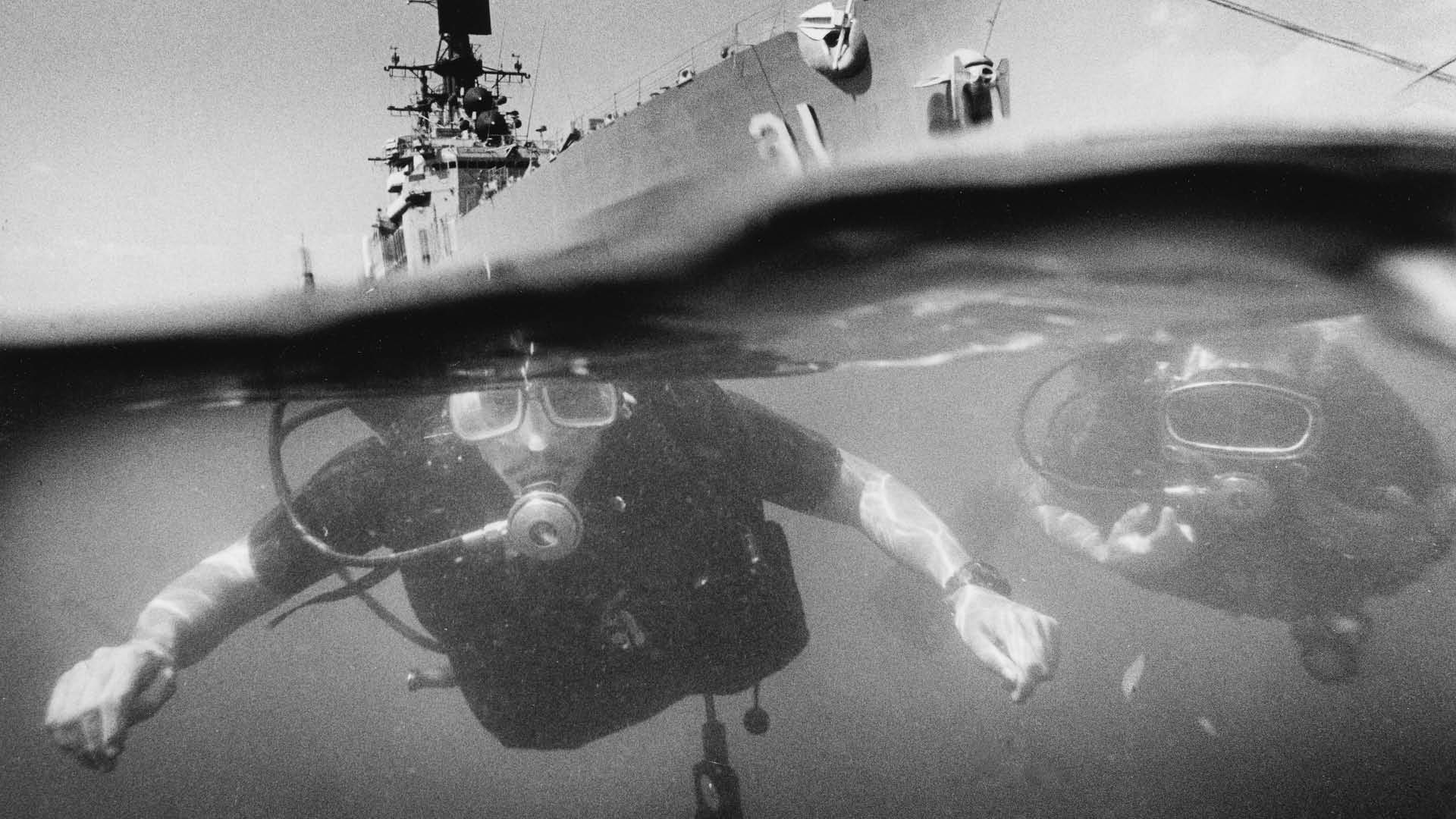
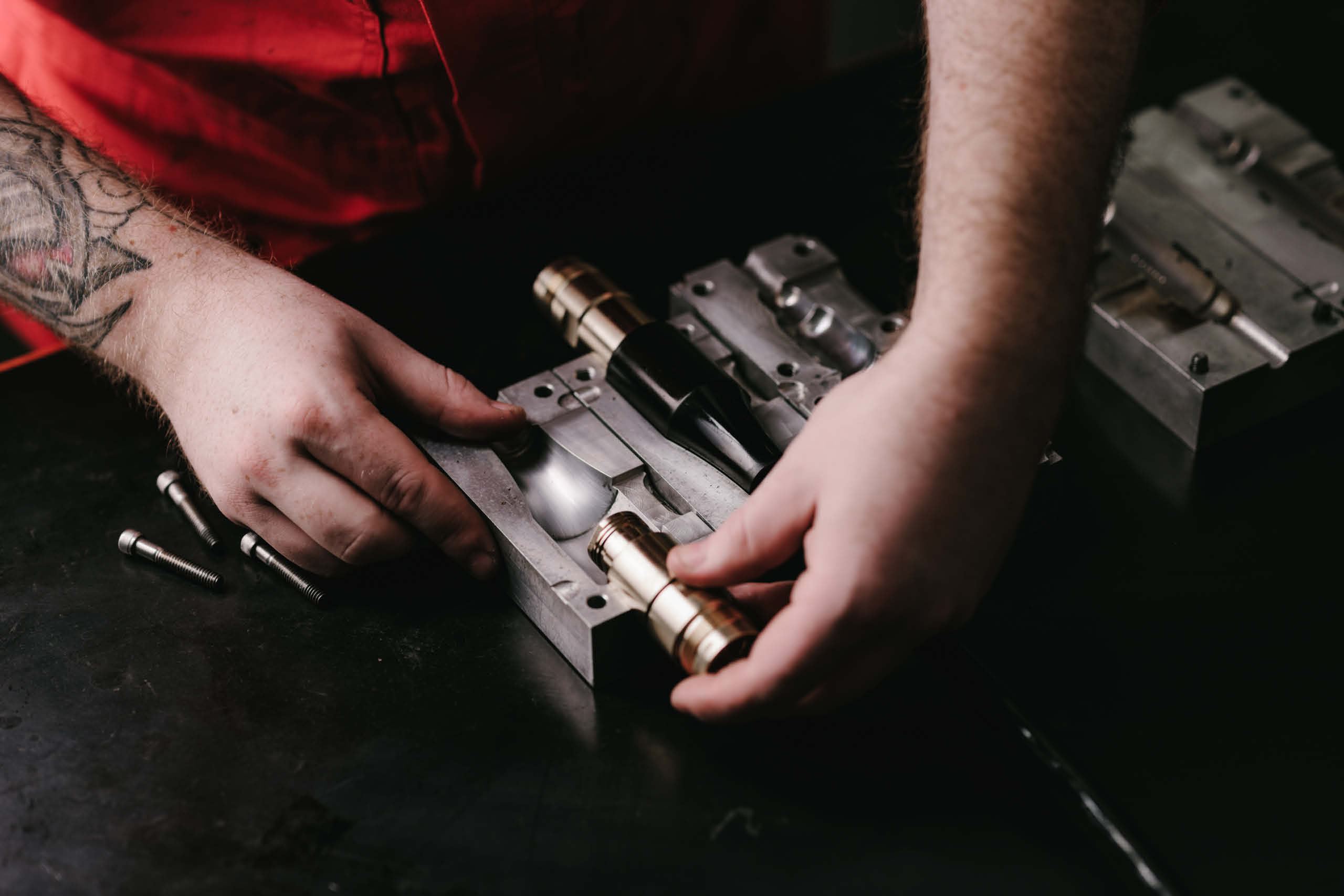
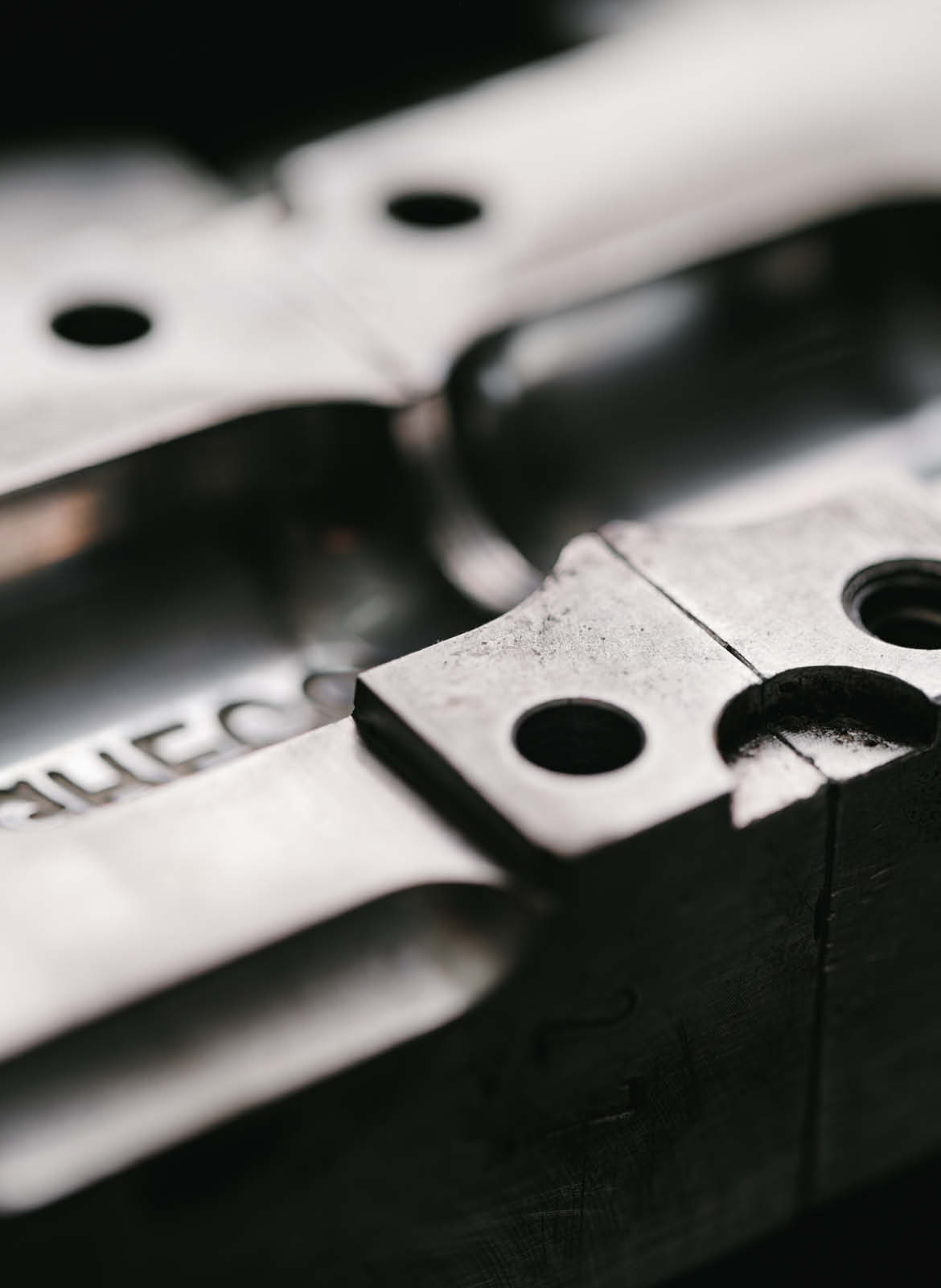
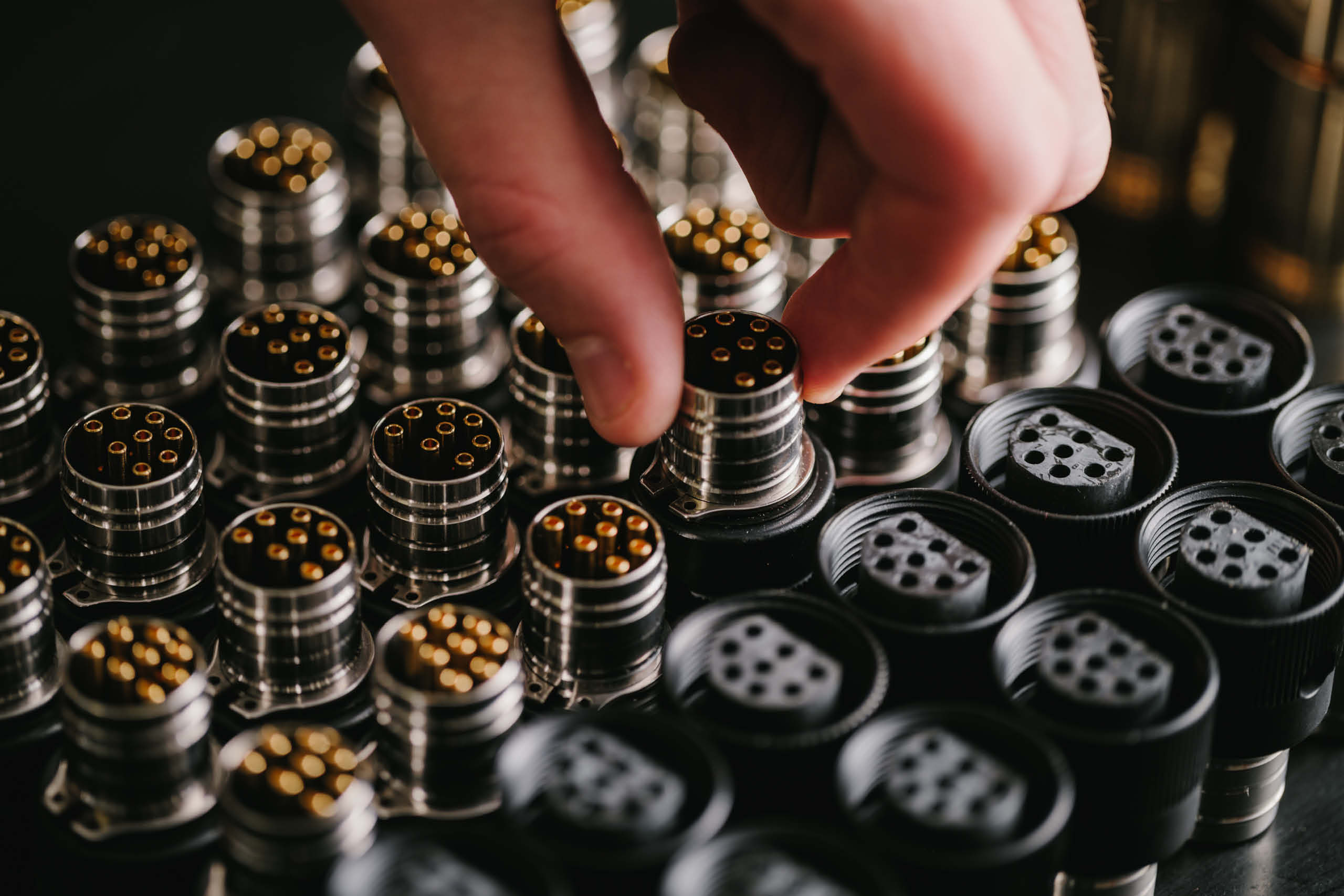
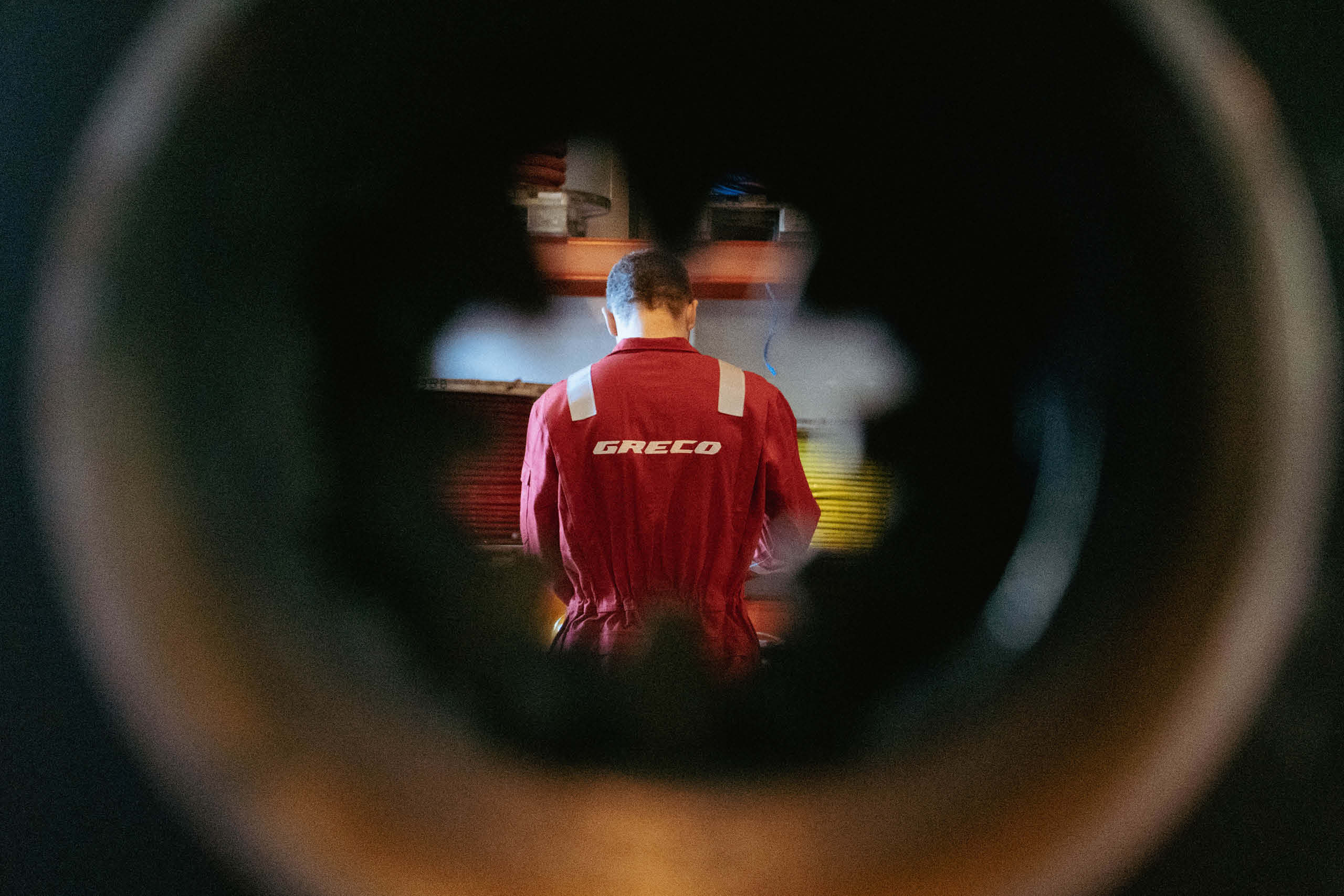
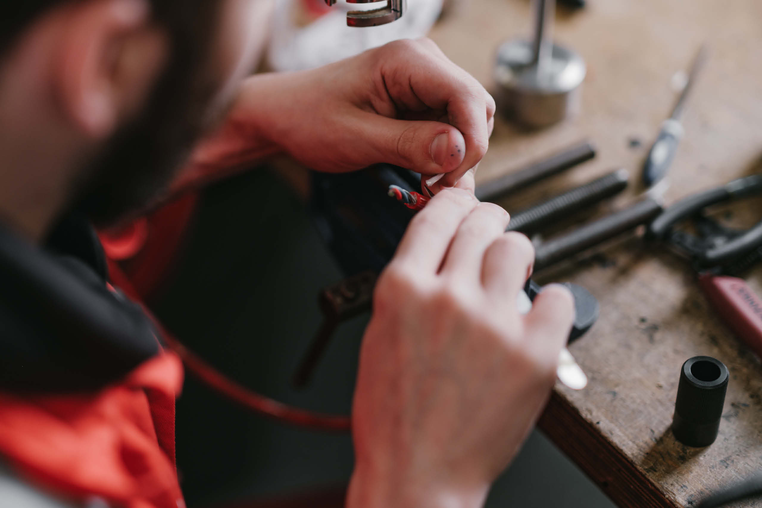
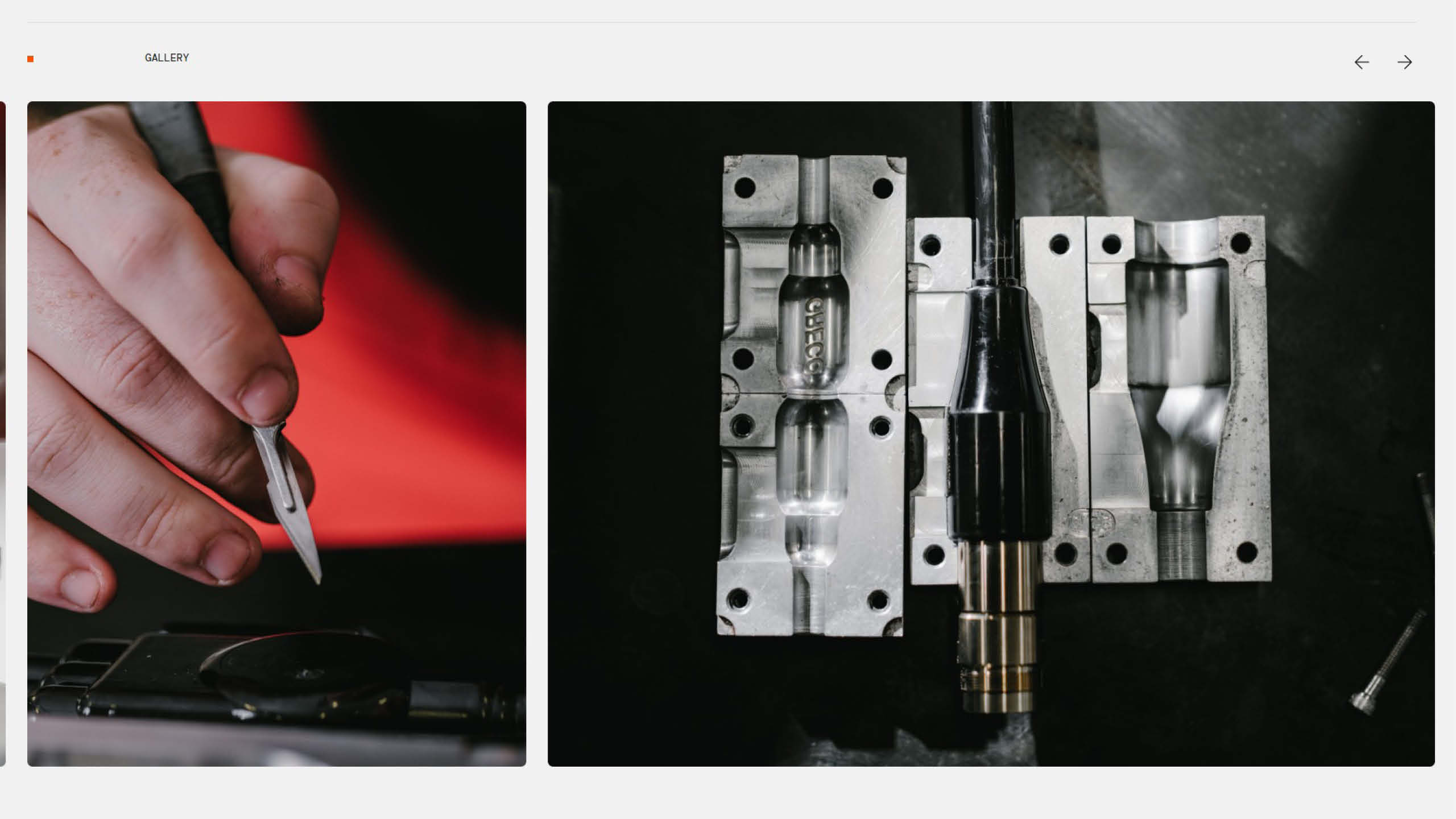
Photography
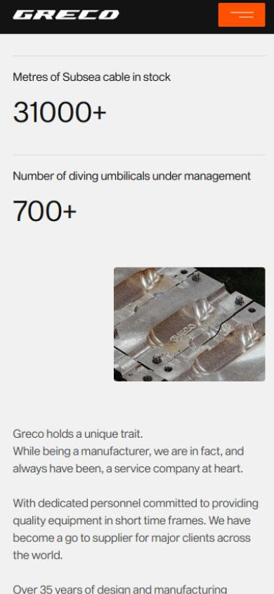
Photography became one of the defining elements of the brand. Working closely with the Greco team, we developed an art direction centred around the manufacturing process itself. High contrast imagery captures mould making, cable assembly, testing and production, revealing the craftsmanship and technical precision behind every product.
Rather than simply documenting the factory, the photography celebrates the people, processes and engineering that underpin Greco’s reputation, creating a visual library that communicates both capability and confidence.
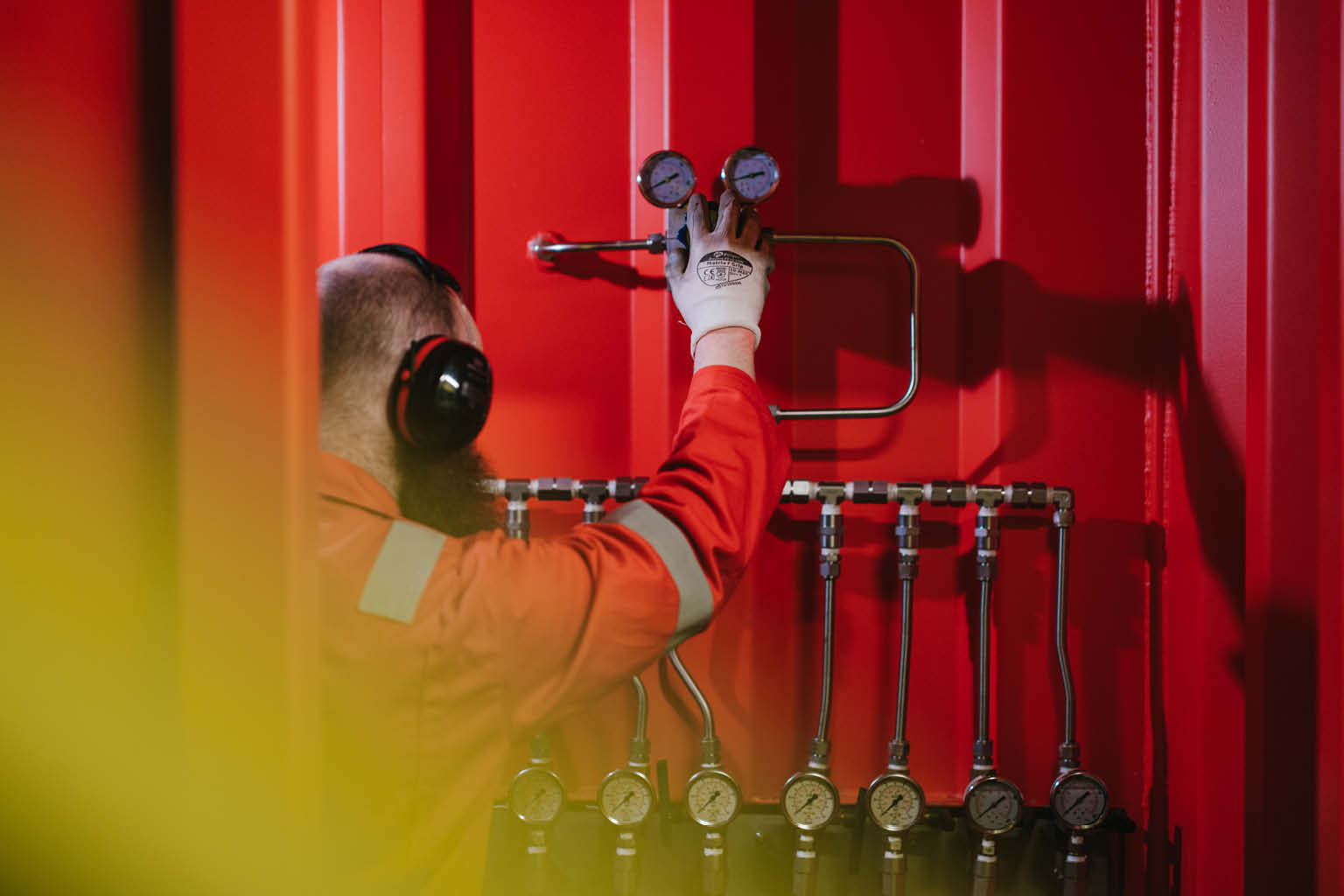
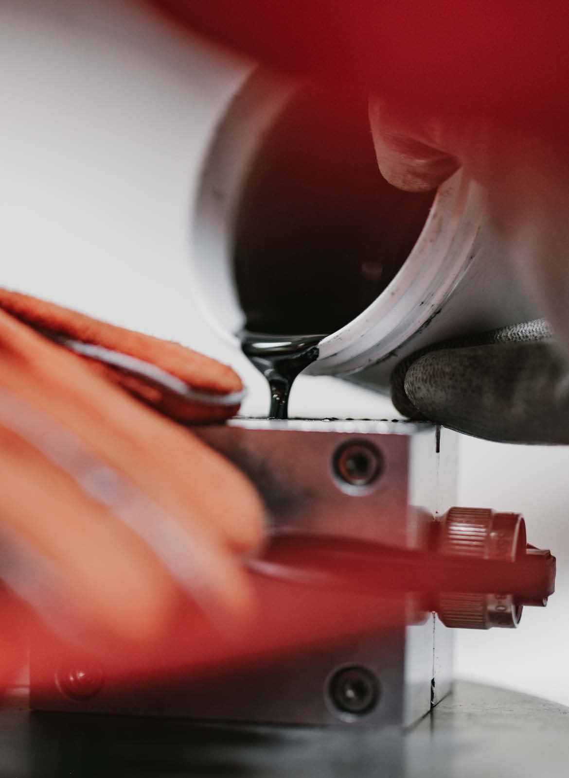
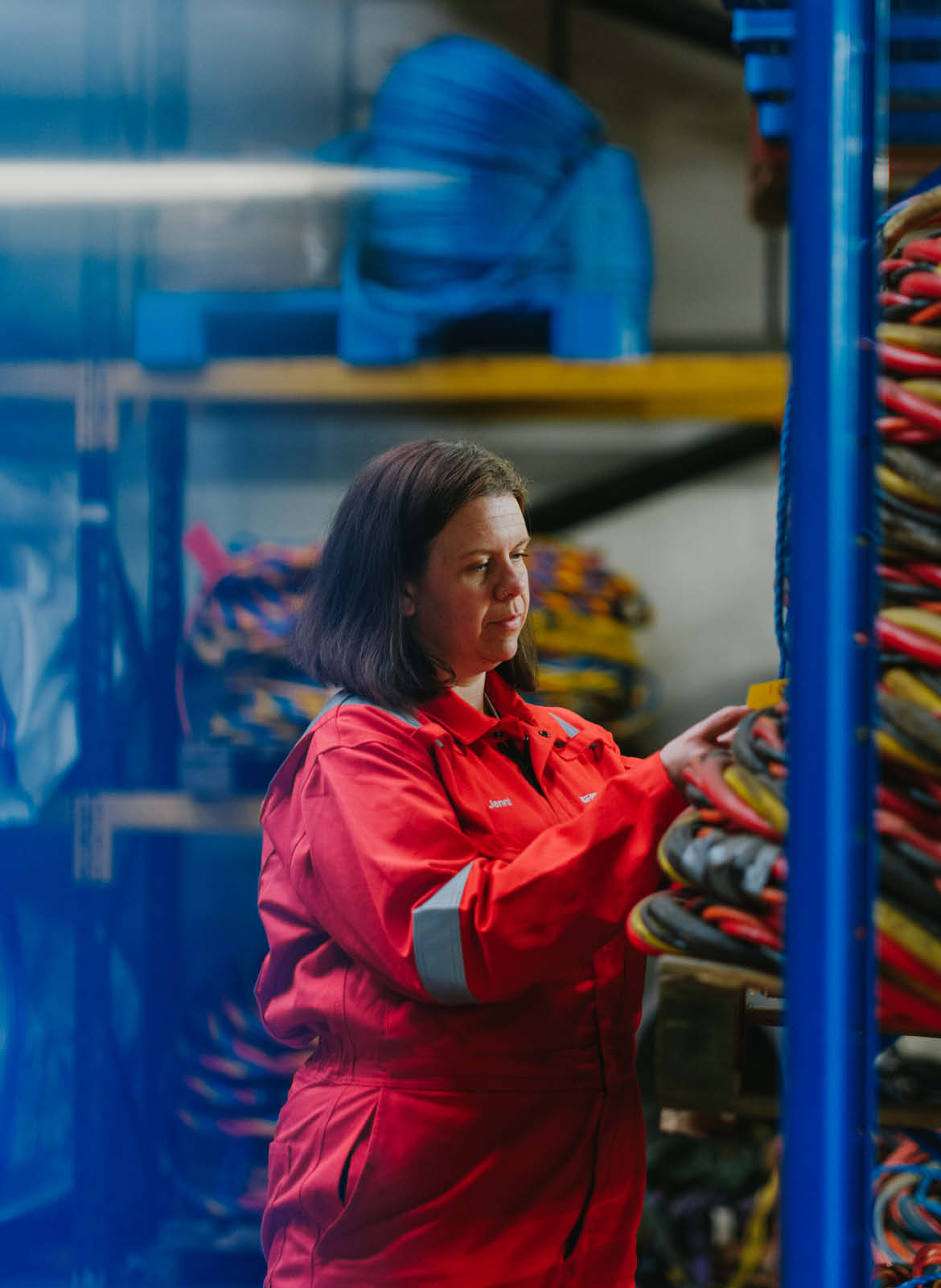
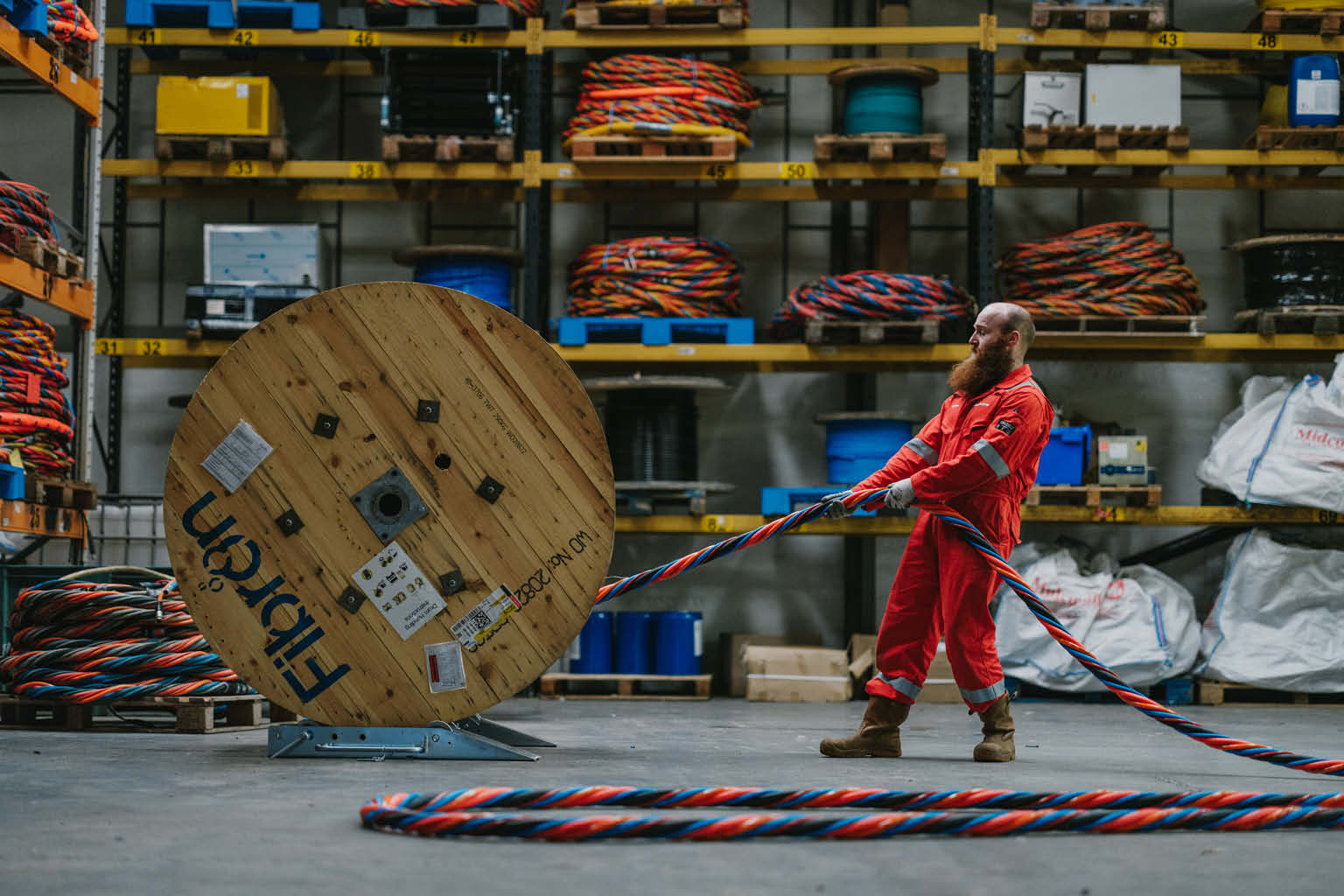
To bring this vision to life, we commissioned local photographers Grant Anderson, Asa Rodger and our own Creative Director, Mark Gordon, to capture Greco’s manufacturing environment. The shoot focused on authentic moments throughout production, from mould preparation and assembly to testing and final inspection, highlighting the expertise, care and precision that goes into every life critical product before it leaves the factory.
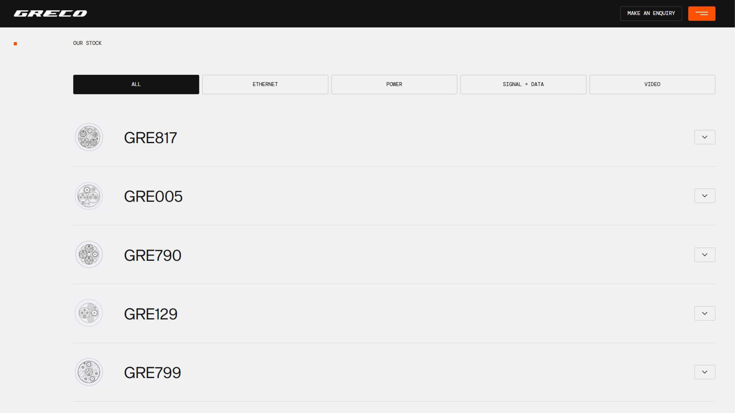
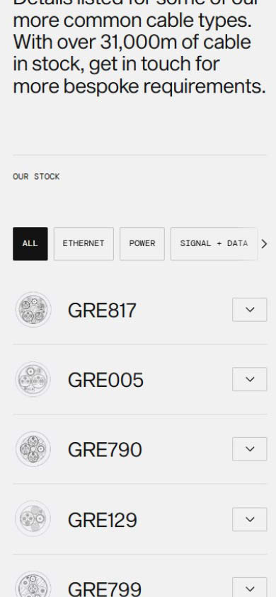
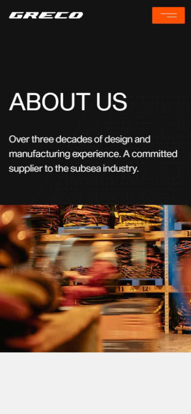
Digital
The website was designed to bring the refreshed brand to life through a clear and intuitive digital experience.
Information has been carefully structured to make Greco’s services, products and technical expertise easy to explore, while the bold visual identity and photography create a more engaging experience throughout. The result is a website that reflects the professionalism of the business while making it easier for customers to understand the full breadth of Greco’s capabilities.
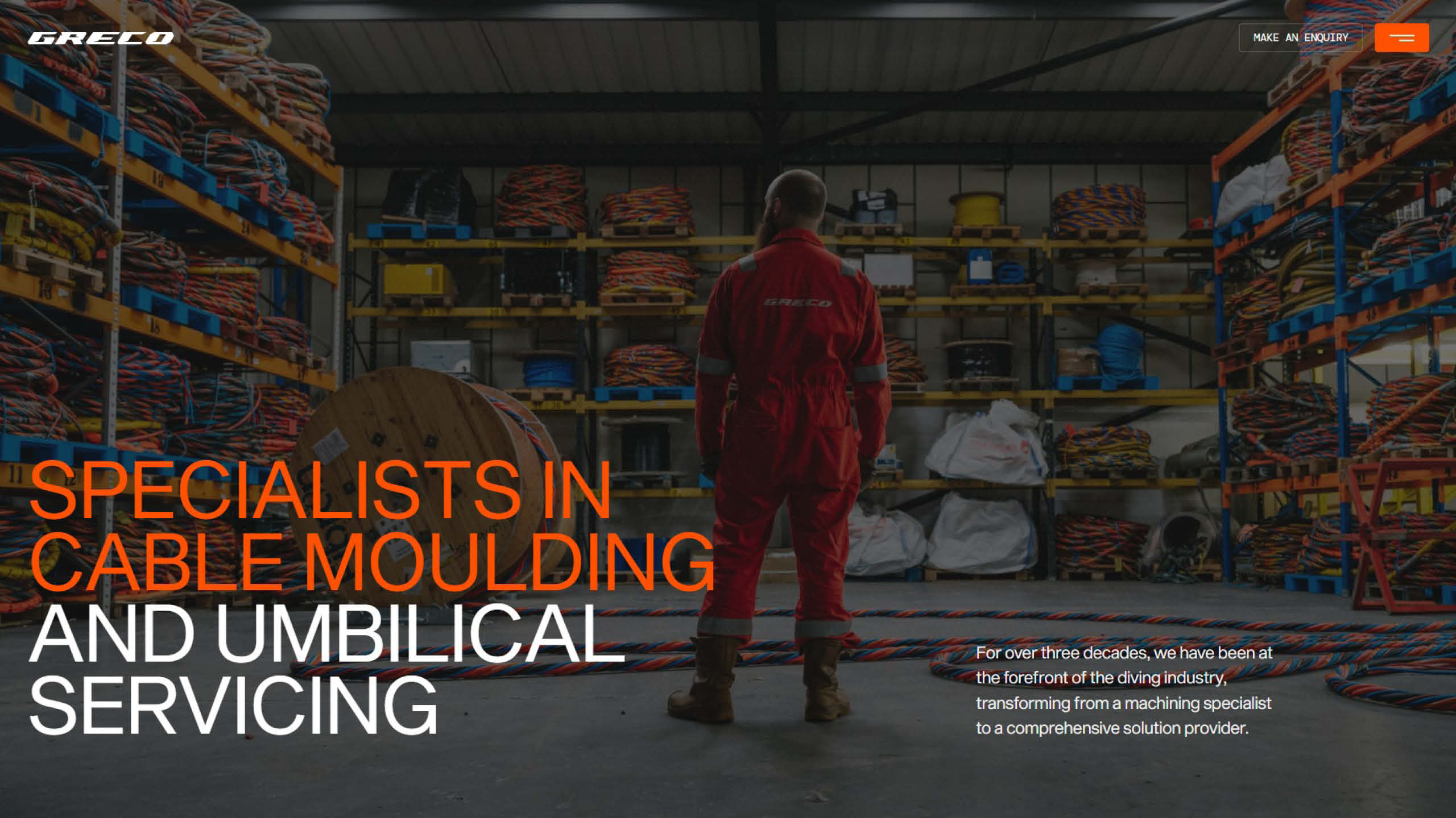
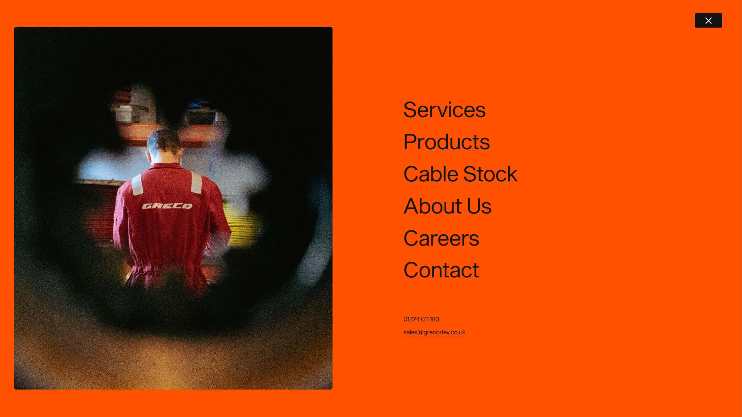
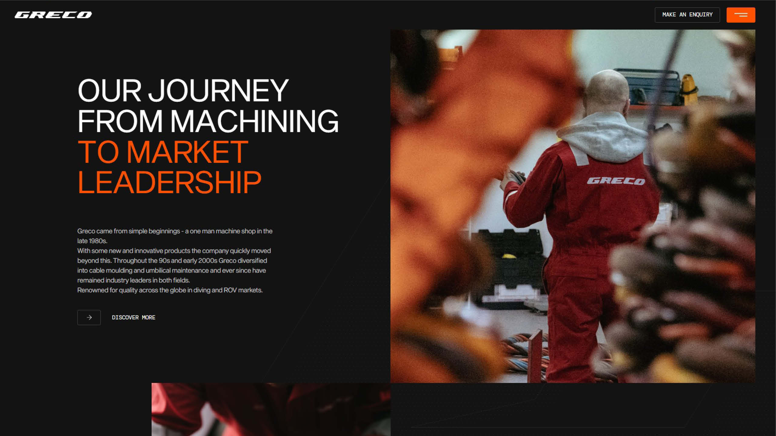
The website was designed as a natural extension of the new brand, combining bold visuals with a clear and intuitive user experience.
Working closely with the Greco team, we restructured the site’s architecture to make products, services and technical expertise easier to navigate. Strong typography, purposeful photography and carefully considered layouts create a digital experience that reflects the precision and professionalism of the business while providing customers with a clearer understanding of Greco’s capabilities.
The result
The result is a confident and considered identity that reflects Greco’s engineering expertise and technical precision, balancing the company’s established reputation with a progressive brand built for the future.